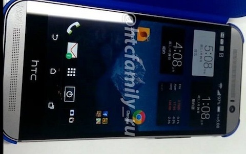
The same source that brought us the first pictures of the dual camera mounted rear of the HTC M8 has delivered another look at the HTC M8, this time from the front. The Russian source @HTCFamil_RU has seemingly found a source willing to show off the device.
As seen above you can see the on-screen software keys which leaked last week. But this time we can see them sitting above a completely, seemingly superfluous black bar, which on the HTC One was for the capacative buttons, but on the M8 seems to just be a strip for HTC to show their logo.
The appearance of the black bar could be tied with the decision by HTC to not venture too far from the critically acclaimed visual look of the HTC One. It wouldn’t be much of a surprise to find that the bar could actually be the same capacative strip from the HTC One but with no defined buttons or internal connectors. A tear down by iFixit after the release should help to reveal the true story if this is a final design, which is more than likely not the case.
The other thing to note is the off-center speaker grill at the top of the device. The new approach to the speaker placement is a different approach to the design for the Boomsound speakers on the HTC One, whose speaker grill was centred at the top of the phone, creating a visually appealing symmetry to the phone. On this device the top speaker grill has been moved to allow the camera as well as what appears to be a notification LED to be placed together on the right hand-side.
HTC is well known for building many prototypes as well as dummy units that have apparently been released merely to throw the press off the scent of the final design. They will generally release the internals in ‘test boxes’ with non-final design to carriers and the like for testing on their networks before release. The design isn’t bad and the hint of HTC Sense clock widgets on the screen is promising as well but we’ll have to wait for mid-late March before we can say for sure what the M8 will look like.
Do you like the look of this HTC M8? Do you think it’s a ‘final’ design?


No this would be a step backwards from the HTC One. I think that this is either an edited image or it a prototype of the original One. HTC wouldn’t be so stupid to have an offset grill and move the camera when it clearly works perfect on the One. Especially in their current situation. If they were to move the camera, it would probably be in the middle with the speaker grill on either side to keep it symmetrical.
Ew those bottom bezels. I thought the whole point of onscreen buttons was to excise that fat black bar.
looks like the side bezels size are still the same
what’s the point of on-screen buttons if they are keeping the black bar with HTC logo???
I hope this is a dummy unit, I’ve heard testing units aren’t final design
If there is no function to that black bar, it needs to go. My HTC One is awesome, but the BoomSound already bloats out the dimensions enough without a redundant black strip. At least the strip on the current model serves a function, but if all buttons were on screen then it would be a serious design negative IMO. I really hope they are patient and launch with an 805 SoC though… The implementation on the S600 is great, I can’t see the 805 making much day-to-day difference, but so many phones are out with S800 already that it makes… Read more »
That looks worse than the current HTC One.
Speakers look off (as the author said, smaller and off center, edges of the phone are curved more and a completely pointless black bar with HTC on it. Looks like a dummy unit. Or at least I hope it is.