When Google announced Android Wear there were two products announced immediately – the Moto 360 from Motorola and the G Watch from LG. The Moto 360 immediately took most of the interest of the tech community with it’s unique round display but the G Watch could potentially be just as interesting.
The concept of a round watch is definitely an attractive option for most people wanting a watch which looks like a traditional watch. But, in the fledgeling smartwatch wearables market, there has been a lot more traction with rectangular or square watches, so LG is ready to leverage the history that comes with the rectangular design with the G Watch.
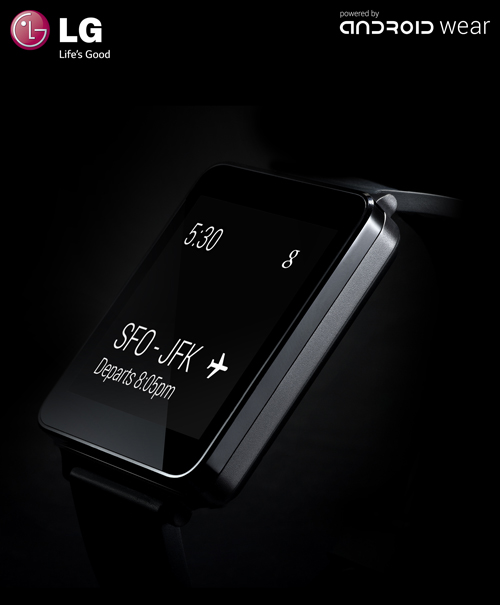
Our first look at the G Watch wasn’t that great, with most of the watch hiddn in shadow :

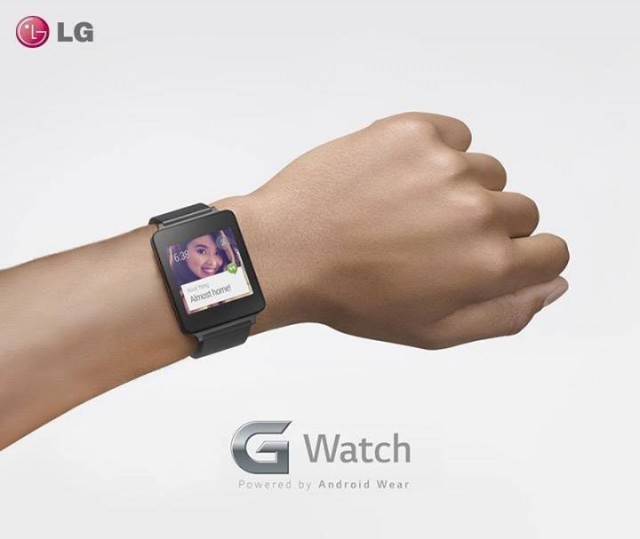
This picture gives us a slightly better look at the G Watch, but is it positive or negative in terms of aesthetics? Until we get a better look at the G Watch up-close and from more angles we should reserve judgement, but that won’t stop people, so what do you think?


Straight top down, the LG doesn’t look to have the thick bulky look of the Samsung or Moto. I’ll reserve judgement till we see some more side views of it being worn.
I don’t like it. Boring, uninspired design. I get the whole minimalism thing but the split line ~half way down the side makes it look like it was designed with manufacturing ease in mind, not consumer preference. Watches, in my opinion, still have a fairly weighted value as a fashion accessory. Releasing another basic form factor like this probably puts them behind the Galaxy Gear, well, if Samsung hadn’t locked up the Gear to being only supported by Samsung devices.
Watches are more a piece of jewellery than a functional item these days imo too. If ppl want the time they pull their phone out of their pocket. If people want to look good they slap a fancy watch on their wrist.
However, I suspect smart-wach buyers will be less concerned by this than traditional watch purchasers.
The thick bezel aren’t doing it for me. I like the moto design better.
The G Knuckle.
The image clipping on this site has the same problem as Twitter….
I don’t mind it at all actually. Sure the Moto 360 is more dramatic, but this is simple and neat, and probably a whole lot cheaper.
I don’t hate it.
personally i think a watch doesnt need bazel that thick, we understand phones do need bazel, but watches ?
If I get one, it is so the Moto with metal band
I don’t even need a metal band but rectangles on watches are fugly.
you get what is right for you, I want one that looks like a watch and until it changes function you would not have a clue it wasn’t a watch. The square shape may indeed come out looking good after all we have only seen marketing images, in person they may look really bad or amazing.
For me rectangles on any watch are fugly. Be it a smart watch, quartz battery powered watch or a wind up watch.