Just the other day we saw Google+ receiving an update, after earlier rumours that were (fairly) accurate about how the update would look. Now, it looks like it’s Gmail’s turn to get a revamped interface, if some leaks from Yoel Kaseb on Google+ are to be believed. Yoel, who’s Google+ profile states he works for Samsung in Argentina, is quite possibly a reasonable source of accurate information, as he previously posted some information about how Google+ was updated, and he was fairly spot on.
Without further ado, here are the leaked photos:
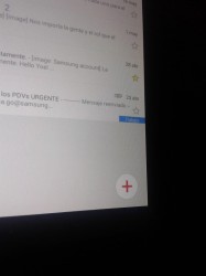
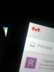
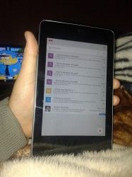
As you can see from these photos, there are design cues from the new Google+ app here — a floating compose button in the bottom right corner of the screen, a streamlined action bar, a lack of the hamburger menu on the left, and a bar (the white one showing Principal in the middle shot, above) that seemingly allows quick access to different boxes, folders and maybe even accounts.
There’s some speculation that these shots aren’t of a real Gmail app, and may be just elaborate mock-ups, but it seems an awful lot of trouble to go to just to leak some photos; if they were mock-ups, we’d expect so-called ‘screenshots’ that are actually just fiddled with in Photoshop, rather than actual photos of a device said to be running a (unattributed) Gmail build.
What are your thoughts?


Isn’t the new gmail update supposed to have the coloured bar across the top? Or maybe this is a small update before that?