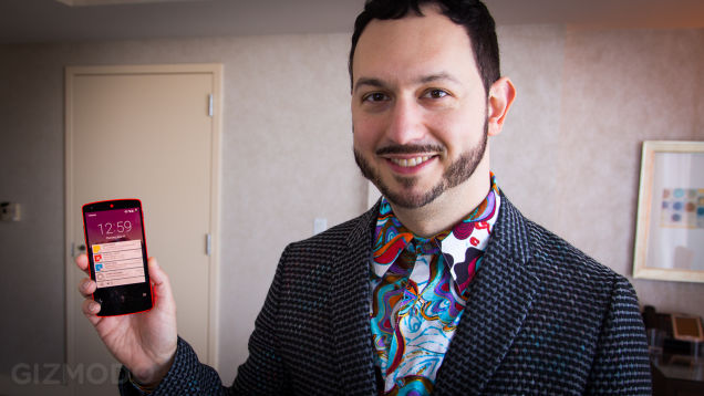
After last week’s I/O on Thursday, Google’s Vice President of Design Matias Duarte has sat down with Gizmodo to talk about the companies release of Android “L” in greater detail. In the interview, Matias talked about a variety of aspects of the new design language and how the new version of Android was built.
Duarte explained that the idea of Material Design originated when Google realised that it had one big issue:
We had a really big problem. It wasn’t just a problem about going beyond phones and tablets, which was clearly something we wanted to do—we wanted to design for all these different screen sizes. And it wasn’t just the problem of going to multiple platforms and form-factors, right? It’s not just Android and web across all these form-factors. And it also wasn’t just the problem of “We want a design system that’s good for Google.” We wanted it to be a design system that anybody can use to really express their brand and their identity and their needs and capabilities.
Duarte continued in the interview to talk about the of elements of Material Design that could make their way to Google’s other products (Chromecast, ChromeOS possibly?). He also noted that during his (and other Google reps) presentations at I/O, was Google unveiling the basis of Material Design and it’s palette. The company and Duarte believes that anyone, inside and outside of Google, could use that palette and implement the Material Design feel in to their own brands or apps alike.
During the interview, Matias Duarte was asked about Googles acquisition of Nest, and he said that even though Google acquired the company, it still operates as a (wholly owned) separate company. He also noted during the interview that he didn’t know whether Nest would implement Material Design into its products:
What you’ve seen a lot of at the I/O keynote, was Google revealing that palette to the world, and showing how we’re going to use it, in a very Googley, opinionated way. With a lot of white space; a lot of bright, optimistic colors; some cheerful, poppy animations; things that are inherently Googley. Maybe a little more sophisticated, more modern Googley than the past Googliness, and with a bit more design savvy, but it’s very much Google’s style. Right now Nest is owned by Google, but is operated like a separate company. They have their own brand aesthetic. It’s actually fairly similar to Google. I don’t know how they’re going to use Material, or if they’re going to choose to use it. I hope they will, and if they do I’m sure they’ll do it in a way that makes sense for their brand.
If you wish to read more of the interview with Gizmodo, you can do so by clicking here.
What do you think of Android “L” and its Material Design? Do you think Google is on the right track? We would like to hear your thoughts in the comments below.


Looking at his jacket and shirt explains a hell of a lot….
You should have asked him directly to start monitoring Australian sports on google now. Really need this to happen.
Cricket, Rugby, NRL – all the good ones are there 😉 #Trolling