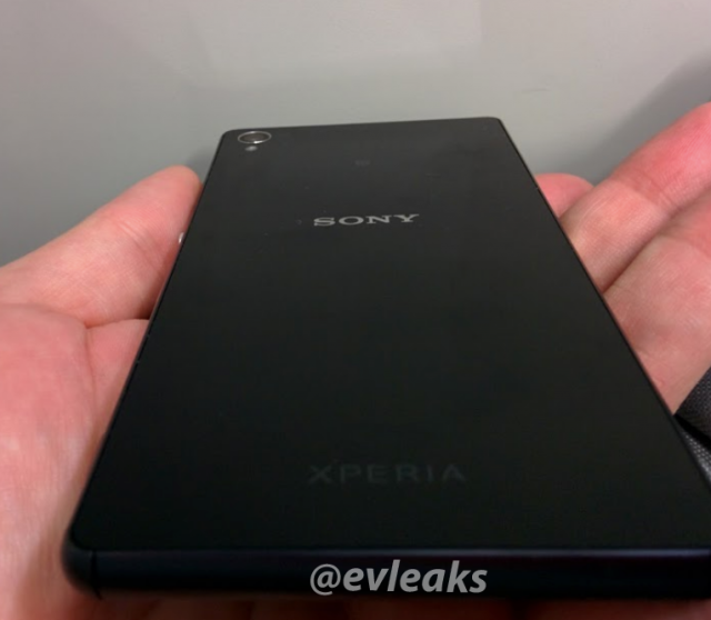
The upcoming Sony Xperia Z3 appears to be wanting to compete with the big boys when it comes to leaks, showing up multiple times in leaked photos, and it’s done it again. Excellent source of leaks, Evan Blass has sourced some pictures of the phone, this time without the blurry-cam that seems to have affected previous shots.
There’s two pictures, the one below which shows the rear of the phone, which seems to be going with Glass as the material on the rear again as well as the 20.7MP camera lens up the top right. The picture also shows the beginnings of the sides, which look to be again slightly more rounded or ‘chamfered’ if we’re using the fancy words, moving on from the decidedly almost razor sharp edges of the original Xperia Z.
Yesterdays leak from EvLeaks, laid out the specs for the phone which will include a 2.4GHz Quad-Core Snapdragon 800 processor with Adreno 330 GPU, 5.15″ 1080P Screen, 3GB RAM and 16GB of storage with the 20.7MP Rear camera and 2.1MP Front-Facing camera. The Xperia Z3 will arrive running Android 4.4.4 (Kitkat) with the usual Sony Xperia software tweaks.
https://twitter.com/evleaks/statuses/491949871730274304
There’s one more shot of the Xperia Z3, which shows off the edge – including the microSD card slot, SIM card tray and power button – over on EvLeaks site, so you can head on over for a very nice, high quality side shot of the phone.


Gun to my head, I wouldn’t be able to tell you if that was the Z, Z1, Z2 or Z3 in that photo.
Consumers are best off waiting for the Z3 to release then pick up the Z2 at a reduced price. Same processor/camera, same design, pretty much the same phone.
Sony is getting stale. Real stale.
I like the Sony handsets, but they always feel huge in one hand (possibly due to the large bezels and square design) and I’m not a fan of the round power button. The LG G2 and G3 are nice, but I don’t know that I’d get used to having the buttons on the back. Then we have the HTC M8, which I prefer, but it has the power button on the top, which is annoying. Samsung has TouchWiz, which is horrid. It’s no wonder that we’re all holding out for the Nexus 6. 🙂