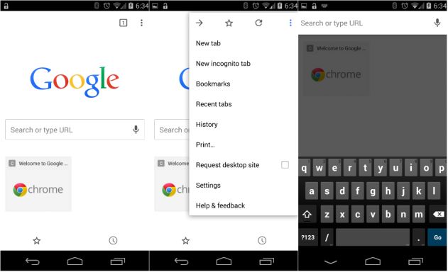
Google has released version 37 (yes, thirty seven) of Chrome for Android, and while it contains the usual bug fixes and other improvements that we typically see in a Chrome release, perhaps the most noticeable change is the implementation of Material Design into the Chrome layout; you’ll notice when you start Chrome next that it looks rather different.

Other new features include improved single sign-in, so that signing in to Chrome automatically signs you in to a number of Google sites as well. The rest are bug fixes and performance improvements which should become more obvious as use goes on. I’ve been using the new version today and it certainly feels just that little bit quicker and more refined than the previous version.
Maybe that’s just my perception. What do you think?


Why the hell did the remove the shortcut REFRESH button
Bookmarks that I have on my homescreen as shortcuts to sites no longer work. Annoying. It just opens chrome whenever I click on any shortcut
Cool, now if only the desktop version of Chrome got a visual refresh. It’s been ugly for years.
The whole interface is a lot cleaner but I’m not too impressed with a few things
Used to open up to my bookmarks page, not anymore.
Apparently you can swipe tabs to close them. This doesn’t seem to work.
The address bar provides suggestions before bookmarks.
Bookmarks page has lost all the site icons. Even visiting sites several times does not restore them. Takes just a bit longer to find what I’m looking for.
Still can’t reorder bookmarks.
Anyone got around these issues?
OFN.
the main menu is annoying, you must tap, should be able just to long press and slide to desired item
I dislike how upon opening a new tab, the search box is not automatically selected and keyboard brought up. You need to hit the now, centred search box again for same gesture as previous version. First world problems sure, but I search within Chrome all the time and this is just added friction.