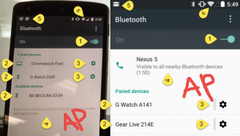
A photo showing a Nexus 5 running a newer build of Android L was posted to the Chrome bug tracker a few days ago … and was subsequently set to private. A build number of LMP LRW66E points to an approximate September 4th build date, making it much newer than builds that are currently available to the public under the Android L “Preview” release, and of course the mention of “LMP” adds further fuel to the delicious “Lemon Meringue Pie” fire.

The photo shows the Bluetooth device management screen (the bug was filed against the feature allowing you to use your phone to unlock your Chrome device), and there’s a number of differences both in UI design and icon/button placement over what’s been seen in current Android L builds. Android Police ran a detailed comparison: of the screenshots:

In short, we seem to be looking at a general spit-and-polish for the Bluetooth section.
The on/off toggle switch is notable in that it differs from Google’s own Material Design guidelines. Perhaps we’ll see an update to this soon. It’s not the first time Google’s redesigned the on/off toggle (in fact, it might be one of the most-redesigned parts of Android’s visual design at this point).
The Wi-Fi and cellular signal strength icons have been updated to no longer have visible segments and the notification bar is showing new Gmail icons that could indicate multiple new emails have arrived – or, it could just be a new Gmail icon.

We’re seeing an increased amount of speculation that Android L will finally make it to general release in the next month or so. That would line up with Google’s usual late-October-early-November release schedule, and it makes sense for Google to bring all areas of the OS in line with its new design principles at this point. We can’t wait to see the finished product!
What other sections of the OS need some UI design attention in the Android L preview release? Tell us in the comments!


