Review:
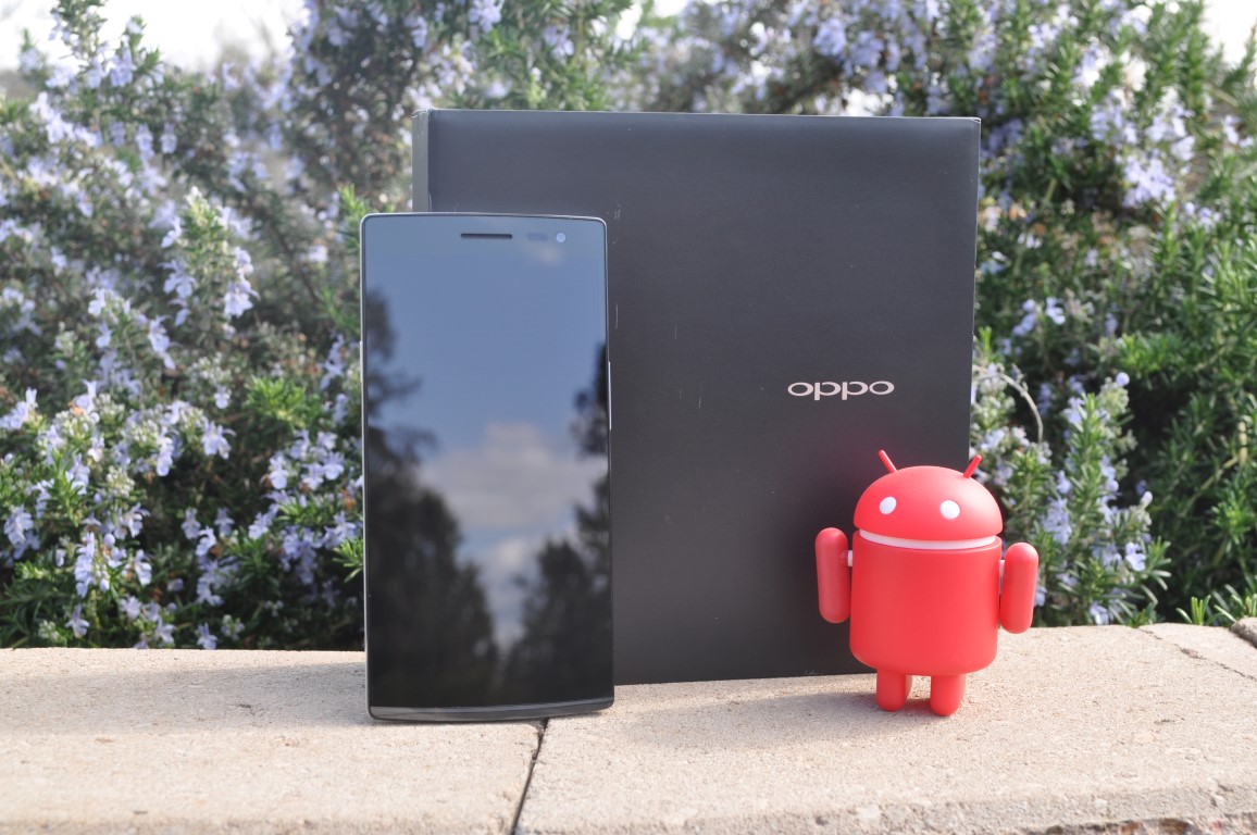
Oppo has just entered the market in Australia, they’ve arrived with four phones to sell through their OppoMobile website, offering phones from the budget conscious Neo 5, up through the N1 mini, Find 7a, all the way to their current flagship phone, the Find 7.
Oppo has the distinction of holding several firsts in the mobile phone market, and indeed in their Find series of phones. The Find 5 was the first phone to market with a 1080P screen, and they’ve followed this up with the Find 7 being the first phone released with a 2K (2560×1440) resolution display. They were beaten to market in Australia by LG with the G3, but they were first in Asia.
Australia is the first western market that Oppo has launched phones in so far. You can still import Oppo phones in other countries, but it’s the direct sales now available in Australia that make the Oppo brand a more interesting prospect now.
The Oppo Find 7 comes in premium style packaging which contains all the usual accessories – headset, microUSB cable and Vooc Charger (we’ll get to that later), it also includes quickstart guide and of course your battery and phone. It’s a nice box, but it’s what’s inside that counts, so how does the Find 7 stack up?
- ColorOS
- Power and Volume buttons can be hard to hit
- Capacative buttons
- Quite blocky to hold
Hardware
The hardware included on the Find 7 is, as fits a flagship, quite a nice collection of components, with many specs sitting above what most phones on the Australian market have received.
The standout feature on the Oppo Find 7 is obviously the 2K (2560×1440) resolutions 5.5” screen, which is wonderful. With such a large, high resolution screen, you’ll also want some power and the Find 7 has it in spades. The Find 7 contains the flagship processor of choice this year, combining a Qualcomm Snapdragon 801 Quad Core (MSM8974AC) clocked at 2.5GHz, with 3GB of RAM. Storage wise, the phone comes with 32GB (About 24GB available at start-up) and a microSD card slot, this should see most people quite happy, but has issues we’ll get to later.
The camera is quite a standard 13MP CMOS sensor, with an f/2.0 lens, and a dual-mode LED Flash on the rear. For the selfie fans out there you’ll find a lovely 5MP front-facing camera ready to transmit your best duck-face to the world.
There’s a lot of hardware here, it’s been thought out quite well, and so far it’s leading the charge when it comes to packing the most specs into a smartphone, at least in our market.
Build Quality
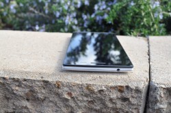
Build wise, the phone is top notch. It has a solid chasis holding it together, with no flex or movement perceptible as you use the phone.
The phone is quite tall rather than wide, it has side mounted physical power and volume buttons, though they sit quite flush with the sides, making it a little hard to press at times. The volume and phone buttons have been switched from the ‘normal’ positions, with the power button on the left and volume rocker on the right.
The phone of course has that wonderfully large, and quite pixel dense screen, and it takes up most of the front of the device, there’s still some bezel either side and the top too looks to be a little high, although here is where you’ll find your front-facing camera, ambient light sensors and of course the ear-piece. Beneath the screen is a row of capacative buttons, with Oppo chosing to go hardware instead of the soft-buttons that Google introduced to phones in Android 4.0. It’s quite a disappointing choice, made worse by the fact that the lights behind the capacative keys are so dim they can barely be seen, even when you turn their brightness up. Still, you could put a ROM on the phone which supports soft-keys, but as a default choice it would not be the way I would go.
One of the most pleasing aspects of the physical design of the Oppo Find 7, is the so-called Skyline Notification. Beneath the screen and those capacitive buttons is a strip of clear plastic behind which a blue notification light glows out when activated. While the blue is serviceable, it would work even better with a multi-coloured LED. The skyline Notification light is a flourish that I feel Oppo would be well served to remember, and include the next time they design a phone.
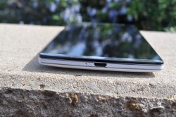
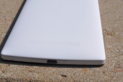
At the bottom you will find the microUSB port, as well as a tiny recessed microphone. At the top of the phone, you’ll see the 3.5mm head-phone jack, a position I find not to my liking, but have found a good number of people championing this position, so it’s a personal choice this one. It’s from the 3.5mm jack that you’ll be able to pry off the removeable battery cover to reveal a 3000mAh Li-Po battery with Rapid Charge battery, microSD card slot and of course your SIM card slot.
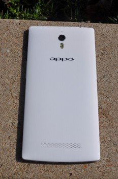
The rear cover is quite flexible, and has a lovely textured finish which feels extremely nice in the hand. It feels remarkably similar to the ‘sandstone’ textured rear of the OnePlus One. The rear panel is slightly hard to remove, with no obvious notches to help you remove it, you’re essentially left to guess how to remove the case. Once it’s off though, it’s quite easy to replace, it’s just the initial remove that seems to be an issue.
The phone has a rounded rear, but quite blocky thicker sides. Other phones in this size range have opted to go for a rounder slope at the sides, making it a little more comfortable to hold, the Find 7 goes more for a utilitarian blocky slab. It’s a design consideration that will come as Oppo design matures I`m sure, but the Find 7 feels a little bulky in the hand.
Screen
As I found with the LG G3, the 2K resolution screen is just beautiful. The colour reproduction is top-notch and as it’s an IPS display, your viewing angles are superb. The ambient light sensor isn’t quite as good as I’d hoped in bright sunlight, you’ll often have to manually adjust the brightness to see the screen in sunlight, but it’s more than acceptable inside.
The phone display is covered with Corning Gorilla Glass 3 for added protection, although it would do you well to remember glass is still glass and as such can break. In theory the display on the Find 7, incorporates ‘Touch-on-Lens Technology’ which provides support for gloved and wet touch input. In practice though, my supposedly Capacative Touch screen gloves didn’t even register on the phone.
The additional resolution is fantastic for viewing the limited 2K content available on YouTube, or of course your own well shot 4K resolution videos, but it’s still a hard sell just for those reasons. What it is good for is viewing text and it’s this reason alone that should sell most people on 2K resolution screens, it’s a matter of once you’ve used them, trying to read on lower resolution screens gets just a little bit harder.
Battery life
Battery Life on phones carrying a 2K resolution screen, is a big issue, at least that’s the first thought for anyone even contemplating a phone with a screen like this. Oppo have thrown a 3,000mAh battery at the Find 7 in a brute strength effort to ensure that there’s no issues here, and to a large extent it’s worked. I wasn’t quite able to get to the 15 hours I saw on the G3 which has a similar setup, but it was close. Average for the Oppo was between 13-14 hours, with about 3.5-4 hours of screen on time. It’s a decent days usage. With that in mind, you’re obviously thinking that’s not going to get me a full day of use, but Oppo has a trick up their sleeves – VOOC Charging.
VOOC charging enables you to charge your phone 4x faster than a standard charger. You can get up to 75% battery capacity with just a 30 minute charge – or if you’re about to take an important call 5 minutes will get you enough charge for a 2 hour phone call. How do they do this? Well, the charger supplied with VOOC branding will output charge at 5A. Yep, that’s 5 Amps. Putting that into perspective, the average phone charger will output around 1.2A-1.5A of charge, tablet chargers get up around 2A, so you’re looking at a fairly decent charge. The issue with this is of course heat, charging causes heat, but not so with the Find 7. Oppo has included ‘5 layers of thermal protective coating’ on the Find 7 to get around this, and quite frankly even though the phone still gets warm, it’s nowhere near what it should be.
There will be a variety of VOOC charging accessories arriving on the Oppomobile website quite soon, including car chargers and portable batteries. Pricing for the accessories will be made available closer to the launch date.
The other factor involved with the Oppo Find 7: It’s a removeable battery. If you want you can purchase a spare battery and swap it in and out as you require.
Camera
The Oppo Find 7 includes a 13MP camera module for the rear camera, the module is made by Sony who have supplied an EXMOR IMX214 1/3.06” sensor, which will impress the absolute pants off you. It’s got features that you’ll love, like ‘Super Zoom’ (or UHD as it’s called in the menu) – a feature that Oppo has created using the camera sensor and their Pure Image software technology which takes ten consecutive photos, really, really fast and then grabs four of the best photos to stitch together to create one massively large 50MP (8,160 x 6,120) resolution photo.
In practice, Super Zoom is AMAZING. It captures some absolutely stunning shots in delicious clarity. There’s quite a bit of detail preserved in the post-processed image, and it’s well worth having this feature included.
The f/2.0 aperture, paired with the EXMOR sensor lens also helps with another feature, which, if you like to photograph night shots you will find quite nifty – Slow Shutter. You can take a 32-second long exposure at night….not terribly useful to the every day person, but the Find 7 does also take a wonderful low-light picture.
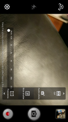
There’s other features like HDR, Beauty shots, or of course the ever novel ‘Audio Photo’ because who doesn’t love adding an audio message with their picture? Oh, no-one then. Still, it’s there if you want it. What it does have which is simply awesome is a GIF maker, EVERYONE loves GIFs and the Find 7 includes one for free right in the camera software just for convenience.
Oh, it’s also got a 5MP front-facing camera, which takes quite a decent picture.
Pictures are very nice, the camera software is even nicer. It’s easy to use, with the settings and various modes quite accessible. There’s still a shutter button included, but if you dig into the settings you can set Touch Shutter, which allows you to touch anywhere on the screen and the camera will take a shot.
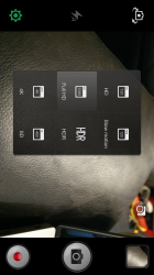
Pictures are great, but Video is where it’s at isn’t it and the Find 7 won’t disappoint. The video options on the Find 7 are amazing. You can choose from video resolutions ranging from SD(480P), HD (720P), FHD (1080P), all the way up to 4K. If great high-res video isn’t what you want, then you can get the lovely HDR as well as 120FPS Slow Motion video, which is actually rendered as slow-motion video by the phone so you don’t have to do this in post processing like other phones.
All up, the camera on the Find 7 is brilliant and whether it’s a quick happy snap, a more refined setup photo or a high-resolution video, the Find 7 can do it all.
Connectivity
The Oppo Find 7 is connectable at almost every level, it comes with USB OTG compatability to connect your USB devices like Flash Drives, Keyboards, Mice and more as well as a full range of wireless connectivity options. From Bluetooth 4.0 through to Wi-Fi 802.11 b/g/n, which is Ok, but it doesn’t include Wi-Fi AC, but you can’t have everything. There’s also expanded Wi-Fi including Wi-Fi Direct and Wi-Fi Display. On the other side of things you’ll get GPS with GLONASS and of course, the old Android standby: NFC.
The Oppo Find 7 has some decent connections, the Wi-Fi connects easily to every router I connected it to and the phone acts as a Wi-Fi hotspot quite nicely too. Bluetooth on occasion presented with stuttering when the phone was in my pocket when connected to a Bluetooth headset. It happened regularly enough though that I mention it here, so hopefully there’s some firmware update that Oppo can provide.
GPS is great. No issues locking onto satellites, with a mean average of about 3-5 seconds to get a lock on enough satellites to accurately locate me. It helped me play Ingress with great aplomb, while also being able to provide navigation while travelling around.
The Find 7 operates on 3G as well as 4G in Australia, up to and including the Optus 4G Plus network in Canberra – a seemingly rare option these days. Of course the Find 7 connects to the 1800MHz LTE network that’s used in the majority of Australia, and it connects quickly and quite efficiently.
Sound
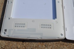
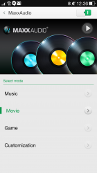
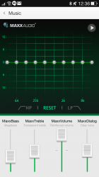
Oppo has with the Find 7 engaged the services of MaxxAudio who deliver a digital sound processing solution by Waves. The Find 7 includes stereo speakers positioned on the rear of the phone. The MaxxAudio is a combined hardware and software solution that overall delivers a fantastic sound experience.
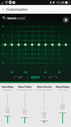
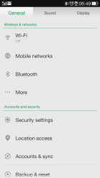
MaxxAudio by Waves is an inherent part of the ColorOS software on the Find 7. Oppo shows just how much the audio experience matters on the Find 7 by giving ‘Sound’ its own tab along with ‘General’ and ‘Display’ under settings. There’s multiple options underneath for the usual sound related settings, volumes, ringtones and then you move onto ‘Waves effect’. Waves has several preset equaliser settings for Music, Movies and Games, as well as a general Customisation tab you can manually refine your own settings under.
It’s a pleasurable experience listening to audio on the Find 7. Oppo has produced a thoughtful approach, which adds an element to the Find 7 which elevates it above what the average smartphone can provide in an audio experience.
Performance
The standard spec for the average smartphone this year appears to be the Qualcomm Snapdragon 801 processor. It’s been included in almost all of the top range devices so far but in the Oppo Find 7, the processor has been upped to a 2.5GHz clock speed, slightly above the 2.3GHz that’s been included on most handsets so far. Oppo has again pushed the hardware on the Find 7 by including an above industry standard 3GB RAM on the Find 7, and it’s noticeable.
With a combination of top notch processor, higher than average RAM, the Find 7 is quite the performer. Opening apps, games and playing videos is a speedy and smooth experience. The Find 7 is a fine example on hardware tuned to perfection. There’s no evidence of lag or stutter on the handset, making it an enjoyable experience all round while using it.
Of course, with a decent amount of hardware, it’s nice to see how it stacks up against the competition. From the evidence presented, it’s nice to see a flagship from a vendor who is still considered up and coming, competing and holding its own against the rest.
Software
Android OS
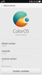
Oppo has been making their own version of Android for a number of years, the first being a modified variant of Android 4.2.2. Oppo has updated the version with Android since the initial release and with the Find 7, they’ve delivered ColorOS V1.2.6i which is a variant of Android 4.3, that Oppo proudly advises contains 410 ‘design improvements over stock Android’.
While it’s not the latest version of Android – and we do hope they update the Find 7 to a KitKat version of ColorOS – it’s not the only player in the Android software market, with Oppo actively encouraging users to install other ROMs, such as CyanogenMod.
But all in all, it’s still Android, and ColorOS is CTS certified and you’ll see all your favourite Google Apps displayed prominently on the screen when you login for the first time. You also have the Google Play store ready to help you install all your favourite apps.
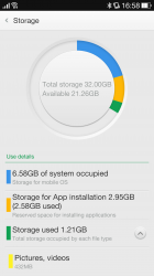
One options I found in ColorOS NOT to my liking, was the way storage is managed. The Find 7 comes with 32GB of storage. ColorOS actually splits this into: System Occupied (Storage for mobile OS), Storage for App Installation (Reserved space for installing applications) and ‘the rest’.
My concern with this setup of storage is the limitation imposed on App installations. Oppo has only allocated 2.95GB of space to apps, if you want to install more than this, too bad. Install a game requiring 2GB of storage, forget pretty much anything else, even when you have over 20 odd GB of space ‘spare’ you can’t re-allocate. Terrible choice Oppo, terrible.
Skins
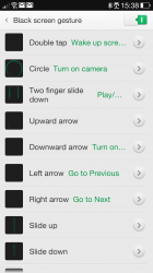
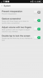
Part of the skin of any modified Android release is extra features and Oppo has gone all in on gestures. ColorOS and the Find 7 supports a heap of gestures at the OS level. Gestures range from Double-tap to wake (or sleep) which is an absolute must have once you’ve tried it, to various double or triple fingered swipe gestures to raise or lower volume, or change brightness of the screen.
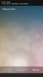
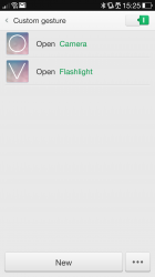
If you need to access gestures, there’s a Gesture Panel accessible by swiping down from the top of the screen on the left hand-side (you still access notifications by swiping down from the right hand side). It’s in here you can use gestures to launch apps by either using pre-defined gestures such as drawing a circle to launch the camera or creating your own in the settings.
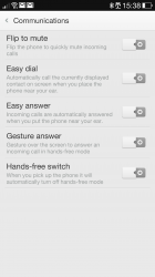
Gestures too extend to physical motions of the phone. You can flip the phone to mute, answer or place a call by putting the phone up to your ear (placing the call happens when you have a contact open on-screen), or even wave your hand over the phone to answer.
Gestures also figure into Oppo’s choice of keyboard, with the original gesture typing keyboard Swype pre-installed for your pleasure, and a pleasure it is. It seems Oppo has listened to customers and reviewers of other phones who’ve begged OEMs to simply get a keyboard that is perfectly functional instead of baking their own, which has for the most part failed for them.
As Swype noob, i’ve generally stuck to Swiftkey previously but after experiencing Swype, a change is in the offing. Swype is fast, functional and offers quite excellent spelling, as well as next word suggestions. It’s a clean look with a couple of themes available, but for a start it’s absolutely functional.
Swype offers many features you’d expect from a ‘gesture’ oriented keyboard, with quick access to functions using the Swype key. There’s cloud backup as well to take your dictionary and settings with you when you upgrade or switch to another device, even it its just switching to your tablet.
Launcher
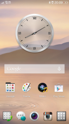
The ColorOS launcher is quite stock in appearance, there’s minor changes to the dock – the app drawer key is situated at bottom left rather than front and centre, but all in all, the changes are fairly innocuous.
The usual Google features of Android 4.3 are still available in ColorOS by means of long-press on the capacative keys. Google Now is still accessible by holding the home button. Multi-tasking too is still available by a long-press on the Menu button. The Back button is still just the back button.
Oppo does like to give you choice in some areas, while not in others. There’s a great deal that owners have with regards to the look of ColorOS, namely through theming. Front and centre on your new Oppo Find 7 is a Theme store, although I was unable to find any theme for sale, they were all free. People have gone to great lengths to design and implement these themes, there’s probably at least a couple in there you’ll like, so check them out.
Where Oppo has removed choice entirely are at certain parts of the OS like the ColorOS settings menu which presents a three tabbed layout, for General, Sound and Display. Whereas in other skinned versions of Android a simple ‘list’ view is an option in the menu, ColorOS doesn’t offer this option.
So too is the app drawer a mess, with no menu options, even to alphabetise the listing, it’s a first installed equals first presented arrangement – until you accidentally swipe an app to another position and the option to alphabetise appears, it’s an odd arrangement for settings and something that Oppo SHOULD reconsider if they have a hard menu button.
There’s extra functionality in the App drawer too which you don’t find on the stock Android launcher. Folders are a great way to group your apps and Oppo lets you group them in the app drawer – handy.
ColorOS acts just like Android 4.3 when it comes to the home-screens, you can add more home-screens (you start with three with the centre one marked as your home) and you can simply add widgets, shortcuts and more by long-pressing on the screen. While you’re in there you can also change the animation for changing screens, be it from a simple swipe, to a ‘Tilt’ or ‘Vivid’ (I liked vivid, but really, they’re all the same)
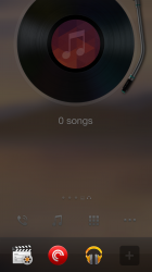
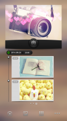
One interesting part of ColorOS is the introduction of ‘Exclusive Spaces’. Exclusive spaces are available when you add a home-screen and there’s two to choose from: Music, or Photos. The photography specific home-screen sets you up with a wonderfully useful quick-access camera widget, as well as quick access links to Camera, Video editor and a voice recorder. The Music space adds a record player widget which lets you control your music, just like Photos, you can add custom music (or audio) related shortcuts.
Overall, the answer for all custom skins is the same, if you don’t like it, install a custom launcher – there’s plenty out there.
Bundled Apps
There’s a number of bundled apps included in ColorOS, all of which you’ll probably find quite interesting if you’re looking for some actually useful tools.
Oppo has included quite a few security tools in ColorOS, starting with things like the Backup and Restore app, an app which can backup and then restore apps, contacts, system settings and user data.
In a confusing choice, Oppo has also included and alternate backup solution in O-Cloud. It’s a less powerful, yet still simple solution which will back up your contacts (but only from your SIM card), SMS and pictures. O-Cloud also offers the ability to find your phone if you lose it, you can do this by jumping onto a website. There’s further security measures including an option to be notified when the SIM card is changed.
Security for when you’re handing your phone over to someone to use briefly has also been taken into account. Oppo has included a Guest Mode for you to setup that allows you to hand over a phone which contains none of your pictures, videos or contacts, you can even hide notifications.
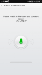
But if you don’t want to go to the effort of using Guest Mode, you can setup individual apps with a swipe unlock gesture, pin or voiceprint. Swipe and pin lock work great, the voiceprint was not so hot, it seemed to be asking for you to read back phrases in Mandarin, moving forward with English seemed to stall at the last check, still pin and swipe security seem to be fine.
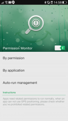
One of the greatest moves that Google made, before they revoked it, was revealing individual per-app permissions. Oppo has implemented this and it’s available under the security folder in the app drawer. You can control permissions on a By Permission or By Application basis, or you can envoke the Auto-Run management system which allows you to effectively white list an application.
If you decide to manage permissions and turn off a particular permission, next time you are accessing that app and it tries to use a function that requires that permission you’ll be prompted to allow or reject. There’s a timer (20second) that counts down to auto-reject if you’re not sure.
App Permission is a really useful feature and shows a way that it should be implemented by Google in a future version of Android – fingers crossed.
In the same manner of control, Oppo has also included an Anti-harassment tool. If you’ve been plagued by spammers who have been stupid enough to leave caller ID on, or you have that ex who just won’t leave you alone you’ll be able to add them to the block list from calls or SMS you’ve received.
In terms of general tools and apps installed in ColorOS, Oppo has covered the bases, they’ve included a slew of useful tools for the new smartphone owner, including a Voice Recorder, File Manager and flashlight as well as a compass and weather app. In terms of productivity, you’ll find Kingsoft Office installed for you to access your MS Office files on the go.
Oppo has gone down the path of many Android manufacturers. They’ve looked at the stock AOSP or even Google supplied default Android offerings and for some reason decided to include their own. This extends to basic phone tools such as the dialler, contacts list and SMS through to more smartphone specific apps like a custom music and video player, calculator, and third party email tool. They’ve included their own calendar, but after being caught on various proprietary calendars over the last few months, I installed Google Calendar quick smart.
DEVICE NAME Specifications:
- 5.5” QHD (2560×1440) resolution (538PPI) Multi-touch, capacative screen with Gorilla Glass 3 and Touch-on-lens technology
- 2.5GHz Qualcomm Snapdragon 801 Quad Core (MSM8974AC) with Adreno 330 GPU
- 3 GB RAM
- 32GB Storage with microSD Card slot (up to 128GB)
- 13MP Rear Camera with Dual-Mode LED and 5MP Front-facing camera with 80° wide angle sensor
- MaxxAudio By Wave
- Radios:
- GSM/GPRS/EDGE: 850/900/1800/1900MHz
- WCDMA: 850/900/1900/2100MHz
- FDD-LTE: Bands 01(2100MHz), 03(1800MHz), 07(2600MHz) and 20(800)MHz
- TD-LTE: Band B40(2300MHz)
- USB OTG, Bluetooth 4.0, 5G Wi-Fi 802.11 b/g/n, Wi-Fi Direct, Wi-Fi Display, GPS with GLONASS, NFC
- ColorOS based on Android 4.3
- 3,000mAh Li-po battery with VOOC Rapid Charge
- 152x75x9.2mm @ 173grams
Ok, I really liked the Oppo Find 7, and I didn’t. In terms of physical design, the phone is a little blocky and cumbersome to hold, Oppo’s decision to use the lovely textured rear battery cover makes it feel nice, but it’s the square-ness of the phone as a whole which makes it feel too utilitarian to call comfortable.
Oppo has done a great job on the software, it’s a comfortable and overall fairly user friendly setup, with a bunch of tools, apps and a productivity suite pre-installed to get even a novice user up and running quickly. For more advanced users, the option to install Cyanogen Mod, or any other ROM of your choice is even listed on their product page, so they’ve covered all their bases. There are parts here and there that could be refined, but overall, it’s a nice job.
And of course the hardware is great, and I mean GREAT. The Find 7 is fast, smooth and quite frankly lays to rest any concerns even the biggest spec junkie could have. It’s even fairly well priced. Even with all this hardware, Oppo is asking just $719 for the phone – a price when you compare spec for spec to phones like the HTC One M8 or the Galaxy S5 is pretty compelling. But, when you can import an LG G3 with similar specs for $100 or more less, it makes it a more difficult proposition.
Oppo has done wonders with the Find 7, it’s a very good phone, possibly one of the best we’ve seen this year. If you’re looking for a handset it’s well worth trying it out – if you can find it for the right price.








The pricing on this is wrong. Mainstream consumers are not likely to buy this. People who import might. An LG G3 with importers is $200 cheaper and a GS5 $150 cheaper.
Does the find7 still have the dated partition layout of the find 5? That was my only issue with the oppo line up. Instead of having the full 32gb avalible for apps, they partitioned the storage so you couldn’t use the full amount for apps and you could still have USB flash drive mode.
Yes it does still have the same partition layout – I mention it in the review, as well as provided a screenshot.