The Nexus 6 is imminent and despite quite a depressing week, Evan Blass, best known by his online twitter handle @evleaks, has blasted out a leak worthy of Nexus season – the Nexus 6.

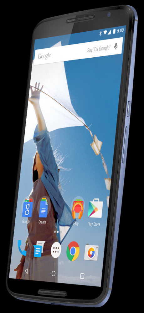
The leak shows off the Android L design with new icons we first saw in a post from Android Police which confirmed the Nexus 6. There are three folders present on the front screen, labelled ‘Google’, ‘Create’ and ‘Play’, seemingly reminiscent of the updated Mobile Distribution Agreement which was leaked a few weeks ago. The folders are filled with complimentary Google apps – ‘Create’ with Drive, Sheets and Docs apps, while ‘Play’ contains the Google Play Music, Books, and Newsstand apps, including an updated, flatter icon for Google Music, while the ‘Google’ folder contains the rest of the mandatory 13 Google apps required by the agreement. The icon from the newly updated Google Play Store is also present on the front screen as per the agreement.
It’s also noteworthy that the time on the render is 5:00, indicating an Android 5.0 version number for Android L.
Hardware wise, the phone has the dual front-facing speakers and volume rocker and power button mounted around halfway up the right-hand side. The phone has a blue hue, which would indicate a possibility of different coloured phones launched. There’s a centre mounted microUSB port at the bottom of the phone, which should leave the 3.5mm headphone jack at the top of the device.
Google are rumoured to be announcing the phone at some time in the next day or so, with a release date some time in November. With a render this good doing the rounds, it’s surely only a matter of time before we’ll get an announcement.


I have been told we might be waiting till december???
any word on the release date, so far we got the month, i.e. November 2014, right?
Will it come with a stylus? If no, why not?
Not everyone wants a stylus. But I wouldn’t mind some form of a digitising pen … This will enable us to use OneNote properly.
What is that messaging icon?
Hopefully they are in fact dual front-facing stereo speakers and not some weird earpiece/single speaker setup like the new Moto X. Though I’ve read reports that the single speaker on the new Moto X is still way better than the dual speakers on the new Moto G. It just concerns me that it might be one of the areas that is compromised to keep the price down. In any case, it will be the internal storage and battery size/life that will either set this apart or place it in the the list of any number of other huge, capable flagship… Read more »
Actually so excited.
Is the phone blue or is that just the render?
The majority of the back casing looks like it is a light blue.
Look at the what you can see of the dark back banding on the sides on the upper and lower left of the device (right edge in the pic). Those bands look to be dark grey.
Looks like it has good screen to body ratio, not bad.