![]()
The latest Google app to get the Material Design makeover is Google Keep, bringing it to version 3.0.
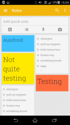
The update brings some new material-inspired touches, the most obvious one being its launcher icon (shown above). The icon has gone from a realistic stack of sticky notes to a single dog-eared note with a lightbulb shape sitting on top.
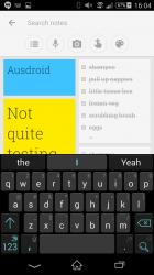
Looking inside the app, there is also a suite of new changes and features, such as a new search interface that allows users to search by type of note (list, voice, image, or reminder), or by colour.
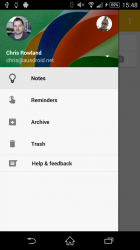
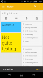
The navigation drawer has had a remake with changes to bring it in line with Google’s design language, and there also seems to be a new “snackbar” which seems to allow for quick undo actions when notes are archived. Finally Keep also gets a tinted status bar to compliment its yellow branding.
The update should be hitting Google Play and your device over the next few hours or days, but if you’re impatient, Android Police have been able to grab an APK file for you to upload to your device.
The APK is signed by Google and upgrades your existing app. You can download it here from APK Mirror.

Still can’t have shared notes?
I have no idea why people like this app. I only use it for very short term information. Anyone who wants to keep notes should look at Evernote, not without some major features but as far as I’ve seen the best there is.
I like it because it is very fast and simple and has a great widget. Creating task/shopping lists is very quick and easy. If only you could share notes/lists for viewing and editing by more than 1 person (thats where evernote does well)….