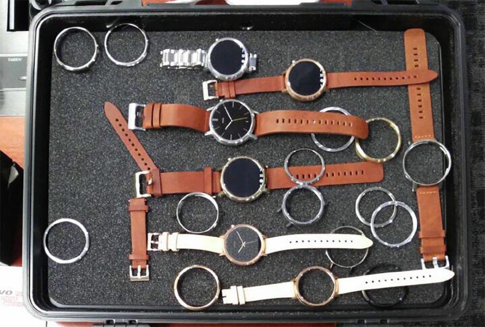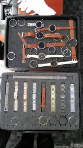
A new Moto 360 is coming – going by the success of the original Moto 360, that’s a given. Lenovo CEO Yang Yuanqing may have jumped the gun though showing off a look at a smartwatch, which is possibly the new Moto 360 on his Weibo account.
The Weibo post – which was very quickly deleted – actually refered to the Moto 360 with a quote that accompanied the image which included the title shot above, as well as a selection of bands. The quote given on the post (translated) was : ‘Moto 360, matching the arrival of the era of freedom, our store in the future to increase the function of the watch shop’.
As you can see, the updated design includes lugs to attach bands to the watch, something missing in the original design, which instead relies on attaching bands to the bottom of the smartwatch. Lugs vs no Lugs is a design decision, but it certainly lends a more ‘watch’ like look about it.
As Droid-Life points out, the ‘flat tyre’ design, which hides the ambient light sensor and the LCD drivers, does appear to have returned. Whether this is a final version of the product or not is another question.
In terms of colours – there’s a lot of choice here, mirroring current options available through the Moto Maker service in the US which offers dark metal, light metal or champagne gold – although a new development appears to be an option for large and small bodies. Likewise there seems to be quite the array of watch bands on offer.
It looks pretty far along in terms of design, when we’ll see it in stores – or hopefully on Moto Maker (Please Motorola!) is anyone’s guess. But for now, it’s nice to take a look at what at least is the design process.
What are your thoughts on this possible new design?


I’m a fan of wire lugs, but I think this looks a tad better than the Huawei.
They moved the button away from the side too. I used to constantly press that accidentally whenever i flexed my wrist upwards
Who or What is that long Grey strap for at the top of the strap section….
Maybe they want you to wear the watch on your leg… you know, for better pedometer readings?
Surely there’s no way they could release a successor that still has the abysmal flat-tire blemish :-/
I thought that as well… but I do believe the ambient light sensor is very important. I don’t know where they would put that without the flat tire design.
They could cut a small window in the side of the casing if there’s no better option, sure it detracts from the styling when the screen is off, but I’d rather have a slightly blemished casing than have the blemish on the thing that I need to look at all of the time.
It looks better than the current model I have but, it still has the flat
Tyre. The only thing that would make me upgrade would be significantly
improved battery life or maybe much snappier performance.
I’m not selling off my current 360 any time soon.
I wonder why they moved the crown/ button, that said I just pressed my button and that placement is better.
can you please point out what made u feel like its better than the current one except the Lugs? really willing to buy the new one if battery life improved 🙂