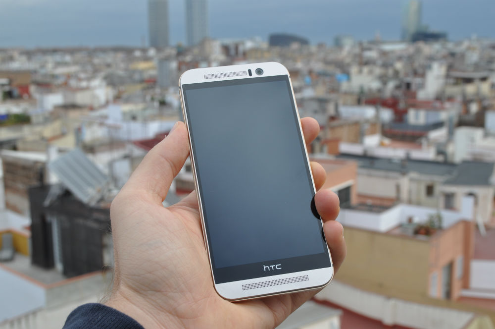
HTC has been a bit of a fan favourite with both Australian carriers and the buying public. Their phones have consistently been available through mainstream channels for a long time, and for the most part have sold relatively well. The anticipation for the next big HTC phone has always been a thing, and rightly so – HTC has been at the forefront for adoption of new technology: Touchscreens, 4G – even the first Windows Mobile and Android phones; so it’s no wonder that the HTC One M9 was one of the most anticipated phones to be announced at Mobile World Congress.
Sitting at the top of the HTC range, the HTC One M9 is the shining pinnacle of the HTC stable. Though we can probably expect a ‘Mini’ version, as well as possibly a ‘Plus’ version, and a slew of Desire phones released throughout the year, the HTC One M9 is the flagship of their smartphone range this year.
As has been the case with their previous flagships, the HTC One M9 is currently available through all major carriers in Australia on a plan. You can also purchase it outright for $1099 (or substantially lower if you shop around). There’s colour variations though Australia only appears to be getting the Gold on Silver and Gunmetal Grey, but there’s also an all Gold model and a Gold on Pink design which appears to be only on limited release.
HTC has released the phone with only one option storage size: 32GB – but it’s got the advantage of a microSD card slot to expand that, something that their big competitor this year has removed. There will be a 64GB version, but it’s not likely to appear in Australia unless it’s through a grey importer.
The big competitor to the HTC One M9 is of course Samsung’s dual-flagship launches: the Galaxy S6 and Galaxy S6 Edge. While Samsung phone launches get a lot of attention – it was the HTC One M9 which was the clear winner when we recently asked which phone people were going to buy. It was so clear that the HTC One M9 alone curried more votes than both the Galaxy S6 and Galaxy S6 Edge combined.
That’s a lot of pressure for any phone, so is this massive outpouring of support for the M9 warranted?
- Camera could be better
- Weird occasional lockups
- Still a little slippery to hold
Design
Since their early days as a ODM/OEM building some of the more iconic PDAs and early smartphones for former ‘big’ names in the industry like Compaq and HP, HTC has always had a reputation for putting together a decent product. When HTC struck out on their own to build their own brand, they built phones and quickly gained a reputation for quality and great design in their own right.
HTC has really focused on their design language with the HTC One M9, it’s all over their launch speeches and their advertising. When anyone from HTC speaks about the phone they speak of ‘Bespoke Design’, drawing comparisons to a piece of finely crafted jewellery or a high-end watch.
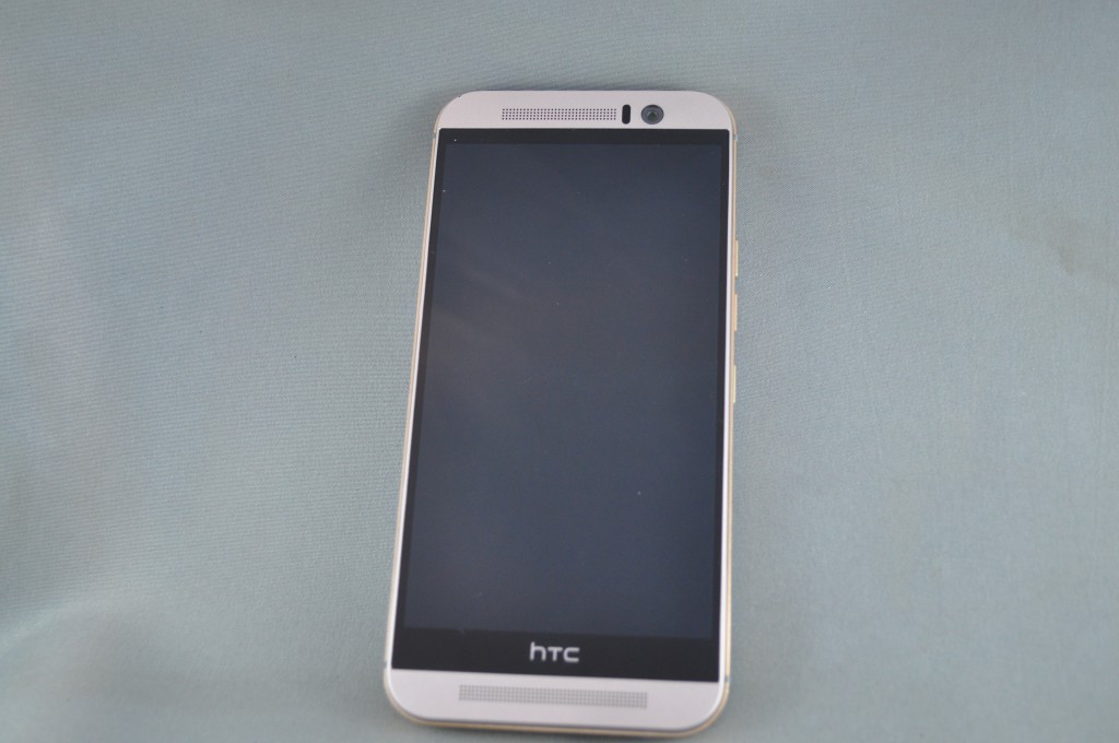
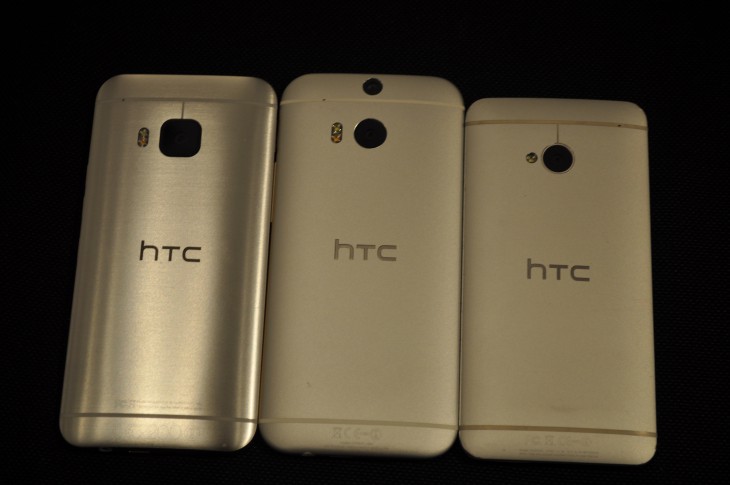
The HTC One M7, then the M8 are consistently described as the best looking phones on the market and HTC have again gone to great lengths with the One M9 to make it a great looking phone. The One M9 is a refinement on the last two phones, improving on what was seen as flaws in design with the previous iterations – the power button now sits on the side rather than the top (this is fantastic) and it has a lovely dual-tone, dual finish body – the contrasting Gold on Silver colour scheme just looks fantastic.
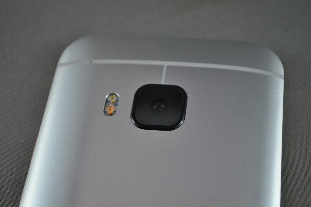
HTC has thrown everything at the wall with the HTC One M9, the manufacturing process now takes up to 300 minutes per phone – up from 170 on the M7. Each handset is hand finished by a master craftsman who creates the brushed metal effect by hand and then polishes the sides for that dual-finish. The body is then covered in a protective scratch-proof coating to stave off any incidents and the protection extends to the sapphire crystal lens cover atop the camera.
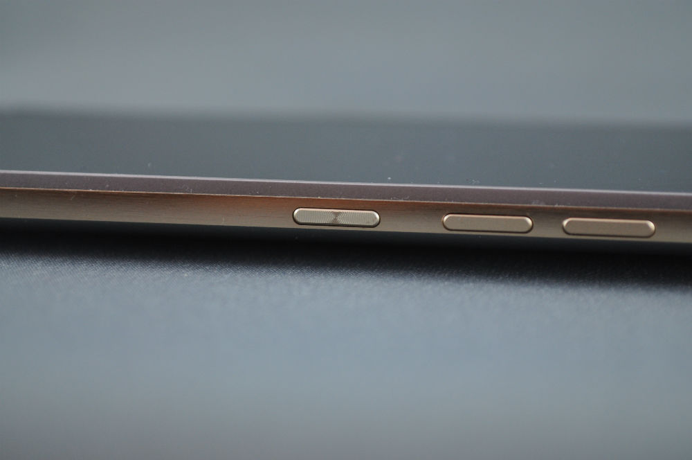
The decision to move the power button from the top to the side is definitely welcome, it’s also now textured to make it easier to differentiate from the volume keys located above it when blindly reaching for it. The volume keys are a sticking point for me though – you now have three buttons on the right hand side, because HTC has changed the volume rocker to two separate buttons. HTC says this is because it gives a more solid feel when you press a button than when you interact with a rocker. I`m not 100% behind this decision, I`m just saying that finding the power button by texture is still harder than feeling a long rocker button.
HTC has also worked on other design issues like the slipperiness of the M8, the M9 has a brushed metal feel to the rear, though it’s still slight enough that it’s more a look than a texture – so it’s still a little slippery. What they have done is create a recessed lip around the edge of the phone, the edge is recessed from the screen to give a dual-purpose of making the phone look thinner and with less bezel on the sides of the screen, while also creating a lip which gives a tactile point to make it easier to hold.
On the subject of easier to hold, the HTC One M9 really is a nice phone to hold. It’s a thinner aspect than other phones, and the rounded rear of the phone really nestles in comfortably in the hand. The aluminium while cold initially on a cold Canberra morning warms to the touch quickly, but not overly so, and really feels like a well used and loved tool from a your toolbox, it fits so comfortably.
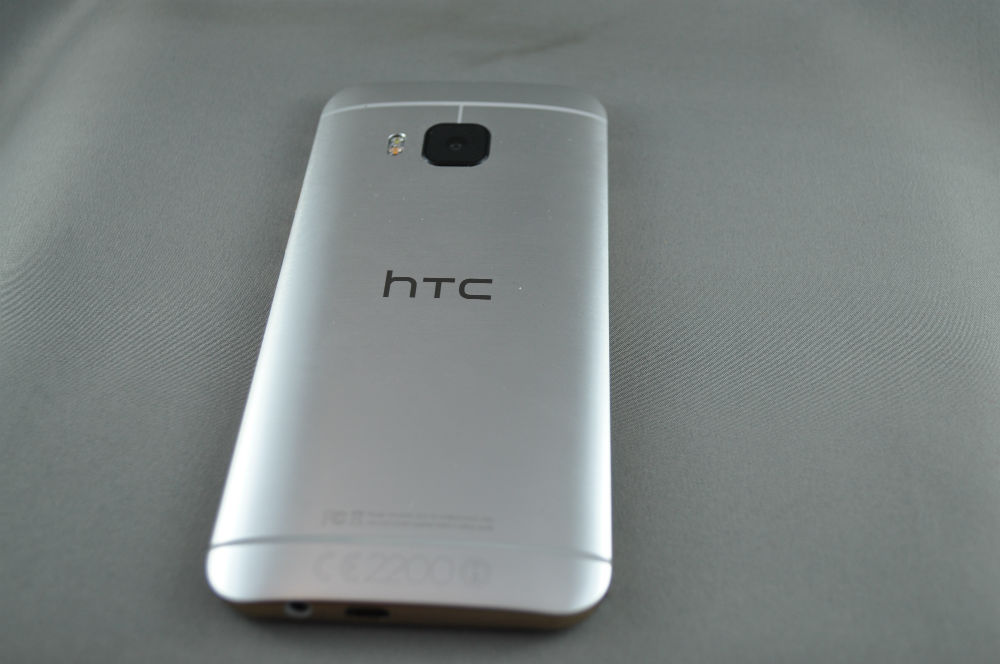
There’s not too much changed with the look of the phone, which has been derided by some as not as bold as they should have been, but it’s definitely a refined design when taking all the minute details into account. While all these little things have gone into refining the design of the phone and making it better, just stop for a second and look at it – the HTC One M9 is just gorgeous.
Hardware
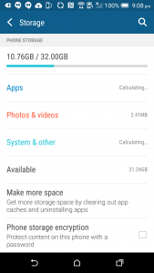
Hardware wise, HTC has the makings of a 2015 flagship phone – it has the top of the line processor: a 64-bit, Octa-Core Snapdragon 810 processor, 3GB RAM and 32GB Storage (you get 23GB of actual space) with a microSD Card slot. The HTC One M9 also bucks the current trend of using QuadHD displays and included a 5″ 1080P display, something many readers have been asking for. The lower resolution screen should help with battery life, which is a big consideration these days.
One of the bigger pieces of news on the hardware front on the M9 is that HTC joined the MegaPixel race with their rear camera. The rear camera has been bumped to a standard camera module, using a 20MP sensor. HTC has moved away from using the Ultra-Pixel camera from the M7 and M8 as the main camera, instead, it’s been moved to the front to enhance low-light selfies.
HTC has again included an IR port on the top of the phone, and on the base you’ll find your usual microUSB and headphone ports. The microUSB port itself deserves some praise, it was actually great, cables fit in snugly with a snap and even with blindly groping in the dark to insert a cable, the bottom of the phone hasn’t succumbed to scratches.
Screen
The HTC One M9 looks smaller than other phones thanks to a recessed bezel, but the phone is also comparatively smaller than its competitors thanks to the inclusion of a 5″ FullHD display. This means that the phone has an overall smaller footprint, which is welcome these days when a flagship ranges anywhere up to 6″ in screen size.
The use of a 1080P screen was a measured choice, when asked HTC said that they felt there was no discernible return to using a QuadHD display – at least at 5″, though if they went in to larger sized displays there may be some value there.
The screen on the One M9 is pretty good, with a ‘but’. It’s a Super LCD3 IPS display, which going on previous runs with the SLCD3 – the HTC One M8 has the same screen – should be fairly good, but there’s a few issues I have with it, it just doesn’t seem as good. The main concern comes with the viewing angles. Being an IPS display means you should be around 178° of viewing out of it, but it doesn’t seem to quite get there.
Being an LCD display also suffers from the black issue, which means that the blacks are still created by the LCD, not just the absence of power to pixels as you find in AMOLED displays. I have no issues with this, but you will find there’s light bleed in the display, especially at night if you’re say reading a book with a black theme, it tends to be overly bright.
Whether HTC decides to continue with LCD in the future or look to AMOLED is up to them, there’s pros and cons for both. The HTC One X, HTC One M7 and the M8 all had super impressive zero-gap displays that impressed the pants off almost everyone. The M9 just doesn’t seem to have quite gotten there.
All that said, the display will be more than suitable and ‘good’ enough for anyone to use on a daily basis. The colours are generally correct, brightness in daylight was excellent – as was the auto-scaling for brightness in both bright and dark environments.
The screen on the M9 is good, it’s just not great as I’ve seen in the past and that was a bit of a let down, but it’s nothing to really worry about for your average daily driver.
Battery life
The battery life on a HTC One M9 is always going to be subjective based on how you use it. I tend to be a heavy user of the phone, going for a lot of network traffic, screen-on time and loads of multi-tasking which generally kills a phone battery fast. After almost a week of using the M9 I found it was actually pretty good.
One day I would hammer the phone and end up with 30% battery life after 14 hours, with around 3.5 hours screen-on time and then another I’d take it easy and still get similar percentage left with around 2 hours screen-on time. The key point to this though is that I had battery left at the end of the day.
The best use I had was a full day of use taking the phone off power at 7am, then hitting the gym for an hour with podcasts streaming over Bluetooth, and intermittent hangouts and web surfing. Then I went shopping which obviously leads into a lot of online comparison shopping – at the end of that 18 hour day I ended with 20% battery life, almost 4 hours screen-on time. Impressive.
The only thing I couldn’t gauge was how the phone would handle on any given day – but given the phone has a Qualcomm processor and therefore supports QuickCharge 2.0 and charged quite quickly, I can forgive that, just take a charger with you and you’re back up to speed in no time.
Camera
This will be the part of the review that most people have skipped to without reading anything else – and rightly so, the camera is a key component in any smartphone.
The HTC One series has so far relied on Ultra-Pixel sensors for their main camera. The Ultra-Pixel sensor lets in a great amount of light to capture images, but tend to suffer from a lack of details. With the M9, HTC has joined the Megapixel race, they’ve opted for the traditional camera sensor (Toshiba), gotten rid of the Duo-Camera and moved the Ultra-Pixel camera to the front.
So with a bigger more traditional sensor on the back, how does it go? It’s Ok. The camera takes a decent shot, in fact it takes a good shot if you play around with framing, lighting and all the little details that go into taking a good shot. The fact that HTC has gone to the lengths of giving you access to the settings in the camera app is also testament to the fact that HTC is taking photos seriously – later on HTC is also going to allow you to capture RAW through a download in their camera modes.
As it stands on automatic mode though, the rear camera on the One M9 takes a pretty good shot when you take the time. There is the issue that even when you take the time and take a great shot once you zoom in on a decent screen the photos will show a bit of noise and there’s a bit of ‘cloudiness’ to the pictures. The good news is that if you’re just wanting to use the phone to take pictures for social media and share them – it’s actually pretty good.
Because we had the One M9 on hand, as well as the Galaxy S6, LG G3 and the Nexus 6, we did a bit of a comparison test around the place. These were all in daylight, some with a little cloud cover. The One M9 is running Firmware 1.32.710.14, the Galaxy S6 was running its latest firmware, as was the G3. The Nexus 6 was running Android 5.1.
There’s one serious downfall on the M9 camera in my opinion and that’s the lack of hardware Optical Image Stabilisation (OIS). HTC says that they have included a software solution, but it’s no replacement for OIS on the sensor and it shows especially in low light.
Low Light Photos
The rear camera on the M9 is also able to take pretty high-end video, with full support for 4K capture. The screen may only display 1080P, but you can capture 4K resolution in the video – at least it’s great for displaying on that new 4K TV you just bought.
On the front of the One M9 you get the Ultra-Pixel camera from previous HTC One phones. The aim of putting the Ultra-Pixel camera on the front is to get rid of the dark, blurry selfies that proliferate on social media. To a good extent this is actually a great idea and really works. Just looking at the comparison shots from a variety of front-facing cameras shows the M9 takes a great low-light selfie.
Low Light Selfies!
The software front is where there’s a heap of cool stuff to get into – it’s all about the editing. HTC has moved their editing options to the top level in the preview when you take a shot on the M9. They’ve made it easier to access the edit menu so you’ll be able to access all the camera effects easily – and there are quite a few to access: Double Exposure, Photo Shapes (Shapes you can place atop your picture to give some extra ‘arty’ effects) and Prismatic effects. Whether you use them or not, they’re a bit of fun to have around and you should at least play with them.
Double Exposure
Photo Shapes
Prismatic
The camera app itself has been overhauled as well. There’s the usual swipe left to access the ‘Selfie’ cam or swipe right to get back to the main camera, but access to the settings and features are a little easier to find as well.
Feature wise, the camera has the basic camera, selfie and panorama (Sweep or Photo-Sphere style ‘360’) modes – or you can download new ones such as
- Bokeh – Captures with Depth of field, or ‘Bokeh’ effect.
- Photo Booth – Capture four photos in a grid.
- Split Capture – Captures with the front and back cameras.
It’s this section you’ll need to keep an eye on in the future, because HTC intends to add more ‘camera’ modes here like the RAW function mentioned above.
If you really want to go the whole hog, the HTC One M9 is running Lollipop, but that doesn’t mean you can just load one of the camera apps that have begun to appear that take advantage of the new Android 5.0 camera APIs. Manual Camera for example tells you the device is incompatible and only lets you access White Balance and Exposure compensation, but won’t let you get to ISO settings.
All up, the HTC One M9 has a decent camera and for the most part just look at the sample pics, they’re pretty good, and moving the Ultra-Pixel sensor to the front was a great idea. The software has been overhauled and there’s some neat filters and effects for you to play around with.
Connectivity
The HTC One M9 has no issues with connectivity. None. When testing out the M8 last year I had no end of issues with Bluetooth, GPS and even just connecting to the phone network at times. With the HTC One M9, there wasn’t an issue, connections to multiple BLE devices was consistent and no issue, GPS locked on fast and the phone network connected to 3G/HSPA and 4G/LTE with no issues – in fact the 4G connections were fantastic thanks to what has to be one of the most compatible radios ever released – it supports up to 21 bands of LTE.
A headline feature from the HTC One M9 is the HTC Connect. HTC Connect is a feature that connect and share music, photos and video to wireless speakers, stereos or TVs. With a three finger swipe gesture you can simply connect and you’re done.
The concept is simple and in practice it actually works really well. HTC Connect supports a variety of different protocols: Qualcomm’s AllPlay, Blackfire, Bluetooth, DLNA and Miracast.
HTC Connect worked really well on the Xbox, as well as the LG and Netgear Miracast dongles connected to my TV. There is a downside in that it’s reliant on your Wi-Fi and as soon as you start stressing your router, your Miracast or DLNA stream begins to suffer.
At this stage, there’s no compatibility for AirPlay, or for Google Cast, support for these may come at some stage down the track, but I wouldn’t count on it.
Connectivity on the HTC One M9 is vastly improved from the M8, it’s fast and connects easily. The HTC Connect stuff is interesting, and because it works with DLNA, most of your existing Games consoles etc will be fine to connect. I’d still prefer Chromecast support, but we’ll move on.
Sound
Oh boy, the sound on the HTC One M9 BoomSound is amazing. The M9 has front-facing BoomSound speakers tuned by Dolby which supports Dolby 5.1 Surround sound simulation and it works too. Play any number of Dolby test videos available on YouTube and you’ll get a decent example of the sound potential on the One M9. It’s not got the rear surround but Dolby manages to still supply those channels and the tuned output through the speakers sounds pretty damn decent.
The sound through the speakers is both loud and clear. There’s any number of phones that will deliver a loud sound from the speakers, HTC makes it clear – the BoomSound experience is about clarity of sound and the M9 delivers it in spades. You’ll find settings for BoomSound in the settings mode, offering you Theatre or Music modes.
The only disappointment for me is that I don’t use the front-facing speakers – or indeed any speakers on phones very often. I will occasionally use them to show a trailer or a funny video to someone and under those circumstances it’s just what I need, but it’s a pet peeve to have to listen to people’s music on a bus or train so I tend to have headphones plugged in mostly but HTC thought of that too: there’s even a built-in amplifier for your headphones to make sure you get the full power of BoomSound.
Performance
Last year with the HTC One M8, HTC proved that they had the nous to deliver a phone which was possibly one of the smoothest running devices of 2014. With the M9 they’ve maintained this reputation, the HTC One M9 is one fine running piece of electronics. The scrolling is fluid and smooth and launching apps is fast, thanks largely to the Snapdragon 810 processor and 3GB of RAM, but also what seems to be some great tuning on the software side of things.
But there are a few issues, very occasionally the phone just locks up for no reason. It appears to take a pause and catch its breath and then it’s back. It’s not a huge deal, it locks up, waits for a few seconds and then resumes. The lockups don’t seem to be related to another issue which is the elephant in the room for all HTC One M9 reviews – Heat dissipation.
There’s numerous reports that the HTC One M9 has issues with overheating. Some people are blaming the Snapdragon 810 processor, saying that it performs differently under load/heat. I didn’t specifically find this – at least when in general use. Admittedly I didn’t sit for hours performing tests on the phone, but I did use it as a phone, GPS, Bluetooth, Wi-Fi using it consistently and the phone gets warm, but actually seemed to me to be better at remaining cool enough to use than the M8.
So, in short, the phone runs smoothly 99.5% of the time, there may be an occasional lockup, but it generally performs like one of the smoothest running phones I’ve had the pleasure to use.
For those that like them, here’s the benchmark results. These were run when the phone was first booted with nothing running or installed:
Geekbench
Antutu
Software
Android OS
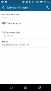
HTC has launched the One M9 with Android 5.0.2. but with an overlay of HTC’s skin we all know and some of us love: Sense, which as of now is up to version 7. Amusingly the timing of the launch co-incided with the release of Android 5.1, which made the launch announcements locally here where they claimed to ship the phone with the latest version of Android a little outdated. That said, HTC have proven previously that they will update devices and an update to 5.1, or at least to a version which includes fixes from 5.1 to be included in an update in the near future.
Skins
HTC has updated Sense to HTC Sense 7, there’s a number of updates to the functionality and the look and of course a couple of new headline features included in Sense 7 to differentiate itself from previous versions.
The look of Sense is the same, the launcher remains largely unchanged from Sense 6, with a few nods to the underlying Android 5.0 update, but overall Sense is Sense. The settings menu, app drawer, fonts etc are all familiar to any HTC owner who has used the HTC One variants or the Desire range of handsets now released.
HTC has decided to go down the path of allowing users to customise the navigation soft keys, allowing you to choose which buttons are included. You of course get your standard Back, Home and Recent Apps buttons but you can change these, adding or removing from a selection of other options like Turn off screen, Auto Rotate, Notifications, Quick Settings and Hide navigation bar. You can also choose the order in which they sit on your screen.
Home Widget
Perhaps the most noticeable update to Sense when first jumping in is the Home Widget which appears front and centre on the home screen when you first login. The Home widget is HTC’s answer to the number of contextual home screen, lock screens and widgets such as Aviate, Cover or Z Launcher. The Widget is a more unobtrusive way to attempt a contextual solution, at least for new users, but in a way it can be an annoyance to the more advanced Android user who has developed a home-screen setup over the years that helps them get through their day.
The Home Screen Widget has three settings – Home, Work and Out. The theory is that when in Home or Work you will see apps that are relevant for you when in these locations – at home you may see apps like the TV Guide app, Plex or your favourite eReader app. At work you should see things like your Calendar, Email or even an Office app. Out will give you any number of different apps based on your usage – and that’s the core of the Home widget, it essentially analyses your usage patterns while in these locations and adjusts which apps appear based on which ones you load regularly – and it works pretty well.
There are a few niggles, the speed at which the widget adjusts from Home to Out is fairly slow. I checked the phone when I’d travelled 5km from home in the car – a couple of minutes away – and the phone still showed that it was at home. By the time I got to the gym however it had updated to out and started offering me Pocket Casts, My Fitness Pal and the other apps it associated with me being ‘out’. Work was pretty decent with the widget offering a number of apps that were semi-relevant but with some fine-tuning it worked pretty well.
The widget contains two folders that are on all three of the Widget screens, called Downloads and Suggestions. Downloads is a folder which displays all your recently downloaded apps, instead of finding them strewn across your home screens. Truth be told, I loved this folder and would love to see it implemented into Android at a core level.
The Suggestions folder however I turned off after a day or two. Suggestions is a folder which lists apps that you may like to try. It seems to be location based because in Spain I was offered a number of apps related to Spain (See the screenshot on the right below), but here in Australia the app suggestions seem a little more generic.
HTC advised that there is a third-party curating the Suggestions folder, but haven’t announced which company is doing the suggesting. At this stage, I would recommend just turning off the Suggestions folder unless you’re really interested in trying new apps on a regular basis.
My main issue with contextual widgets is that they take up a lot of screen real-estate. I have a home-screen setup which involved a couple of folders of apps, four widgets and the Google Search bar, and with this setup, I can access 90% of the things I use or information I need to know every day within 2 taps, or for the most part, at a glance.
If HTC wanted to move the Home Widget to the lock screen, I’d actually be ok with that, but as a widget on the home screen, I wouldn’t personally use it for very long.
Theming
HTC and just about every other company has jumped onto the theming bandwagon. Theming your phone is a pretty individual sort of thing which you either love or just don’t bother with – I am the latter, I just don’t do it. I’ve played around with theming on Android phones though to know that what HTC have done here is pretty good though.
HTC Themes is pretty darn good, it’s easy to use and amazingly simple to install a theme, or create your own from scratch. There’s a fair few default themes in the HTC store which you can download – for free, HTC hasn’t let theme creators charge for their work yet, but that may come down the track – or you can create your own, and that’s actually fairly fun.
There’s two ways to create a theme – online on the HTC Theme Developer website – or using the HTC Theme app on your phone.
In both cases, you start with a wallpaper which you can choose from a picture you take of something there and then, or from something saved in your gallery or have downloaded. You can then pick and choose colours for your theme based on the wallpaper which will affect the background colour in folders, icons and more, you also choose your font style, icon style and shape, and even a sound profile.
You either love themes or you just don’t use them, it didn’t appeal to me, but there’s very likely a subset of people absolutely champing at the bit to get to this feature. If you’re really keen to check it out, the web based Theme tool is a great place to check it out and start making themes.
Blinkfeed
HTC has invested a lot into Blinkfeed over the last two years since it launched on the original HTC One. Although faced with criticism over making it an integral, non-removable screen it’s been morphed to a removable piece of software you can love or ignore – but there are people out there that love Blinkfeed.
Blinkfeed is a great way to get an influx of news from your usual sources such as social media – Facebook, Google+, Twitter, Instagram and more, as well as from more traditional news sources. HTC has carefully cultivated news sources and there’s a good range of sources on topics ranging across the gamut of subjects that will interest most readers. There are still limitations that won’t let you add an individual source, but hey, Ausdroid is included in Blinkfeed so there’s half your reading right there.
The new trick from Blinkfeed are recommendations for eating out – as well as receiving that extra special theming touch. This new service is linked to services such as Yelp and Foursquare. In theory, you’ll see a pop-up in Blinkfeed suggesting you eat at a certain restaurant nearby when dinner, lunch or breakfast rolls around, but I’ve been using the M9 for two weeks and have yet to see a notification – most likely due to me not being anywhere near restaurants.
The other issue is that though this recommendation system is powered by Yelp and Foursquare, there’s no way to access a login for your own Yelp, or Foursquare account which may match you more intimately with recommendations relevant to you. Something a bit short-sighted, but in theory the recommendations will encourage you to try out something new, and it could be fixed in an update.
As always though, if Blinkfeed isn’t for you – simply choose to remove it. You can use the Blinkfeed, or Home Launcher as it’s now called, or just install another launcher like the Google Now launcher and your swipe to the right will bring up Google Now.
One Gallery
We take pictures a lot now, with no film or developing costs associated with taking picture now, people take thousands of pictures a year, and invariably we all store them here, there and everywhere. HTC has included an updated Gallery – which is a step up from the ‘Photos’ app on stock Android, which lets you access your photos across a variety of platforms.
HTC has initially partnered with Flickr, Dropbox, Facebook and Google Drive to let you view photos stored on their platform. HTC is open to adding more providers down the track, but these four are the main ones people use at the moment – at least for me anyway.
The sign-ins for each service is simple and pretty well easy and when it’s setup you see thumbnails for your pictures in the gallery. If you decide you want to actually look at the pictures, you tap on them and you get the full image. It’s a good setup, saving your storage if you don’t need the pics, but giving you an option to access your pics quickly when you need to…provided you have a data connection.
Peel
HTC – and a couple of other vendors – have included an Infra-Red port on the top of their phones for controlling equipment via remote control for a couple of generations now. HTC previously had HTC Sense TV, but this has now been replaced by Peel. Peel is essentially the same sort of thing, but updated by a third-party. Peel connects in with your Google+ or Facbook account and then feeds you information about what’s on – basically the Freeview guide for your area.
In order to really use Peel though, you have set-up an actual remote control on your phone, this involves a bit of futzing about, as you’d find with any setup of a universal remote, but it’s quite painless. Once setup, Peel is pretty useful. It’s a nice layout, though the program preview graphics tended to be squashed into a portrait layout, so that could use some work, but other than that, it was pretty decent.
Bundled Apps
HTC has bundled a bunch of helpful apps into Sense 7, most are the same as were included on the Sense 6 on the M8. The Car and Kid mode apps are still included, as are a bunch of other HTC apps made for Sense. Apps which are in part supposed to replace the default AOSP Android or just Google apps such as Calendar, Contacts (People), Clock, Dialer (Phone), Mail, Message, Music are included, but HTC has also included a few extras like Backup, Scribble, FM Radio and Voice Recorder apps. All these have been designed to match and suit the HTC Sense design ethos, so they seem to integrate rather well visually, and even run quite well with the functionality.
HTC does a good job of making a good overall design of Sense, there’s a continual design throughout their skin. It’s not everyones cup of tea, but Android is about choice and Sense is that choice for certain people. If the hardware is what you’re after, but the software isn’t for you, a change of launcher is all that’s required to mostly push Sense to the background, although any trips to the Settings menu will of course bring you back to the reality of HTC phones, but there’s a lot worse out there and frankly HTC do software surprisingly well – it is after all one of the first skins that helped Android to look more beautiful at the start.
DEVICE NAME Specifications:
- Dual-tone, Dual-finish all metal unibody design
- Quad-core 1.5 GHz Cortex-A53 & Quad-core 2 GHz Cortex-A57 – Qualcomm MSM8994 Snapdragon 810 with Adreno 430 GPUd
- 3GB RAM
- 32GB on-board storage with microSD Card slot up to 2TB
- HTC BoomSound with Dolby Audio
- Camera:
- Main camera: 20MP with sapphire cover lens, auto-focus , BSI sensor, f/2.2, 27.8mm lens, 4K video recording
- Front camera: HTC UltraPixel™, BSI sensor, f/2.0, 26.8mm lens, 1080p video recording
- NFC, Bluetooth 4.1, Wi-Fi 802.11 a/b/g/n/ac (2.4 & 5 GHz), DLNA, GPS and GLONASS
- Sensors: Ambient light, Proximity, Accelerometer, Compass, Gyro, Magnetic sensor and Sensor Hub
- Radios:
- 2G/2.5G – GSM/GPRS/EDGE:850/900/1800/1900 MHz
- 3G UMTS:850/900/1900/2100 MHz
- 4G LTE:
- FDD: Bands 1,3,5,7,8,20,28
- TDD: Bands 38, 40, 41
- 144.6×69.7×9.61mm @ 157 grams
- Android 5.0 with Sense 7
- 2840 mAh Battery
With every phone you come across you’ll invariably find something that doesn’t do something you don’t exactly like. There still hasn’t been a perfect phone invented yet, but we’re getting close, and HTC is almost there. Sure the camera isn’t as good as it could possibly be, but it’s still a pretty decent one.
Over three generations HTC have refined the design of the One series, till it’s the best looking phone on the market – something some vendors are still trying to perfect.
Hardware wise, there’s not much left wanting. The combination of Snapdragon 810 Octa-core processor and 3GB of RAM is fantastic and lets you run apps with ease. The screen is pretty good, and the decision to go with a 1080P resolution seems to have paid off with a relatively decent battery life.
Software wise, HTC has created a smooth running device which again promises to be one of the most smooth operating devices this year. There’s been some interesting and useful additions to HTC Sense 7, and though you may not personally use all of them, there’s some smart ideas in there.
HTC has created a great phone with the HTC One M9. I really like the phone overall. This is definitely a contender for one of the better phones this year, and warrants, nay demands your attention when you’re thinking of updating your phone.
Daniel flew to Barcelona courtesy of HTC for the launch of the HTC One M9, HTC Grip and HTC Vive.















Thank you for the review, Daniel. Does the M9 still have the IR Blaster that the M7 had? No-one seems to be mentioning it and I use it a lot. My TV remote has died and Sony want $149 to replace it.
I have to disagree with the part about the screen, I’m finding the black on the M9 to be significantly darker than those on the M8. SO far I am slightly disappointed with the M9’s battery life and the smoothness of game play. I have been noticing some stuttering and frame drops when playing some games, that my M8 did not seem to have, but this could be down to optimizations not yet made for the new Adreno GPU. I have found the camera to be really great in well lit photos, significantly out shooting the M8 during the day.… Read more »
Looking at the photos, the lower resolution detail of the G3 is just no where near in the same league as the S6, N6, and M9
It’s GORGEOUS – I mean look at it!”…..Why so when it is still M8 ;p
Finally a review that is unbiased and tells it as it is about the M9 camera. Until reading your review I was actually considering selling my M9 but I think I’ll now hold onto it to see how the camera “pans out” before offloading it. The M9 is definitely a beautiful piece of hardware and in my mind the only weakness at the moment is the camera. I love the 1080p screen, the speakers, customization and even the built in car app that speaks to you for incoming calls etc. The first couple of photo comparisons against the S6 show… Read more »
There was an update released a week or so ago that was supposed to improve the camera’s performance. Did you have that update installed?
Are you still using the Nexus 5 as your daily driver?
Nexus 6 is my daily driver. I don’t have the update on the M9 – we’re hoping to hold onto the review unit till the update comes through and then we can try out the photo shootout again.
Hey Dan, any way you can find out when the Telstra branded M9 will receive the camera update?
I went into a Telstra store today and was greeted with a blank face when I asked about an OTA update. Mine is currently on 1.32.841.7. Cheers
As you predicted Dan, I skipped straight to the Camera section.
Heh, Thought you’d like them. Probably have put a note in about the AR on the sensors. At full resolution, the GS6 and M9 are 16:9 while the G3 and N6 seem to be 4:3
Spot on with those sensor crop aspect numbers.