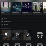
Arguably the biggest name in music streaming worldwide, Spotify has introduced some changes to their latest version of the Android app which allows easier navigation, searching and queue management. In fact it reminds me a lot of the Google Music interface, which makes it a much more attractive proposition for music on the go (or would, if I didn’t have an All Access pass on Play Music already).
The mini player is now much easier to control with a swipe to change track function, as well as a new look. The change in look allows users expand to the full player interface which in turn gives users the functionality to quickly and easily jump into the player, reorganise their playlist, remove tracks or check their queue while still keeping their searches in the background. I have noticed this seems to use more system resources, specifically RAM, but that is to be expected when you’re asking more of an app.
This is a really nice user based addition to the app, perhaps as an early reaction to the announcement that Apple Music will come to Android. We’ll see how that goes later this year.
What is your preferred streaming music provider and why?


Ummm, this update came out in like March. EDIT: Actually, April. Here is the Spotify blog post: https://news.spotify.com/au/2014/04/29/a-great-looking-update-for-our-android-users/
This month they are rolling out updated Android Wear support, which I hope isn’t as f***ed as the rest of their software. The only reason I still have Spotify is the Browse and Playlist features. Sorry it owns all over Google Music — which is saying something coming from a Google fanboi!