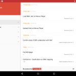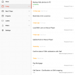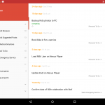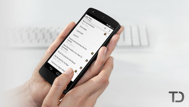
The popular to do list manager Todoist has had an update to their Android app which brings Material Design and a redesigned tablet interface. The changes are visually quite dramatic, but thanks to the predictable and familiar behaviour of material design standards set out by Google, it immediately feels comfortable and familiar.
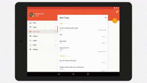
As you can see in the images below, the tablet interface is equally well conceived, taking full advantage of the extra screen real estate, more so if you’re using your tablet in landscape mode over portrait.
Other changes in the app include colour themes making the app more customisable to your preferences, quick add of sub-tasks (a smaller task inside another), visual changes with the transitions between screens are really slick and pleasing to the eye, a more intuitive recognition of dates which has been something of a bugbear for a number of users who wish to setup recurring tasks and swipe to schedule or complete tasks.
Its a comprehensive rethink and redesign of an already very useful app on Android; we use Todoist at Ausdroid to manage internal tasks and it has been (and continues to be) extremely useful for us.
What has caught your eye with the material design makeover for Todoist?

