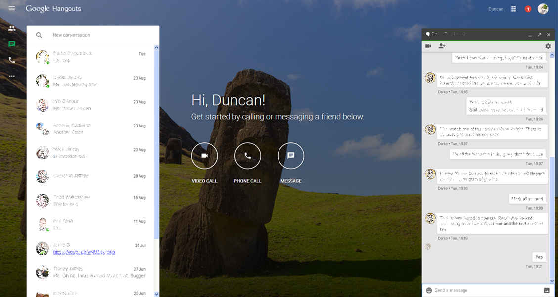
Following last week’s release of a dedicated web interface for Hangouts Google engineer Jordanna Chord has come back to Google+ to announce the first update to the new site.
I’ve been reading all of the user feedback submitted on the launch of https://hangouts.google.com and there are a ton of good ideas!
To address the first round of feedback a few modifications have launched today, and more will come as we continue to work on it.

At present, the only change we have spotted is the increase in the size of the chat windows, allowing for easier reading and replying of your messages.
Messaging continues to be an area of significant interest and unrest in the technology space. With every major tech company all developing their own proprietary platform for online messaging the entire ecosystem is in somewhat of a compatibility mess. Unfortunately unless the major players either all adopt a common standard or open up their systems to other developers to cross-integrate into their own messaging platforms there is no end in sight, and I certainly won’t be holding my breath for that to happen.
We will continue to look for further enhancements to the Hangouts web interface and will let you know if we find anything major.
Have you been using the new Hangouts interface? Let us know if you’ve spotted any other changes.


I think this is only useful for the people who can’t install chrome on their computer. Since you have chrome and hangouts plugin installed what’s the benefits using this? If someone sent me a message I need to go to the page tab and then reply? It’s not convenient. Why not just use the plugin?
I keep this window open while at work, as I don’t want the plugin installed on my work machine.
Yeah, unless hangouts is the only window your browser open. I have many pages need to open and this is not the important one.