LinkedIn hasn’t done a lot with their Android app in quite a while, and though its web and iOS properties have seem some changes, Android has been left a little out in the cold. The social network for professionals has finally updated its Android app though, and the new version includes fresh animations, a cleaner more modern and approachable design, more white (and less drab gray) and better use of screen real-estate.
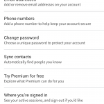
The actual layout of the app has changed quite significantly too; it’s now a lot more reminiscent of Facebook’s app. The side-drawer has been replaced completely, and there’s now a blue bar atop the screen with icons for each tab which allows you to view your feed, profile, messages, connections, and to search for new information. The settings page has been moved to the profile tab, and allows you not only to make changes to the Android app’s behaviour, but finally some more changes to your actual profile as well.
The new app makes using LinkedIn just that little bit easier, and while it’s definitely not the network for everyone, it can be a useful tool, particularly if you’re a professional, in business, or seeking to network with other likeminded people! The new version is rolling out gradually via Google Play, but if you haven’t received it yet and can’t wait, you can grab it from APK Mirror.


