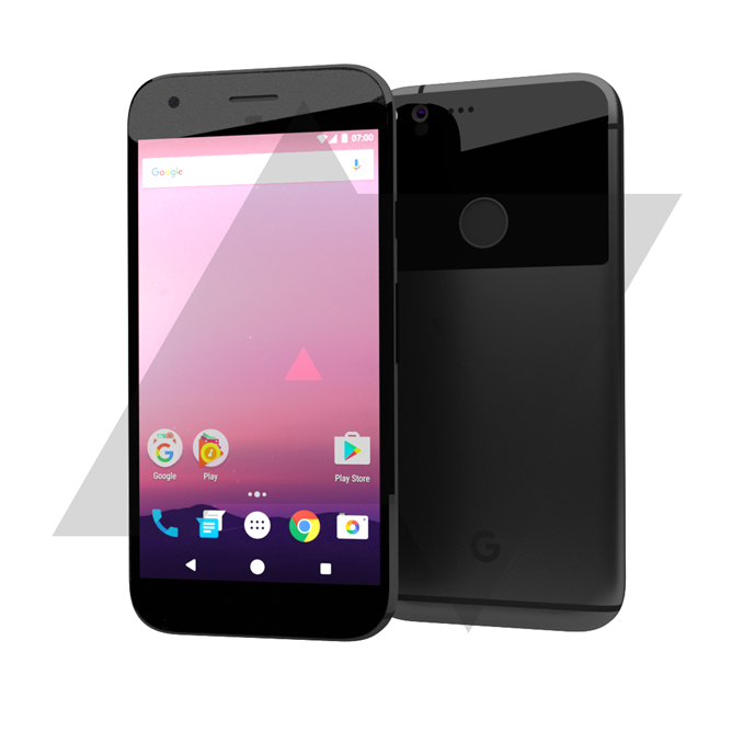
The upcoming Nexus phones, which will be built by Taiwanese manufacturer HTC according to rumour, have been taking shape over the last month or so, with specs hitting first and now a render of the phones has arrived.
The render is based on what the phone looks like according to Android Police, not a render of the phone, or phones themselves as it were. This method is designed to protect their source, and we’re still a fair way out from release so some changes could be made before the expected late September/early October announcement is made.
So what’s it look like? Well, there’s only one render for both phones, because according to Android Police, they essentially look the same this year, just differing in size. So, here it is:

As you can see, the fingerprint sensor is rear mounted again, there’s no camera bump and there’s the somewhat familiar Nexus shape. Android Police don’t see it, but looking at the render, especially in the same black colour as the HTC 10 I reviewed, the shaved lines on the rear of the phone look somewhat HTC-esque.
While their version is rendered in Black, Android Police do say that the phone will come in an aluminium colour, pointing to both phones being aluminium bodied – a material HTC excels in making phones out of. There is also apparently talk of a ‘electric blue’ version with a white face and a glossy rear – personally I loved the look of the Mint or Ice coloured Nexus 5X.
One of the things both Android Police and I agree on is that the G logo on the front will be swapped out for Nexus branding before the release is final – but maybe this could be released with more heavy Google branding – just like those re-designed navigation keys we saw previously.

Specs for both ‘Marlin’ and ‘Sailfish’ Nexus phones have been leaked previously giving us a look now at what’s under the hood as well as now what it could look like.
| Sailfish | Marlin | |
|---|---|---|
| Display | 5″ FHD (1920 x 1080) display @ 440 ppi | 5.5″ QHD (2560×1440) AMOLED display @ 534 ppi |
| Processor | Quad-core 2.0GHz 64-bit processor | Quad-core Qualcomm processor |
| RAM | ||
| Storage | 32GB | 32/128GB |
| Camera: | ||
| Bluetooth | ||
| Fingerprint scanner | ||
| Port | ||
| Battery | 2,770 mAh | 3,450 mAh |
| Speakers | ||
| Android | ||
So there you have it, it may be rumoured, but there’s plenty to think about here. What do you think about the design, potential colour options and do you have any other thoughts?


Glad to see they’re sticking with the rear-mounted fingerprint sensor. Moving from a Galaxy S6 (front mounted home button sensor) to a Nexus 6P, the rear placement is so much more natural and unlocking the phone is much quicker and more intuitive.
Colour me underwhelmed…
HTC aren’t known for good screen to body ratios nor good cameras, so odds are it’ll have big forehead/chin/bezels and a distinctly below average camera.
Pretty much a ‘meh’ design. Not as actively ugly as the 6P, but nothing to write home about. Looks like no Qi charging again. Add it to the list of things that Nexus should support, but the designers refuse to. Something strange with those three dots to the right of the camera – active noise cancellation maybe ? Is that home button going to have 4 way drag functionality? Would make sense if it had a force touch screen, and also from a usability standpoint; but maybe the colours is just designer w*nk. PS the AP rumour now has both… Read more »
Shame they’re moving away from front facing dual speakers like the 6P.
Glass back? Sigh.
I’m not seeing iPhone, the proportion is all wrong, the iPhone is much ‘longer’ in look, and the lack of chin for the button does make a big difference. When you look at the chamfered edges they have an angular nature that is very not iPhone, that’s my 2 cents worth
I’m not sure about the chamfered edges. At the top it looks like they exist but then at the bottom not so much.
We also have to remember these are renders put together by AP. I think conclusions on some of the finer details need to be put on ice a little longer.
I find that don’t care what a phone looks like these days, unless it’s really ugly with huge bezels. I just care about the spec, and especially battery size.
Apple’s lawyers will be getting warmed up. If you glance quickly at the front view, it’s an iPhone! Design has taken a step back from the 6P for me.
Not really a fan of that huge glass (or is it plastic?) pane at the back. And the bezels look quite large, but I guess this isn’t a 100% accurate render and things could change.
Can’t say there’s anything particularly interesting about its design.