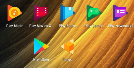
It’s been just over a year since Google rolled out new icons for their ‘Google Play’ apps – Games, Books, Music, Newsstand and Movies’ but in the latest update they’ve finally updated the Google Play Store app icon to look more like them.
The new update pulls the triangular Google Play logo that we’ve become familiar with out of the shopping bag it’s been stuck in since, well, since it was the Android Market. Here’s how they look:
![]()
Now, the Google Play family of apps all look the same, if they could just turn the Tango app icon around…


And then there’s Android TV… where the app icons are a schamozzle. Play Music still doesn’t have the new Google branding, let alone the new Google Play iconography.