
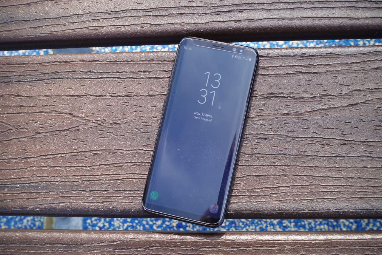
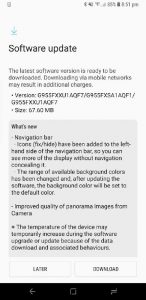
Over the weekend, Samsung has released a new software update for its Galxy S8 line of handsets, which brings a couple of new features and inclusions. The most noticeable feature is the ability to selectively hide the navigation bar, to give users even more screen real-estate to use when using apps that don’t ordinarily offer a full-screen experience.
The new feature allows users to toggle the navigation bar on and off by tapping the left side of the navigation bar. The navigation bar will then disappear, but not completely. If you want it back, simply swipe up from the bottom of the screen. The navigation bar will also be shown whenever the on-screen keyboard is visible, and also on the home screen for ease of navigation.
Besides the navigation bar feature, other new features include new background colours for the navigation bar to better suit your mood, and improved panorama quality in the camera app. Perhaps more interesting for us, at least, is the inclusion of the June 2017 Android security patches, meaning that your Galaxy S8 is and remains nice and secure.
We’ve seen the update on Optus and un-branded (XSA) units, though we’re not sure about Telstra or Vodafone just yet. As with any other software update, this has to go through your carrier’s approval process if you have a branded handset, so you might not see the update immediately.
In any event, the update is quite small (just 67MB for Optus handsets) so it’s quick and easy to apply. Keep an eye out for these new features on your Galaxy S8 soon!





There’s a bit of a hack to getting the dark navbar back here: https://www.reddit.com/r/GalaxyS8/comments/6ickwa/revert_a_black_color_on_navbar_settings/
It’s still a step back from the standard Android adaptive navbar colour set by app which Samsung has overridden for no good reason (but they love to do that don’t they), but it’s definitely easier on the eyeballs reading 9gag at night.
They haven’t overridden it at all. It is dependant on the individual app being coded to update the colour of the navigation bar. For example. Twitter still uses black, the AFL app uses blue, Australia Super app updates it dependant on what page you are on. The only difference now is that for those apps that do not specify a navigation bar it will default to what you select in settings which no longer includes the option for black. The reason for no black option is for good reason as to reduce burn in.
Been checking and just got this update through Telstra, but it was about 250MB! Agree, the nav bar update is a step backward.
My first experience of it was a panic after trying to navigate away from an app. I prefer the previous arrangement. What problem does the new navigation bar solve?
The ability to hide the navigation bar really doesn’t solve any problem it simply allows the user to hide it and allows more screen realestate for the app you are using, if you don’t like it you don’t have to use it, you can even remove the option (dot) from the navigation bar is settings if you like.
The removal of the black option on the navigation bar is to reduce burn in.
This update is a bit one step forward, two steps back, as the new nav bar feature for some reason also gives all in-app nav bars a white background, whereas previously the nav bar background colour was set by app as Android typically does. Try using any app with a dark background at night to see how annoying this is. Disabling the navbar hide feature does nothing to solve this so all you can do is hide the nav bar in any app where this is an issue. This is why user acceptance testing is important!
Can’t disagree here, the feature is interesting but the interference with status bar colours is rather annoying – that ability for it to adapt to different apps / colour schemes will be missed.
As the other comment points out, what problem does this solve and why was it done?
I believe the ability for the navigation bar to adapt to the different app colours is still present however is dependant on the app being written to support this. The move away from an all black navigation bar is to remove the chance of burn in on the screen. When an area of the screen is solid black it is not actually on for LED displays, this means that the pixels for the actual button icons that are white are on and degrade quicker leading to burn in. By making it a solid colour the navigation bar and button will… Read more »
I wonder why they couldn’t use the same method that I read they use on the always-on display, where they offset which pixels to prevent burn-in (though I suppose what I read could have been inaccurate)
I believe they tried this previously however there is only a limited number of pixels that you can move the icons without impacting the user experience, and there are already many reports of people experiencing burn in on the navigation bar after only a few months. Plus, the AOD moves quite dramatically around the screen from top to bottom to middle as well as slightly left and right, you simply cant do this with the navigation bar.