The team at Shifty Jelly have been hard at work (well at least they tell us they have) working on a number of projects including an update to the Pocket Casts web interface which is currently in beta and we’ve been lucky enough to have had access for about a month now. They’ve outlined a lot of the work they’ve put in via their blog which gives some great insight into what to expect.
What would a new release be without a completely new interface?
The new interface is fantastically simple to use and brings the web interface far more in line with what users are far more accustomed to with both the iOS and of course, Android application.
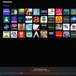
The look
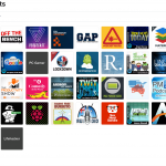
The default page you’ll see load is your subscribed podcasts, by default displayed to alphabetical order. For users who regularly use the mobile app, you’ll immediately be very comfortable with the look and feel of this page to begin with. The display options include large or small tiles and a list for those who prefer that style of display.
For those who are a fan dark themes, get excited – there is a dark theme included in the update which can be enabled in the settings area and it looks great.
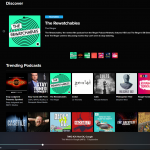
Among the subtle changes is a persistent search box in the top right of screen. It’s far quicker than previous search in the web player and covers both your subscribed podcasts and as a discovery tool for new listening. That’s not the only option for podcast discovery though. there is a dedicated area where you can search for content creators, keywords such as Android or by podcast name to identify and of course subscribe to new podcasts. The discover tab also covers New Podcasts, Trending, Top rated podcasts, Video casts and of course explore the larger networks.
Playback
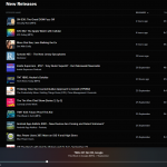
Once you get through the basic functions and discovery options you’ve then got your listening options to work through. The new release tab offers you a list of your subscribed podcasts showing the most recently release episodes from most recent to oldest. For listeners like myself who often will not listen for a week there will likely be a backlog; much like the Pocket Casts app, you can work through the backlog.
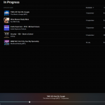
There are a few useful functions that have been developed starting with adding a star on individual podcast episodes for later reference if you want to listen back again for any reason. The other one I use heavily is the in-progress tab. As you go through your day, it’s easy to get distracted from your valuable listening by that pesky work thing — the in-progress tab allows for easy resumption of podcasts. This storage of in-progress podcasts also transfers over to your mobile devices so you can save battery during the day by using your desktop, then continue the playback on your way home on your phone. The functionality is really simple, well thought out and hugely useful.
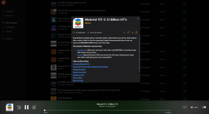
Variable playback speed has been in Pocket casts for some time but the changes on the beta is the variable speed can be (in theory at least) applied across all podcasts, or per podcast which is very useful when different hosts speak at different speeds.
For those who like to skip chunks of podcasts the skip forward and backward functionality is there again, but this time around you can choose the times that forward and back skip. I’ve found the default of 30 seconds forwards and 15 back pretty much right for my needs but you can tweak that setting to your heart’s content.
There’s a lot to like in the update and if you’re a paid web player user, you can now access it at the Pocket Casts Beta website.
If you’ve tried out the new web interface for Pocket Casts – let us know what you think in the comments below.

