As is often the case with Samsung’s flagship announcements, there are more rumours and leaks ahead of the company’s launch events than there are confirmed news items coming out of them. However, there’s one area where the leaks didn’t really do Samsung’s new Galaxy S9 range justice.
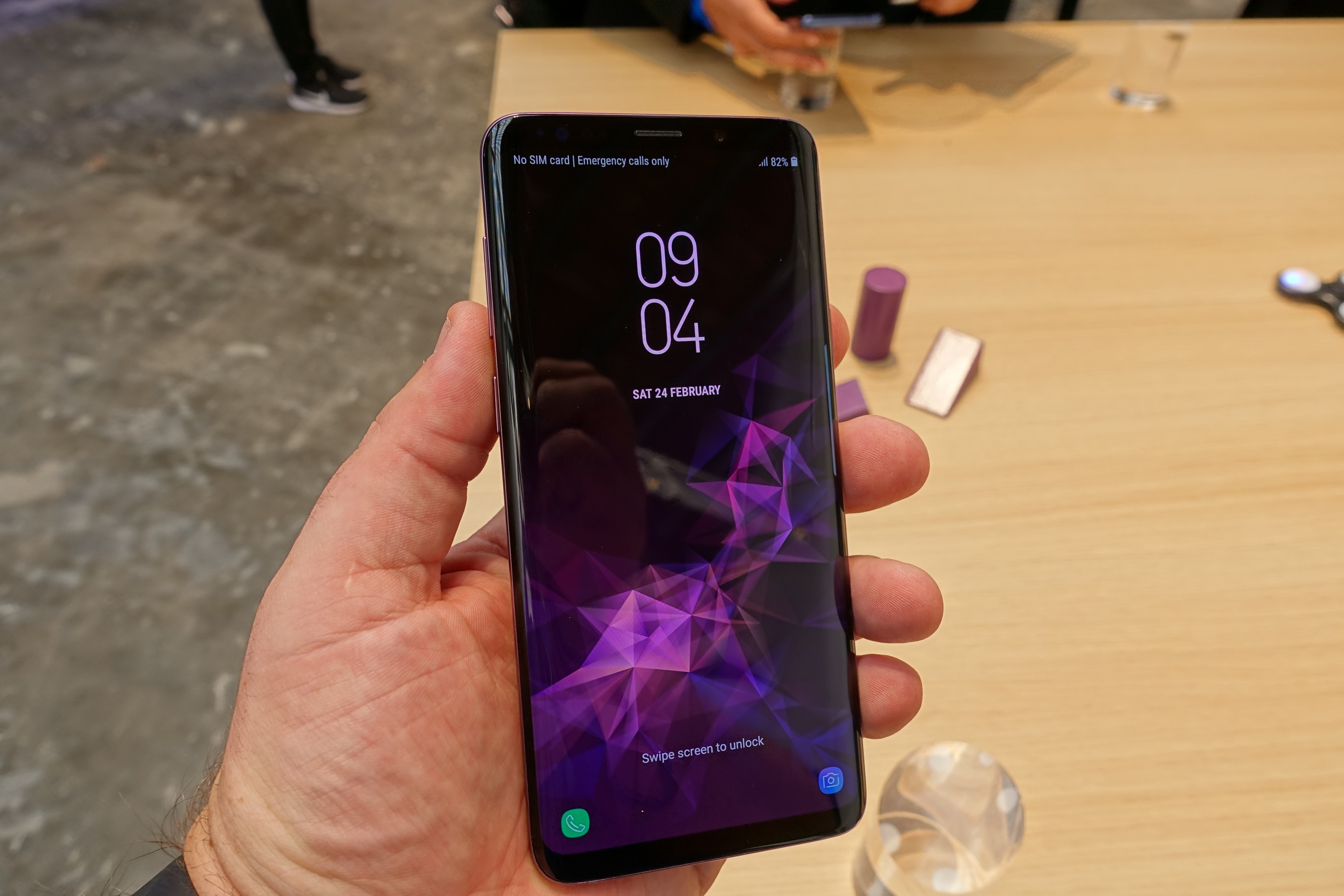
I’m guilty of making the same assumption; from the leaked renders and designs, I thought “Here we go, the Galaxy S9 looks just like the Galaxy S8 .. how innovative”. Some even branded the design boring, lazy or worse, lazilly refreshed. Regardless of what was said before, when we first saw the Galaxy S9 on Saturday morning at a confidential briefing session, the rumours and leaks were proven correct. Superficially, the design hasn’t changed much.
Arguably, this isn’t a bad thing. Much of the Galaxy S8 range design was remarkably well done. Of course, a few things were crap, such as the fingerprint sensor’s location, the mono speaker, and the lacklustre battery life, but many of these would ultimately be shown to be fixed.
Having spent time with the phone – both before the announcement, at Unpacked 2018, and with our take-away phone – I can confirm that the Galaxy S9 design does represent a significant update, plus there’s lots of changes within, too.
First and foremost is the new camera with variable aperture, with other party tricks in tow – it can film super slow-motion, of course, but it can also make an emoji that looks just like you, which you can share with anyone. Far from being a gimmick, it’s actually quite fun. Think of Bitmojis for Snapchat, but which are 3D, animated, and usable everywhere.
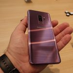
The exterior design is obviously less different, and from the front, they’re visually indistinguishable (unless you really know what you’re looking for). The back remains similar, too, but with fingerprint sensors moved to below the lens area, it falls in a much more natural position which makes it much more usable.
Don’t let the front and rearward design fool you, though. Much has changed. The glass used is 20% thicker, and the aluminium is of a higher grade, making it stronger, sturdier, and giving it a more premium feel. So much so, in fact, that the S9 feels significantly more planted in the hand. It’s not heavy, by any stretch, but it feels like it belongs there and won’t fall easily. The S8 was a touch too light.
Dimensions have changed slightly too; though just half a millimetre thicker, and with displays the same size as the S8 range last year, the Galaxy S9 range are both shorter and narrower than last year’s models. This makes them ever so slightly more suited to those without giant hands, and represents a reduction in the useless bezel space.
More screen on less body makes for a much better user experience, and having been hands-on with the Galaxy S9 for most of the day, I can tell you – it’s damned hard leaving it with the guys while we travel back to Australia tonight.
Expect a hands-on walkthrough video in coming days showing off some of the Galaxy S9’s key features, and a full Ausdroid review ahead of retail availability in a couple of weeks.

