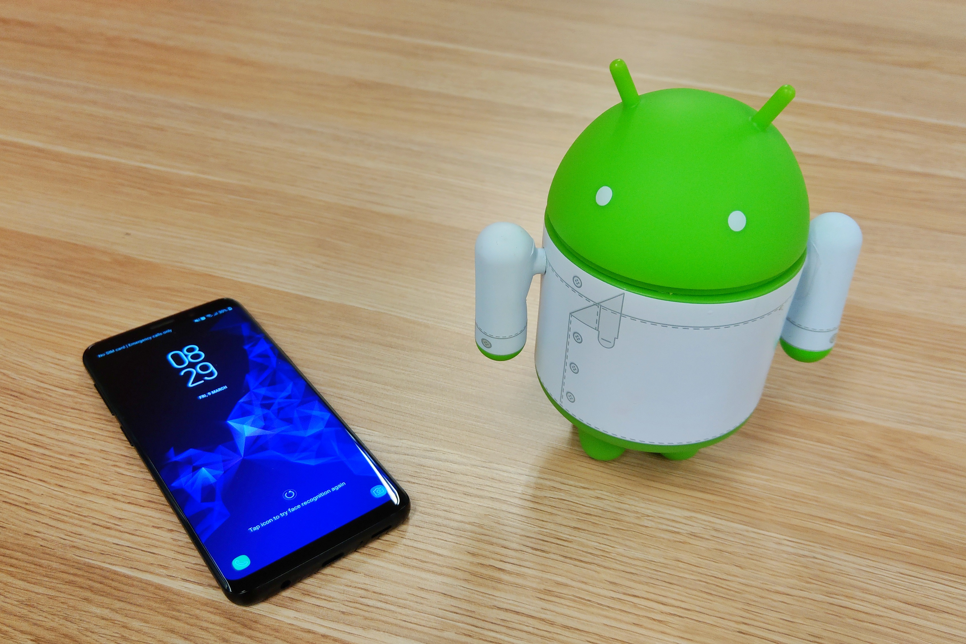
It’s been a week and a half since Samsung launched its latest Galaxy phones, the Galaxy S9 and Galaxy S9+ at Mobile World Congress. Samsung promised much with a reimagined camera, and a number of smart features attached to it. It’s time to take a look at the finished product.
Firstly, some parameters. We’ve had a near-final version of the smaller Galaxy S9 for a little over a week. That’s not enough time for a proper review, but we can certainly talk first impressions. We’ve also not had our hands on the Galaxy S9+ since the launch event in Barcelona, so this is purely about the a Galaxy S9.
Our Galaxy S9 was delivered in a retail box containing 3.5mm headphones, an AC charger, USB A-to-C cable, and a transfer device for moving data from an old phone to a new one. There was also a USB-C-to-Micro-USB adapter, but that could just be for European boxes.
Much has been made of the fact that there’s only minor physical changes between the Galaxy S8 and S9. Given the 2 year contracts on which most consumers obtain phones, that’s fine really – its customers upgrading from a Galaxy S7 that this phone is really aimed at – and what an upgrade it is!

Design
Samsung made a huge effort to update it’s design language with the S6, and has continued to refine it over the last few years.
It’s a beautiful phone in its own right, with symmetrical top and bottom bezels that never actually confused me as to which way was up. Samsung’s now signature glass and aluminium finish has never looked or felt better.
While the S7 refined that device and addressed the shortcomings of the S6, in the same way, the S9 gets to take a run at fixing the S8’s issues.
The main physical problem with the S8 was it’s astonishingly poor placement of the fingerprint scanner, addressing which you’d imagine was the first thing on someone’s to-do list after the S8 launched. Address it they have, although it feels a little like a grudging concession that the first version was a mistake – the scanner is directly beneath the camera and is a rectangular piece that feels about half the height it needs to be. It’s a far cry from the expansive circles that have become the norm on other Android devices but it works just fine in practice. The lip around the scanner also helps guide your finger to it.
Samsung walked back most of its crazy Edge displays with the S8, opting instead for a subtle curve off to the side of the screen. That subtle curvature makes a return on the S9, and it’s matched by a similar curve on the device’s rear glass, meaning the side edges of the phone are quite narrow and a little harder to grip.
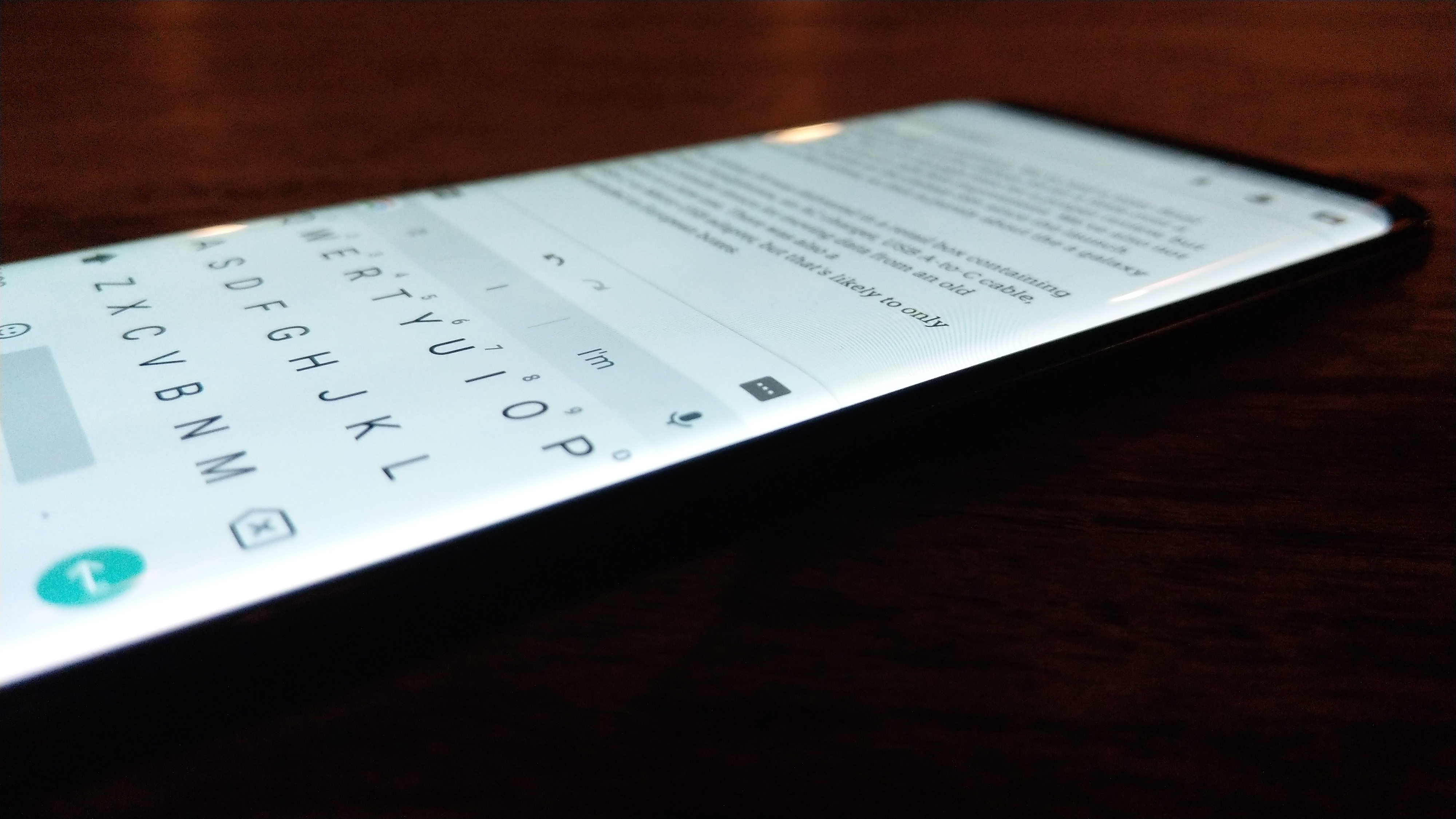
It’s disappointingly slippery, which goes with a glass front and back. It’s a lesson I’d have thought Samsung would have learned by now. The Galaxy S9 feels like it needs to be in a case, although it doesn’t have to be huge and chunky – a slightly grippy clear plastic case preserves the phones beautiful design. While it’s been fun having the phone in advance of its release, I’ve really missed being able to go out and get a case for it.
I expect a case will also help with errant touches, which is mainly a problem for me if I’m using the phone lying on my back in bed. Any time I’ve needed to apply grip to the phone, I’ve ended up with unwanted touches detected around the edge.
Finally on design, we do need to talk about the buttons. Given the narrow edges on the phone, the three buttons – a volume rocker, a power button and a Bixby button – all feel a little small and fiddly and don’t quite have the travel you’ve come to expect from Samsung. The power button, whose double-tap-for-camera feature will make it the most used button on your phone, is sometimes only hit once because you know its travel distance is quite shallow.
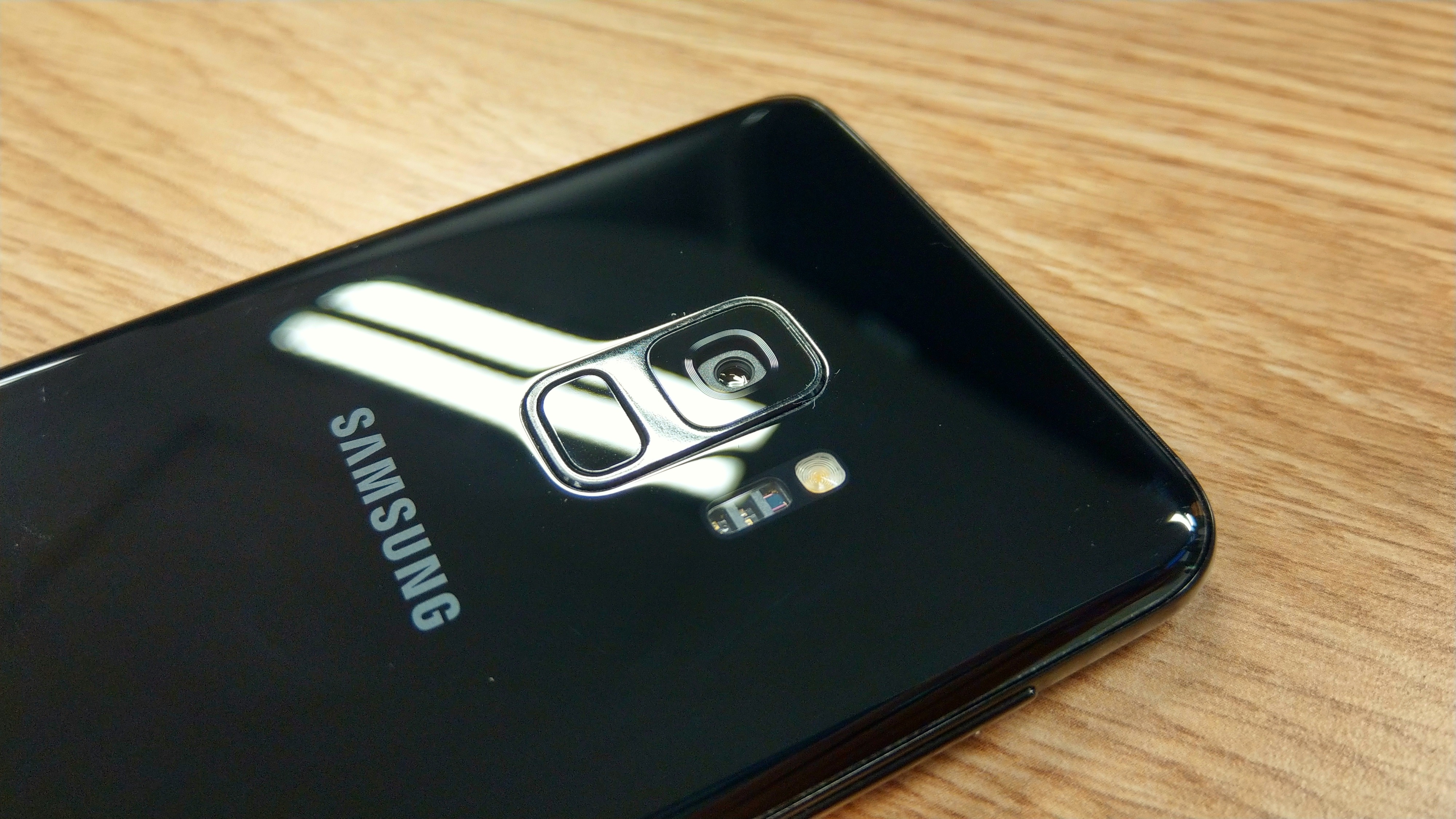
Camera
Samsung’s marketing room tell you they’ve reimagined the camera, and that the Galaxy S9 is a camera with a phone attached. Both are true, although perhaps not to the extent that Samsung really wants us to believe.
The camera’s got two big party tricks this year – the switchable aperture, and AR Emoji (Three, if you count the dual camera on the S9+, but we didn’t get one in time for this post).
The big news on the switchable aperture is simple: it works. In fact, it works quite well. You can see the difference in these two shots, the first shot at f/2.4 and the second at f/1.5.


A wider aperture is better for low light photography, but it also means a shallower depth of field. We’ve seen this as phone cameras have plunged below f/2.0 in the last few years – the “bokeh” effect, where you get a blurry background as your subject is brought into focus, has increased. It might be visually pleasing for particular types of shot (eg portraits) but it’s a problem when you get to wider vistas Android landscapes.
In the above tests, you can see the writing on the signs in the background is clearer in the f/2.4 shot while it’s just a blur on f/1.5.
You can switch apertures manually in the Pro mode in the camera. Otherwise, the camera will choose for itself in Auto mode.
The low light performance of the camera is pretty amazing. I took this picture of my cat at about 3am, illuminated only by a nearby phone screen at 25% brightness:

It’s a little bit grainy as you move away from his face. It’s an extreme case though, and actually a testament to what the camera can actually accomplish. Usually you won’t be in near pitch black darkness for low light photography. It feels like an unfair test to apply, but I’m impressed at just how well it did under the conditions.
Like most Samsung cameras of the last few years, you’re very safe leaving the Galaxy S9 in Auto mode, unless there’s a particular goal or effect you’ve got in mind.
We’ve already shown you a lot of photos taken by the Galaxy S9 in Barcelona, so now let’s see some taken around Sydney.
In Pro mode, you can adjust ISO (50 to 800), shutter speed (1/24000s to 10s), aperture (1.5 or 2.4), scene type, focus, white balance, and +/- exposure adjustments (although that option mostly remained ghosted and unselectable). Pretty comprehensive, and a lot of options in there.
There’s also a pretty wide variety of other modes in the camera. Food mode makes a return (it looks like it applies a blur of some kind and perhaps a colour enhancement), Panorama works as you expect, Selective Focus seems to pass for Portrait mode, and (Instagram-originated) Hyperlapse is a first class citizen.
Super Slow Motion is also present, and wielded properly it can come up with some impressive results. It shoots 960fps for 0.2s (so, 192 frames) at 720p HD which is a centre crop of the image sensor, so appears to be slightly more zoomed in than you’re used to in other shooting modes. This can make movement seem a little unnatural in the resulting video, so you’re probably going to want to crop it a little closer to the slow motion action.
It took a while to work out the best subjects for Super Slow Motion. Distant subjects like a flag on a building didn’t move enough to really notice the effect, so you really want something that fills the frame.
I sent Dan running through a flock of pigeons with impressive results:
A food shop we passed in Barcelona had a flame visible in its store window:
We passed a pinwheel on a balcony, spinning in the breeze:
And, tattoo needles make for a particularly interesting subject given the speed at which they move.
(that’s Dan, BTW – his tradeshow tattoo collection is earning him some notoriety!)
I had to get pretty close to that last one, and use the flash to light the scene to compensate for the flicker of the lights in the room.
When shooting Super Slow Motion, you get a choice of shooting manual (where you hit a button to engage the feature) or Automatic mode (where the feature is engaged when motion is detected in a predefined area of the screen). We couldn’t get Automatic to work very well and ended up going for manual controls every time, however that might just be the software on our unit. Also, you can’t move the predefined watch area which is a bit disappointing – it ends up off-centre in landscape mode.
The final party piece for the S9 camera is pretty divisive, but it doesn’t need to be. I’m just going to put this here:
AR Emoji is a feature that feels like a direct “me too” response to Apple’s Animoji feature on the iPhone X.
Here’s the thing – I don’t care. It’s actually really fun.
Creating your own AR Emoji is simple – snap a pic, and the software draws out your facial shape, features, hair colour, eye colour, skin tone and turns you into what’s basically a caricature of yourself. You can go for a somewhat-realistic appearance (think Xbox) or a more cartoon-like appearance (think Wii).
Customisation options are actually a little bit limited – there’s only a few outfits, and you get to change hair colour and style and eyewear. That’s about it.
Once your AR Emoji is created, a bunch of animated GIFs are loaded into the phone’s gallery (and so they also sync into Google Photos, whoops) so you can use them as reaction GIFs in other apps.
You can also make your own by going back into the camera and selecting your avatar. The camera app is eerily good at tracking your movements – your ARel Emoji follows your head as you move it around and matches mouth movements and eyes and eyebrows. It’s a shame it doesn’t track your shoulders, ATMs and hands as well as you can never be quite as animated as the Samsung-created GIFs. Maybe that will come in an update (or the S10…).
The Samsung Keyboard gives you the simplest way to find and insert them, but you can just send them as images if you’re using a different keyboard. I’m hopeful that GBoard might eventually grow support for Samsung’s AR Emoji, since it already supports Bitmoji and I much prefer it to Samsung’s offering.
Here’s the thing about AR Emoji – you don’t need them, they could get pretty old pretty fast, but they are pretty fun. The feature is really well implemented (given it was likely developed in a really short time frame) and used in moderation it’ll be quite fun.
Parting Thoughts
We’ve had a week with a not-quite-final version the Galaxy S9. That week has included a day of travel back to Australia and subsequent jetlag. We can’t really tell you about things like battery life, or how the phone is as a daily driver. That stuff will come in a full review.
What we can tell you is this: the Galaxy S9 is a beautiful phone to look at and hold. It has a number of great features that work well and are even fun to use. It’s been a while since we’ve used the word fun in a review, but it’s wholly appropriate here.
It’s not a cheap phone. The base RRP haa been trending upward in the last few years, and it should make you wonder whether you really need the latest and greatest. If you like to live on the bleeding edge though (and we know a lot of smartphone owners do), the Galaxy S9 is certainly not going to disappoint.
We’re looking forward to getting our hands on final retail units of both the Galaxy S9 and S9+ to put them through their proper paces over the coming weeks. Look out for our full review.

