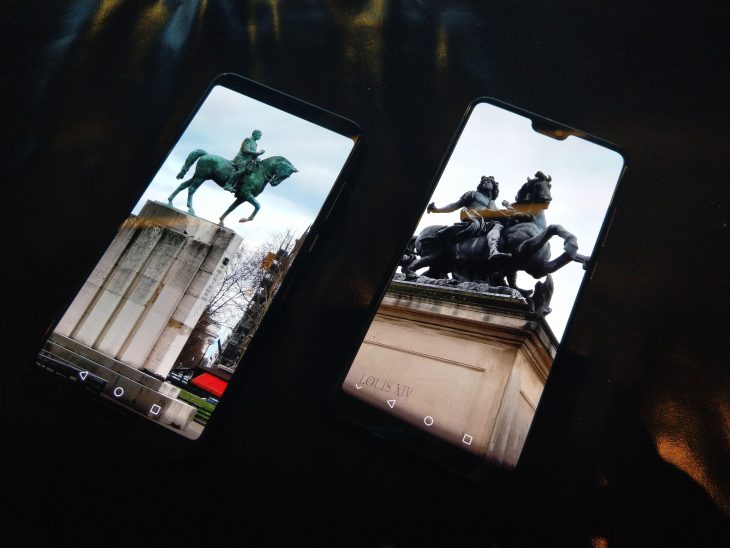
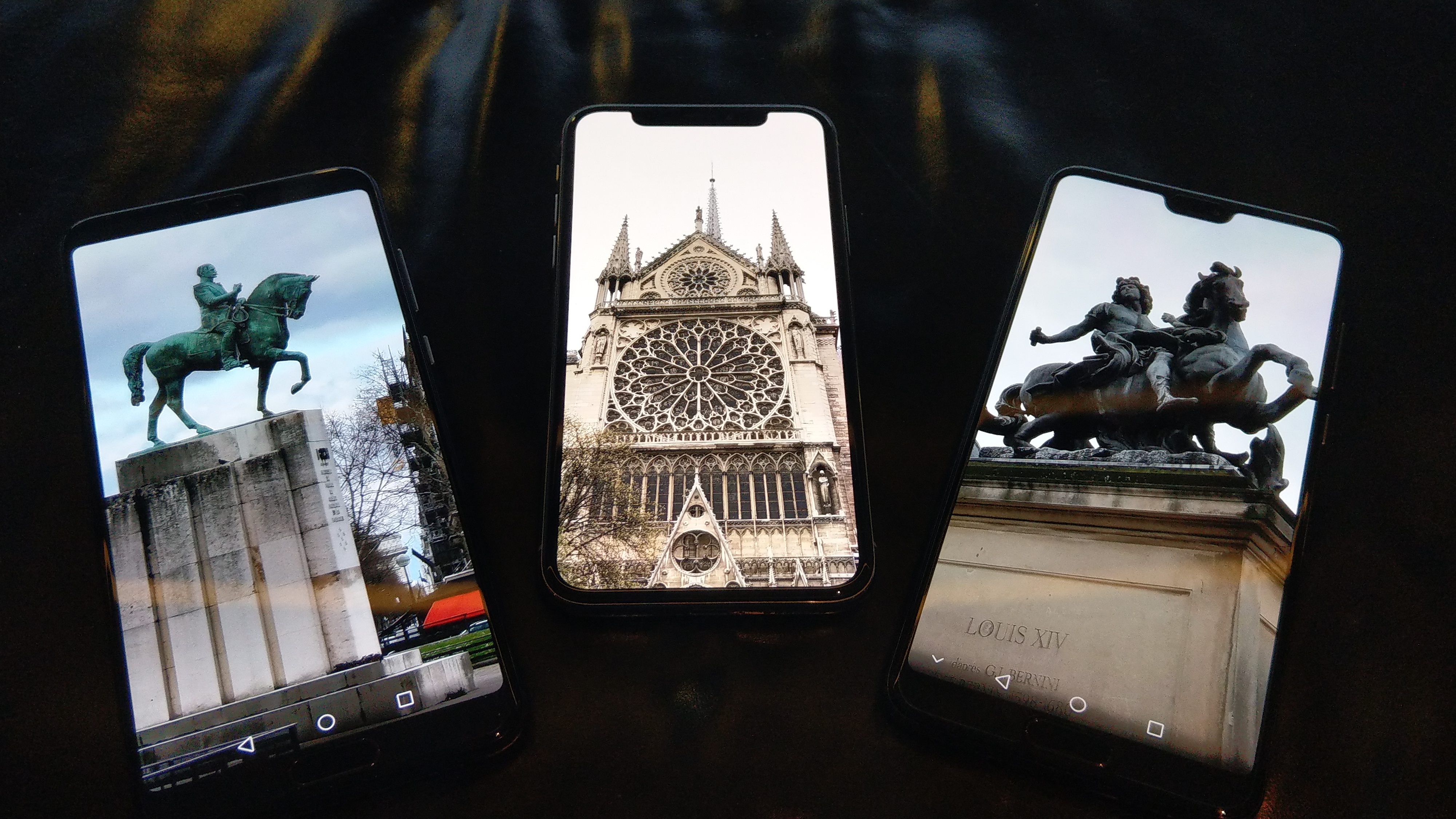
The advent of the “notch” smartphone design has been controversial, but with multiple manufacturers telling us that phone screens will eventually be taking over 100% of the face of the phone, it’s a design element that seems here to stay.
The notch is a design element that’s most common in “full screen” devices – where the screen most commonly extends to the top of the device – and holds components like the front facing camera, proximity sensor, light sensor, and more. While it was technically first introduced by Essential with their PH1 phone, Apple is mostly credited with its introduction on the iPhone X. On that device, it houses additional hardware sensors that power Apple’s Face ID system.
Online sentiment is difficult to gauge. Users love it or loathe it in almost equal numbers, depending on the poll and the audience. Apple’s iOS users have embraced it, but it presents a design challenge to developers who may no longer be able to place a logo or buttons at the top centre of their app. On Android, it most commonly removes screen space from the system status and notification area, and might be seen as a “me too” adoption of an Apple trait.
Huawei’s recently launched P20 and P20 Pro phones use an almost-full-screen design on the face of the phones, and so the phones embrace the notch in their physical design. Compared to the iPhone X, the P20 notch is comparatively small and only intrudes into a (slightly taller than normal) notification area.
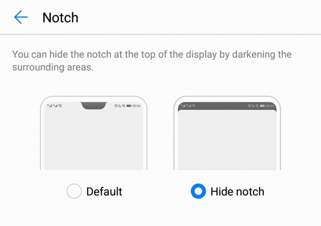
Recognising the online angst around the notch, Huawei’s phones offer users the option of using the phone with the notch “enabled” (where the screen background etc extends into the space next to the notch), or “disabled” (where the system cleverly turns the notification bar black and keeps it there at all times, essentially hiding the notch within it.
The option is there in settings:
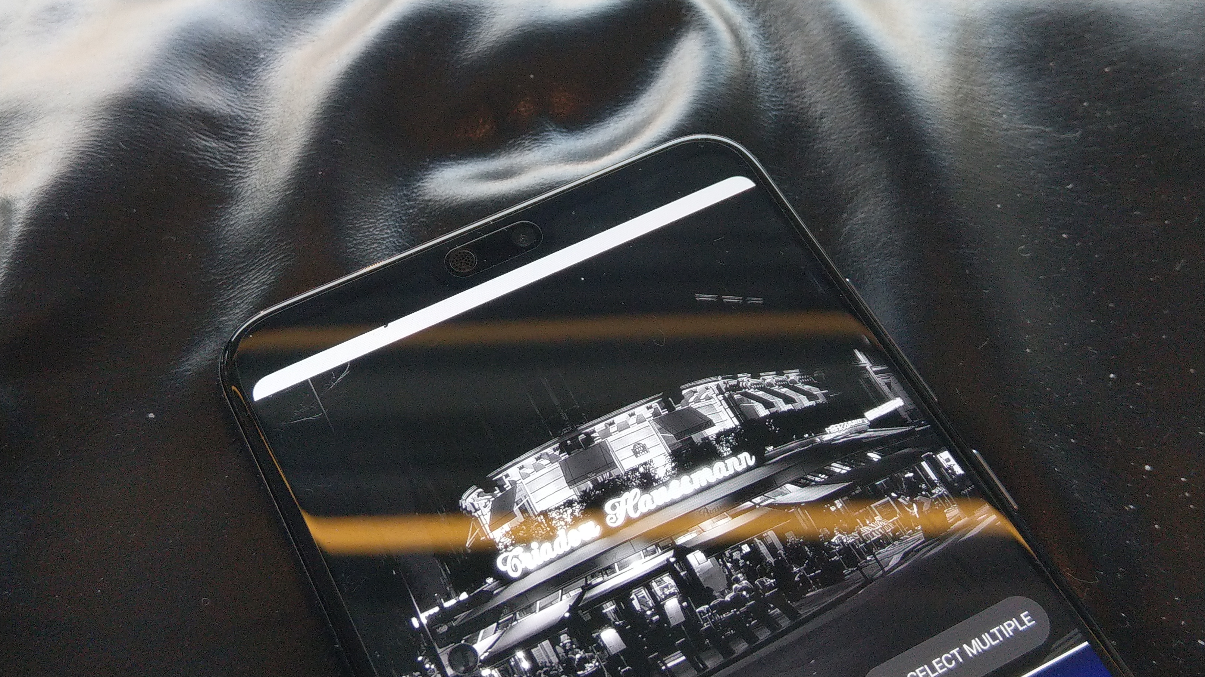
I’ve been running the P20 Pro in “notchless” mode for a few days now. If you don’t care for the notch, you wouldn’t even know it’s there.
I don’t particularly mind the notch myself, but I really like the result – it’s like using one of the “secondary screen” phones from LG or HTC that were momentarily popular in 2016 / 2017 – you get all your notification icons (slightly reduced in size) crammed into the top to the left of the notch, and system icons and the clock at top right. In the future, maybe enterprising developers or custom ROMs might even run applications up there to simulate a secondary screen.
That said, the notch hiding isn’t perfect – some apps don’t quite respect the screen layout. Instagram is a particular offender on this front, with some buttons rendered under the status bar although it seems that fault may lie with Instagram more than Huawei.
Right now, Ausdroid’s P20 Pro isn’t running final software, and we’re expecting a system update on our P20 Pro in the next few days. We’ll check in on this feature when it arrives to see whether it changes.
What’s your preference? Do you love or loathe the notch? Would you hide it as Huawei offers? Tell us in the comments!



I don’t really get everyones total hatred of bezels these days, personal preference though. for me, i just dont mind having a bar at the top and bottom, I bought a mate 10 for the main reason that it still had a touch button at the bottom for the fingerprint scanner, which also meant i could get rid of the onscreen nav buttons (if you’ve never tried the mate 10 home button, go try it, its amazing). the notch, I dont like as it means the icons in the top bar have to be split and doesnt look as neat,… Read more »
Clever
Anyone who loves the notch is an idiot, if they accept the notch (for a taller screen) they are realists. Having an option to turn it off should make everyone happy.
Only people calling other people idiots are the idiots. Just because they don’t agree with your view does not mean it is any less valid.