For nearly every leak of the Pixel 3 XL we saw the notch, unhidden and glaringly obviously to all and sundry. Unlike basically every other Android manufacturer that has a notch on their phone and give you the option to hide it easily Google are not making it easy.
The Made by Google have taken to Twitter to answer users’ questions and the answers regarding the hiding of the notch on the Pixel 3 XL seems to be getting a few offside. Not only are Google defending the size of their notch they are offering a way to hide it.
The notch enables us to provide the best cameras (two, one of which is wide angle) and audio experience. Pixel 3 also has a smaller border & front-firing speakers to provide optimum sound quality. Our notch-to-display ratio is actually less than many top competitors.
— Made by Google (@madebygoogle) October 9, 2018
For people who prefer a more traditional smartphone look, we’ve added an option to hide the display cutout (the notch).
— Made by Google (@madebygoogle) October 9, 2018
Do you mean the option in Developer Settings? That doesn't really hide the notch. It reduces the screen real estate in fact
— nikhils (@extrapao) October 9, 2018
As you can see the natives are unhappy. For one thing, Developer Options are not something that Joe and Jill Public know about. You have to go and tap on the build number 7 times to activate them — how many people would know to do this? For those who do know to do this the solution by Google is sub-standard.
Google have known all year that they were going to use a notch and have seen how well many other companies have implemented the hiding of the notch and instead Google opt to not just remove the notch but make that part of the display useless.
https://twitter.com/hallstephenj/status/1050036131419607043
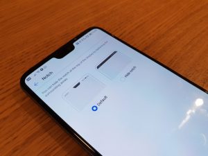
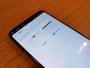
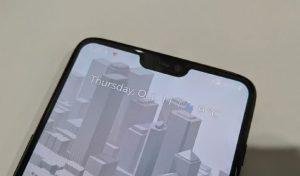
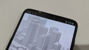
As you can see above Google’s implementation makes the usable display area less. For those who are yet to use a phone with a notch most manufacturers just put a black background behind the status bar effectively hiding the notch but allowing notifications to still fill that space. This can be seen below in Huawei P20 Pro and OnePlus 6 pictures.
It is unclear if Google will move the setting from a Developer Option to a standard setting, nor if they will change their implementation when they do but considering you normally purchase a Pixel phone because of the software Android can offer it seems a strange choice that Google have gone down this path.
In the end it seems unlikely that Google will budge on this due to what they have implemented in the Android framework. Hopefully Google can find a way to fix this.
Hi there! We’ve added an option in 'Developer options' to hide the display cutout (a.k.a. notch). Learn more here: https://t.co/JdPNrAlICS Hope this info helps.
— Made by Google (@madebygoogle) October 9, 2018
What are your thoughts on this? Do you like Google’s implementation or do you prefer the other way? Is this a deal breaker for you? Sound off in the comments below.



If I were Google, I’d have the notch off, however use that space with white text on black within that area either side of the notch.
Hilarious!
“Hey Google, let me hide the notch”
“Sure, you can do that”
“Heeeey. My screen is smaller!!”
Genius at work.
Google *is* allowing
Ha . . and I thought I was the only grammar Nazi on here!
With all the tracking and analytics in the OS these days, I wonder if Google has the statistics of how many people are hiding the notch versus how many leave it on.