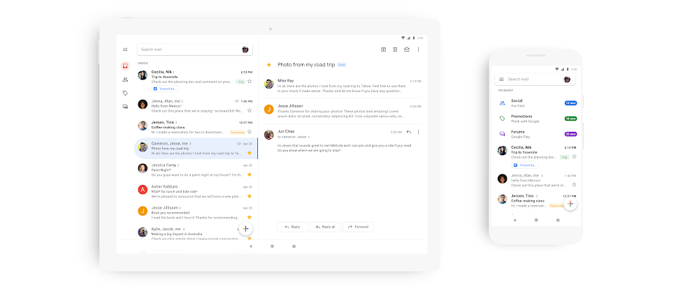
It’s been a while since the Gmail app for a fresh coat of paint, and Google’s announced its doing just that today.
Gmail’s the latest of Google’s apps to be brought into line with the company’s updated Material Design Theme. The updated Gmail app is a little bit less red (aww), and puts search front and centre at the top of the UI. It’s also surfacing attachments in conversation threads better, and finally bringing security warnings into the mobile app.
Most interestingly (for those of us that watch Google’s UI design patterns, anyway), it features a new account switch interface – the user’s profile image is displayed at the top right of the app, and opens the switch control when tapped.
In announcing the update on Google’s Keyword blog, Gmail’s product manager Nikolus Ray also called out Smart Compose, Smart Reply and “nudge” reminders but didn’t explicitly state that they’re bringing these features into the app yet.
Google’s intending to make its G Suite apps look and feel more like a connected family throughout 2019 though, so hopefully this kicks off an era of better feature parity between the desktop and mobile Gmail experience.
As for timeframe, the Gmail update will roll out as usual – “in the coming weeks”. We daresay there’ll be a few APKs flying around as the update lands.


Google has had a switch account feature for years?
Looks good on my 2XL but still no dark mode.