Google has released more details today about developing for the enhanced Media Controls that are coming to Android 11. New enhancements include, improved media controls in the notification shade, media resumption tools and seamless music transfer. Overall these features combine to bring what looks to be a significant upgrade to media on Android.
Media Controls
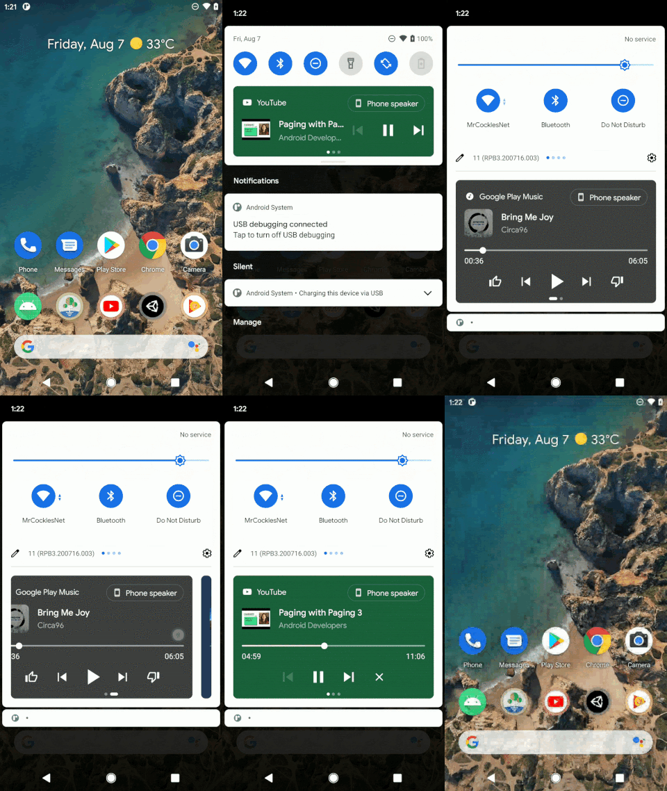
Controlling media via the notification shade in Android is a great option, but it’s disjointed, inconsistent and can get a bit messy. Google is aiming to fix that by creating a unified and centralised media control UI in the shade. The new UI brings quite a few enhancements.
Firstly there will now be a single persistent media control UI. All active media apps will appear in the new UI meaning you will no longer see multiple media controls in the shade. The new UI will standardise the layout and controls for media meaning enhanced consistency regardless of the app.
The media controls will include, play pause, timeline seeking, skip, media art, app icons and output switcher. This is a significant refinement to media control in Android and we’re very much looking forward to it.
Media resumption
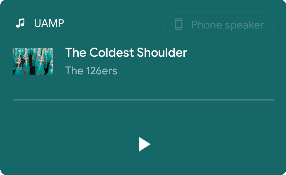
Google has also built a system for developers to build in the resumption of playback from the last position. The new functionality will allow devs to build media apps that save their last playback state and then resume it next time the user calls the application. This will be especially good for episodic content such as podcasts — that said, most podcast clients have built this functionality themselves.
Seamless media transfer
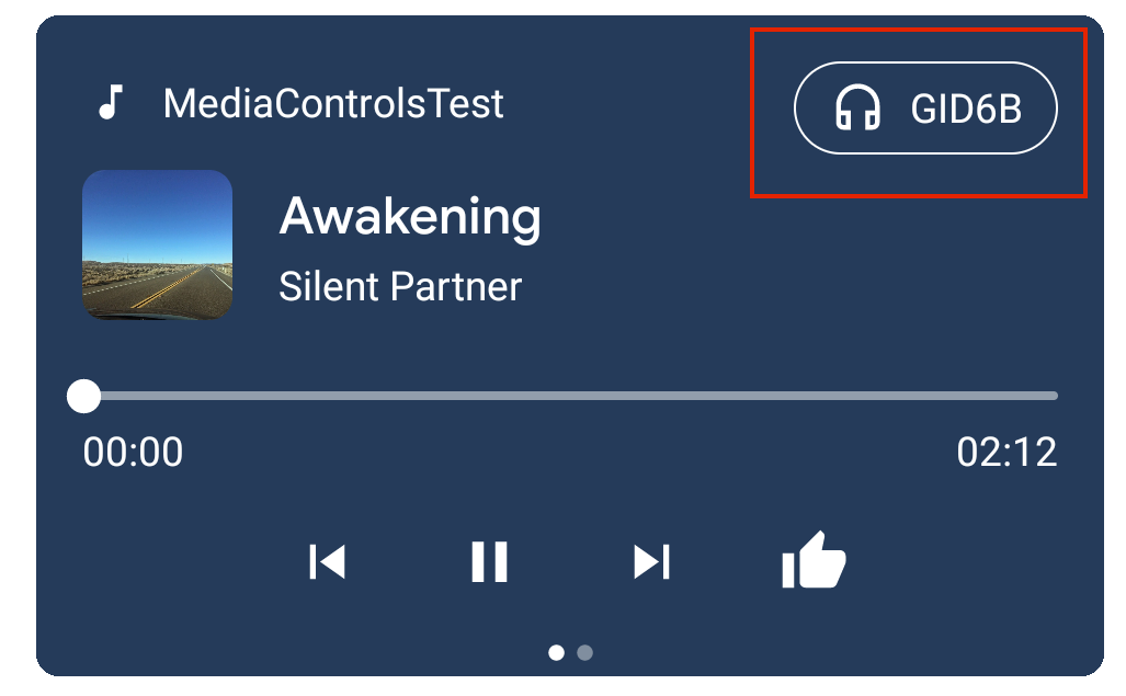
Using the new output switcher in the top right of the controls UI card users will be able to seamlessly transfer media to any connected playback device. This includes Bluetooth headphones, device speakers, 3.5mm headphone jacks and even Google Cast devices and groups, assuming the developer has enabled these playback types in their app.
With Android 11 getting ever closer to public release we really hope that media app developers integrate these new features. They represent a significant shift in media controls and users may well come to expect them sooner rather than later.


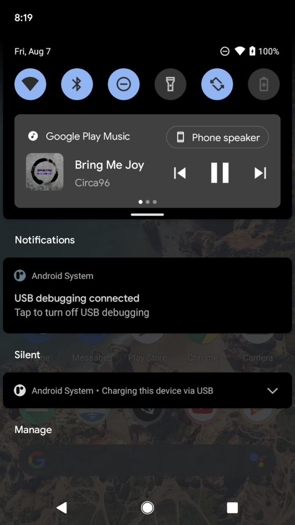
What’s missing is an easy to use large format volume control or widget. Output volume is the control I most frequently use. It’s not always convenient to reach for the side mounted up down volume controls on your phone, and it makes infinite sense to have them alongside any pause, next track etc. screen control.
My benchmark in terms of getting this feature right can be found in either Dubbs in app control or its home screen widget.
That’s the best new Android 11 feature announced so far and my favourite change to the media controls since those of Android 4.4 Kit Kat’s lockscreen (which was too short lived, in my opinion). After all of Google’s messing around with the media controls, let’s hope they stick with this one for a little while.