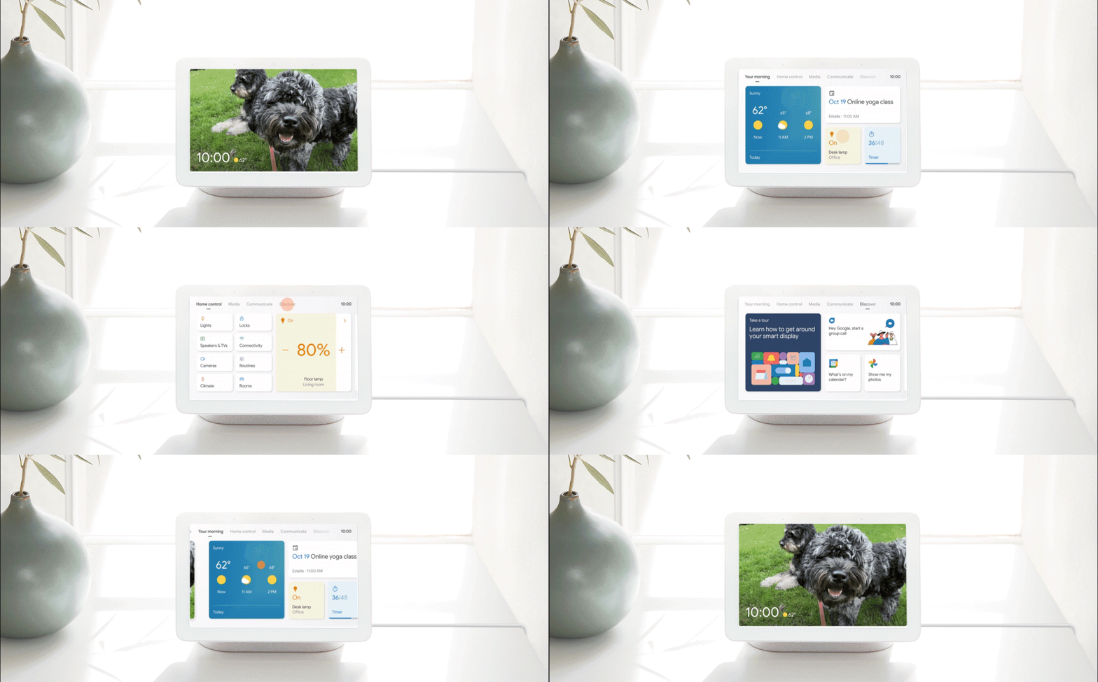
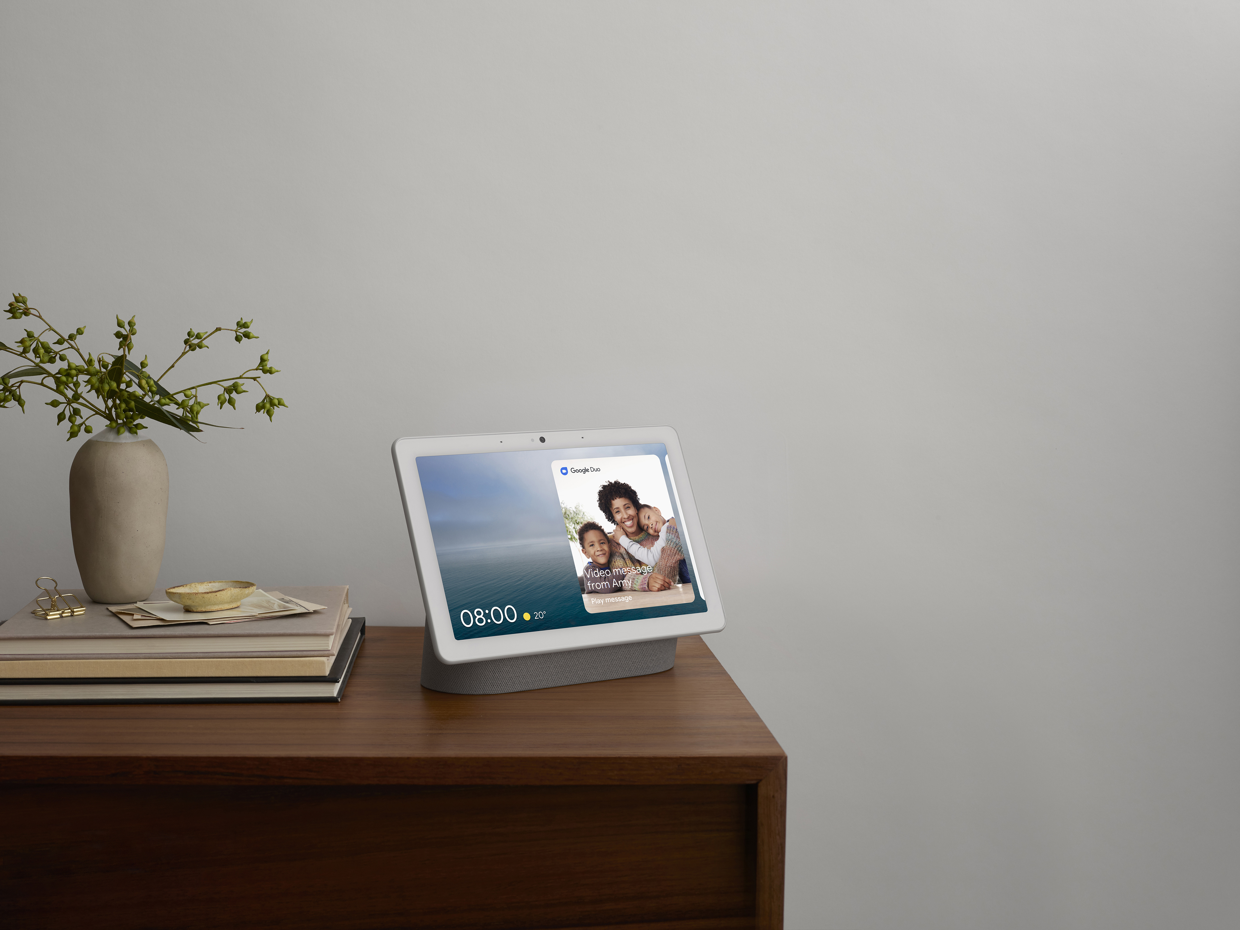
A few weeks ago we spotted a test of an updated UI for Assistant-powered smart displays, now Google has officially unveiled the update, and it’s significant. The new UI, builds on the familiar look and feel of smart displays but adds a new tab-based navigation, which makes it easier to know where you are, and where you want to be in the UI.
The new UI is broken down into 6 new tabs; Photo frame, Your morning/ afternoon/ evening, Home control, Media, Communicate and Discover. The photo frame is the default screen and you can either swipe left to move between the panels or tap the display to bring up the tab navigation bar along the top and simply tap on where you want to go.

Each tab provides the kind of information you would expect with the Your “time of day” tab showing the traditional card-based layout for appointments, commute times and news. The new Entertainment tab brings together all of your available media sources like music, podcasts and video services while the new communicate tab will host services like Due, Meet and soon Zoom.
The Home Automation tab replaces the old swipe down gesture and provides and more unified navigation experience, that doesn’t require people to master the control UI. The discover tab provides insight and tips on what your smart display can do, and how to use it, which could be good for new users.
With the update, Google has also introduced multi accounts, sort of. We will need to test this to fully understand how it works but just like on Android, users should now be able to link multiple accounts to their voice and have the relevant appointments and context from those account surface on the displays.
Two much-appreciated feature for those of us using smart displays as a bedside clock is the implementation of dark mode, while I’m not a fan of dark mode my wife is 100% not a fan of the blaring white screens at 10pm at night. The other feature is Sunrise Alarm that will slowly increase the brightness of your screen 30 minutes before an alarm.
Overall this is a solid update to smart displays, and while there isn’t a lot of new features, it is a much welcome refinement to the overall package. With the new Tab based UI and the recent integration of Assistant into Android apps, it’s not too much of a stretch to see Google allowing developers to link more services such as messaging into smart displays in the future.
We don’t have a rollout timeline and schedule at this stage, however, it has started now. We really hope this is a ubiquitous rollout and we don’t end up with fragmentation between different devices from different OEMs.


