One area that Google has notably failed to really capture market is messaging. With a number of good options already featured at killedbygoogle.com it’s easy to understand why many don’t look back. Over the last 12 months though, Google has made a concerted effort to make Google Messages a go-to app.
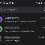
Now with notification dots seemingly ready to come to the user interface, there’s even more reason to take another look. The feature has been spotted by an eagle-eyed (and Beta tester for Message) reader of Android Police. Where other apps may simply show a notification dot or message count the change will show a dot next to unread messages in the UI.
This is a step away from the previous bold text — easy to miss if you’re scrolling quickly — to signify an unread message. From the screenshots, it looks like a change that will make locating unread messages a lot easier for users. There is, of course, the chance this is just a test (since it’s in the Beta app) and only time will tell if it rolls out to a wider user base.
Google Messages continues to evolve to user needs: What do you need from the app before it becomes your preferred messaging option?


Serious question, Phil: Why show the cleartext of a spam SMS promoting a push to legalize health harming activities?
The feature isn’t live on any of our devices and that’s the screenshots available from the source.
It’s not the live/not-live status of the feature, that I am questioning, Phil.
It is why show the cleartext of a spam SMS promoting a push to legalize a health harming activity.
It is cleartext content that should have been blurred out in an edit to the original image, before the edited image could be used in this article.