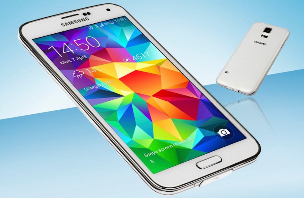
Samsung’s Galaxy S5. Announced only recently at Mobile World Congress 2014 and released in Australia last week, the Galaxy S5 is already taking the world by storm. We’ve had the opportunity, and we expect you have too, to read reviews of the 2014 flagship from Samsung (and that’s the last time we’ll use that overworked cliché). It’s safe to say that most tech news outlets that have reviewed the S5 have given it overwhelmingly positive reviews.
This is what makes me a curious choice to review the Galaxy S5. You see, I don’t really like Samsung phones. I’ve used each iteration of the Galaxy S family from that device itself through to (now) the Galaxy S5, and with each iteration, I was less and less satisfied. TouchWiz became more and more overbearing, to the point with the Galaxy S4 that I just couldn’t handle it anymore, and swore I’d never use nor own a Samsung mobile device again. Ausdroid’s Galaxy S4 was in my hands only briefly before the interface and battery life caused it to leave my life for good.
It’s a tough position to have taken, because as a tech journo, I really can’t have that kind of bias against one of the largest manufacturers in the Android space. It’s also complicated by the fact that both I personally, as well as Ausdroid, have an excellent working relationship with Samsung and their PR firm in Australia. I love working with them, but I don’t really love their flagship products.
By the time the Galaxy S5 review device arrived at my office, I’d already played with the HTC One (M8) and decided it would be the 2014 phone for me. It’s with this background — an existing dislike of Samsung’s developments in the Galaxy S line in particular, and having already bet on my winning horse — that I undertake this review.
Being a professional (well, sort of) I put my fears and expectations to one side, and used the Galaxy S5 as if I had no previous experience with the line, no expectations, and without having chosen a competitor’s handset. In other words, I took the Galaxy S5 as it came.
- TouchWiz is still awful, there’s too much packed in, but at least lessons have been learned — Settings app is no longer the hot, disorganised mess it was with the Galaxy S4
- IR emitter is quite weak compared to others — doesn’t have the same range. Plus side is the S5 can control more devices — DVD, BD, and more.
- No wireless charging built in, but it can be added via official accessory cases.
- Besides the Samsung apps (and there’s a few) there’s not too much bloat, but the OS does take up a lot of space out of the 16GB storage.
- Dock icons remain locked. Can’t drop in Chrome instead of Samsung’s browser, Hangouts instead of Messages, Gmail instead of Mail, etc.
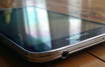
Samsung has decided to stay with the mostly plastic construction of the previous generations of Galaxy S devices with the Galaxy S5, and although there’s some 50’s Diner-style chrome banding around the edges, the rest of the Galaxy S5 casing is plastic. Eschewing the machined single piece of aluminium hasn’t harmed the the S5 much; it still looks a premium handset, and still (mostly) feels like one too. The dimpled metal band, and dimpled plastic back, give the S5 a comfortable, secure in-hand feel — there’s less chance of dropping this. The S5 is light — 145g or so — and thin, only 8.1mm, and so while it feels light in the hand compared to some other handsets, this isn’t unwelcome. It’s easy to move around and doesn’t feel hefty. You can thank the plastic for this. Our review unit came clad in black, but there are options of white, gold and blue (depending on where you pick it up), and the combination used means the S5 — to me — looks better than the S4, with it’s greasy-fingerprint-prone rear, and the faux leather look used by some other of Samsung’s handsets. Waterproofing It’s not just a good looker, though. The S5 is also quite practical. You see, plastic parts are cheap to replace if you destroy them, so if you manage to crack the rear case, you can probably find another one for $5 somewhere. If you are going to buy replacement case parts off eBay for example, be careful to ensure they come with the rubber gasket required to maintain the waterproofing, otherwise your expensive new phone could quickly become a paper weight. On that note, the Galaxy S5 is also rated IP67 for dust and water-proofing, meaning you can dunk your S5 in water for up to half an hour and still have good expectations of it working. We’ve tested this waterproofing in a number of household hazards. The Galaxy S5 survived a dip in the marine fish tank, in the bathroom basin, and even shared a shower with yours truly, and (while it’s emotionally scarred for life now) it remains working as well as it first did. The water didn’t bother it a bit. Are you the type at a party who wears a Hawaiian shirt, gets smashed and falls in pools? Buy an S5, you won’t regret it. Other reviewers have done much more awful things to their S5s, including coffee spills, and even a swim in the toilet, and while we’ve not tested those things, it’s reassuring to know that some other bozo has, and their phone has survived. The S5 is a phone designed for life’s little errors. The S5 mightn’t share the premium construction and in-hand feel of the HTC One (M8) or the Apple iPhone 5S, but it can withstand a lot more of what life throws at it, while still looking a premium handset. It doesn’t look tough, but it is. Guts and glory Samsung’s Galaxy S5 is powered by the same Snapdragon 801 chipset used in the HTC One (M8), and the same 2GB of RAM as well. Matched on the 16GB of built-in storage and the ability to expand it via microSD card, you could be forgiven for thinking they’re the same phone in different clothes. But they aren’t. Samsung’s display is a 5.1″ AMOLED as opposed to a 5.1″ LCD 3 display, making it just that little bit more vibrant and intense than LCDs, but it’s not as overdone as it has been on previous Galaxy S phones. Reflection aside, the S5 is viewable from just about all angles, the colours are bright and faithfully reproduced. This is a great device for consuming media (well, except sound). Tap ‘n’ Pay Sadly, though, we can’t. Why? Because, at launch, there are precisely zero services that support using Tap and Pay on the Galaxy S5, even though Samsung has exclusive deals tied up with both Westpac and CommBank. Westpac’s promised update hasn’t yet arrived on the Play Store to enable Tap ‘n’ Pay, whereas CommBank’s app is there, but it hasn’t been updated to support the S5 yet. Fingerprint sensor There’s also a fairly naff fingerprint sensor built into the home button, but I must caution you, don’t expect too much. Advertised as a secure and reliable way to unlock your S5 and authorise payments from compatible apps (including Samsung’s own apps and PayPal at the time of writing), it sounds as if it should be easy, but it just doesn’t quite work as it should. You see, the sensor is VERY fickle, and unlike the iPhone 5S which simply requires pressing your thumb into the circular sensor until it reads, the Galaxy S5 requires a swipe across the sensor. Not just any swipe, but a fairly similar angle and speed to your original swipe, otherwise your fingerprint won’t be recognised. It’s tricky to reliably operate one-handed: the balance of the phone and the movement of the thumb mean that dropping your phone is equally as likely as unlocking it. I tried the feature, and promptly disabled it. I don’t recommend using it. It’s not reliable enough. I’ve used my partner Rachel’s iPhone 5S fingerprint sensor for a comparison point, and it works a heck of a lot better (and even it isn’t infallible). Battery life Samsung has also made a bit of noise about battery life, and it seems that it’s not without merit. I was woefully disappointed with the battery life in the Galaxy S4, moreso than I have been with other handsets, and let’s just say that most Android handsets don’t have excellent battery lives. The Galaxy S5 packs in a 2,800 mAh Li-Ion battery. It’s just 200 mAh more than the HTC One (M8), and the battery life is (at least from my testing) comparable. It’s pretty good. Samsung quotes some amazing figures like 390 hours of standby time, or 21 hours of talk time, but in the real world where the rest of us live, let me put it like this: the Galaxy S5 will last a full day without too much effort, and if you’re not going over the top (like I do when reviewing a phone), it’s entirely possible to extend past 24 hours and well into 36 hours or more. After the initial days’ excitement, we’ve settled into a comfortable day-and-a-half of battery life in mostly ordinary usage. We’re not alone — other reviewers have found similarly; without heavy media consumption (of the Netflix, Plex or similar streaming video varieties) a couple of days’ usage is not unheard of. Of course, the more connected apps you use, like email, social media and chat apps, the less life you can expect your battery to give. Charge it overnight to be safe, but if you’re in dire needs, you can use Samsung’s two power saving modes to extend this battery life out to almost a week at the cost of background data, colour display, and more. It’s a neat feature if you find yourself away from power for awhile. Samsung’s previous Galaxy S devices have had reasonable cameras, and the S5 builds on this comparative quality and delivers a decent camera yet again. Having experienced the HTC One (M8) camera, which retains the 4 MP ultra pixel design from the 2013 HTC One, I was left a bit disappointed. I don’t have a small digital camera anymore, just a DSLR, so for daily photo requirements, my mobile is my go-to answer, and I need it to take reasonable photos. The S5 features a 16-megapixel rear shooter, and it takes bright, sharp and detailed photos that will survive zooming in and cropping without turning to a hot pixelated mess. There are reports of the sensor tending to over-saturate colours, but I haven’t found this to be too upsetting. The auto-focus is fast, but it sometimes misses the target. I do actually prefer the auto-focus speed and accuracy of the M8, but without that comparison point, the S5 won’t leave you disappointed. On the video front, the S5 is capable of recording 4K video at 3840 x 2160 resolution (though chances are your TV isn’t capable of playing it back). This format isn’t to be messed with — it uses so much data that, unless you’re packing a large SD card, you shouldn’t really bother. At something like 6.6mb for a second of video, you’re quickly going to fill that space. In fact, an hour of video will pretty much fill a 32GB card by itself, and just a few minutes of video will completely fill the on-board storage. The quality, however, is amazing. We’ve filmed a short video below so you can see what it’s like. Do note, though, you might need to change the resolution in the video to get it to show the 4K version, and if you do so, be aware it might take quite some time to download; the 15 second clip is around 80mb large.
YouTube doesn’t really do it justice, but besides that, you’ll also notice that in 4K recording, the Galaxy S5 is unable to stabilise the video it shoots. Drop it down to regular ol’ HD (1920×1080) and stabilisation is available, at the cost of a few pixels. Truthfully, I think you’re better off shooting at this “lower” resolution because the video stabilisation on such a light (and easily shaken) camera is really required.
The video recording function can also record slow- and fast- motion video, but there’s a catch. Unlike the iPhone 5S which can do this on the fly, with video that’s already been recorded, the S5 takes the opposite approach; video must be specifically recorded in slow- or fast-motion modes, and you’re stuck with the choice you make before the fact. Not quite as cool, but it’s still pretty useful, and it’s better than what a lot of other Androids can do. Camera Shortfalls While it stuns with higher megapixels and generally better photos, there are some shortfalls to Samsung’s camera, where it seems almost as if Samsung has tried to do some of the things HTC has succeeded with, and come up short. The first of these is the dynamic refocusing offered by the M8, which is achieved there using two sensors — the primary 4MP sensor, and a secondary 2MP camera used for depth of field and perspective. HTC’s M8 uses this to devastating effect; you can change the focus of your photos easily and it approaches (without quite reaching) the quality of a Lytro camera. The S5, however, does this really badly. It’s obviously done in software, and you can see where the processing has tried to guess what should be in focus and what shouldn’t. With a portrait photo against a distant background, the S5 does a decent job, but for anything else, don’t bother. Secondly, photos in low-light just aren’t quite there. The One (M8) has big, glorious pixels in its camera which make for decent low-light performance at the expense of resolution and some softness in the captured image. The S5 delivers a sharp low-light shot, but they can be a bit dark. Let’s just leave it like this — the S5 has a better overall camera, but like the M8, if you’re planning on taking low-light photos, use a real camera if you want them to be much good. Point-and-shoots just can’t cut it. We haven’t had the range of handsets and hardware on hand to actually show you the shortfalls of the Galaxy S5’s camera, and so with some reluctance we’ve incorporated some images from Phandroid’s Chris Chavez which really demonstrate where the S5 falls behind. As Chavez describes: One side you have a picture I snapped with my full frame camera to show you exactly how much light was actually in this scene. On the right is how well the Galaxy S5 handles in the smallest dip in light: like a muddy mess. It’s not really fair to compare a Galaxy S5 to a DSLR, but the comparison with the Nexus 5 is interesting; one’s a $400 phone, and one’s more than double that price. Something’s amiss if the S5 is being outgunned here. The camera software has also been tweaked; it’s much less overwhelming and easier to use than in previous generations. There’s still plenty of options, like Beauty Mode for prettying up your subjects a bit, but they’re hidden away and better organised. I’ve found previous Galaxy S cameras unpleasant to use; the S5 on the other hand isn’t too bad. It’s at this point we jump from hardware to software, so join us if you will after some sample photos.
Hardware
Construction
Standout features
 One of the big features (in our minds) of the Galaxy S4 was the integration with Commonwealth Bank’s Tap and Pay service via their Netbank app. Unfortunately, at the time of writing, other banks haven’t really followed suit, but we were looking forward to testing out the service on the new S5, because we think that using our phones to pay for things (using the built in NFC circuitry) is the coolest thing since sliced bread.
Cameras
Camera Samples
Software
It shouldn’t be too surprising that Samsung has launched the S5 with the latest version of Android — KitKat 4.4.2. As with previous Galaxies, the S5 hides a lot of KitKat’s expected appearance under a fairly thick layer of TouchWiz, and I’ll be blunt — TouchWiz is still a special kind of ugly to my tastes. It’s gaudy, full of too many ‘features’, and slows down the experience somewhat, infringing on some of the things Android should be good at.
Before we get into some of the particular elements of TouchWiz that I found boggling, there’s an overall comment that needs to be made. TouchWiz is slow.
Before coming to use the Galaxy S5, I’ve been using a string of what I’d describe as snappy, responsive handsets. HTC’s One M8, preceded by the LG Nexus 5, and before that, the HTC One M7. None of these suffered from the kind of inexplicable (and almost inexcusable) lag I’ve found on the S5.
The Galaxy S5 has the latest Qualcomm Snapdragon 801 CPU, the very same as in the HTC One (M8), it’s running the same latest version of Android KitKat 4.4.2, and yet the user experience is remarkably different. One’s fast (and it’s not the S5) and one’s just that little bit (and noticeably) slower. One can’t be proud of software — TouchWiz — that manages to screw up that power.
It’s noticeable across the experience: waking the S5 from sleep, waiting for the keyboard to catch up (either Samsung’s supplied keyboard of even SwiftKey), opening up the multi-tasking window, and just across applications. There’s lag everywhere. It might not be seconds and seconds worth; in many cases, it’s probably fractions of a second, but it quickly adds up, and boy oh boy do you notice it.
TouchWiz
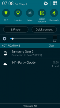
I won’t go too far into how the experience is detracted from, but here are a few examples. Firstly, the notification blind. On the left, HTC’s One M8, and on the right, Samsung’s Galaxy S5.
 |
 |
HTC’s is nice and empty, allowing you to stack up quite a number of notifications before you’re forced to scroll for things. Samsung loads the blind up with quick settings, quick shortcuts to S Finder and Quick connect, and a brightness setting which take up a good 40% of the display before you get to your first notification. Factor in a couple of ongoing notifications which you might have from apps, and there’s not much space left for actual notifications.
Secondly, there’s what Samsung has done to the settings screen. It’s not something you might access often, but when you do, you need to be able to find what you’re looking for. Long-time users of Android will have become accustomed to the fairly standard Android-esque layout of settings, and some OEMs present these largely unchanged, and some change them completely.
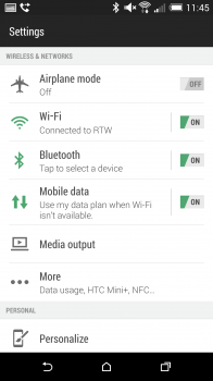
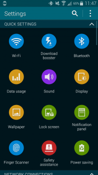
We’ve set out below three examples — the settings screen from the HTC One M8, Samsung’s Galaxy S4, and lastly, the S5.
 |
 |
 |
The One M8 sticks fairly closely to the standard Android settings flow, and users of other Android devices won’t be too lost here. Yes, they’ve Sense-ified it, but everything’s still fairly easy to find.
The Galaxy S4 made finding settings a real challenge, with four seemingly-arbitrary groupings hiding options away, making finding the setting you’re after quite a challenge, as some things were not logically placed where you’d expect them.
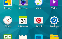
With the S5, Samsung has seemingly realised the error of its ways, and while the Settings menu doesn’t resemble anything remotely Androidy, it is actually fairly easy to find what you’re looking for. Gone is a scrolling list of options, and in it’s place is a scrolling table of icons and names. Everything’s on the one ‘tab’ (there’s no multi-tabbed weirdness from the S4 here), and scrolling up and down will find you what you’re after. In fact, some things which are hidden behind “More [Setting type]..” on other handsets are shown on this one screen on the S5. Changing NFC settings and Personal Hotspot settings is easier on the S5 than on other devices, and this is a big tick for me.
The list is long, and some might say there’s an argument for putting things behind a top-level menu in some instances, and while I do agree, the S5 implementation is miles ahead of the S4’s settings menu, and that progress needs to be recognised.
Quirks and complaints
TouchWiz has really cleaned up in some respects; as noted above, there are lessons that have been learned and things improved. However, there’s still some things that just plainly suck, and really need to be addressed on way or another.
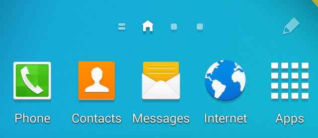
Samsung’s fixed app dock is a continuing source of annoyance. On most other Android devices (and indeed, iOS devices) you can change the four icons that appear at the bottom of your screen when you swipe between screens. Samsung denies you this option in Australia. You’re stuck with Phone, Contacts, Messages and Internet.
You can’t swap in Hangouts, or Chrome, or Gmail … or anything else. We’ve complained about this long and hard at Ausdroid and we’re not letting up now. The decision to lock this, whatever the reason, is a disgrace. If you want to change them, you’ll be changing your launcher from the TouchWiz default to something else. We recommend finding the Google Now Launcher and leaving the TouchWiz home screen behind. You can modify the dock, you get easy access to Google Now (which is awesome, by the way), and you get another benefit too.
Your app drawer becomes alphabetically sorted, instead of having to sort things yourself. You see, Android has this unique feature whereby you’re not just stuck with a list of apps you can put in whatever order you want (iOS), but you get two views — a list of all apps installed (your app-drawer), and a home-screen where you can choose what apps to display, in what order, and grouped in folders of your choice (your home-screen).
I want this level of customisation on my home-screen, but not my app-drawer. I just want a list there, where I can easily flick through the list and find what I want. An alphabetical list makes the most sense here. Samsung offers you this as a choice on the S5, but it isn’t easily found (open the app drawer, tap the settings overflow button in the top right, select ‘View as’, then alphabetical).
We have a bit of a rule at Ausdroid where we don’t advocate using third party replacements in reviews, but I’m breaking that rule here. TouchWiz launcher isn’t up to standard, and you should replace it.
The last bug we noticed, and it’s perhaps not something that’ll affect too many people, but it annoyed us. If you’re a fan of Hangouts for your SMS and MMS needs, you might find your Galaxy S5 does odd things when sending picture messages.
As you can see below, we’ve tried to send two pictures to ourselves, and you can see that they’ve badly distorted:
The only way we were able to successfully send a MMS message containing a 16:9 or 4:3 photo was using Samsung’s own Messages app. Hangouts consistently distorted images sent via MMS. It was curious to note, though, that images sent via Hangouts (i.e. to a Hangouts contact, not via MMS) were sent just fine.
Included applications
As has become the norm for Samsung smartphones, there’s a handful of included applications of various usefulness.
Useful inclusions
Believe it or not, they exist! Samsung has included shortcuts to Catch-Up TV apps, which allow you quickly install and access the TV catch-up apps offered by the Australian TV networks. Paired with this, there’s a Smart Remote application that allows you to control your TV, Set Top Boxes and DVD players, but the IR emitter isn’t the strongest, so you’ll need to have fairly good line of sight to get this working ideally. The built in device database is rock solid though, instantly picking up and controlling our Sony TV and Foxtel IQ2.
There’s a smattering of Samsung apps like S-Planner which is the standard calendar offering (and it’s not too bad), Samsung Apps for accessing Samsung’s own app marketplace, and the Samsung Music Hub which competes with other streaming music services like Play Music All Access, Spotify and others.
In all, the included apps aren’t numbered in their hundreds like they might once have been, and they’re mostly pretty good. Some have some questionable features though, and S Health, while useful, had us scratching our collective heads a little.
S Health
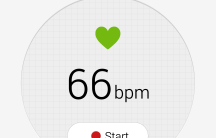
S Health, a mammoth app that includes things like a pedometer, calorie counter and more, also includes a heartrate monitor this year. It’s an interesting inclusion, something about which Samsung made a bit of fuss at the S5’s launch, but it’s a strange inclusion as well. It’s a bit fussy — it took me three goes just to get it to register a pulse, and I’m not dead yet — and it’s just not that user friendly. If you’re into hard-core fitness measurements, chances are you’ll have a Fitbit or Jawbone Up, or if you’re a Samsung fiend, a Gear 2 or Gear Fit. These kind of features should, in my view, be in an accessory separate from your phone. Many of these fitness devices are designed to cope with a bit of sweat or being dropped or banged into, and many are easier to carry about with you while exercising than is a Galaxy S5.
Is a heart-rate monitor something that most S5 users will use? No. Should it be a central part of the phone then? No, probably not.
If Samsung really wants to push its accessories, like the Gear 2 and Gear Fit, including almost all those features in the smartphone they pair with seems a curious choice.
Overall utility
It’s precisely this kind of inclusion that really defines some of Samsung’s inclusions. Throwing in things most people won’t use, just in case. There’s no kitchen sink in the retail packaging, but perhaps their ought be, just in case someone’s in need.
I can’t criticise Samsung too loudly for this, because these inclusions are useful to some people, and don’t really harm others who won’t use them. At least with the S5, Samsung has toned them down a little bit, and hidden away the more gimmicky features so that most users won’t be confused by them, yet those who want them can find them.
Take, for example, the various gesture controls offered on the S4 like Air View, smart stay, and more. On the S4, they took up a good amount of the settings menu and for those, like most of us, who never used them, just got in the way. On the S5, they’re hidden away under their own menu option, and better yet, they’re turned off by default. If you want them, they’re there. If not, you might be forgiven for thinking they aren’t.
Samsung Galaxy S5
- Operating system – Android 4.4.2
- Processor – Quad-core Qualcomm Snapdragon 801 @ 2.5GHz
- RAM – 2GB
- Networks – Quad-band 2G, Quad-band 3G, LTE Cat 4 (150/50mbps)
- SIM – MicroSIM (please don’t use a nanoSIM adaptor)
- Screen – 5.1in Super AMOLED with 1920×1080 resolution (432ppi)
- Camera – 16MP rear (UHD @30fps), 2MP front (1080p)
- Storage – 16/32GB (microSD expandable by up to 128GB)
- Connectivity – Wi-Fi, 3G/4G, USB 3.0, NFC, Bluetooth 4.0
- Battery – 2800mAh
- Dimensions/weight – 142×72.5×8.1mm/145g
- Ingress protection – IP67 — Dust and water-proof (up to 1 metre for 30 mins)
Included in the box
- Samsung Galaxy S5
- Travel/Wall charger
- USB to microUSB cable
- Headphones
- A handful of paper
- Mobile Monster recycling bag
I said at the outset that I declared that I’m no fan of where Samsung has gone with its smartphones, especially its flagship line the Galaxy S range.
When discussing doing the S5 review with Daniel and Jason, I said that I wanted to love it. I wanted to be convinced that the S5 fixed up the things that were so bad about the S4 that it had me running for the hills (so to speak).
We all knew my stance on smartphones of late. I purchased last year’s HTC One and used it from release until November when the Nexus 5 arrived. The Nexus 5 lasted a good five or six months until the HTC One (M8) arrived, and then I jumped in bed with HTC again. I like where they’re going with smartphones, and the M8 — to me, at least — epitomises what a quality Android handset should aspire to be in 2014.
So concerned was I that I’d struggle to find positives in the S5 that the review was almost offloaded elsewhere to ensure it got a fair hearing. However, I set the challenge to review it fairly, and so here we are.
I have to say I’ve not hated the S5 as much as I did the S4, and nowhere near as quickly. It took all of 48 hours for me to find things about the S4 that I disliked intensely, and to question the wisdom of using the phone any further. 48 hours with the S5 and I’d already gotten past the initial quirks that annoyed me, and I’d moved on to a peaceful acceptance of Samsung’s interpretation of Android.
That’s what it comes down to. Android is a platform, not just an operating system, and major manufacturers put their own twist on how they see Android should be delivered.
There’s things that should be — and are — consistent between Android devices, and Samsung respects that. Google services, access to the Play Store, and a mostly consistent user experience regardless.
There are things that can be done differently, where some creative licence is given, if you like. Samsung’s creative licence is TouchWiz, and while it’s not my cup of tea, I will drink it anyway. I wouldn’t go out of my way to drink it, but I’ll enjoy it when I do.
HTC does it as well with Sense, and others go even further. If you’ve used an Amazon Kindle Fire-type device, with its completely different spin on Android (and even a lack of any Google provided services), you’ll see that Android can go a number of directions, and TouchWiz isn’t — anymore — what I’d call the wrong direction. It might not be right, but it’s certainly not wrong.
You see, I have to defer to common sense and taste. Samsung doesn’t sell hundreds of millions of handsets because TouchWiz is a hideous gaudy mess, nor because some of its included apps are of questionable utility. Rather, that success is a combination of powerful hardware, easy to use software, with enough bells and whistles to satisfy the majority, and even a few to satisfy the pure geeks, all in a package that has a huge third party following — major accessory manufacturers make things for Apple and Samsung devices primarily. You see, Samsung sells a lot of phones because they simply make good phones. Even I, whose tastes don’t really align with Samsung, have to concede this point.
HTC, LG and Sony (to name but three) receive far more limited accessory support, and so if you’ve been conditioned to like a case, screen protector, some cool toys (Gear 2, or Gear Fit anyone?) and specially designed car-holders … you’ll want to buy a Samsung, whether you want the Samsung inclusions or not.
I’ll give the S5 to Samsung. I quite like it. It’s not just because of what you get out of the box, which definitely has some shortcomings that I’ve gone over in this review. It’s because of the whole package. The S5 receives a lot of third party support, and even some exclusives like Foxtel Go and CommBank’s Tap-n-Pay app using built in NFC hardware (even if those exclusives aren’t actually working at the time of this review), and it’s probably the most supported Android phone when it comes to accessories.
If you’re a power user, if you appreciate beautiful design and you want a premium looking (and working) phone with zero perceptible software lag, and if you don’t mind the slightly-less-than-powerful camera, you would be better choosing the HTC One (M8).
If you’re everyone else, and you want a great phone, with great accessories and an overall great experience, the Samsung Galaxy S5 is a great choice. Put it this way, it’s what I’d recommend to my friends or family who aren’t quite as technically inclined.







I think that the (unfair) accusations of bias have a lot to do with the fact that the review is quite candid with personal opinions and previous experiences. It’s a problem with perception, rather than reality. But IMHO, there are limits to how much personal opinion and previous experience should be explicitly discussed in a review. I realise that reviews are inherently subjective, and it’s good to know where a reviewer is coming from. But a reviewer is writing not just for themselves but for all people; beyond a certain point it gets in the way of writing for all… Read more »
Ausdroid reviewer, you can learn a thing or two from this man.
‘If you’re a power user, if you appreciate beautiful design and you want a premium looking (and working) phone with zero perceptible software lag, and if you don’t mind the slightly-less-than-powerful camera, you would be better choosing the HTC One (M8).’ why r u recommending m8 in s5 review…..
Simple. In those aspects — premium look, zero lag — the M8 is a superior phone. Why wouldn’t we recommend something we perceive as better? Ausdroid reviewing the S5 is not an advertisement for Samsung; we’re not paid to review handsets. We offer our opinion, and we know that a lot of people will want to choose between the S5 and M8… it only makes sense to compare.
Agreed, but u could also recommended nexus5 why only m8
Great review Ausdroid. The accusations of HTC and Ausdroid partnering up is absolutely pathetic.
Great review, thanks. Smartphones have become such a personal part of many of our lives that it makes total sense to unfold a personal journey with the device along with the technical account – and it makes for much better long-weekend reading!
Although the contrast with the M8 was part of that journey, some of the comparisons seemed to me a bit forced e.g. the saying the battery is “just 200mah larger than the HTC”. While that’s a relatively small percentage difference, a reviewer could also probably describe that as ‘significantly larger’.
Some of the comparisons, like the piddly difference in battery capacity, probably didn’t need mentioning. I’ll concede that 😉
why the hate on using the notification shade space for having some useful toggles? I have a few xposed moduless on my n5 and its quite similar to the samsung one. I wouldnt have it any other way.
Ive also encountered similar mms bugs on hangouts on other devices as well (rotate and or stretch) so I wouldnt say its unique to the s5
It isn’t so much the toggles that I didn’t / don’t like. It’s that they are as big as they are, that s finder and quick connect take up as much room as they do and can’t be removed, and that the brightness slider is always visible. I’m a fan of quick toggles in the second notification tab, but a single row atop the normal shade is fine if they’re implemented well.
You *can* remove the brightness slider from that drop-down on my Note 2 – you tap the ‘windows box’ to open the chooser, then tap on the ‘edit pencil’ icon at the top to modify that and other stuff. Not sure if it’s the same for the S5…?
Yeah, that option is there. I find the Brightness slider useful so I’ve left it. I’d love to be able to remove S Finder and Quick Connect though.
Wow what a terrible review. This felt more like a roasting of the S5. When I was in the Telstra store demoing the m8 I noticed that ausdroid was one of the sites you can select in BlinkFeed. Ausdroid and HTC clearly have a partnership going.
We have no relationship with HTC. We were invited to become a Blinkfeed partner by their content provider — Mobiles Republic — but we’re far from beholden to HTC. If you actually read the review, like actually follow what I said, and the conclusions I reached, I’m actually satisfied (very much so) with the S5. So much so that I’m continuing to use it in preference to the M8 as my daily phone for now. I wouldn’t do that if I was beholden to HTC and determined to rubbish everything else. I’ve been reviewing phones for over four years now;… Read more »
Oh, and in the interests of disclosure.. This lucrative deal you think we have because we’re in Blinkfeed? Seven bucks a month in banner revenue is all it amounts to.
In other words, nothing. Why? Because they don’t even pay until a threshold is met, and we’re not likely to ever meet it.
Blinkfeed is great for us to be featured in, but it’s far from HTC buying our voice. What a ridiculous suggestion.
Ausdroid and HTC are in bed with each other. History has shown that Ausdroid doesn’t get along with Samsung.
This is the reason why I don’t take Ausdroid review seriously.
Hahaha. You have no idea. Our relationship with Samsung is probably better than with HTC, and just because I personally don’t like Samsung’s handsets all that much, doesn’t mean they aren’t popular with the team, and doesn’t mean that the S5 got a crap review. Like I’ve said elsewhere. Read the review — it’s positive overall.
I have had my S5 for one week now and I’m finding quite useful apart from being a phone. I have tuned it to change channel on my foxtel as well as my TV. I don’t believe the battery is as good as what’s being mentioned, I like the camera. .
The battery varies wildly. After a few days it settles into easily managing a full day provided you don’t smash it too hard.
The battery being all over the place sounds more like the typical conditioning phase of a brand new battery, Chris.
But with it still not yet managing to last a day’s serious use, that has me wondering just how long will it take to settle to its proper run time.
Samsung phones generally have good battery life. Whenever I hear people complain about how their phones battery sucks…a lot of the time its because they dont know how to maximise it. I’m not saying everyone has to be a battery guru…but for those that sit with their phone screen on maximum brightness even while inside…constant FB usage and all sorts of other constant syncing and push notifications and gps, bluetooth and wifi always on even when not using…I feel like smacking them in the head. Its the same with most every device. And quite often which can’t be bothered when… Read more »
Thanks Chris. I understand that battery settles , I’m a very low user of the battery. the first few days the battery was awesome . but after nearly 1 week I’m disappointed in that yesterday it took 3-4 hours to charge from 10%.and not using it all day and the next morning the power was down to 54%. what also annoys me is that IN the USA they get the USB 3.0 cable and charger and my friends tells me the charging is about 90 minutes. I guess we don’t have the population s the States so we get the… Read more »
Thanks for being so explicit in your bias. Other journos could learn a lot.
also looks like always on voice (Hi Galaxy at lock screen) is also disabled for us.
Learning that the S5 is causing lag to the third party OSK, SwiftKey, is somewhat concerning.
What are Samsung doing behind the scenes to drag down performance so severely?
Well were to start off. First would be touchwiz or whatever they call it now, all those health eccentric features would cause lag as from the demo I played, it was shocking. Kept wanting to check my health, Blood pressure etc. If I wanted that I would go to my GP or Emergency (which is where I generally end up – due to my disability sadly). Put all those health things on the Gear I say, not on the phone!!
Galaxy S5 Vs Nexus 5 comparison is a bit unfair. The S5 was taken whilst shaky and the Nexus was still.
The Nexus 5 takes better pictures in low light, especially if you use HDR+. I have both phones and I’ve tested it on different subjects. In better light the GS5 is significantly better. I’d like to get a hold of an M8 to compare at some point. Although what I’ve seen of the M8’s camera is unimpressive, lacking dynamic range and blowing out exposure in both dark and light environments. I do like the U Focus results though. The LG G2 is also something I’d like to try at some point.
All good mate, great response 🙂
Camera shake isn’t the issue.
Screwing up the light levels is. In that particular comparison, the S5 pic was brightened too much, and as a result is washed out of detail.