Many of us love the open source nature of Android but being open source is a double edged sword, allowing literally anyone the opportunity to download the source code and modify it as they see fit. The Chinese phone manufacturing ecosystem has often been dubbed the wild west of the Android world, with many manufacturers making their own “enhancements” (term applied very loosely here) to the Android UI to suit their phones and tablets. While this is what attracts many to Android the GPLv2 licence that covers the Android kernel also states that the source for the kernel should also be distributed to anyone who asks for it. Chinese manufacturers very rarely release the source code, (historically due to Mediatek not letting them although Mediatek seem to have now done a 180 on that) and it is for this reason that I have never given a Chinese manufacturer and OS a good try until now.
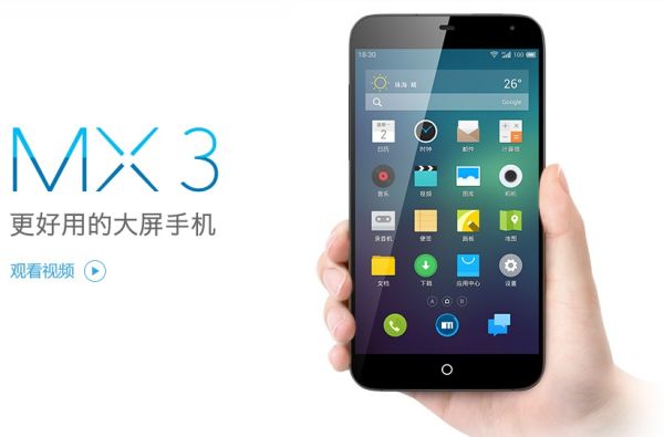
A friend recently purchased the new Meizu MX4 and sent me his old MX3 to test out and review. I can occasionally be open minded so decided to do a quick review of the phone followed by a more extensive review of the OS, Flyme OS. The phone is now 12 months old so it seems unfair to Meizu for me to review something that is now outdated and while Flyme OS has also been updated recently the changes to it are minor compared with the changes in hardware in the phones from the MX3 to the MX4.
Flyme OS is the name given by Meizu to their take on Android. It is built specifically for their phones, the MX phones. The version of Flyme I tested, 3.0, is designed with the MX3 in mind. The newer version of Flyme, 4.0 is designed for the newly released MX4. While 4.0 was released with the MX4 last month the changes between the two are relatively minor.
Meizu MX3 specifications
- 5.1-inch LCD, 1080 x 1800, 412 ppi
- Samsung Exynos 5 Octa Exynos 5410 quad-core Cortex A7 @ 1.2GHz & quad-core Cortex A15 1.6GHz, PowerVR SGX 544MP3 GPU
- 2GB
- 16/32/64/128 GB memory
- 2400 mAh non-removable battery
- 8MP rear facing camera, 2MP front
- GSM 850 / 900 / 1800 / 1900 MHz
- HSDPA 850 / 2100
- A-GPS, GLONASS, microUSB, Wi-Fi a/b/g/n, dual-band, Bluetooth 4.0 LE, NFC
- Android 4.2/Flyme OS 3
- 139 x 71.9 x 9.1 mm, 143 g
- PRice = $289US 16GB MX3
- Price = $399US 16GB MX4,
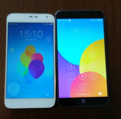
On paper the MX3 has some impressive specs and although it does not support 4G the newer MX4 does. Looking at the phone you could be mistaken for thinking the MX3 was an iPhone clone but dig deeper and you soon realise that the phone is not a cheap iPhone knock-off but has a persona all of its own.
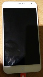
The front of the phone has a distinctive iPhone look about it with a small circular capacitive button in the centre at the bottom. The capacitive button itself makes the phone, which is a big concession for me given my recent invention of the phrase ‘crapacitive buttons’. The rest of the front is unremarkable except for the usual front-facing camera and usual sensors (proximity and light sensor).
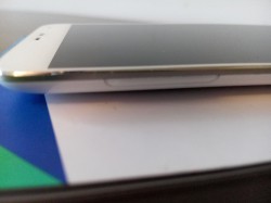
The sides of the device are bereft of any features except for the usual volume rocker on the left hand side. The power button is located at the top of the device which would be incredibly annoying (are you paying attention HTC?) except for Meizu’s intelligent use of the capacitive button. The headphone jack is also located at the top of the phone.
The bottom of the phone has the usual microUSB port and our assistant editor Jason will be happy to know that it is the “right” way up.
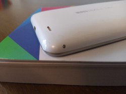
The back of the device is a curved shiny plastic surface which does make the phone feel cheap. The camera module and flash and what appears to be a noise-cancelling microphone are on the back along with a relatively subtle Meizu MX logo located in the middle. A small speaker is also located down the bottom of the back of the device next to a small metal button used to release the plastic back cover. This is required to change over sim cards only, as the battery is non-removable. Although the back cover is plastic, the frame of the phone is stainless steel.
The hardware seems to struggle with the requirements of Flymes OS and when compared with the Nexus 5 (approximately the same era) it seems very sluggish. There was occasional slow-downs in performance when running apps and games and the delay when opening apps was very noticeable. Whether this is the Samsung processor or the OS or a combination of the two is up for debate but the sluggishness is very real and very present. It didn’t affect my day to day use of the phone but if you are a power user and play a lot of games then this may not be the hardware for you.
The MX4 has an upgraded processor, a Mediatek 8 core CPU compared with the Samsung Exynos in the MX3 and thus promises to fix any of this lag. Apparently it is successful but if someone is already used to the slow opening of apps then they may not notice this in the MX4 as well. A custom kernel is of course out of the question due to the lack of source available.
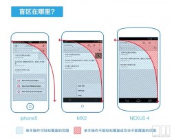
The 5.1in 1080p display was everything you would expect a display to be today. It didn’t jump out at me for being outstanding but on the other hand it didn’t jump out at me for being poor. For a relatively cheap phone many may expect a cheap display and it may have well been cheap but it certainly didn’t suffer from the price Meizu paid for it. It also runs a relatively odd aspect ratio of 15:9, which makes the device slightly wider but not as tall, meaning easier one handed operation.
The 8MP camera suffered from a lot of graininess, as did many cameras of 12-15 months ago. At first glance most pictures looked bright and vibrant but zooming in just a little demonstrated the lack of exposure to the lens and the resultant graininess. Also the camera features enhancements such as focus mode, HDR and “live” instagram style filters that can be applied to the image while taking a photo not in post processing. Some of the night/low light time shots were decent compared to some other phones I’ve used.
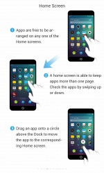
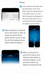
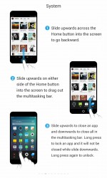
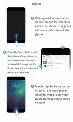
Overall the experience with the phone was just ok. Not overly enamoured with it but where it excelled was it’s use of the capacitive button. This really made the device easy to use throughout the day and left me wishing other manufacturers who insist on using capacitive buttons move to a more functional capacitive button such as this. As can be seen below in screenshots from the user manual installed on the phone (another nice touch many other manufacturers should adopt) the capacitive button can be used for gestures as well as the usual tapping.
- Single tap on the button will take the user to the home screen
- Double tap the home button and the music player is launched
- Long press the button and the display is turned off and phone locked
- Swipe up from the button into the screen goes back a step (same as a back button)
- Swiping up from the button while the display is off and phone locked unlocks the phone and turns the display on taking the using to the home screen
- Swiping up from next to the capacitive button into the screen (either side) brings up the recent apps as well as the customisable action bar
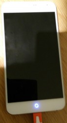
As you can see the capacitive button is a multifunction button which Meizu have intelligently used to make the device easier to use. I found it so easy to get used to using the capacitive button in this way that when I switched back to my OnePlus One with on-screen buttons I found myself swiping up to go back etc. Not only does the capacitive button have all these functions but it also functions as the notification LED, with the ring lighting up as required. If they made this light RGB then that would have been perfect.
The phone itself is borderline when it comes to performance (compared with Nexus 5 and OnePlus One) but when you consider the hardware is now over 12 months old it was acceptable. Add in the beefed up specs of the MX4 running a more efficient version of the OS (based of Android 4.4.4) and I think this would be a great phone for nearly everyone. The user experience delivered by an OS designed specifically for that device is something that many manufacturers fail to capture in the way that Meizu have.
Flyme OS
Meizu have customised stock AOSP a lot with Flyme OS without the over-the-top glariness of some skins. While there were some minor slow-downs when using the phone the OS itself had a pleasant feel to it and left me feeling like it was a pleasant user experience. Flyme OS is basically a custom rom without the experimental quirkiness of a custom ROM which is just as well as Meizu do not offer the source for Flyme OS so if custom ROMs are what attracts you to a phone then this may not be the phone for you.
My main reason for testing out this OS was to see just how different it was to a stock Android experience. We often dismiss Chinese versions of Android and I have no idea why. Do we still expect them to be cheap and poorly made that many of the earlier devices out of China were? The bigger Chinese manufacturers are now among some of the biggest phone manufacturers in the world with Xiaomi ranked number three in recent times. How is a Chinese version made by one of these big companies (Meizu, Xiaomi, Oppo etc) different to those made by Korean companies (LG, Samsung)? One main difference I can see is that the Chinese tend to only sell to the Chinese population and thus have very little reason to release the source code for their kernels (as they are actually required to by international law).
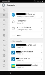
To run Flyme OS to it’s full potential you do need to create and log into a Flyme account. Is this a problem? Surely if the NSA have the ability to read everyone’s email don’t you think the Chinese government could too? If you have a problem with this you can use Flyme fairly well without creating an account. Root access and the use of their theme market and music store do require a Flyme account though.
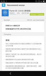
The version of Flyme OS I tried was the Chinese v3.0 which is based on Android 4.2. Flyme 4.0 which comes with the MX4 is based on Android 4.4.4, a nice little bump. Last week Meizu teased users with Lollipop reference so an update may not be far away. Although Meizu do release experimental weekly builds they tend to not update the version numbers of their builds, instead cherry picking things they want. Now rumours have surfaced with Flyme OS being updated to Lollipop by the end of November which seems ambitious considering the Nexuses are yet to receive final 5.0 updates but certainly something I hope they achieve. It is good to see all these manufacturers scrambling to release Lollipop in a timely fashion.
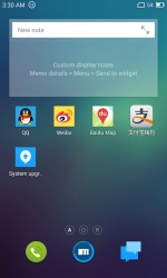
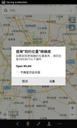
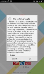
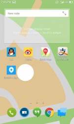
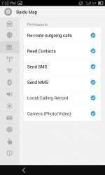
The international version of Flyme OS is still stuck on Android 4.1.2. It seems that the international are a low priority for Meizu and to be honest why would they be otherwise? In China there is certainly enough people to buy enough phones to earn themselves a tidy profit. Once English is selected upon setup the amount of Chinese in the Chinese version is minimal. There are still a few apps that are in Chinese and what they were for I have no idea but I didn’t feel that my experience with the OS was lacking at all without these apps. The apps in Chinese were QQ, Weibo, Baidu Maps and are easily uninstalled.
So what is Flyme OS actually like? I liken Flyme OS to a cross between MIUI custom ROM (and now of Xiaomi fame), LG’s Android skin and stock Android, and not in a bad way. Meizu have done a great job of customising their OS to their hardware, especially the capacitive button.
The differences are in the way Meizu have made the UI appear. Under the hood and throughout the OS all the main staples are still there, just often in different places.
Turn the phone on (with a swipe up from the capacitive button) and if you have a security code present you can then automatically go to the camera as in standard Android. On Flyme 3.0 there is no shortcut for the camera on the lockscreen when there isn’t any lockscreen security. Flyme 4.0 brings gestures to the lockscreen where you can set a gesture in each direction to do something different- open camera, open a user defined app etc. The lockscreen code can be swiped from number to number (for some reason there isn’t the Android pattern lock) and thus the lock code can act as either.
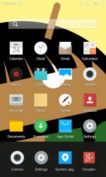
Upon unlocking the phone you are greeted with the launcher. I have been fairly harsh on all manufacturers for phones I have reviewed for their launchers. I am not going to make an exception with Flyme and Meizu. For a company that has put so much work into customising the Android experience for Flyme the lack of time spent on the launcher is astounding. The lack of options with the launcher is disappointing. There are none. There are even less than with the Google Now Launcher. A note for the manufacturers out there: It’s not that hard. There are many open source launchers out there where you could easily fork their code and put your own spin on it. A launcher is the home screen of Android. The place where users spend a bulk of their time on your device (especially when you remove the app drawer as Meizu have done, as have many other Chinese manufacturers). Make it a pleasant, customisable experience. Let the user make the phone their own.
First use of the phone may leave you wondering how to navigate the system with only a single capacitive button. The capacitive button is a full multifunction button. As stated above in the description of the phone the capacitive button can function as the home button, back button, recents button (next to capacitive button), and power button. Ingenious in my opinion. When my friend told me about this button the first time he used it I was not impressed. To understand how useful it is you really have to try it. Imagine if HTC had made their black bar across the bottom of the HTC One a useful capacitive bar instead of a waste of space.
Swiping up next to the capacitive button (either side) brings up the recent apps. Then a swipe to the left on these recent apps reveals older recent apps and to the right reveals a customisable action bar which includes a display brightness slider, a settings shortcut and then spaces for four user-customisable shortcuts.
This capacitive button and associated shortcuts and software are nice enhancements to the Android UI and definitely improve the user experience. Those manufacturers who insist on including capacitive buttons (and those who include non-capacitive buttons) should look at the Flyme OS software implementation of their single, unobtrusive capacitive buttons and think about improving their users’ experience with their devices.
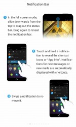
Flyme 3.0 does not include the quick settings that are present in the modern Android UI. Instead they opt for the older custom ROM implementation of a quick shortcut bar in the notification shade. These are the standard shortcuts such as turning wifi and bluetooth on or off etc. The shortcuts cannot be added to or subtracted but can be re-ordered by long pressing on them. The shortcut bar is scrollable to reach the entire length of it. Within the notification shade the user is also able to change wifi access point or cellular (2G/3G/auto) mode. The KitKat style quick settings are included in Flyme 4.0.
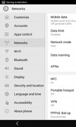
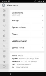
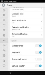
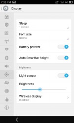
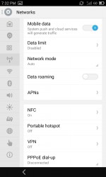
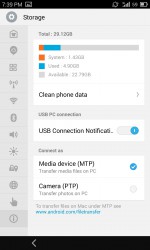
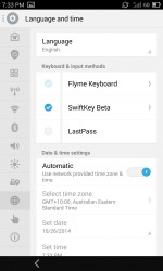
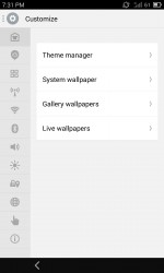
Flyme OS displays the phone settings differently to stock Android. There is a panel along the left hand side of the page that is expandable so you can view the title for each icon. Tapping on each icon reveals the contents of that subsection within the panel on the right. A few of the contents are in different places and of differing importance (proximity to the top of the menu) when compared with their positions in the stock Android settings.
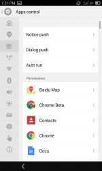
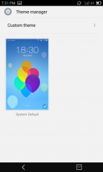
As with most custom ROMs Flyme OS keeps most of its customisations within the settings of the device, intermingled with the stock standard Android settings. First you have the Customize settings where you will find a theme manager along with wallpaper settings. The next main difference is the Apps Control sub-section where the user can turn on or off the notifications for each and every app installed. You can do this with stock Android but I like how Meizu have set it out in it’s own section (much like iOS). This Apps Control sub-section also has controls for controlling the Dialog of apps and whether an app will auto-run at boot or not. The sub-section doesn’t end there. Meizu have also included permission control where you can deny or allow permissions, something I think should be included in all Android versions put out by all companies, not just the standard custom ROMs. Google have stated that the reason they don’t include it is because it can break some apps from functioning as they are designed to.
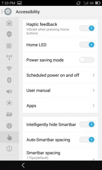
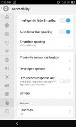
Within the accessibility settings is where Flyme hides some of it’s gems. Three of these gems are:
- Home LED control (LED controlled within the capacitive button)
- Smart bar settings
- Schedule power on and off
- Proximity sensor calibration
- User Manual
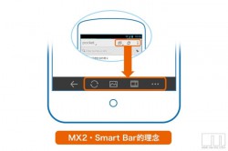
The Smart Bar is Meizu’s answer to finger gymnastics. The point of the Smart Bar is to replace some of the shortcuts normally at the top of apps within this smart bar at the bottom allowing for “increased control over all operations of the device”. They feel that the Smart Bar thus offers “a more natural and more comfortable user experience.” In using the phone I would have to wholeheartedly agree. Although the MX3 is of such a size that finger gymnastics are rarely required I did find that having those shortcuts at the bottom allowed for ease of use.
Within Accessibility you can Intelligently hide the Smart Bar and change the Smart Bar spacing. In other words, the Smart Bar is not always present and only shows up when it can be of use. This is something that every single manufacturer should include in a phablet OS in my opinion. I’m saying this while at the same time trying to stretch my fingers, anticipating my Nexus 6 arriving in the mail. People would care less about the size of the display if there was a function such as the Smart Bar present to aid in everyday use of the phablet.
The presence of a user manual sounds trivial but why not? So many new users to Android are often overwhelmed. A simple user manual like this makes a huge difference, especially with all the customisations Meizu have included. The user manual demonstrates the use of the capacitive button and around it as discussed above.
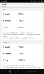
The music app is where Flyme OS becomes what people have expected from Chinese manufacturers in the past. Without paying a single cent, just by logging into your Flyme account, you have full access to streaming music of any and pretty much every music you could throw at it. You can set it to download the music as well for a small fee of a VIP account. The VIP fees are shown below in the screenshot and include the ability to download and stream full FLAC. Not sure how they get away with this given the political influence the recording studios and their parent companies have. The music app itself is very nice and Meizu have put a bit of work into it and have produced an easy to navigate, useful app, not one that needs to be replaced with something from the Play Store as soon as possible.
There is a video application similar to the music app where the user can stream movies and TV shows. I was able to stream every single episode of The Walking Dead from within the app if I wished. Obviously if Meizu ever want to break into the western market they will have to do away with this sort of thing unless they can come to an agreement with the music and film industries. While Meizu do not offer the full music and video subscriptions on the international ROM you would have to suspect that they would not be happy with a manufacturer offering this anywhere in the world.
Why wouldn’t you buy a Meizu phone running Flyme?
There may be issues with warranty in buying this phone. If you buy from one of the big name websites it will undoubtedly be a better experience than some of the more shady websites but getting a Meizu phone fixed under warranty could be an issue.
Installing the Google apps and Play Store on the phone was not a simple process and may scare some people away. There is the option of using the international ROM instead which does not include all the music and video “enhancements” and runs a very old version of Android. The international ROM does include the standard Google Apps though, including the Play Store.
If you have issues with using the phone who do you turn to when the phone’s users are predominantly Chinese? Luckily this can be covered by a simple Google search. Meizu have created such a big following these days that there are a heap of willing and able English speaking users who will help you out on their online forums.
Why should you buy this?
The OnePlus One has created a lot of hype and publicity through being cheap and hacker friendly. While Meizu do not provide the source for their kernel they certainly make it easy for users to obtain root access on their phones and they certainly do tick the box for being cheap too. One could argue that they may just be a better bet for a phone than OnePlus due to them being an established phone manufacturer with proven experience at producing solid phones that work as they should.
Flyme OS is basically a custom ROM à la CyanogenMod. While is may stray further from the AOSP line than CyanogenMod it still offers many options for the user, including installing a third party launcher to replace the dog that they call a launcher. The hard work with the ROM is done by an official party and released every two weeks meaning it is more likely to be stable than the average ROM found on XDA.
The MX3 is a solid phone and apparently the MX4 is even better with Flyme OS becoming more mature as well. Once they update it to Lollipop I have no doubt that the MX4, with all of its hardware and software customisations will be a great phone. For the average Joe Blogs I cannot recommend Flyme OS unless they have a friend who is an enthusiast who can help set it up in the first place (unless they are happy to run an outdated version of Android that will include the requisite Google apps) but for a phone enthusiast I can certainly recommend the Meizu phones and Flyme OS as a combination worth considering for their next daily driver.























Very balanced review. I am thinking of the Meizu MX4 or Xiaomi Mi4 for the wife early next year. I think Chinese mobiles will be worth watching in the next few years