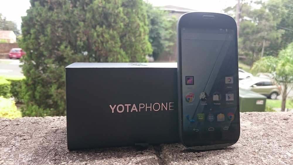
While the original Yotaphone was nothing particularly exciting back in January 2014, it did introduce a new concept for Android mobility — the inclusion of a second screen. We find second screens in many aspects of life now, with many office workers and creative types having discovered the benefits of two (or more) screens quite some time ago.
On a mobile phone, this is a bit new. The original Yotaphone tried this with a secondary eInk display on the rear of the phone, and while that was fairly revolutionary, the benefits were quickly outweighed by what was otherwise a fairly lacklustre device.
Fast forward to present day, and the Yotaphone 2 rewrites a bit of history. Gone are the fairly ordinary specifications, and present are some which are pretty decent. Gone are awkward gestures required to operate the rear screen, and today it operates just like an Android touch screen. In short, it works pretty well.
- Sound quality is lacking, but you can’t win everything
- Camera is good, but not great
- The price could be considered a bit steep at $859
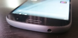
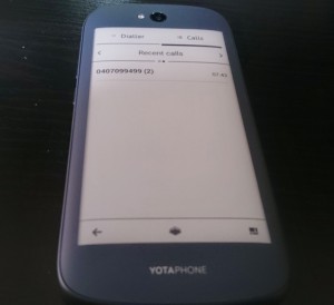
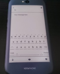
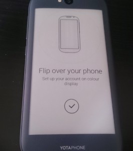
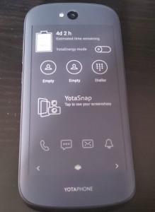
The first thing that struck me about the Yotaphone 2 is its design, the way it looks, and the way it feels. There are no marks — none at all — adorning the front of the handset. There’s a fairly discreet aperture for the earpiece, a front facing camera, and that’s precisely it. It looks every bit deserving of the premium price tag. The glass that sits on the front is flag and edge to edge, with minimal bezels as well. The feel in the hand is elegant and simple, refined. The smooth, flowing curves mean that this is a device that feels every bit as comfortable to behold as it is to look at. Turn the Yotaphone 2 over, and there’s the eInk display front (or rear) and centre. The muted gray of the plastic on the rear of the phone blends almost seamlessly into the eInk display, making it look as if it is just meant to be there. The back of the Yotaphone 2 is curved, slightly, but it isn’t unpleasant to look at, and does make it rather comfortable to hold. The flat front of the phone does make it a tad awkward to hold rear-facing for extended periods, but you quickly get used to it, and it’s no longer an issue. Underneath its clothes, the Yotaphone 2 has a magnesium chassis with a glass-fibre reinforced plastic outer surface. Both panels also feature Corning Gorilla Glass 3, which will prevent all but the most determined keys and coins from scratching up the displays. If you’re extra concerned about what you’re throwing at the phone, a rubber bumper is available from Yota as well. Taking its measurements, the phone is just 8.95mm thick at its best, 144.9mm tall and 69.4mm wide, with a net weight of 145 grams. The phone compares well with the Nexus 5, for those who are familiar with that device, as the two are of similar size and weight. Considering the Yotaphone 2 has two screens instead of one, the fact that it sizes favourably next to many other popular 5″ phones on the market. Around the edge of the phone are a 3.5mm headset socket at the top, a standby/power button and volume rocker at the right, a micro-USB port on the bottom surrounded by two speaker grills (even though there’s sadly just one speaker in there). You might have noticed the omission of a SIM card tray. You’re right. There isn’t one. Well, there is, but it’s very well hidden, and this makes for an even more polished look. You see, the Nano SIM which the Yotaphone 2 takes is inserted behind the volume rocker. What? That’s right — using the SIM removal tool, you pop off the volume keys, and behind that is where the SIM card goes. On the downside, it does make the volume keys a little mushy, but not overly so. I think it’s a brilliant idea. The Yotaphone 2 is powered by a slightly dated Snapdragon 800 CPU, running at 2.2GHz paired with an Adreno 330 GPU. While it isn’t the newest CPU on the market (we’re presently seeing the 810 as the top of the line, and most of 2014’s flagship phones used the 805), the Yotaphone 2 keeps up admirably. For the purposes of recollection and memory, the phone has 2GB of RAM and 32GB of storage respectively, which is bang on the middle of the market. 3GB of RAM would be nicer, but a phone like this doesn’t really need it. 32GB of on-board storage is definitely a premium feature in a market dominated by 16GB standards. Other reviewers found the Yotaphone 2 suffered from keyboard lag, commenting that trying to type resulted in lag which queued up characters for input, and sometimes led to the keyboard mistakenly thinking you were trying to enter text by swyping when you weren’t. I have to say, I didn’t find any of these issues when using the keyboard on the model supplied to Ausdroid, but it is entirely possible that a software bug has been squashed behind the scenes. Typing on the eInk display was a bit more fiddly, but really, that’s to be expected. It’s not designed for heavy text input, and while you can type on it, it’s not recommended for more lengthy efforts. Everything else is fluid and snappy; switching between apps, loading apps, installing apps… there’s really nothing major that slows the Yotaphone 2 down, and I think we’re reaching that point in 2015 where, unless a phone is plagued by inexplicable lag, there’s really little point commenting on performance anymore — phones these days are as powerful as (if not more so) than many desktop and laptop computers, and lag just isn’t a factor across the board anymore. The two displays incorporated into the Yotaphone 2 are brilliant. On the front, there’s a well-lit 5-inch full HD (1920 x 1080) AMOLED display, which gives an effective pixel density of 442 ppi (very crisp!). For those who appreciate the finer details, white balance is neither warm nor cold, resulting in a nice natural feel. Others have commented on a slight green hue to the display, but I can’t say that I’ve noticed anything of the sort. Viewing angles are impressive, getting close to 170 degrees in all directions before the screen becomes hard to make out. Of course, you don’t really care about the front screen, do you? We’re all about the eInk here! It’s the killer feature for the Yotaphone 2, and while there are some quirks, it’s definitely well implemented. Smartphones use a lot of juice to power their displays. The average phone user probably consumes more battery power by having their display turned on than by any other phone process. Having a 4.5″ eInk touch screen on the back of the phone, which only draws any power at all when it refreshes, is going to make a huge impact on screen battery usage. At 4.5″, the eInk display is more than capable of use for web browsing, reading emails, messages or books, or even composing brief messages, emails, or dialing phone numbers (yes, you can do all of that). The panel is 960 x 540 in size, and allows 16 levels of grayscale display. It refreshes surprisingly quickly, and while the touch response is a little slow, it works very well. Two displays on a smartphone is something that takes some getting used to, but it does come fairly quickly once you have a bit of an explore. The more you use the eInk (and conversely, the less you use the front screen) the longer your battery life can be. Yotaphone reckons this can be measured in days rather than hours, with the on-board energy saver claiming upwards of 3 days of battery life when the eInk display is primarily used. This would be quite easy to achieve, if the eInk display were more responsive and refreshed more cleanly than it does, but even still, you can cut out the front display for a lot of mundane tasks — checking the time, reading an SMS, dialing a number, reading an email, even browsing a web page all can be done without activating the front display at all. Like any eInk display, the Yotaphone 2 panel is good, but it can be slow to register touches, and slow for those touches to take effect. This isn’t a delay on the processing side of things, rather just the nature of the eInk display technology used. As the display doesn’t 100% refresh with every screen change, you can be left with artefacts on the screen from time to time, though these hardly impact the usability of the phone. Such is the quality of the display that I tried to kill it by watching a YouTube video on the rear of the display. Amazingly, it didn’t kill the display at all. In fact, besides the display being black and white, watching videos was not too challenging at all. I tried it out with Peppa Pig and the Terminator Genesys trailer, and frankly I was astounded. Obviously a 16 gray scale display can’t handle live motion video all that well, especially when its eInk and not a real display, but I am reminded of what it was like watching cutscenes on the original Nintendo GameBoy. It’s a little clunky, but my goodness I’m blown away. Others have claimed the rear display really isn’t up to playing games or watching videos, and I don’t think that’s fair. While you’d have to be certifiably insane to want to game or play videos on the rear display, you certainly could if you were so inclined. Cartoons obviously work better than live motion video, but hey. Peppa Pig was quite watchable (even if the show itself is rubbish). Where the rear display really excels is for consuming content. Want to catch up with the news on your way to work? Reading a good book? Reading a lengthy email? This is where eInk comes into its own, and the battery life savings really can be realised. It’s not a clunky proprietary interface either; the same Android OS that you use on the front display you use on the rear, and it’s very intuitive. Yotaphone have done some amazing things behind the scenes to make the eInk display work as well as it does with Android, and frankly I’m surprised that we haven’t seen more of this technology used elsewhere. I can imagine that such a display would work incredibly well on a phone designed for rugged outdoor use; not only would it extend the battery life significantly, but in an environment where fast screen performance might not be required, but legibility in bright sunlight will, eInk makes good sense, and could be used to incredible effect on more phones than just this. I quite like my crisp audio on my phones, and I’ve enjoyed what the HTC One (M8) and Sony Xperia Z3 have done with stereo front facing speakers. Going from that relative luxury to a single side-facing loudspeaker is a bit of a drop, but one must compare apples with apples. The audio isn’t great, but it isn’t unacceptably bad either. Battery life is a bit more impressive, though. First, the inclusion of a 2500mAh battery in a phone at this level is about right. It’s not a flagship with a 2300 mAh battery, but equally it doesn’t get close to the 3000’s that we’ve seen in some of its competitors. That eInk display should make a bit of a difference, and so it does. Flat out, the Yotaphone 2 runs for just shy of four hours when playing a video over and over, and in average day to day usage, the working day is easily covered with eight to nine hours of solid performance. Of course, the more you use that eInk display, the more you can get, up to an impressive three days or so if you almost exclusively use that instead of the front display.
Design
Physical aspects
Hardware and Performance
Displays
Having two displays
Sound and Battery
Camera and Photos
The Yotaphone 2 camera is an 8MP shooter, which places it squarely in the middle of the road; some smartphones have significantly better cameras, and some cheaper phones have significantly worse. However, for the price, the Yotaphone 2 camera probably could be a little better.
That said, I don’t mind the Yotaphone 2 camera. The software interface is decidedly vanilla Android, so much so that it uses Google’s camera app. Taking photos is a simple point and click affair, and there’s no surprises or bells and whistles.
The one feature, if you can call it that, is that when the camera app is active, the eInk display on the rear of the phone displays either a cursive ‘Smile!’ banner, or alternatively, a black and white depiction of an old-fashioned camera. It’s cool, but if you’re the type wanting to take subtle photos, it mightn’t be for you.
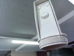
As you can see in the sample photos above, the camera performs well indoors and out, and does decidedly good work with macro (close focus) shots, as you can see on the power point and frangipani photos.
Not a brilliant camera, but certainly not terrible.
Sofware
This feels like it’s becoming a redundant part of an Ausdroid review unless we’re looking at phones from OEMs that customise things heavily. Android phones these days fall into two categories. Those offering a plan, vanilla-like experience (Nexus phones, Sony phones to an extent, Motorola, and others) and those which use a more customised experience on top of Android (such as HTC with Sense, Samsung with TouchWiz, LG, and others).
Neither is really better than the other, but people definitely have their preferences. I prefer vanilla, untouched Android, but it isn’t perhaps as user friendly as some of the 3rd party additions offered by the big names.
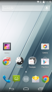
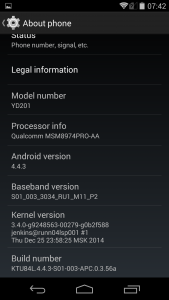
Yotaphone 2 goes with the vanilla approach, running Android 4.4.3 KitKat out of the box. It isn’t the latest, but it’s as close to stock as you’re likely to get on a phone that isn’t a Nexus. The phone does receive a software update out of the box, but it only provides a minor update leaving the phone at Android 4.4.3. Yota do promise an Android 5.0 Lollipop update for the phone at some point in future, but no specifics have been given.
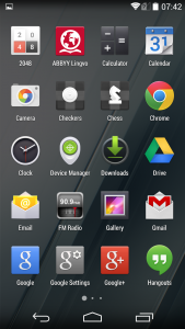
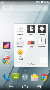
There are few apps pre-installed on the phone, but all can be removed. YotaRSS is a Feedly-connected RSS reader, and there are a handful of games which are fun to play on the eInk display, including Chess, Checkers, Sudoku and 2048. There’s also an eBook reader in the form of Yota Reader, which can handle ePub and Text files, but not PDFs surprisingly.
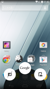
You’d think that’s a bit of a limitation, but Yotaphone 2 doesn’t restrict you to using Yota’s apps to power the rear display. You can fire up YotaMirror (via a simple swipe up from the Home on-screen button), and then access any app you like via the rear display. Not a fan of Yota Reader? You can use Play Books or Kindle Reader on the rear display just as easily. Apps don’t need to be designed for the eInk display to use them, or to use them well.
YotaSnap is a curious app, which takes a screenshot then immediately displays said screenshot on the eInk display. Why you’d want to do this is beyond me, but nonetheless it’s there.
YotaEnergy is the more useful of the included apps, which is a clever battery saver mode that uses the eInk display to maximise battery life in a way that other smartphones can only dream about. Various functions can be dialed back, limiting CPU frequency, turning off wireless radio, lowering brightness and more. If you’re in a pinch and really need to save power, flick this on, and 10% battery life can easily be extended to last over six hours.
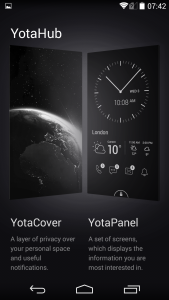
YotaHub offers YotaCovers and YotaPanels. Yota everywhere. Buzzwords aside, YotaCovers basically gives you the option to display an image of your choosing on the always-on eInk display if you want a bit of privacy about what’s displayed while you’re not paying attention. YotaPanels offers configurable widgets which you can add to the eInk display. There aren’t too many options, but there are adequate options to make good use of the display.
Pricing
This ordinarily wouldn’t receive its own heading, but it’s something to bear in mind when considering the Yotaphone 2. At $859 AUD, this is not the cheapest phone available, and there are some good competitors available in that price range which may make the Yotaphone look decidedly less desirable.
For that price, all of 2014’s flagships are accessible, and even upcoming flagships for 2015 are likely to be around the same ballpark. Granted, you get a very impressive and premium-feeling phone for that price, but it does feel a bit expensive, even if there is the value of the second display included.
The letdowns include a fairly modest camera and audio capabilities that really aren’t very impressive. Throw in a slightly slower, older Snapdragon CPU, and all of a sudden the Yotaphone 2 really just isn’t up there where its price demands.
Sure, for that price, you do get a phone with two displays, and the potential for multiple days of battery life in ordinary usage (if you can call juggling two displays ordinary). On the flipside, you could easily spend a little over half and get a more powerful, better all-rounded phone.
For a phone that is so well designed and so enjoyable to actually use, that price is just a disappointment. I’d rather see it about $150 cheaper to really drive adoption. Yota really are pushing this phone, with availability across Europe, Middle East, the Americas and now Asia as well.
I want to love it, and I do, but I want other people to love it too. At that price, I don’t see it getting the love it otherwise deserves.
Yotaphone 2
- Dimensions: 69.4 x 144.9 x 8.95 mm
- Weight: 145 g
- SoC: Qualcomm Snapdragon 800 MSM8974AA
- CPU: Krait 400, 2200 MHz, Cores: 4
- GPU: Qualcomm Adreno 330, 450 MHz, Cores: 4
- RAM: 2 GB, 800 MHz
- Storage: 32 GB
- Display: 5 in, AMOLED, 1080 x 1920 pixels, 24 bit
- Battery: 2500 mAh, Li-Polymer
- OS: Android 4.4.2 KitKat
- Camera: 3246 x 2448 pixels, 1920 x 1080 pixels, 30 fps
- SIM card: Nano-SIM
- Wi-Fi: a, b, g, n, ac, Wi-Fi Hotspot
- USB: 2.0, Micro USB
- Bluetooth: 4.0
- Positioning: GPS, A-GPS, GLONASS
The thing I read about the Yotaphone 2 which completely and accurately sums up my thoughts is this: The Yotaphone 2 is a great phone, a great device, but without that second display it’d be nothing. It’s a basic handset with few bells and whistles, and a middle-of-the-road camera and audio capabilities. Besides the second display, it doesn’t offer anything new or innovative. To really nail this feature and drive widespread use and enjoyment, the rest of the phone needs to be equally as impressive.
If the Yotaphone 2 had a better camera, stereo sound, Android 4.4.4 out of the box and a timeframe for upgrade to Lollipop, paired with a Snapdragon 805 or even 810, I’d be all over it like a rash, whether it was $759 or $859. In other words, it’d justify that premium price, and match a premium feel with a premium offering.
The eInk display is unique and beautiful, and works surprisingly well across a number of usage cases. It’s fantastic having this option on a phone, and I find myself wishing that other phones I have and use had this feature as well. The ability to read emails and content without powering up a thirsty colour display is a great one, and opening up this display a little further to 3rd party developers would be a fantastic move by Yota.
Despite these niggles, the phone is otherwise close to the top shelf. It’s beautifully designed and constructed, and it works incredibly well as a package. It’s fast, snappy, and enjoyable to behold, and that extra usability which the rear screen offers is definitely a unique selling point.
Would I recommend it? Yes, with reservations. Except for that price, the Yotaphone 2 is a great device and one which would look equally at home in the hands of a commuting student as well as a busy executive. A premium looking phone with great usability is a good combination, but it’s just a tickle too expensive.
As I’ve said before, $759 feels like the right price-point for the Yotaphone 2, and until/unless they can approach that, I fear it won’t be a big seller.
Ausdroid reviewed the Yotaphone 2 as supplied by Expansys AU, and you can buy your own for $859 (at the time of writing).





If someone made a tiny, entry level phone with ONLY eInk display, I’d totally buy it. Hell, I’d buy several.
The question that comes to my mind is why didn’t Yota go for 64GB, since as OnePlus revealed the price for storage doesn’t change whether you use 32GB or 64GB.
Good review. Although I wonder if this eInk idea is more of a novelty which can wear off after a while, making the user wonder on what the hell he or she has spend their money on.
4hrs constant video on an amoled display isnt good