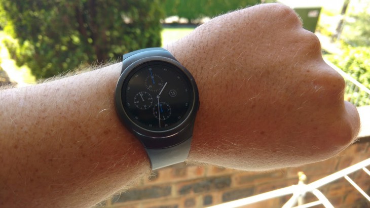
This isn’t Samsung’s first rodeo when it comes to smartwatches, and after some interesting creations in the past, Samsung has taken a clear leaf out of Android Wear’s book (and probably a bit from Apple Watch’s book too) in designing the Gear S2. Gone are the square or rectangular attempts of yore, and in their place is a round-faced smartwatch that actually looks and feels fantastic, and despite it running a proprietary operating system, there’s a lot of potential here.
There’s a lot this watch can do that an Android Wear watch can’t — such as on-screen typing and interaction beyond a simple side button — but there are a few areas where it really is left a little wanting.
Let’s take a look beyond its good looks and its promise, and see what makes the Gear S2 tick.
Here’s our quick video walkthrough, and you can read the details below:
What we like about the Gear S2
That bezel, yo.
The first thing you notice on using the Gear S2 is the rotating bezel. It’s been used on watches for decades, as a way of showing an alternate timezone, operating a compass or more, but smartwatches haven’t — as yet — featured anything much more than a button or touch interface. However, touch isn’t everything, and the rotating bezel on the Gear S2 is quite striking.
Somewhat similar to the Apple Watch’s digital crown, turning the bezel allows you to scroll through the user interface, scroll messages, and flick through menus without blocking the screen or needing to swipe on what is — sadly — a rather small display.
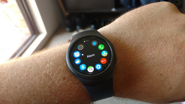
Better yet, the bezel has a satisfying click when turned, and the version of Tizen (Samsung’s proprietary accessory operating system) looks like it was clearly designed for this interface method. While the bezel is cool, there’s one thing it lacks; there’s no ‘Select’ or ‘Enter’ button .. while you can scroll with the bezel quite easily, selecting something still requires a tap on the screen. As you can see in the photo above, the apps screen has a circular list of what’s accessible through the watch, and you can use the bezel to move the cursor around to each app …. but you can’t click on them. You have to touch the screen, which makes me wonder why the bezel is used at all for this (and other) interfaces.
Think of it more as the wheel on your mouse; good for scrolling around, but you need (and the Gear S2 doesn’t have) a left mouse button to actually select things.
There are two buttons, but they don’t quite do what you’d expect. The top operates as a back button, and it works the same as every other back button I can think of. The lower button is a home button, and it takes you back to the watchface from wherever you are. A double tap on the home button has configurable options that you can set to opening the weather, setting a new alarm, or whatever other activities might be installed.
Notifications
We’ve become so used to notifications on our phones, tablets, and even our TVs now that not having them on a watch seems wasteful. Though the Gear S2 runs Tizen, and doesn’t have a huge amount of developer support for 3rd party apps just yet, it does interface rather well with Android’s notification system, including the new actionable notifications, so it keeps pace with Android Wear there.

If an email comes in, you can archive, delete or read it from your wrist. If you get an SMS, you can ignore it or reply, using your voice or a keyboard (see below). You can even get Google Now notifications on your wrist, but they’re not as frequent as they are with Android Wear (a good thing, maybe?)
On-screen keyboard … on a watch
When I found out that the Gear S2 has an on-screen keyboard (I didn’t know that this was in last year’s Gear S as well), I immediately thought it was a joke, but it isn’t. Not only is it not a joke but it actually works kind of well, too! Unlike Android Wear, where you can respond to a notification (SMS, email or whatever) by using your voice, or selecting a canned response, the Gear S2 allows you to respond with a third option — the on-screen keyboard.
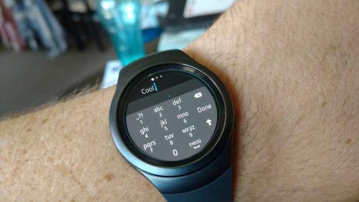
It’s not something you’ll want to use often, because it’s like typing a text message on an old T9 Nokia phone, but it is a fantastic alternative to having to take your chances on Google’s voice recognition. If you’re wanting to tap a brief response without talking to your phone, you can do that, and fairly subtly too, with no need to pull your phone out.
Battery life, alert notifications, and more
Already we’re finding that the Gear S2 battery life is pretty impressive, even with the screen always-on enabled. Samsung’s estimate is that the phone will go two to three days between charges and what we’re seeing confirms this. After 24 hours off charge, the battery is down to around 40%, and that’s with the screen on. Turn off the always-on option, and the Gear S2 could easily last into a third day.
Not that charging it is a major hassle. There’s no USB cables to plug in, or pogo-pinned chargers to worry about. Like the Moto 360, the Gear S2 has a magnetic wireless charging dock. Just sit the watch on it, and it charges quickly.
Vibrating alerts are handled well too; some Android Wear watches are very loud when they vibrate, to the point of being more annoying than they are useful. The Gear S2 has a less obvious, subtle pulsing vibration to let you know something’s happening, and you can adjust the notification four ways; strong or weak vibration, and long or short vibration length. I’ve found that the weak setting, with long buzz, is the best way forward; it’s not loud enough to hear, but you can certainly feel it. Something I’m sure many smartwatch users will appreciate, instead of being told to “shut that thing up” because it buzzes too much!
The Gear S2 can of course do many other things that smartwatches do; you can start/stop/change music playback on your phone or connected device, you can check the weather, you can set an alarm, check your heartrate, or look at your upcoming schedule. This is all laundry-list stuff for a smartwatch, and really doesn’t deserve too much time; it works, it works pretty well.
It’s easy to say that the Gear S2 is doing a lot right, and that’s because it is. It’s an unassuming, sporty looking thing with enough usability to keep your phone in your pocket just a bit more.
However, there are a few things that aren’t quite so good.
Where the Gear S2 could do better
Third party app support
Developers are focusing their smartwatch efforts on Apple’s Watch, Android Wear, and a little bit on Pebble. Tizen really doesn’t have that much market share, and it has the corresponding amount of developer interest, i.e. close to none. Samsung can’t really do an awful lot to improve this, because developers will support it if, and when, they want to.
My Android Wear watch has a number of third party apps which are quite useful, such as CommBank to show me account balances, FlightRadar 24, Google Keep, PayPal, Remote Control for the TV, Todoist and Google Translate.
The Gear S2 has precisely none of those.
Granted, I don’t use the Android Wear versions of those apps very often, except for the TV remote which is very handy for turning off the telly if I’ve walked out and accidentally left it on (it works over WiFi, so it has a fair range outside the house).
The Gear S2 doesn’t give me the option. The built-in apps are pretty good, and allow me to do most of what I could possibly need to do from a smartwatch, but there are limitations, and being a small part of the global smartwatch market, and being released in a smaller share of that market (Australia), we’re unlikely to see the likes of CommBank coming up with anything for the Gear S2.
It’s not a really big issue, because apps on the watch really don’t mean much to most people, but it’s an issue nonetheless.
You can’t easily set a reminder
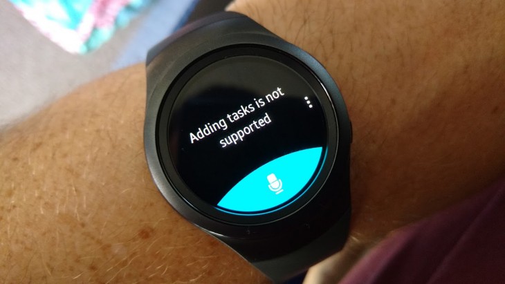
Android Wear is cool because — amongst other things — you can ask it to remind you to do something at x time, or in y minutes, and it’ll do just that.
Ask the Gear S2 to do something that Android Wear could manage (e.g. “Remind me to get up and stretch in 15 minutes”) and you’ll get told that “Adding tasks is not supported”. It’s really annoying, and something that smartwatches are (and probably should) be rather good at.
Of course you can do it the other way, which is setting the reminder on your phone, and that will trigger a notification on your watch at the appropriate time, but it’s just not as easy as it could be.
Phone support is (for now) hit and miss
Samsung says:
“The Tizen software on the Gear S2 has also been designed to provide compatibility to smartphones that run on Android 4.4 and above, with a minimum of 1.5GB RAM and Bluetooth 4.0. Gear S2 smartphone compatibility can be activated on the Galaxy and Android-powered devices via the Samsung Gear Manager app, available in Galaxy Apps or the Google Play store.”
We say that it’s not quite as simple as that. We have a number of phones in the Ausdroid office, so finding one that works with the Gear S2 wasn’t difficult, but it didn’t support our Motorola X Play that we’ve been using for the last little while. Because the Gear S2 requires not one, but three proprietary Samsung apps to make it work (the Gear S2 Manager, Gear Plugin and Samsung Accessory Service), getting it to work on a non-supported device was so annoying as to simply say it just doesn’t work.
On a supported handset, the setup process is easy. The watch prompts you to visit a Samsung website, which in turn redirects you to the Play Store to install the required manager app. Running this pairs the watch to your phone, and prompts the installation of the two other service apps. It’s rather quick and seamless, and once done, the Gear S2 works basically the same way as an Android Wear device.
Getting it working on a non-supported phone like the Moto X Play was a pain in the ass. We had to install the apps on a supported phone, use an APK Extractor to copy those apps to Google Drive, and install those apps on the Moto X Play, manually, one at a time.
What should’ve taken a minute or two took closer to fifteen, but once it was done, there haven’t been any further issues.
If you’re thinking about the Gear S2, make sure you can download and install the Gear Manager app first; if you can’t, be prepared to find another phone that can so you can grab the necessary files.
Conclusion
Between those of us at Ausdroid, we’ve used every Android Wear device that’s been released, as well as a few other platforms and they all have their quirks. The Moto 360, for example, had rubbish battery life when it was first released, though this was later significantly improved through an update.
LG’s Urbane looks like a G Watch R with a lick of paint, and Huawei’s Watch is awesome but the vibrate function is very loud.
The Gear S2 is the same; it has its strengths, its sporty appeal, and it’s arguably better usability than Android Wear. To suggest it could be the smartwatch of the year really isn’t that much of a stretch, given that it takes the best of the two competing platforms and makes its own.
Before we go making those claims, we need to consider the shortcomings too. Lack of third party app support, lack of reminder settings, and the inconsistent setup process could leave some customers a bit confused.
I would easily recommend the Gear S2 to someone looking for a smartwatch, especially if they’re after one that doesn’t look like a smartwatch, or that works a little differently to Android Wear.
The Samsung Gear S2 is available now through Samsung’s Experience and Online Stores, starting at $499 for the standard Gear S2 (pictured in this review), and $599 for the Gear S2 Classic which has standard, interchangeable bands. Ausdroid’s Gear S2 was supplied by Samsung for the purposes of this review.


