The camera that’s also a phone
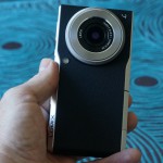
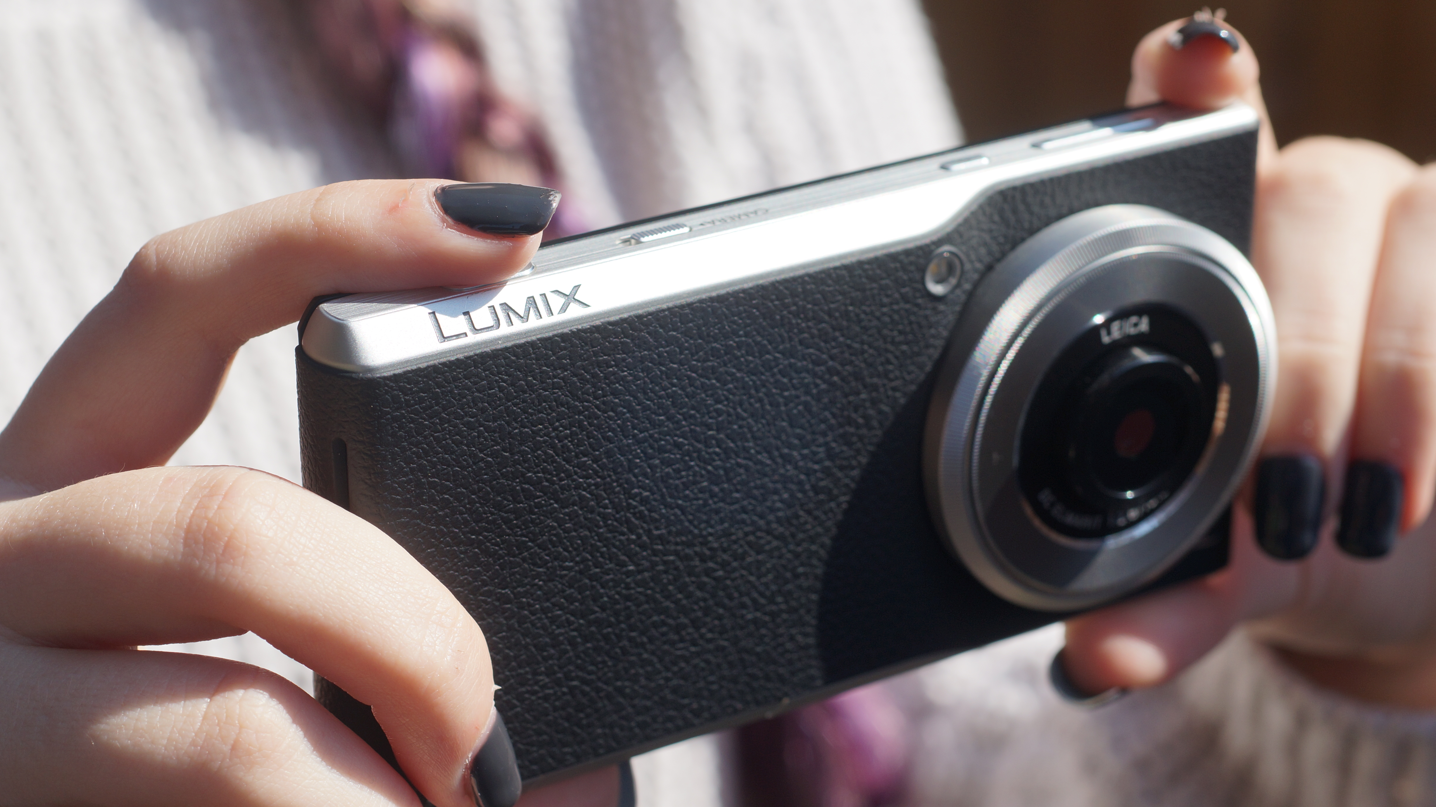
The Panasonic Lumix CM1 is somewhat different to your average smartphone camera. In fact it’s probably better to describe it as a camera that’s also a smartphone. And that’s just what Panasonic seem to be aiming for too. Their Australian online listing calls it a Camera Phone. And with a full 1 inch sensor it’s more than twice the size of today’s flagship phone sensors. That means more light gathering capabilities for better quality images. Add to that a custom 28mm wide angle Leica lens and you would expect both clearer and sharper images than what’s possible on the best smartphones. Finally, Panasonic have their own dedicated ISP on board called the Venus Engine which promises excellent noise reduction, detail preservation and colour accuracy.
Many of the features of a dedicated camera that escape almost all smartphones are possible with the CM1. Full manual control with the dedicated control ring allows adjustments to Shutter Speed, Aperture and ISO. Included are advanced controls such as a 3D level gauge, histogram, manual focus assist and focus peaking to help compose your photos. Both jpeg and RAW capture formats are available, the latter enabling greater editing and post production tweaking of pictures. Of course, there are also full auto modes for those times when you just want to point and shoot.
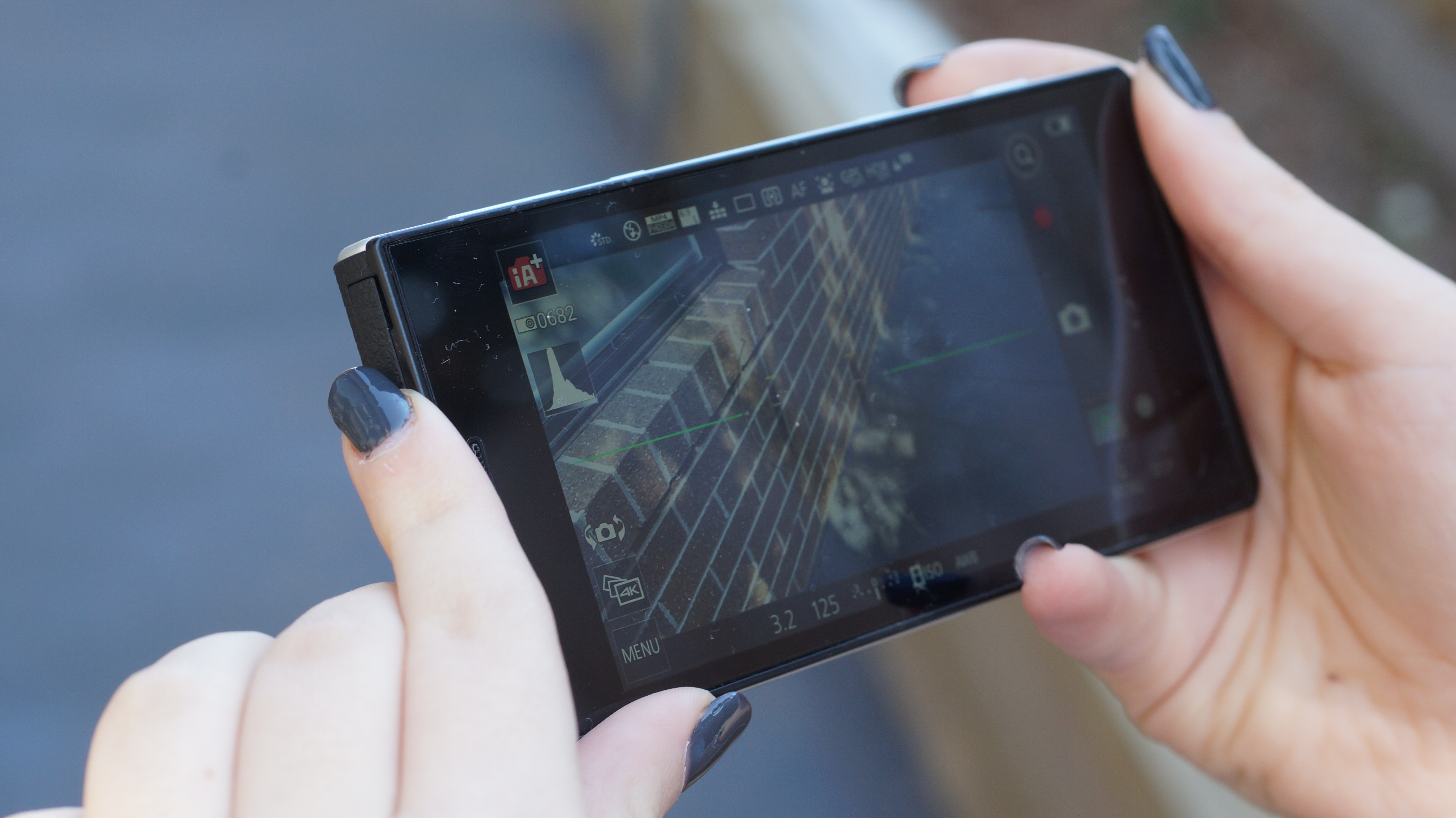
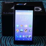
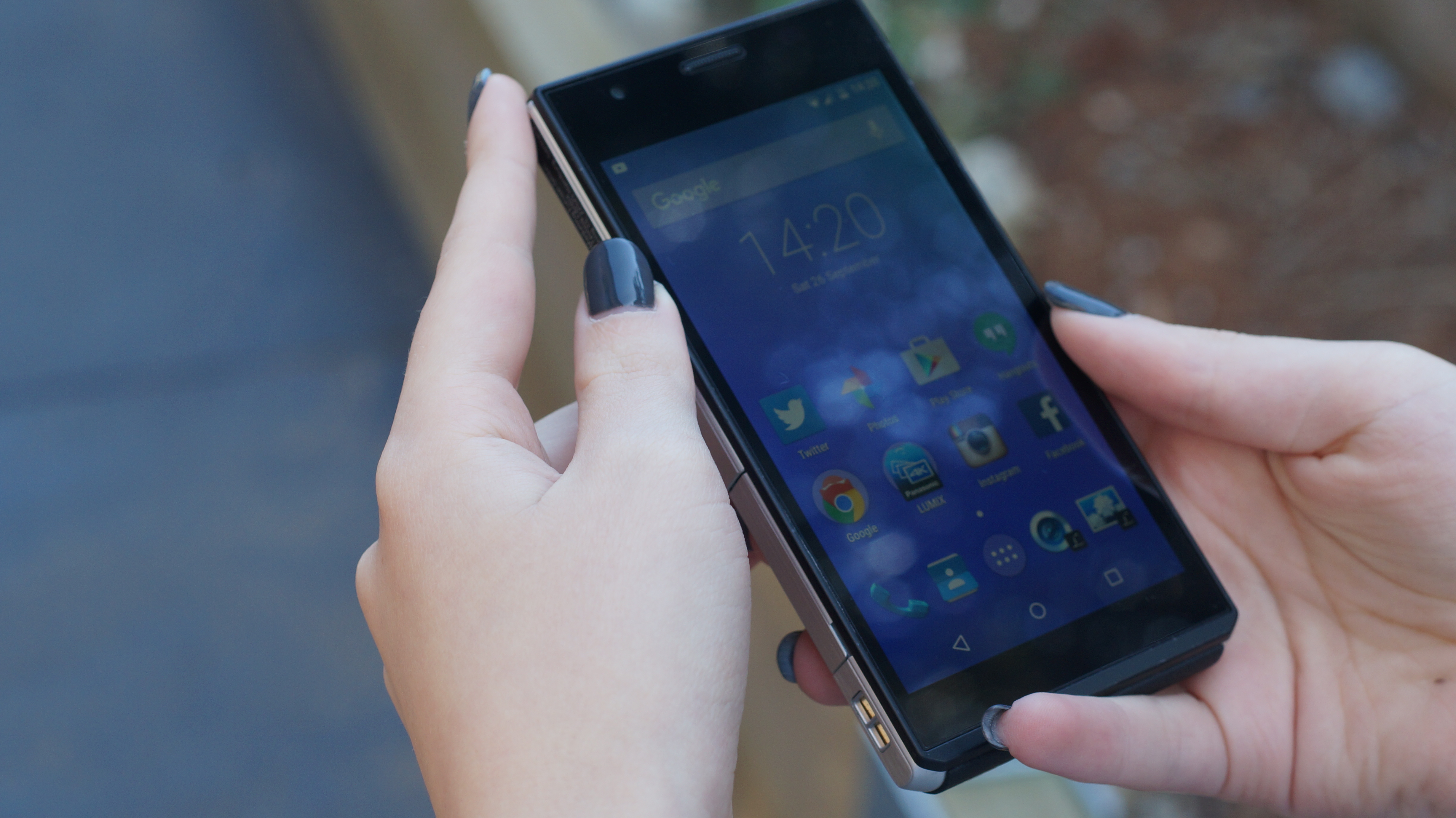
On the phone side, we have a capable Snapdragon 801 with 2GB of RAM driving a 4.7in 1080p LCD display. There’s only 16GB of internal storage but you can (and should) pop in a storage card. The review model is running a clean version of Android 5.0.2 with the only extras being the necessary camera software and a few extra wallpapers and themed icons. Thumbs up Panasonic for not including a bunch of bloatware like most other Android vendors!
- 4K video is only 15fps
- Video is shaky
- Display is hard to read in direct sunlight
- Expensive price
- Future updates uncertain
Hardware
The lens side of the device is made of a practical, grippy material that looks like a traditional camera grip but doesn’t seem to be rubber. It’s likely leather or a leather like substitute. The case tapers at the top and bottom to facilitate using it in portrait as a phone. The taper is appreciated because the body is quite thick at 15.2mm (20.1mm at the lens end) and would be more difficult to grasp without it. The thickness is expected due to the size of the camera. Mind you, it’s nowhere near as big as something like a Galaxy Camera.
The lens ring dial itself has a satisfying clicky feel in use. I found it a little difficult to use because it doesn’t protrude from the body like one on a traditional camera would. But hey, it’s a phone too so you don’t want it to protrude! The external storage card expansion slot sits underneath a flap along the tapered bezel on the lower edge of the lens side of the device. It’s good for up to 128GB in microSDXC format. The SIM card slot also sits under the same flap.
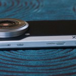
There’s a micro USB port for charging and transferring data at up to USB 2.0 speeds. Along with the headphone port it sits on the right hand edge just next to the lens ring. Along the top edge there’s a volume rocker, power/sleep button, spring loaded camera quick launch switch and a double detent shutter button. The two stage shutter key doesn’t have much travel but the half press for focus and full press for capture are easily to get a feel for. The quick launch switch works well and launches into the full camera UI from anywhere in Android in about second. Plenty quick when you need it, rather than navigating out of apps back into the camera app. I’d say it’s comparable to Samsung’s quick launch feature enabled by double pressing the Home button.
Display
The LCD display is nice and sharp, packing 473 pixels per inch. Just as well because it doubles as both viewfinder and display screen. The colour looks good, not super contrasty but not dull either. It seemed well balanced, suiting the quality of images the accompanying camera can capture.
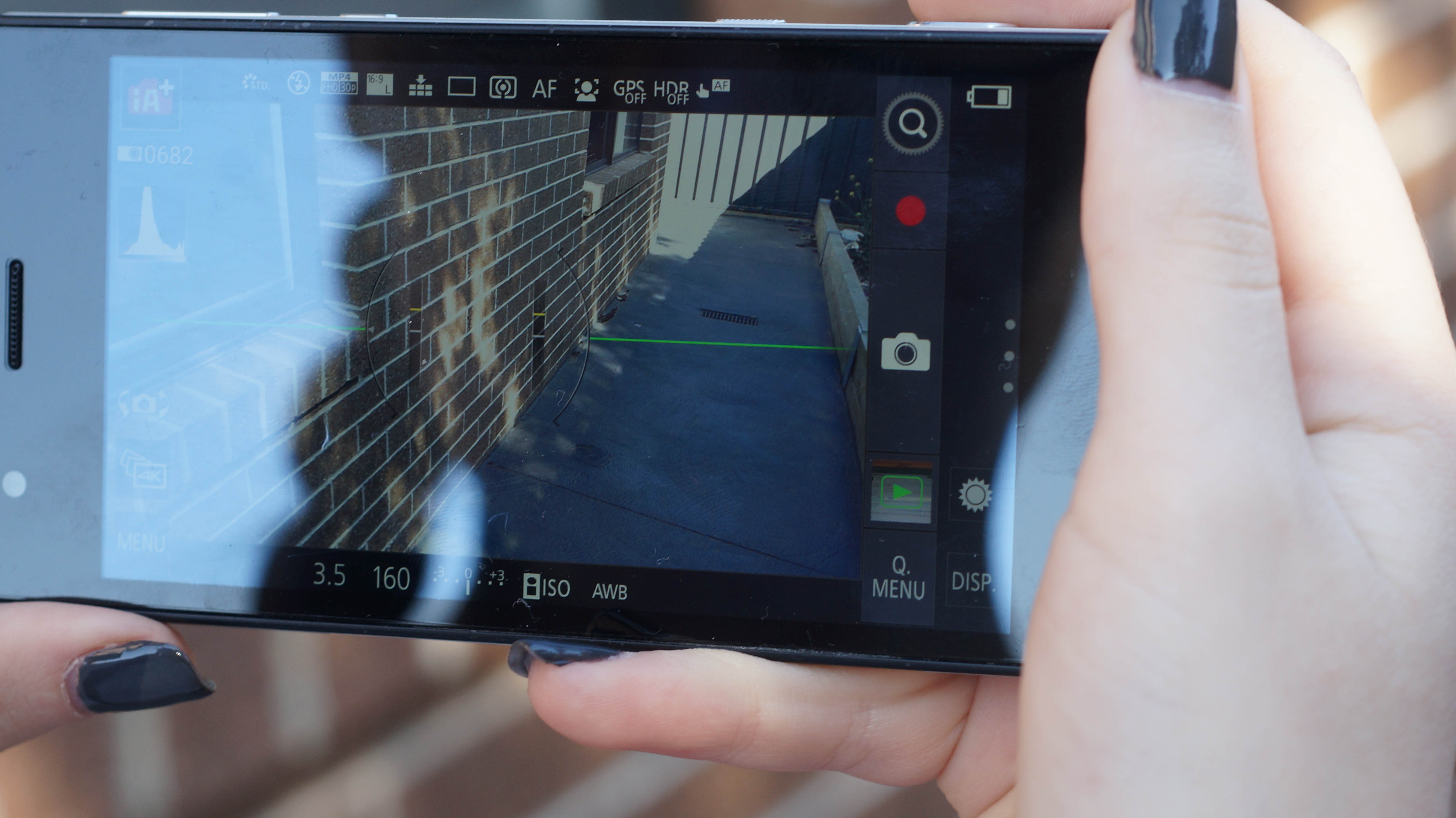
Indoors and at night there’s plenty of brightness in the display to see those fine details. On a bright summer day though I had trouble framing pictures with the sun behind or above me. I’d reckon Panasonic would want to go with a laminated, brighter or less reflective display next time. In the image below using the highest brightness setting, I had to get my hand model into the shade to read the screen clearly.
Camera
I feel like I’m burying the lead so let’s have a look at what this camera can do. For the most part I used it in Auto mode to compare it’s abilities with the 2 devices that it could potentially replace. A smartphone and dedicated camera. For this I used my current daily driver, a Samsung Galaxy S6 and my Sony Alpha NEX-6. To be fair, I only used the kit lens. A good quality Compact camera would probably have been a fairer comparison but chances are many people, like myself, haven’t bothered with a compact camera for years. Mirrorless cameras are much more adaptable and capable with add on lenses and smartphones are just so portable these days. Anyway, I’m not hating on compacts – there’s some great ones out there!
Left to right in the portrait photos is the Galaxy S6, Lumix CM1 and Alpha NEX-6. That order will follow for the following sets of images. Where the photos are in landscape orientation it will also be GS6, CM1 and NEX-6 from top to bottom. Unfortunately, the NEX-6 images were taken an hour later in the afternoon. There should be minimal difference in the available light however. As you’ll soon notice, the GS6 often produces a warmer image generally compared with the cooler results from the CM1. The NEX 6 produces an image with superior dynamic range but doesn’t seem any sharper than the other two. In this comparison, and most others the GS6 chooses an HDR capture from it’s Auto setting. I’ve set all the cameras to an intelligent auto setting for all the comparison images. Only Samsung makes it obvious on screen as to whether an HDR capture is chosen or not.
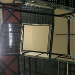
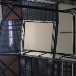
In these three images we see how each camera handles the challenge of exposing foreground scenery while trying to get accurate colours in the background sky. The GS6 lacks dynamic range and struggles with properly exposing the clouds, adding unnecessary contrast. Overall, it’s not bad for a tiny phone sensor. The CM1 drags in heaps of light almost to the point of overexposure, particularly in the clouds but does a better overall job of reproducing the colours in the scene. The NEX-6 again produces excellent dynamic range with more natural colour and nails the sky. Noticeably there’s less clouds to deal with in the NEX-6’s shot.
All of these cameras have plenty of detail in all the comparison images. The maximum resolution of the GS6 is 16MP cropping the sensor at a rather wide 16:9 whereas the CM1 is 20.1MP at a sensor crop of 4:3. The CM1 will also shoot in 3:2, 16:9 and 1:1. It’s set to 16:9 for our comparisons reducing images down to 17MP. The NEX-6 uses a 3:2 crop for a maximum 16.1MP but also allows 16:9 at 14MP which we’ve used in the comparisons. The ducks in the above images, despite moving around, were captured sharply by all 3 cameras. The CM1 pulls in the brightest image, again, with the NEX-6 again showing better colour range. The GS6 falls somewhere in between the other two.
In these close up images we can immediately see the limitation of the NEX-6’s kit lens. A little zooming however shows that it still captures plenty of detail and colour. The GS6 produces an image that’s a little warmer than the CM1 but matches it for detail and can get a fraction closer. The CM1 nails the flower’s white petals and is second only to the NEX-6 in dynamic range. In terms of what I was looking for with this shot, I’d need to change lenses on the NEX-6 to do better than the CM1.
In these three images I was looking for a nice background defocus. I didn’t expect anything too creamy with the limited lenses being used. The GS6 and CM1 were my favourites. Like the earlier picture of the road the CM1 produces the brightest and whitest image, albeit the NEX-6 was shooting an hour later than the other two, as already mentioned above. The NEX-6 nails the sky which the GS6 does better than the CM1.
Another challenging test for the smaller cameras here. The NEX-6 has no competition here nailing the foreground and the background. The GS6 manages to pull off a slightly better photo than the CM1, probably mostly because of clever image processing. To my eyes, the NEX-6 has pulled off the better range of photos in the above comparisons. Depending on whether you prefer a warmer, more dynamic image or a cooler more natural image you may prefer the GS6 or CM1.
I also tested the 3 cameras as camcorders. One test walking and the other panning. There are 1080p videos of each and also UHD videos from the two phones. My NEX-6 can’t do UHD. It’s also a rough opportunity to check out the microphones on each device. I wouldn’t expect too much though!
Samsung Galaxy S6 1080p video walking:
Panasonic Lumix CM1 1080p video walking:
Sony Alpha NEX-6 1080p video walking:
Samsung Galaxy S6 UHD video walking:
Panasonic Lumix CM1 UHD video walking :
Samsung Galaxy S6 1080p video panning:
Panasonic Lumix CM1 1080p video panning :
Sony Alpha NEX-6 1080p video panning:
The following comparisons will be between the Galaxy S6 and Lumix CM1. They will follow the same theme as above with GS6 on the left and CM1 on the right.
The CM1 takes this with more accurate colours.
This looks like a draw to me with the GS6 slightly sharper and the CM1 more natural.
The CM1 pulls off a sharper image in the foreground and again, more natural, lifelike colour tones. I prefer it to the overly warm GS6 image.
The GS6’s wider frame of view made it easier to capture this but I think the colour integrity is a whisker better in the CM1 image.
I’d give this one to the GS6 mainly because of the difficulty with focussing on the latte art on the CM1. In Auto, the CM1 has a smaller area of focus. That can be a good or bad thing depending on what you’re trying to achieve.
Samsung are known for over sharpening. In this image it pays off with more overall detail in the GS6 image above. Again, the colours are slightly more true to life on the CM1. The images below have the same characteristics.
Looking at lunch here I definitely prefer the GS6 image. Although it’s a little too red it is sharper than the CM1 to my eyes. There’s some strange greens and yellows in the CM1 image.
The CM1 image here is more true to life, although just a little bit too blue overall. The GS6 is adding pinks to the sky that don’t belong there in the morning but it is a hair sharper.
The CM1 has the more accurate colours here and handles the sunlight a little better than the GS6.
Despite blowing out the exposure just a little the CM1 has the more natural colours. The GS6 has punchier contrast and is sharper overall. I’d probably call this one a draw.
In this final comparison with the sun about to set, the CM1 gets the exposure right and ends up truer in its colour representation. Both phones added contrast to the clouds that wasn’t there in real life.
In summary I think the person who wants more accurate images would want the Panasonic CM1. Although it sometimes overexposes images, it more faithfully reproduces the original scene. And considering that we dialled down the resolution from 20.1MP to 17MP to make image comparison easier with the 16:9 Galaxy S6, we probably lost a little sharpness or detail in the process. On balance I’d favour the CM1 over the GS6 when it comes to the end result of what can be achieved simply using auto settings.
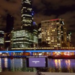
In Manual mode it’s another story altogether. The Galaxy S6 has limited shooting capabilities in its Pro mode. You can make some adjustments in software to Exposure, ISO, White Balance and Aperture. RAW capture and shutter speed control up to 10 seconds duration are coming in an update. The CM1 however can do pretty much anything you can do with a compact camera and has many of the features of an interchangeable lens camera, apart from changing lenses, of course. You can do long exposures up to 30 seconds in length and to facilitate this for folks that aren’t up to speed with doing everything manually, the scene modes do a great job of automating it for you. Here are some examples of exposures between 5 and 30 seconds.
These type of long exposures are dead easy. All you need is a cheap tripod. Mine (pictured below) is a $30 Joby Griptight Gorillapod. You just choose your scene from the menu, frame up your shot and tap the shutter key. The shutter will be held open for anywhere between just a few seconds or half a minute, then an equal amount of processing time will follow to reduce any noise in the image.
Performance
If the CM1’s camera chops have you interested you’re probably wondering what the device is like to use as an Android smartphone. In my experience it was quite good. A proven performer, the Snapdragon 801 drives the 1080p display easily. I’d say it’s about on par with an Xperia Z3, which has similarly specced parts, camera aside. I just used it in the same way I do my own phone and it held up under light to medium multitasking duties adequately.
There doesn’t seem to be any software additions to bog down Android and that’s a good thing! I didn’t install any games on this phone because it’s not really targeted that way but I’m sure the odd casual game would work just fine. There’s ample power for it. But bear in mind that there’s only 16GB to play with.
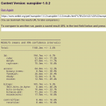
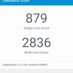
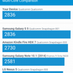
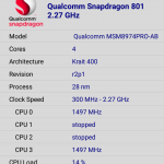
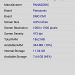
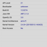
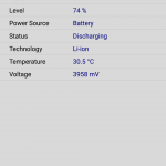
The Chrome browser performed much the same as it does on most upper range Android phones. That is to say, not really super fast but quick enough and reliable. It did ok in the Sunspider javascript test. It’s Geekbench numbers weren’t amazing either but that’s not really what this camera phone is about. In daily use it held up well. Just don’t expect it to be a gaming beast or heavy multitasking phone and you’ll be just fine. For those who want the nitty gritty about the SoC, Device, System, etc I’ve included screenshots from CPU-Z below.
Battery Life
With light to medium use the CM1 can last all day. I generally use about 2-3 hours of screen on time during a normal day. I found that the battery would be calling out for more juice after about 12 hours of my regular type of use. On one occasion I was shooting for about 3.5 hours continually. By the end of that I had only a few percent of battery left.
So, with a full battery and the Viewfinder brightness set to full you should be able to shoot for at least 3 hours. If you’re a heavy user of the smartphone side you will need to get some juice during the day in the form of a portable charger or mains outlet if you have access. If that doesn’t suit your usage, you’re gonna struggle. Like most smartphones today and unlike most cameras, the battery isn’t removable.
Software
With what is basically Nexus software plus the Panasonic camera and gallery app there’s little that can go wrong here. There were no bugs, crashes or hiccups of any kind. Of course you get the occasional lack of smoothness in Chrome and the Play store but otherwise everything runs fine.
Multitasking works well although I confess I’ve never liked the recent apps carousel overview that is used in Lollipop so I tend to drop back to the home screen fairly often.
There’s little more that needs to be said about the overall experience. It’s the usual stock/pure/clean/unbloated Android experience that we Ausdroidians know and love. The only question in my mind is how far Panasonic will go with updates? I’m sure the SoC can run an unbloated version of Android 6.0 Marshmallow but so far there hasn’t been any indication that it will get that update.
Panasonic Lumix CM1:
- 4.65-inch, IPS LCD, 1080×1920 resolution (~473 ppi)
- Qualcomm Snapdragon 801 (Quad-core up to 2.27 GHz Krait 400 CPU) Adreno 330 at 578MHz GPU
- 2GB RAM
- 16GB onboard storage, SD card up to 128GB
- Cameras:
- Rear: 20.1MP, f/2.8-11, Leica DC Elmarit 6 element lens,
- Front: 1.1MP
- Wi-Fi 802.11 a/b/g/n/ac dual-band, Bluetooth 4.0, NFC, GPS, Glonass
- Radios:
- 2G: GSM850, GSM900, DCS1800, PCS1900
- 3G: I, IV, V, VIII
- 4G: 1, 3, 4, 5, 7, 8, 20
- 135.4×68.0x21.1(Body 15.2)mm @ 203g
- Android 5.0.2 Lollipop
- 2600 mAh non-removable Battery with Quick Charge 2.0 available
I enjoyed my time with the Lumix CM1. I loved that it could fit it my pants pocket so I could carry it around without a bag. Note: I don’t wear tight jeans! I loved the bright, accurate photos it could capture simply by flicking the camera on switch and shooting in Auto. I appreciated the lack of bloatware and the good performance of the Android software. I liked the look and feel of the metallic and leathery/rubbery construction too. Classy is how I’d describe it. Handsome even. My favourite thing was to experiment with the different scene modes. They produce many different types of rich and interesting photos with little effort. A smartphone simply cannot do all the things this camera phone can do.
Shooting is hard when there’s direct sunlight on the display. On a dedicated camera you could offset this with a view finder. But that adds bulk, so the display brightness must compensate. It doesn’t quite manage here. The only other thing that concerned me with respect to the camera was the lack of adequate stabilisation for videos. When shooting 1080p the image stabilisation system cannot compensate adequately for movement. While walking for example. There are some smartphones that do a better job of this.
I come back to what I said at the start. The Lumix CM1 is a camera phone with smartphone features not a smartphone with camera features. For the person that wants the best camera in their pocket that can also do everything a smartphone can do, the CM1 has you covered. There simply is no better option that I know of for the person with those needs. You just need to be content with not necessarily having the latest smartphone processor or version of Android. And I think there could be quite a few people that fit the user profile that I have described. Panasonic are catering to them with the CM1.

