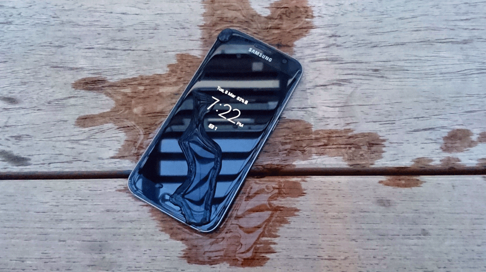
2015’s Galaxy S6 range was not without it’s flaws, though. When we reviewed these handsets about 12 months ago, the most obvious concern was that the battery life on both variants of the phone was disappointing. We’re not talking slightly below par, either – the battery life straight up disappointed, even angered us during the review. Perhaps more concerning, though, was the inexplicable issues with the software on the handset – radios performed poorly, and after some time, the handset would become so slow as to be virtually unusable. Eventually, Samsung carried out enough incremental updates that the issues largely went away, but the battery life remained a massive blight on the handset.
Fast forward 12 months (or thereabouts), and we’re looking at the release of the Galaxy S7 and the Galaxy S7 Edge. Samsung tells us it learned a lot from listening to the consumers over last 12 months, and in these handsets, it shows. The most obvious problems that plagued the Galaxy S6 have been addressed, including the return of water resistance and MicroSD cards. The exterior design has evolved from the S6 range, and the result is a Galaxy S7 and Galaxy S7 Edge that are significantly more comfortable to hold and to use than even last year’s gorgeous handsets. Samsung has moved the bar significantly in a direction we didn’t even realise it needed to go.
These aren’t even the most important new features. Samsung is aware that a smartphone with a rubbish battery life isn’t very smart. Both handsets in the Galaxy S7 range are exhibiting fantastic battery life in the review period, to the point even where they can last a full day of actual real world usage.
Although the camera sensor wasn’t an issue last year — the Galaxy S6 range featured one of the best cameras around — Samsung has improved it this year. With an ultra bright f/1.7 aperture (pretty much the lowest aperture on the market), we expected great things from the Galaxy S7 camera, and we weren’t disappointed.
It’s hard to review the Galaxy S7 without drawing comparisons to last year’s models. Despite calling out the issues above, the Galaxy S6 held its place as one of our picks of 2015, and the similarities between the phones is hard to ignore. Calling the Galaxy S7 a simple evolution on the Galaxy S6 is a disservice – a better word would be refinement, and and it’s from that perspective we’re approaching the comparisons.
- Great battery life
- Amazing f/1.7 camera captures great photos effortlessly
- Fast & efficient Exynos processor with 4GB of RAM
- Water resistance and MicroSD support is back
- Wallet pain: These phones are very expensive
- The Always On display is neat, but could be way more useful
- The IR blaster is gone; no more controlling the TV
- MicroSD support is great, but there’s no adoptable storage here
Hardware — What’s inside?
The core
Predominantly, the Galaxy S7 range is the same across both handsets with minor variations – this is one of the reasons we’re reviewing them together. We’ll start with where they’re the same, then move on to the differences.
While the Galaxy S7 range is available with a Qualcomm Snapdragon 820 CPU in other markets, the model destined for release in Australia now features Samsung’s own Exynos 8890 CPU. This is a contrast to last year’s S6, which carried Exynos processors worldwide. Quite why Samsung’s returned to its dual-processor arrangement isn’t really known, but Australia is now an Exynos market for Samsung.
By any objective measure, the chipset is a monster. With eight 64-bit cores, four of which run at 2.3 GHz, and 4 at 1.6 GHz it’s slightly faster than the Snapdragon 820 at the top end, though in most day to day usage, you probably wouldn’t notice.
Memory-wise, the Galaxy S7 line is the first non-phablet to market to come with 4GB RAM as standard. This helps multitasking, and puts paid to some of the performance issues we saw in the Galaxy S6 last year.
We’re also finally seeing the death of 16GB as the entry-level storage option with both handsets starting at 32GB of built in storage, though 64GB models are available. That storage can be expanded through the welcome return of the Micro SD slot, although that return is not without its caveats.
Physical impressions
The standard Galaxy S7 is about the same size as the Galaxy S6, just a touch shorter. It comes in at 142.4 x 69.6 x 7.9 mm thick, and weighs in at a very comfortable 152g. Breaking with last year’s almost identical designs, the Galaxy S7 Edge is bigger, although it’s also a touch thinner — 150.9 x 72.6 x 7.7 mm. Despite the size difference, it’s only 5 grams heavier at 157g.
Despite being close in weight, the Galaxy S7 Edge features both a bigger display and a significantly greater battery capacity too — 3,600 mAh to the Galaxy S7’s 3,000 mAh. Otherwise, the physical appearance of the handsets isn’t all that different.
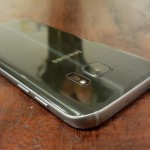
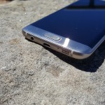
Around the edges is very standard Samsung; on the right edge, a power button and on the bottom, a MicroUSB port, speaker and 3.5mm headset jack. The left edge has the two-button volume rocker, and there’s nothing on the top save the hybrid SIM / MicroSD tray and ejector port. That’s important, because it speaks to the removal of the IR port that’s been a feature of the phone since the days of the Galaxy S4.
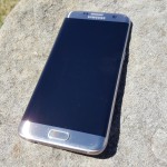
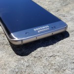
The front of the devices are nondescript, featuring little more than the display, front-facing camera, earpiece and subtle Samsung branding, and a slightly larger-than-last-year home button with integrated fingerprint sensor. It’s larger and more rectangular this year, and while it’s tempting to call it a final admission from Samsung that squeezing the fingerprint sensor into their standard narrow home button size was a mistake in years gone by, other manufacturers (Sony and Nextbit come to mind) have since made do with thin sensors mounted in the side of their phone bodies.
Despite the almost identical size and layout of the phones, a Galaxy S6 case won’t cut it on a Galaxy S7 because these buttons have all been moved about half a centimetre down from their placement on the S6. This isn’t a bad thing (it makes them ever so slightly easier to hit), but you can’t help but feel a little cynical about the buttons being moved and necessitating the purchase of a brand new case – again.
The Galaxy S7 and S7 Edge are exactly the same in this regard, though of course the Edge is a little taller and wider, and of course has a rounded-edge display.
In hand feel
Last year’s Galaxy S6 was like a bolt from the blue in terms of design. Gone was Samsung’s much-criticised plastic body and in its place was the stunning and comfortable metal and glass body, speaking to Samsung’s newfound focus on design and premium quality materials. That focus resulted in a handset that felt great in the hand, combining a smaller-than-it-looked feel with a great in-hand feel. The S6 Edge, however, didn’t share that same in-hand feel. It felt positively sharp where the edge display met the body of the phone. Both phones were also not all that grippy; it wasn’t an easy phone to keep a hold of without a case to give it a bit more grip. Neither phone needed a case, but both felt better with one – we found our preference was a slim case to add just a bit more grip and protection, without damaging the phone’s stunning good looks.
We’ve spent so long recapping the look and feel of the Galaxy S6 phones because this next part is important – Samsung’s industrial design has evolved so much in a short space of time that the Galaxy S7 makes the Galaxy S6 feel like yesterday’s phone, almost a cheap imitation.
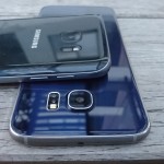
The S7 range has kept the comfortable in-hand feel, and they’ve brought along the rear curves that debuted on the Galaxy Note 5 and Galaxy S6 Edge+ from the latter half of 2015 along in order to do it.
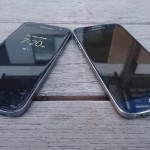
The standard Galaxy S7 remains remarkably holdable, with an ever so slightly chamfered edge and a slight curve at the edges of the glass front – it calls to mind the pleasing edges of the Nexus 4 although it’s nowhere near as pronounced but still pleases you to run your finger across. The S7 Edge still has the slightly narrow shoulder of the S6 Edge, but it no longer meets at a point. It isn’t uncomfortable to hold.
There’s next to no weight difference between last year’s range and this; some 15 grams between them, if that, and this contributes to the comfortable and familiar feel.
Both phones would still benefit from a case to protect the rear glass from scratches. It’ll also prevent your palms or fingers from accidentally activating touch response at the sides of the screen when you’re trying to type. With practice, you can avoid this, but it is a bit of an annoyance and a case fixes it easily.
Bells and whistles, spit and polish
Despite retaining the benefits of the S6 range, and only improving on the comfort to hold and use, there’s quite a bit more smarts in the S7 range than there was last year, and it’s surprising how much extra Samsung has squeezed in.
Water Resistance
Let’s start with the return of water resistance. The Galaxy S5 carried an IP68 rating with a capped Micro USB port and gaskets on its then-removeable rear covers. That IP-rating is something Samsung omitted when they crafted the Galaxy S6, despite it being a better candidate for the feature with a sealed battery and no Micro SD card slot.
This year, it’s back.
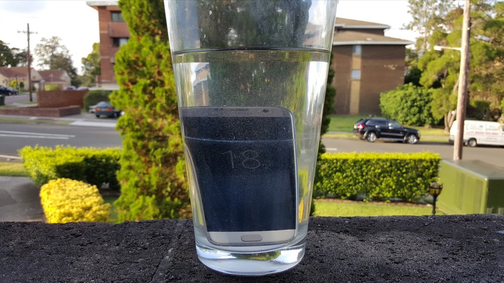
Samsung listened to the criticisms over the lack of water resistance last year, and both the Galaxy S7 and Galaxy S7 Edge are again rated IP68. Given the caveats we’ve seen placed on waterproof phones in the intervening years, you probably won’t want to take them for a swim or take them near salt water, but if you do happen to fall into a pool or get caught in a torrential downpour, your phone will survive.
Battery life
Ausdroid reviewers are typically hard users of phones. We’ve come to accept that we really push phones to the limit in terms of usage, performance and power demands – way beyond a typical consumer. We can’t really help this – we use review phones as our daily drivers and when those phones fail to meet our needs it’s frustrating.
One of the greatest marks against the Galaxy S6 was its dismal battery life. A smartphone isn’t much good if it runs out of juice in the afternoon, and Jason’s regularly able to wipe out 25% of the Galaxy S6’s battery before he gets to work in the morning.
We’re thrilled to be able to report that the Galaxy S7 significantly improves this mark. Samsung has figured out that a smart phone needs smart power.
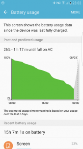
Chris has had three days of regular usage without going near a charger until 10pm on the Galaxy S7 Edge. The Galaxy S7 performs about as well, despite a battery that is one sixth smaller.
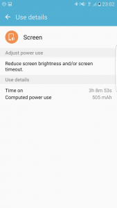
We pushed the phones with screen-on time – Jason hit the 5% battery warning on Sunday at about 7.30pm after being off the charger for some 10 hours with 4 hours of screen on time. Chris has regularly hit long working days with 15-18 hours off charge with up to three and a half to four hours screen on time with the S7 Edge, while still having enough in the tank to last until bedtime (and an overnight charge).
Undoubtedly there’s a combination of things going on here. On the one hand, this year’s Exynos processor is more power efficient than last, there’s a larger battery in both phones, and Android Marshmallow’s Doze feature kicks in when the phone is left alone on your desk. There’s probably efficiencies and optimisations in the software as well, although that’s harder to prove.
The largest consumer of battery life remains the screen, but you can mitigate that by keeping it at half brightness – or even leaving it on auto. The brilliant Super AMOLED display doesn’t need its brightness bumped up to be visible in all but the brightest of sunlight.
Return of the MicroSD cards
Android has been through a phase for the last few years of MicroSD cards really being on the outer. Google’s engineers claim that the use of such removable storage in a phone presents problems in terms of file ownership and transport from one device to another, and they’re not wrong – it’s a conundrum.
Given these problems, Micro SD cards are generally best used as general media storage. They’re a good place to store photos, movies and music. Some users still want to move apps to Micro SD storage, but it’s generally discouraged because the SD card is almost always slower than the system’s main built-in storage.
That legacy remains in some places today. For example, Google Photos will quite happily accomodate photos that are stored on your MicroSD card, but it won’t allow you to delete them, referring you to the normal Gallery app instead. Google Music has a confusing and inconsistent approach to how it stores copy-protected music on your SD card, even under Marshmallow. Using a Micro SD card can actually be a real pain in the ass.
Whether MicroSD cards are as useful as they were or not, they’re definitely of no use when you can’t actually use them, and last year’s range had no MicroSD. None. You were stuck with the capacity you purchased, which saw a number of users opt for more expensive models with more internal storage – “just in case”.
Well, the Micro SD is back this year, and the range supports cards up to 200GB in capacity, meaning you can carry more on your phone than you can probably conceptualise. It’s not all flowers and roses, though.
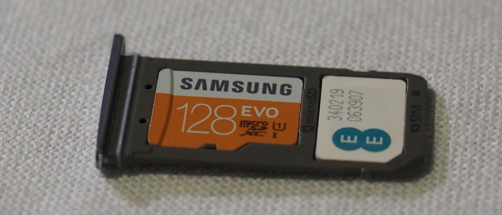
Android Marshmallow made some changes to MicroSD cards to make them a little more useful, including an amazing feature called Adoptable Storage. This feature allows a MicroSD card – if it passes certain speed tests – to effectively be absorbed by the system, becoming a part of the main storage pool. In simple terms, your 16GB device can become an 80GB device by adding a MicroSD card, and your apps are none the wiser (though, annoyingly, some apps don’t support the feature — Google Play Music is an obvious ratbag).
Samsung, though, has chosen to disable Adoptable Storage on the Galaxy S7. This makes the return of MicroSD cards somewhat less exciting as there’s still only so much you can actually use them for. Photo storage is of course a big one, and you can put TV shows, movies, videos and whatever else you like on there. However, they’re not as truly versatile as they should be, and it’s a rotten shame.
Still, we’d all rather have MicroSD support without Adoptable Storage than no MicroSD at all.
Gorgeous Displays
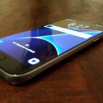
Samsung’s had consistently good screens over several generations, casting aside the AMOLED oversaturation accusations long ago. The Galaxy S7 and S7 Edge screens don’t stray from this formula one bit, remaining bright and vivid even at an angle.
That off-axis brightness gives the impression that the phone’s glass front is in fact the screen, and the screen is right there at your fingertip instead of a millimetre or two beneath it.
There’s not really that much more to say about the displays. They wowed us last year and they’re still ahead of the pack this year.
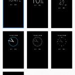
Always On Display
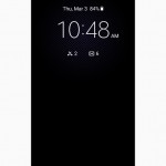
Samsung’s borrowed a feature from a number of smartwatches with AMOLED displays this generation, bringing an Always On display to the Galaxy S7 so you can tell the time at a glance.
This takes advantage of the power properties of the display, allowing the phone to light up only those pixels it needs to display something on the screen. This means that instead of lighting up a backlight and powering all 3.6 million pixels to show you the time, the S7 can light up a selection of those pixels to display simple things on the display without really affecting your battery life.
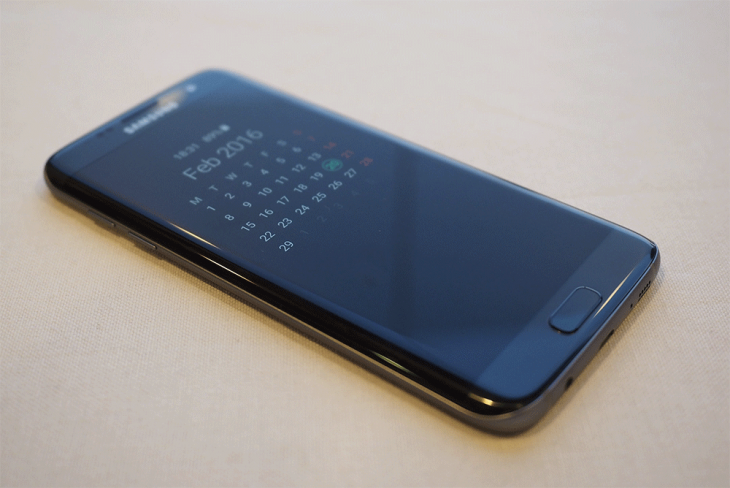
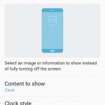
The Always On display can show you things like the time and date, a simple calendar, whether you’ve missed any calls or messages … and unfortunately, that’s about it. Unlike some other implementations of this feature, Samsung’s Always On display can’t show you notifications from other apps (like Hangouts, Telegram, etc), and you can’t interact with it — there’s no touch sensitivity. It truly is for your eyes only (and anyone else who looks).
You can configure what’s there, and Samsung should be complimented on adding those options, but the choices are pretty limited. Samsung would do well to enable some kind of app notifications to be shown, even if it’s just the icons like the system notification bar. That might cause some kind of a hit on battery life, though. It’s all a compromise, really.
Sound
As we saw on the Galaxy S6, the speaker in both Galaxy S7 models is on the bottom edge of the phone. A pretty familiar arrangement in 2015 and 2016 with sound emanating from a series of 10 precision-drilled holes at right. It’s a single mono speaker. Sound is fine … but we’ve heard better. It can get plenty loud, but distorts a little at full volume. It’s the classic story of the smartphone speaker, but it doesn’t have to be this way.
HTC first debuted its BoomSound front-facing speakers some 3 years ago now, and it’s a shame that Samsung still refuses to bring similar tech to their phones, especially with several manufacturers not only jumping on board but even taking it through multiple iterations.
More of a concern though is that the position of the speaker often causes your phone shelf (aka your left pinkie finger) to block it. Jason had to adjust the way he held his phone to stop blocking the speaker area, which was a little larger on the Galaxy S6.
Camera
In 2015, we were fairly spoiled for mobile cameras, and we’re seeing continued improvement this year. The Galaxy S6 was praised for great camera performance across day and night, whether you were shooting still pictures or videos. In our review, we certainly praised the Galaxy S6 camera, and justifiably.
Then, it was a departure from most other phones on the market. A bright, f/1.9 aperture lens meant better photos in the dark, when most other smartphones were looking at an f/2.0 lens or above, it was simply brilliant. Samsung established itself as a powerhouse in smartphone camera performance and set the bar by which other phones were measured for the year. Some of us even started to use the Galaxy S6 (and S6 Edge, Note 5 and S6 Edge+) to shoot photos for reviews.
Well, that was twelve months ago, and we’ve seen some stiff competition since … well, no, actually we didn’t.
LG’s G4 had an amazing camera with fine-grained manual controls, and it became a firm favourite last year; not necessarily because the camera was technically better, but because of its battery life. Sony’s Xperia Z5 promised a lot camera-wise, but largely failed to deliver. Apple moved the needle with the iPhone 6S range, although it’s generally accepted that they failed to catch Samsung’s sudden and surprising lead.
Besides the Galaxy S6, we saw some fairly lacklustre mobile cameras last year, and it left us wondering what we’d see this year.
Well, there’s no surprises now. Samsung innovated, again, and is without a doubt leading the market for the time being. They’ve reduced the megapixel count slightly to 12MP from 16MP (although you’ll have to knock that down to 9MP to go 16:9), but that’s the only compromise. Instead of an f/1.9 lens, we now have an f1/.7 lens. Instead of a 1.12um pixel size, we have a 1.4um pixel size. The front-facing camera has seen the same improvement and can take some prettty amazing selfies.
To someone who doesn’t understand how photography works, these numbers might not mean much. In English, it’s like this. The Galaxy S7 lets in significantly more light than the Galaxy S6, and the pixels on the image sensor are larger so they can capture more of that light. This means a few things:
- Better photos in low light.
- Better photos of moving subjects with less blur.
- Brighter photos that literally pop out of the phone.
On paper is one thing, and real world performance is what matters, and in the Galaxy S7, the real world performance doesn’t disappoint.
You do have to be a little careful when the light goes down, but this is no different to any other smartphone camera on the market. Moving subjects in low light are very likely to produce a blurry image as the phone extends its shutter open time to capture more light. It’s an unfortunate trade-off and it’s just when smartphone camera technology is right now.
We sent Jason out with the Galaxy S7 to Sydney’s Gay and Lesbian Mardi Gras, a cavalcade of colour and sights that produced some pretty amazing results:
All in all, we’re pretty happy with the Galaxy S7’s results at Mardi Gras. As the light went down, the camera stepped up and smashed it out of the park. You can see glitter in the air and the camera stops light sources from blowing out when they’re in frame. You can’t currently ask for much more of your smartphone.
The Galaxy S7 packs a few extra tricks into its video shooting modes as well, with the ability to shoot impressive slow-motion videos and also the opposite with a hyperlapse video shooting mode built-in. There’s also an interesting four-quadrants video collage that stitches together 4 6-second videos.
Those modes are alright, but you can’t configure them. Want to set the framerate for your hyperlapse? Nope. Want the four-quadrants video to last longer than 6 seconds? Too bad. It’s a bit odd that there’s so many options elsewhere on the phone but Samsung simply forgot to add them to video shooting modes.
At least the slow motion video allows you to choose which parts of the video to slow down after shooting. If you want to upload the video you’ll need to export it.
If those modes aren’t your thing you’ll still find a capable video shooting mode that can go up to UHD resolution – at which point that Micro SD card will become pretty important.
Like last year, Samsung’s also seen fit to put the exact same camera on the front of the phone as the back. This means you get the same abilities like HDR shooting and a wonderful wide angle for your selfies. Enjoy our mugs:
Camera accessories
We couldn’t talk about the Galaxy S7 without talking about some of the accessories on offer, though sadly, they’re not on offer yet.

Firstly, there’s a set of two screw-on lenses for those who want a bit more from their mobile photography. Offering both a fish-eye wide-angle lens and a telephoto lens, the kit is well constructed and the lenses themselves just ooze premium. They’re heavy with quality glass, and you won’t be disappointed with the results.
In fact, the only disappointing thing is that we weren’t able to take the lenses for a spin before our review was published. We’ll come back and do a quick feature on these lenses when we can get hands on with them.
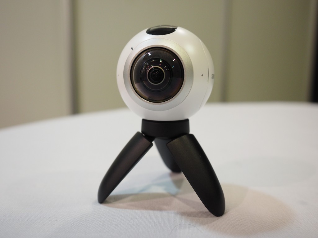
Secondly, there’s the Gear 360, which as the name implies is a 360º camera designed for use with the Galaxy S7. We’ve previewed it at MWC, and had a quick play with it in Sydney, but as yet it isn’t on the market, and retail builds aren’t available at the time of writing for us to take for a spin.
We’ll come back to the Gear 360 in future, and trust me, you’ll love it.
Software
The Galaxy S7 is an easy upgrade for S6 owners (and probably for S5 owners at the end of their 24 month contracts) — there’s enough the same to keep existing customers happy, and enough improved to keep power users impressed.
Out of the box, the Samsung Galaxy S7 range comes with Android 6.0.1 with the 1 February 2016 security update in place. This means that all the fun Android 6 features like Google Now On Tap are there (goodbye, S Voice!), as are the improvements underlying the operating system (Android Doze is a big one).
Of course, Samsung being Samsung, a phone wouldn’t be released without TouchWiz, Samsung’s once-garish and now acceptable layer on top of Android. Jason and Chris are in agreement on most of this — the Galaxy S7’s software really hasn’t changed much, visually, since last year’s model, and that’s probably alright.
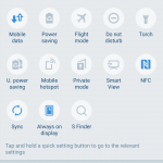
The only obvious changes are to the way the dropdown notification drawer looks — it’s better, less crowded, and in fact it looks a lot more like what most other manufacturers are doing. This is a good move, and it reduces the barrier to entry to those new to Samsung. Virtually everything else looks largely the same as it did.
Samsung’s Settings app looks virtually the same as it did last year, and Samsung’s own apps — S Health, S Planner, S etc — are largely unchanged from what was available before the Galaxy S7 arrived.
Though the Edge screen has seen improvements (which we’ll go into in a moment), the settings for it remain largely unchanged, too. In fact, the Galaxy S7 presents as a really easy upgrade for S6 owners (and probably for S5 owners coming to the end of their 24 month contracts) — there’s enough that’s the same to keep existing Samsung customers happy and comfortable, and there’s enough improved to keep power users and those on the bleeding edge impressed.
New Edge Display
While the Edge display last year was kind of cool, it wasn’t without its flaws. It felt more like a gimmick than something truly useful; there simply wasn’t that much you could usefully do with it, and neither of us used any of the Edge features beyond the night clock when reviewing the S6 Edge or S6 Edge+ last year.
In 2016, the Edge display features are actually a bit more useful. Samsung have listened here, again, and heard that users want this feature to actually be useful to them, instead of a parlour trick that never gets used outside of a Samsung demo.
Samsung listened.
Out of the box, the Edge display comes with a number of panels set up for you. The first, shown above, is Apps edge, which gives you two columns of customisable app shortcuts you can use to quickly access your favourite apps from anywhere on your phone. With 10 shortcuts you can configure, you’ll easily have enough for your needs.
People Edge is back, allowing you to set some favourite contacts that you can easily call, SMS or email with a couple of quick taps. Think of it like your Favourites, but a subset thereof; these are the people you probably need to be able to contact at a moment’s notice.
Task Edge is cool, but it seems crippled. Task Edge is similar to Apps Edge, except that instead of just launching apps, you can launch things like Create New Contact, Create New Calendar Event, or in fact, any shortcut that Android apps support. In theory. In practice, it just doesn’t seem to quite work, and beyond Samsung’s own apps, we couldn’t get other apps’ shortcuts to appear here. Maybe we’re missing something.
There are other configurable panels too, which you can add or download. At the moment, Chris has Apps, People, a Data Usage monitor, and a Weather panel. What you choose is up to you, and the feature is well thought out.
Not everyone will use it, but those who want it will enjoy it.
Connectivity
Connectivity doesn’t usually get its own section in a review, because in 2016, the kinds of connectivity we can expect are basically the same in every single phone. There’s WiFi, Bluetooth, 4G, 3G and even 2G, NFC, and Wireless Charging.
There really isn’t anything that the Galaxy S7 (or indeed, any other modern smartphone) can’t connect to. Its LTE radio is Cat9 compatible, meaning a maximum of 450mbps downstream and 50mbps uploads (though most modern networks will struggle to reach 450mbps just yet).
Jason found some connectivity niggles with cellular though; on moving through some underground areas he found his Galaxy S7 on Vodafone lost data connectivity (not surprising as he was in a tunnel), and steadfastly refused to reconnect to data when he emerged until airplane mode was toggled. This was an issue with last year’s Galaxy S6 too, but other phones on the same network in the same area all reconnected when expected.
It’s entirely possible that this is a one-off issue (the Galaxy S7 we are reviewing is an engineering sample, after all), but we’ve not been able to take the Galaxy S7 Edge (from Australian retail stock) around the same area to test at the time of publishing our review.
Specifications
| Samsung Galaxy S7 | Samsung Galaxy S7 edge | |
|---|---|---|
| Screen size | 5.1-inch | 5.5-inch |
| Resolution | 2,560×1,440 pixels | 2,560×1,440 pixels |
| PPI | 576ppi | 534ppi |
| Rear Camera | 12MP | |
| Aperture | f/1.7 | |
| Front Camera | 5MP | |
| Aperture | f/1.7 | |
| Processor | Exynos 8890 Octa core | |
| Core config |
2.3GHz Quad + 1.6GHz Quad 64 bit, 14 nm process |
|
| RAM | 4GB | |
| Storage | 32GB, 64GB | |
| Micro SD | Yes, 200GB 2TB theoretical max |
|
| Battery | 3,000 mAh | 3,600 mAh |
| Removable | No | |
| Other features | Water resistance Wireless charging |
|
| Connector | MicroUSB USB 2.0 |
|
| Wifi | WiFi 802.11 a/b/g/n/ac (2.4/5GHz), MIMO | |
| Bluetooth | 4.2 LE, ANT+ | |
| NFC | Yes | |
| Location | A-GPS, GLONASS, BDS | |
| Sensors | Fingerprint Accelerometer Gyro Proximity Barometer RGB Light Geo-magnetic Hall HRM |
|
| OS | Android 6.0 with Samsung UX |
Android 6.0 with Samsung UX and Edge features |
| Dimensions | 142.4 x 69.6 x 7.9 mm | 150.9 x 72.6 x 7.7 mm |
| Weight | 152 g | 157 g |
| Colours | Black, Gold, Silver | |
| Outright Price | $1,149 outright | $1,249 outright |
| Carriers: | Telstra Optus Vodafone |
|
The Galaxy S7 range is what last year’s Galaxy S6 range should’ve been. Everything that was wrong has been fixed, and everything missing has been added back in.
Sometimes writing a conclusion is hard, and in the case of a recent review (ahem, the Xperia Z5) it took quite some time to really conclude the review in a balanced and fair way.
Not so with the Galaxy S7 range.
Of the phones announced at MWC, with the caveat that we have not yet had significant hands-on time with LG’s G5, Samsung appears to have cornered the market. Again. As we remarked above, it’s as if Samsung has listened to the market, heard everything that it did not like with the Galaxy S6, and fixed it to release the Galaxy S7.
The Galaxy S7 makes the Galaxy S6 feel like a proof of concept.
Everything about the Galaxy S7 just feels better than the S6, and not just in a “it’s a new year, so the handset should naturally feel better” kind of way, but in a genuine, actually better way. Seriously, let’s break it down:
- The battery life? It’s better. Much better.
- The camera? Amazingly, it is better. As much as the S6 was better over just about everything else, the S7 is better than the S6.
- Software? Well, it looks the same, but the performance is better.
- Physical feel? It feels finished, polished, refined, compared to the S6 which just didn’t.
- Inclusions? MicroSD, waterproofing? They’re back, and it’s better that way.
In fact, there’s not much to really fault on the Galaxy S7. If you were to push, it would be these:
- During the first few days of use, there was some weirdness around certain apps. Google Photos managed to lock up, and take down the capacitive buttons in the process. Rebooting the phone fixed it, but it was a weird error.
- The construction is amazing, but it does scratch a bit easily.
- Like the S6 range last year, it feels like the S7 wouldn’t go well with a drop onto anything other than soft, fluffy carpet (Jason got to test that drop from standing height onto moderately soft carpet in his office, is glad the phone lived to tell the tale, and is hoping Chris doesn’t notice this aside until the review is published).
- Keeping MicroUSB when there’s a move to USB-C is a little annoying to our inner nerds, but at the same time, is pleasing because we don’t need to buy too many new cables (yet).
Flaws though they are, they really don’t amount to much; the Galaxy S7 really is a joy to own, to use, to hold, and even to look at. The colours — black, gold, and silver — all look premium and yet restrained. The gold is more a champagne than over the top gold, and though we feared it’d look silly, it actually doesn’t.
There’s nothing much to take serious issue with, except perhaps the price. At $1,249 the Galaxy S7 Edge is just too damned expensive. Granted, it is an order of magnitude closer to the perfect phone than just about everything else, but the price just isn’t realistic in today’s economic climate. It’s just too much.
The Galaxy S7 is a bit cheaper, by a hundred dollars, but it too is still rather expensive for a phone.
This said, if you have the money to spend, you will absolutely get two years of enjoyment from a Galaxy S7 or Galaxy S7 Edge, and while we may recommend other phones to some particular customers, the best phone for most people this year may well be one of the Galaxy S7 range.







You mentioned that the S6’s radios performed poorly. Indeed it seems like it was blind to 4G, and stubbornly refused to drop back to 3G despite no bars, and wifi reception was poor. Do you have any comments on whether these are still issues with the S7?
This doesn’t seem to be an issue anymore. Thank goodness.
Anyone else getting random reboots? About once a day at a random time my phone will reboot. It’s usually when the phone is not in use so it hasn’t inconvenienced me yet. Anyone else experiencing this?
I wouldn’t day it’s once a day, but certainly it has happened a few times in the few weeks I’ve used the phone.
It’s dropped off in frequency now. It’s only been once or twice in the last week.
I’m really loving this phone. It’s ticking all the boxes for me.
They are big enough phablets to replace a tablet. This is the only way I can justify the price. After using the nexus 6p for 3 months, I was convinced i did not need a tablet.
The battery life qualms on the S6 are interesting. I have one and I get the same battery life and screen time as you guys are thrilled to get on the S7 phones.
Am I the only one in the world who’s completely happy with my S6 battery life? Incidentally it’s an unlocked G9208 (Chinese market).
Yep Far far too expensive. And we have Apple to blame for that.
What ever happened to computers getting cheaper?
Great review, Chris. I think that Samsung will sell a few phones this year and could possibly increase the overall market share if the phone and the cameras are that good. Good on Samsung for listening to the customers.
Surprised that we’re getting the Exynos version down under. Sounds like it won’t matter much though in terms of performance. At least for the next 6 months while I’m using it.
Jason’s network reconnection issue is a little concerning as I’m in and out of coverage blackspots during the day.
I’m very glad to hear that you boys have gotten better battery life this time around.
I’ve preordered the black GS7 and I’m super keen to give the camera a workout on Friday night ?
Great review lads ?
then they should make it an option that’s off by default, let power users enable it?
great review, nice phone but shame about the adaptable storage. Any explanation from Samsung why this was omitted? hopefully will be implemented in a software update.
I think both Samsung and LG (the G5 also doesn’t offer the feature) are concerned about what happens to the user when the adopted storage is removed – that could be catastrophic for the phone.
That doesn’t say much for Samsung’s opinion of their customers if they don’t think a customer is smart enough to make the choice and wear the risk themselves. Hiding it under developer settings at least should have been considered.
I think they weighed the disappointment of the extremely niche audience looking for this feature against the potential backlash of a much larger proportion of mainstream, non techy users who could accidentally bork their phones and decided to play it safe. I think it’s a sensible decision.