For those of you who have never heard of them (as I had not), Vivo is a phone manufacturer based in China with production facilities in India, Indonesia and the US. In terms of retail, they are well established in China, India and South East Asia. They are a relative newcomer to the Australian market and the Y20s is one of their first offerings.
What’s in the box?
Pretty much what you’d expect – the phone itself, a charger and cable, and a set of wired earbuds since this model does include a phone jack.
Physical features
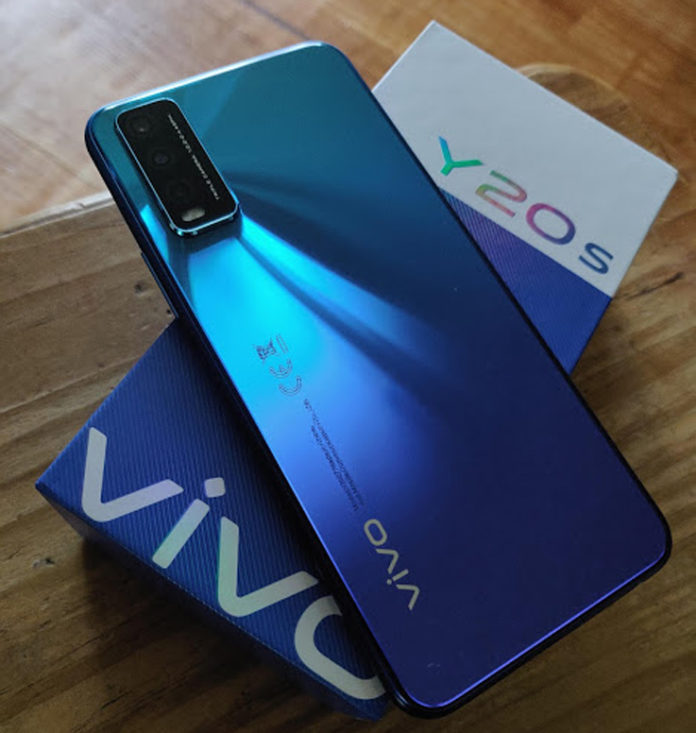
One of the big selling points of this phone is how it looks. The ‘nebula blue’ model is beautiful, people who have aesthetics as a major factor in phone choice are going to have their attention caught by this phone. Beauty has a price however. The back of the phone is an absolute fingerprint magnet, and at the time of writing the only cases available for this phone do not include a transparent option.
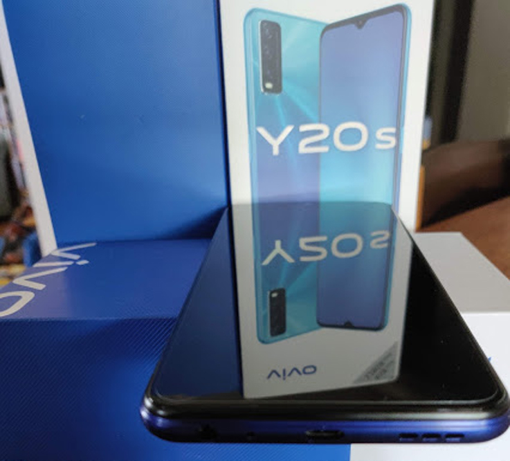
The Y20s has a lovely screen, easy on the eye, crisp and clean and the phone has the standard eye protection software. The unit comes with a screen protector already in place, however, it’s soft and easy to scratch, and any scratch lines on the protector can cause visible distortions. There is only one screen protector provided – more can be purchased, but at the moment accessories for the Y20s are only available from the Vivo Amazon store. The PR rep for Vivo did inform us that they are working towards a partner agreement with some of the retail stores to carry accessories, but were unable to provide us with a timeline for that occurring.
One mildly annoying feature is the decision to go with a MicroUSB charging option. I have grown used to the convenience of USB-C, having to go back to checking which way up to plug the cable in is a bit tiresome. Add to that the advantages of USB-C over MicroUSB – faster data transfer and faster charging – given USB-C has been around since 2014 the choice of MicroUSB is a little perplexing.
All the buttons on this phone are on the right side – less convenient for all you lefties out there, but still easily usable. Many of the phones on the market currently feel too large for me to easily hold in one hand. The Y20s is a very comfortable size, and feels balanced in my hand, the power button/thumb print sensor right where I need it to be.
The speaker is quite powerful, I found when listening to music or audiobooks that the halfway volume was the sweet spot. It was loud enough to hear easily and increasing the volume past that point resulted in very tinny and unpleasant sound reproduction.
Phone Specifications
- 6GB Ram 128 Rom
- 5000 mAh battery
- 6.51 inch full view display – HD 1600 x 720 res
- Side mounted fingerprint unlock
- Multi turbo 3.0 – this is essentially overclocking for the cpu to boost performance, however this can drain the battery faster than normal usage
- 13mp main camera f/2.2 aperture and PDAF (phase detection auto focus)
- 2mp bokeh camera – mainly for portrait shots when you want your main object in focus but the background blurred
- Super macro camera – for this to work you will need to be 4cm or less away from the object
Setup
The setup process was pretty standard – enter your google account details, enter your wifi details then leave the phone to do it’s thing and download all your apps. One thing I didn’t like about this setup was the ‘Add icon to home screen’ setting, which is on by default. While it’s not a big deal day to day, on initial setup this being on means all your apps end up with an icon on your home screens. I generally only have 12 or so apps that I use often enough to want a shortcut for, so after setup completed I had to manually remove 50 or so app icons.
Interestingly, although there are 3 options available to unlock the phone (PIN, face unlock and fingerprint), only one can be selected during setup. However the option to activate the other 2 was easy to find in the device settings once the phone had completed the setup process.
Setting up face unlock was easy but there was no prompt in that process to turn on the ‘pick up to wake’ function needed to make it work. If that function isn’t on you have to press the power button to turn the screen on to do the face unlock, but if you also have fingerprint unlock active, touching the power button would just unlock it.
I’m not sure the software being used for the face unlock is the best available, as it seems to be operating only on depth of field and face shape, rather than a retinal scan. The phone will unlock for me when I am wearing sunglasses but it won’t unlock for a photograph of me.
Camera
General happy snaps taken by this phone are pretty good, however if you just point and click without touching the screen to give it a specific spot to focus on, you might find your photos are slightly blurred more often than not.
The macro lens is good but it produces picture quality you’d expect to see when you have used the regular camera zoomed in – if you zoom in on a photo taken with the macro lens it’s grainy and pixelated. Having said that it takes very good photos for a sub $300 phone.
It has the usual fun options of time lapse and slow-mo and one called ‘live photo’. Live photo seems to be a hybrid mixture of video, gif and photo. You do a single tap to take the picture and you end up with a 4 second recording which has the visual feel of a gif or animation. Interestingly the video recording starts before you tap the button to take the photo.
The camera also has pro mode where you can adjust all the settings yourself, portrait mode with an array of interestingly named filters (short grass, yoghurt and light snack to name but a few) and panorama mode.
Like so many phones aimed at a primarily Asian market, this camera also comes with a raft of “beauty settings”. This isn’t the place for a treatise on the evils of image manipulation, photo-shopping, social media and the negative impacts these things can have. The fact that these options are there isn’t in and of itself troubling to me, however the fact that they are applied as a default is. The adjustment of these settings isn’t difficult, but you have to go looking for them and they can make a drastic difference to the photo.
Good vs Bad
| Good | Bad |
| A very clear crisp screen display | The phone is a fingerprint magnet |
| The phone case is super pretty | The speaker audio is not great when at full volume |
| For the price it has a decent camera | The charging socket is micro USB |
| The phone is very user friendly, and intuitive to use | There is no case or spare screen protector provided – the screen protector is easy to damage and the need to purchase accessories takes a sub $300 phone to over $300 |
| Great battery life – it lasted 3 days if there was minimal Chrome use – 1.5 to 2 days if there was heavy use | There are no case options at point of sale. eBay only has one case specific to the Y20s – the others are ‘universal’ and none of them are clear cases. The Vivo Amazon store has only one case option and it’s also a solid colour not clear. A big part of the appeal of this phone is the colour on the back, if you aren’t able to get a case that shows it off, it’s kind of pointless. |
Conclusion
The phone is beautiful, budget friendly, and easy to use. It’s not groundbreaking bleeding edge technology but it’s decent for the price. It has a good camera, but old tech in the microUSB option.
The main problem with this phone is the lack of accessories, even aftermarket ones.
Having said that if you’re prepared to constantly clean it and to be super super careful with the screen it is without doubt good value for money.
If you are interested in checking this phone out in person you’ll find them at Officeworks, Good Guys, JB Hi-Fi, Big W or via the Amazon store for $299 (keep an eye out for Black Friday sales coming this week).


