TCL is a company specialising in the research, development and manufacturing of consumer electronics. Their products range from TV’s to phone and audio equipment as well as smart home products. Founded in 1981 they now operate in over 160 markets globally.
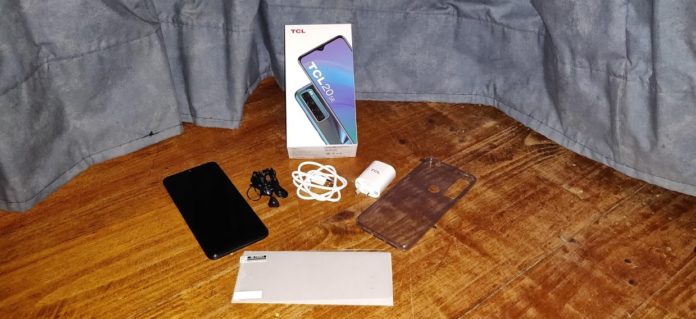
The TCL 20 SE comes with the standard accoutrements – charging plug and cable, but also includes a set of earbuds and screen protector.
The setup of the TCL 20 SE was fairly standard, but did contain a few variations, one of which was the ability to choose your favoured home screen style – labelled as either left or right handed – to select which way around your bottom navigation is situated.
The other interesting inclusion was the setup of Google pay as part of the initial start up. Interesting because the service needs an SMS verification code from the bank, and you can’t receive said SMS until the phone completes setup – it then becomes a race to see if the Google pay app downloads before your 30 minute code expires, especially since you can’t prioritise the order of your app downloads.
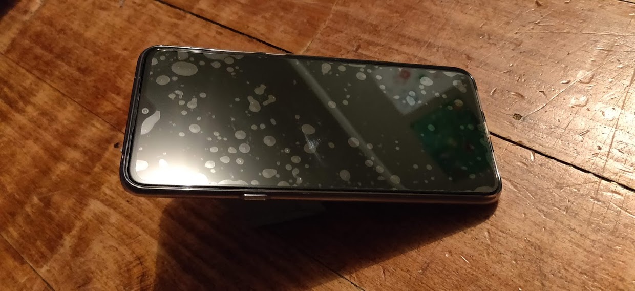
I had a slightly inauspicious start to using the 20 SE. As I suppose most people would, I tried to apply the included screen protector prior to powering it on. I did my best, I really did, but no matter what I tried the phone ended up looking as though it had a bad case of acne. However, the clear case which comes with the phone has just enough of a lip on it to keep the screen clear of the surface if you put it face down.
The Specs
The screen itself is fantastic, with crisp and clear high quality resolution it is a 6.82-inch V-notch HD+ display, featuring a screen to body ratio of 90%. The phone is running a TCL UI with Android 11 OS, a Qualcomm Snapdragon 460 chipset, Qualcomm Kryo 240 Octa-core CPU and Qualcomm Adreno 610 GPU.
The 20 SE has an AI Quad-Camera, a 16MP/48MP main camera (16MP uses the auto default settings, 48MP is used when in high pixel mode) a 5MP Super Wide-Angle camera with a field of view 115°, a 2MP Macro camera and a 2MP depth camera.
According to TCL, the rear cameras feature: 4X digital zoom, AI colour portrait, Depth Bokeh, dual single-tone LED flash, face detection, Google Lens, HDR, in-recording snapshots, Light Trace Mode, low-light video, Night Mode, Panorama Mode, photo filters, Portrait Mode, Pro Mode, scene detection 2.0, Slo-Mo Mode, Super Macro Mode, Super Resolution, Stop Motion Mode, Wide-Angle Mode
The front camera is 13MP and features: face beautification (photos), face detection, HDR, LCD flash, and portrait mode.
The face beautification options are fairly minimal – just two slider bars – and are set to off as a default. HDR gives your photos more detail by taking multiple shots at different exposure levels and then combining them into one picture. In effect, this means you can take photos without having overly bright and or dark areas and which have a consistent level of detail across the whole of the photo.
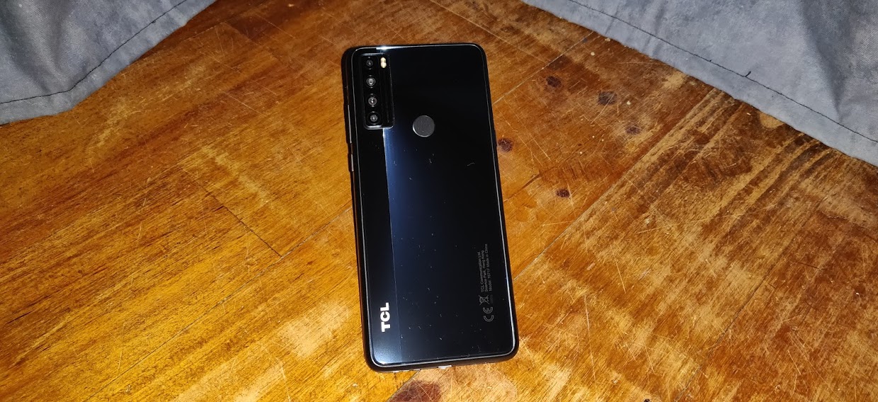
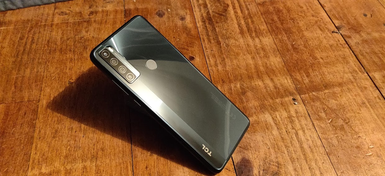
The phone itself comes in Aurora Green and Nuit Black, and with the case on, is 17.5cm long and 8cm wide. The fingerprint scanner is located on the back of the phone just to the side of the four camera lenses. It has the standard volume and power buttons on the right and a dedicated Google Assistant button on the left. This model also includes a headphone jack as well as Bluetooth connectivity. You are probably going to want to use both or either of these features as the inbuilt speaker isn’t the best. The sound is quite muffled, with a noticeable echo-y quality on spoken word audio and a notable lack of clarity when playing anything instrumental.
The battery life on this model I found to be excellent, I tend to be fairly moderate in my phone use, but I do use Google Chrome quite a lot which can be hard on battery life. Even with that I found I was getting 2 to 2 and a half days of use without needing to recharge.
There are the usual security options for locking and unlocking the phone – face unlock, pattern or code and fingerprint unlock. The face unlock is the easiest, but there is a slight delay between the power button press and the unlocking of the phone.
The fingerprint scanner was inconsistent in successfully unlocking the phone. Quite a few times it wasn’t able to recognise my fingerprint, and after 3 attempts it sends you to your passcode/pattern screen instead.
The Camera
Rather than a circular grouping, the camera lenses are in a vertical line, which can require some readjustment if you are jumping between lenses but capturing the same shot – going from auto to macro causes the centre of the shot to jump an inch or so to the right.
I also found that I ended up with better, less pixelated images using the auto camera and optical zoom than I did when using the super macro lens.
The 20 SE comes with the usual camera features of time lapse, slo-mo, panorama and super macro, but also has a few new interesting options – light trace, AI colour and high pixel. High pixel is exactly what it sounds like – instead of using 3000 x 4000 resolution, it uses 6000 x 8000 resolution. The resulting photo is of higher quality and has a much larger file size.
AI colour leeches the colour from the background to make the subject of the photo pop more. It is a really fun feature to play with but the execution isn’t quite on point. The software isn’t 100% when it comes to detecting accurately what is background and what isn’t, you can end up with patches through the centre of the subject being shown in grey, or flyaway hair ending up looking grey because it was outside the colour bubble.
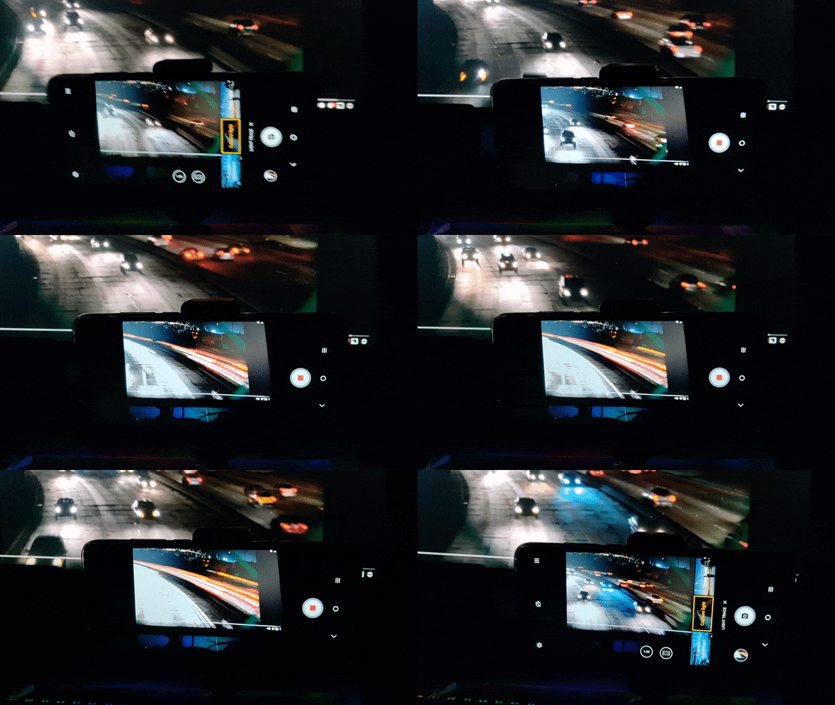
Light trace gives you three options: capture movement, capture light and draw light. Capture movement seems to be for capturing a still scene with one aspect of it being in motion, a waterfall for example. The camera records in similar fashion to a video but instead of connecting the frames taken into a video, they are layered over top of each other with the end result being a still picture. In reality, what it produces is a picture with blurred sections to indicate movement.
The capture light option is in effect a time lapse – a long exposure generated by capturing an image every second and overlaying them.
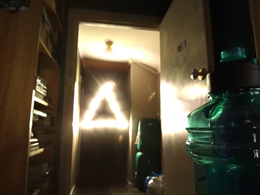
Finally, draw light. In a darkened environment wave a bright light around and the camera works in essentially the same way as it does with the capture light option.
While these options were fun to play with, realistically all three options require the use of a tripod to get any kind of reasonable result, and even then the images produced are just that – reasonable.
A quick look through the camera settings showed two intriguing options: AI scene detection and calorie detection. The AI scene detection is used with the AI colour selection option but also to allow the camera to automatically adjust the settings to get the best possible picture. TCL smartphones also have something called NXTVISION which is a visual enhancement software. It can, in real time, switch between SDR and HDR (standard and high dynamic range) to improve the colour, contrast and clarity of your picture quality. It also allows you to engage reading and eye comfort modes and adjust your screen colour options.
The calorie detection is supposed to show you the approximate calorie count of the subject of your photo – providing it’s edible of course. I found this feature incredibly hard to get to work. I eventually did manage it, but only with an apple, and only after 10 minutes or so of waving it around in front of the camera, trying every possible angle and lighting option.
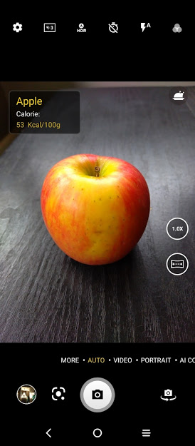
It couldn’t recognise grapes or a banana, even a Freddo frog still in its packaging wasn’t recognised.
After finally managing to get the calorie display on the screen I took the photo – only to find that the calorie information isn’t retained, either on the photo or in the photo information.
The cameras and their quality are about what you would expect given the cost of the phone – for day to day photography in the auto setting the 20 SE is quite good, but the fancy extras which have been included miss the mark somewhat – they are fun to play with but you can’t expect anything quality from them.
The Experience
The 20 SE is one of those phones that, once you set it up to your liking, just works. There’s nothing jarring or aggravating in the UI and quite a few nice surprises.
The app tray can be the standard alphabetical arrangement, but the default used by TCL is to group your apps by type. It takes a bit of getting used to – you have to figure out which category the phone has put your app under rather than just alphabetical order but it can be a useful way to access your apps. Additionally, it displays recently opened apps across the top of the tray for quick access.
The 20 SE also has the option to show either a floating window or a split-screen. It is accessed by pulling up the open apps and dragging the desired app up and right for a floating window or up and left for split-screen.
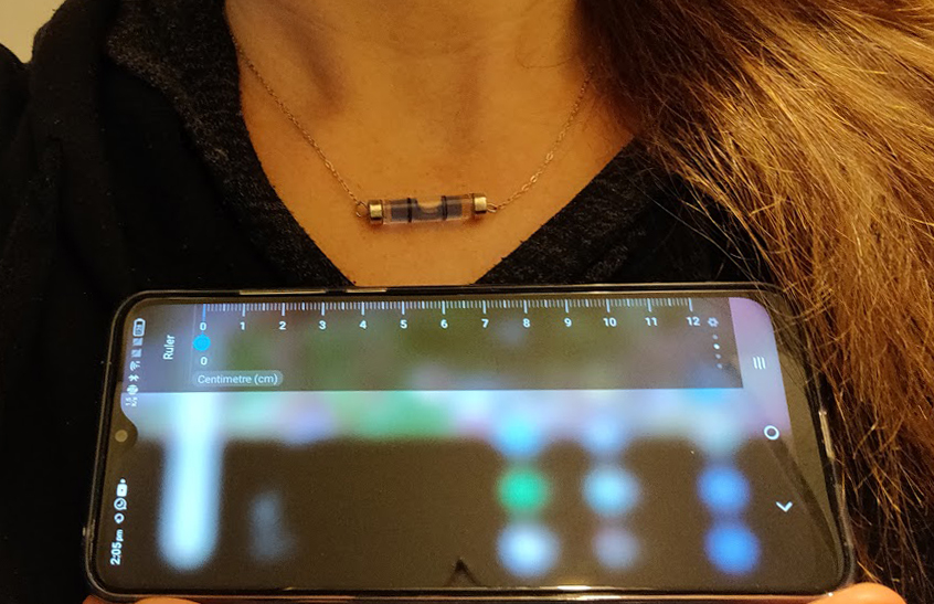
There is also a slide out sidebar for quick access to apps, contacts, and functions which also contains a ruler. This particular discovery made my nerdy little heart beat with love. I know most people wouldn’t get overly excited about this feature but you’re talking to a girl who owns a spirit level necklace here.
In summation, the TCL 20 SE is quite a reasonable phone for its price point of $299. The user experience is pretty seamless, the battery life is great and the auto camera settings produce really nice pictures.
There are other phones in the TCL range at slightly different price points, keep an eye out for an upcoming review by Phil of the TCL 20 5G and Duncan’s take on the TCL 20 L+, so if the 20 SE doesn’t tick all of your boxes there is likely another TCL that will.
The TCL 20 SE can be purchased from all the usual online and in-store retailers.



Pffft what’s this rubbish. 720p in 2021 welcome to the 90s
A few things you failed to note, Keith:
Reliable 720p in Android phones was early to mid 2010s, not 1990s. The first generation of Android devices was merely 240p to 480p.
Despite the absurd rip-off price here in Ausfailure, this is obviously an entry level device.
TCL are a Chinese mob that has their corpor-rat HQ in the Cayman Islands Tax Dodge.