
Garmin is a name synonymous with athletic GPS and wearable activity trackers. A position in the market well earned by their ability to adapt to the times and give users the functions they’re seeking. One of their most recent hardware additions, the VIvomove HR edges away from the athletic wants and needs into a smartwatch with a professional edge while keeping the Garmin smarts about it.
The Hardware
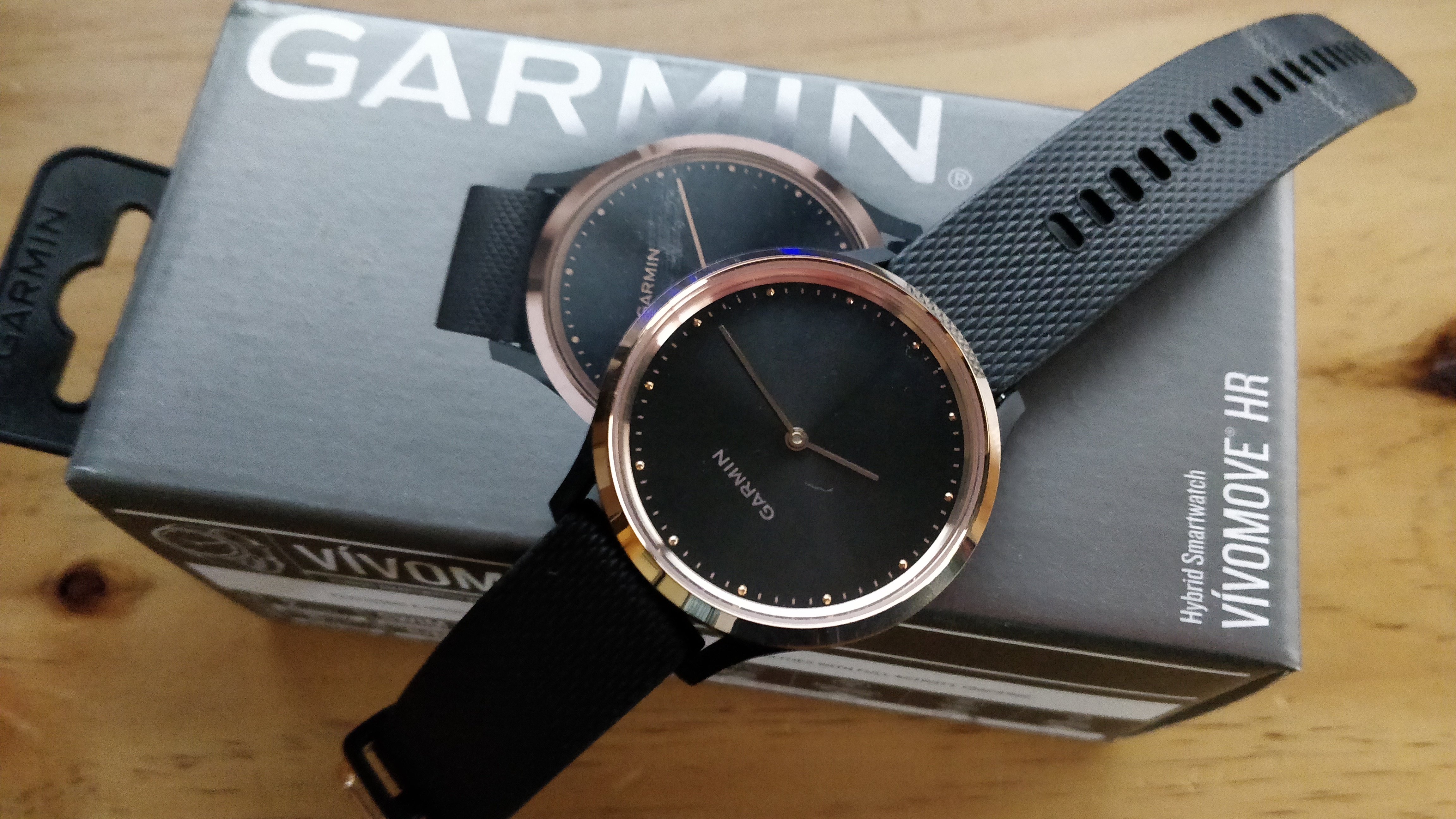
Taking a quick look at the hardware directly, it has a clear look about it that gives it a place in a professional setting versus many of the other smartwatches on the market. The watch function itself is a sleek and elegant analog clock with a 64 x 128 pixel touchscreen panel in the display for notifications and control of the GPS and smart functions.
The watch face is as near to perfect as they’re likely to be able to achieve without making a mens and womens model. Achieving a balance between not looking overly large and chunky on a woman’s wrist vs looking dainty on a man’s, a very fine line to walk and a huge tick in the box for the garmin team who’ve done their research here. The other notable thing here is there was no fiddling about, as soon as I put the Vivomove HR on – it was really comfy.
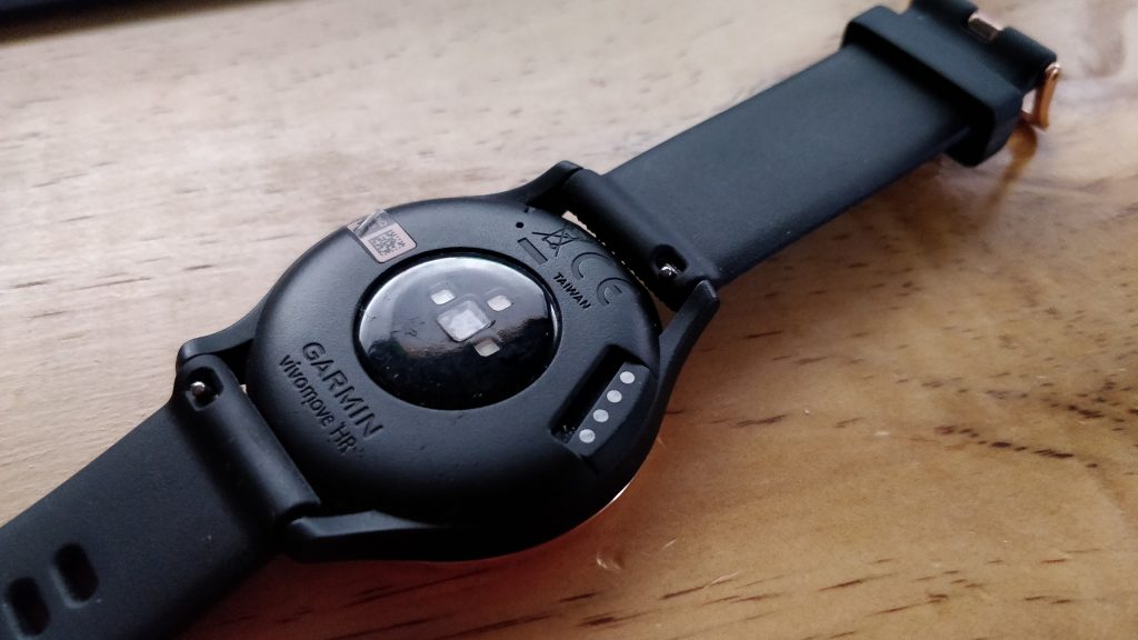
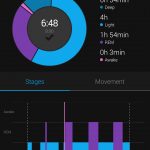
The comfort factor is really important for wearable devices like the Garmin range because they also track sleep quality and patterns, depending on the specific device – there’s also some very advanced sleep tracking available from Garmin.
Garmin list the watch as having 2 weeks battery life in “watch mode” or up to 5 days when running as a smartwatch and as with nearly all the Garmin review devices I have had the fortune to review in the past – The battery life has been exceptional. I’ve been tracking 30 – 45 minutes of activity four or five days a week and have gone 6 days between charges, the less activity tracking you carry on will result in better battery life.
As earlier mentioned, compared to previous models that we’ve reviewed at Ausdroid, the Viovomove HR Sport is a fairly significant change in screen presentation. Rather than a full smart screen, the analogue clock is a permanent fixture and the smart screen is simply a 64 x 128 screen that has some very simple displays on it requiring you to understand what each of the icons mean. The two things I really like about this setup is that even in full sunlight, the screen and watch are clearly visible and the clock is always available.
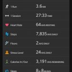
The downside of having the small screen for activity data is that there is little capability to review on the watch itself, you need to open the app on your phone to do so. Frankly though, I’m more than OK with that because the target market for this device is more the casual “at home” runner versus the serious athletes out there who are running marathons, long distance cycling or swimming on a regular basis.
Being a simpler device than many others, the customisation for data screens is pretty minimal but offers a reasonable amount of insight into your daily activities. The scrolling screens available are the date and time, steps, intensity minutes for the week, calorie burn for the day, some basic music controls for your phone, Weather based on your GPS location, Notifications, Heart Rate and Stress.
Activity Tracking
Garmin activity tracking has always been top notch and they live up to their reputation as one of the market leaders in the field. After several outdoor runs and walks, the device has done some calculation around step length and made the tracking of indoor treadmill activities surprisingly accurate.
When it comes to tracking options the Vivomove HR has only a few options: Walk, Run, Cardio, Weight Training and Other activities. A significant reduction in the activity tracking compared to some of the higher end models, but again this particular device is aimed at users who are not serious athletes but more those who enjoy a casual run, ride or swim.
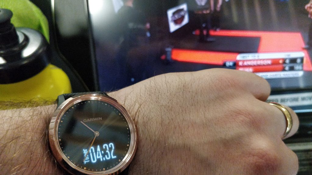
The impressive accuracy of weight training detection has continued on this devices, at high accuracy detecting most activities accurately as well as the number of repetitions. One of the issues I’ve faced previously was the need to start and stop sets, the Vivomove HR only requires a single tap on the screen which somewhat alleviates this and gives better timing for your rests and set timing.
For a relatively basic device, the Vivomove HR Sport offers a really solid set of options for a large number of users who are looking for some basic activity tracking and notification options.
What it does well
The design presentation and user experience delivery is really solid, fitting in a professional environment but having much of the functionality that many smart devices do. The main caviat being that it’s a notification device and does not offer any input functionality that a WearOS device would.
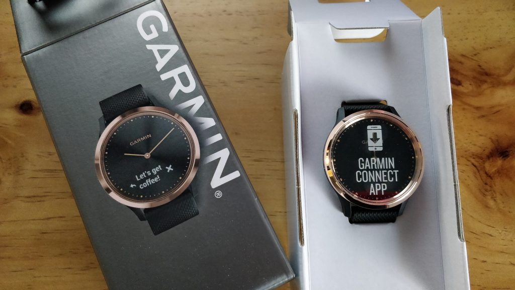
The notifications are simple, discrete and in many ways I find it far less invasive than other devices. A simple notification of outstanding messages, emails, social media or chat notifications that you can open if you wish. If not you can either ignore them or if you need to drill into them with more detail, grab your phone.
The App and experience
While the Garmin app continues to evolve and add functionality, the experience has been really solid for quite some time. The continued evolution will be more an expectation of users now than a pleasant surprise when it occurs.
Generally speaking whether you have an older GPS device or a new, bluetooth enabled on that links directly to your phone for the instant gratification of seeing your data then the experience does vary slightly but the intuitive interface makes navigation simple and quite honestly – the best option in terms of mobile app for activity tracking that I”ve had exposure to.
The app experience is integral the the success of a device like this due to the minimalist nature of the data available on the watch itself. The combination of hardware and software, with the real time data-sync between the two makes for a simple and enjoyable user experience.
Conclusion
This is another really good device from Garmin which ticks all the boxes for your average users. There’s plenty of activity tracking options, sleep tracking, good battery life and plenty of data that can be analysed in the app itself.
The engineering effort that’s gone into the physical watch itself is outstanding and the presentation can easily pass in a professional setting. The comfort factor is very high for women or men, giving users all day (and night) wear in order to capture the maximum amount of data possible.
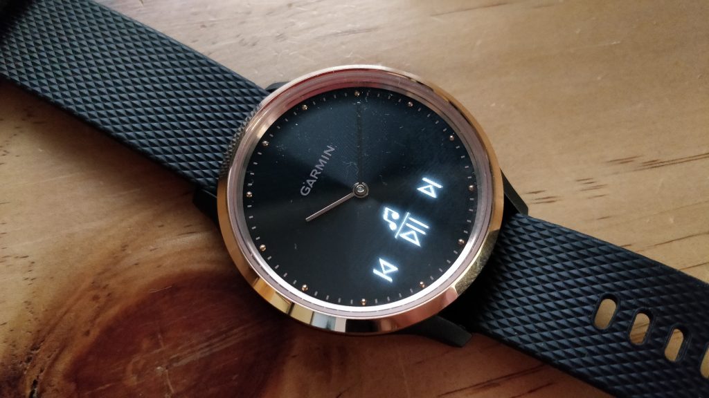
The $299RRP of the watch makes it highly attractive given the $500+ competitors on the market. If it’s not quite down to a cost that’s right for you, keep your eyes out for the inevitable sales that will happen regularly. Garmin produce excellent quality hardware and the user experience is excellent.
What features do you look for when shopping for a smart watch?





No NFC? Such a shame, the only thing that is missing for me.