The wearables market isn’t going anywhere. There is definitely a market for wearables, but no one has really hit on the perfect formula; this is certainly the state of play for smartwatches. There’s a lot of choice in the ‘smartwatch’ market with devices ranging from fitness trackers like fit bit to full blown wearable OSes such as Wear OS and Apple Watch and so much in between.
Some people have found a device/ ecosystem that they love, others haven’t. I’ll admit where my feelings fit in all of this, firstly I have always worn a watch, and likely always will. Secondly I do like Wear OS 2.0 the new UI is great but the overall performance and battery life of the platform falls just a little short for it to be mass market ready.
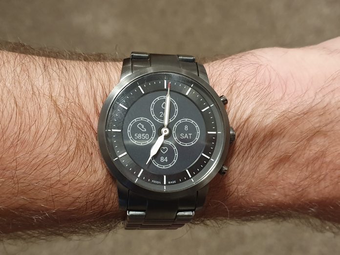
When we heard about a potential Fossil Hybrid Smartwatch featuring mechanical hands, a digital display and insanely long battery life I was immediately intrigued. I’ve had the Fossil Collider HR on my wrist for a little while now, so how did it compare? Is this the smartwatch we’ve been waiting for?
WHAT’S INSIDE?
Hardware wise you’re looking at a very traditional looking 42mm round analog watch, I have the Stainless Steel model and it looks simply stunning. Most people who see this watch mistake it for a traditional watch.
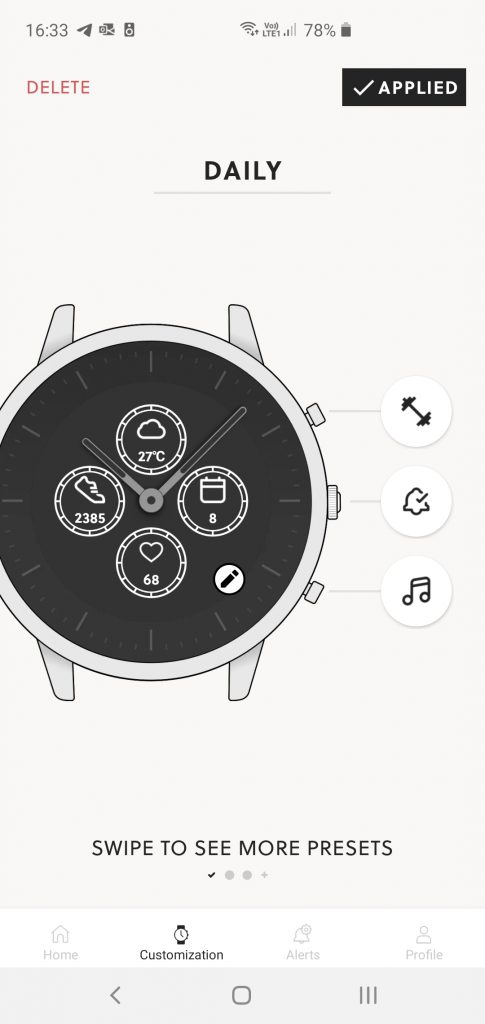
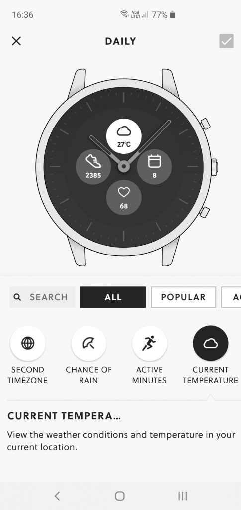
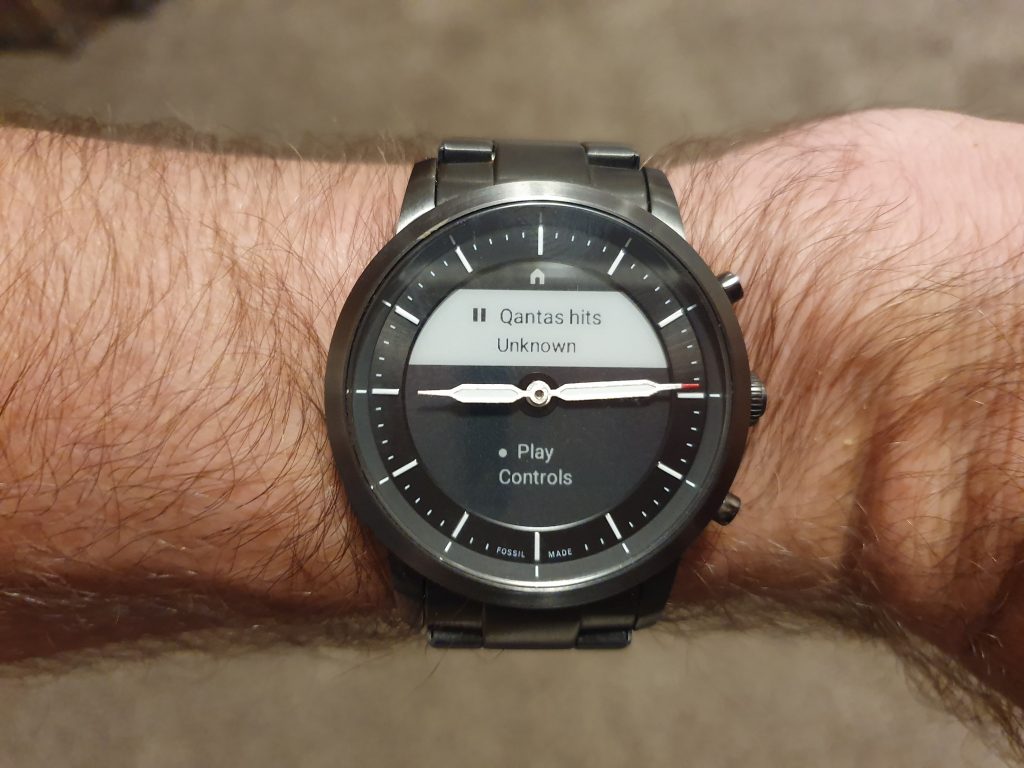
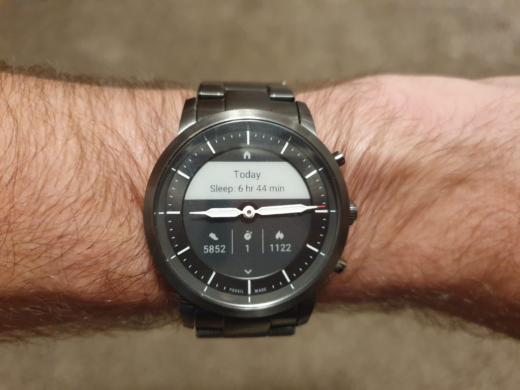
The magic is in the e-ink display that sits under the mechanical hands, this display can be configured with four complications to act as a dashboard, with the standard array of options available including date, steps, heart rate, weather, temperature, calories and battery life.
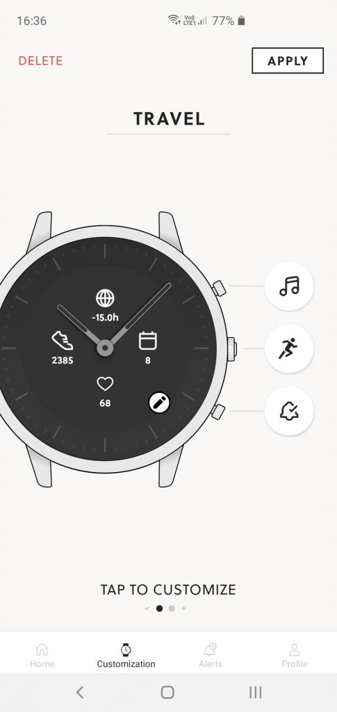
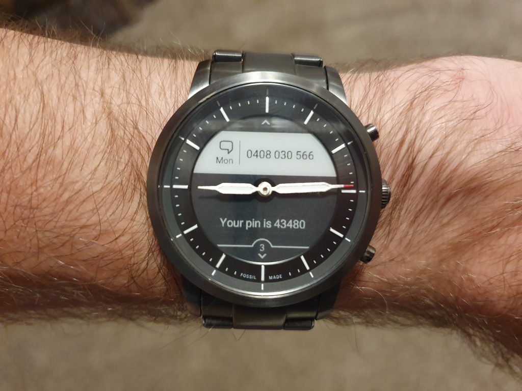
The three buttons can also be configured to launch different UIs for the watch including a notification display, wellness display (with all of your health metrics for the day), Media control, stop watch, timer and a few more.
You can set multiple preset combinations of the complications and button actions so you can quickly switch between them in different scenarios. For me I never needed that, I used it the same way day in and day out, but for you this customisation may help.
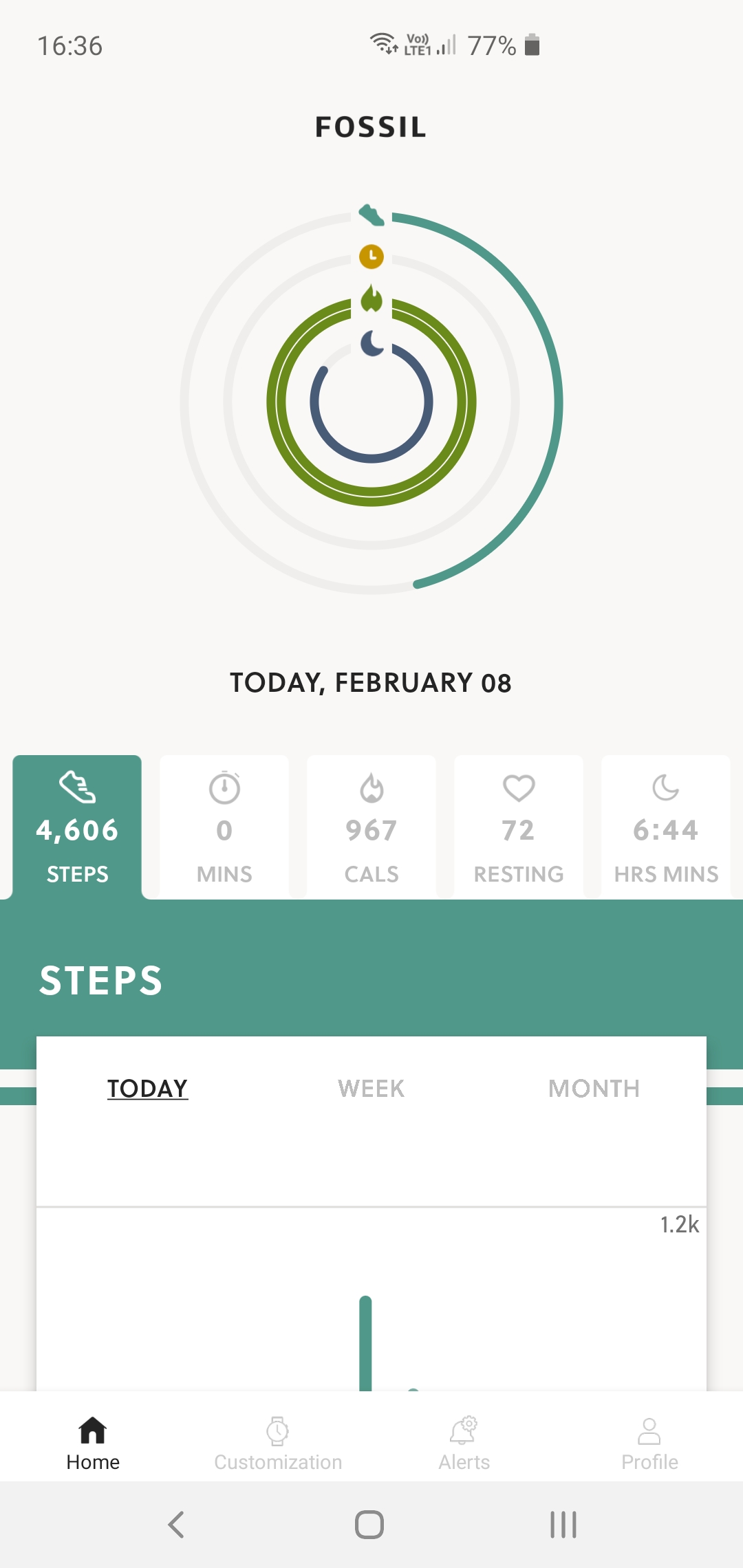
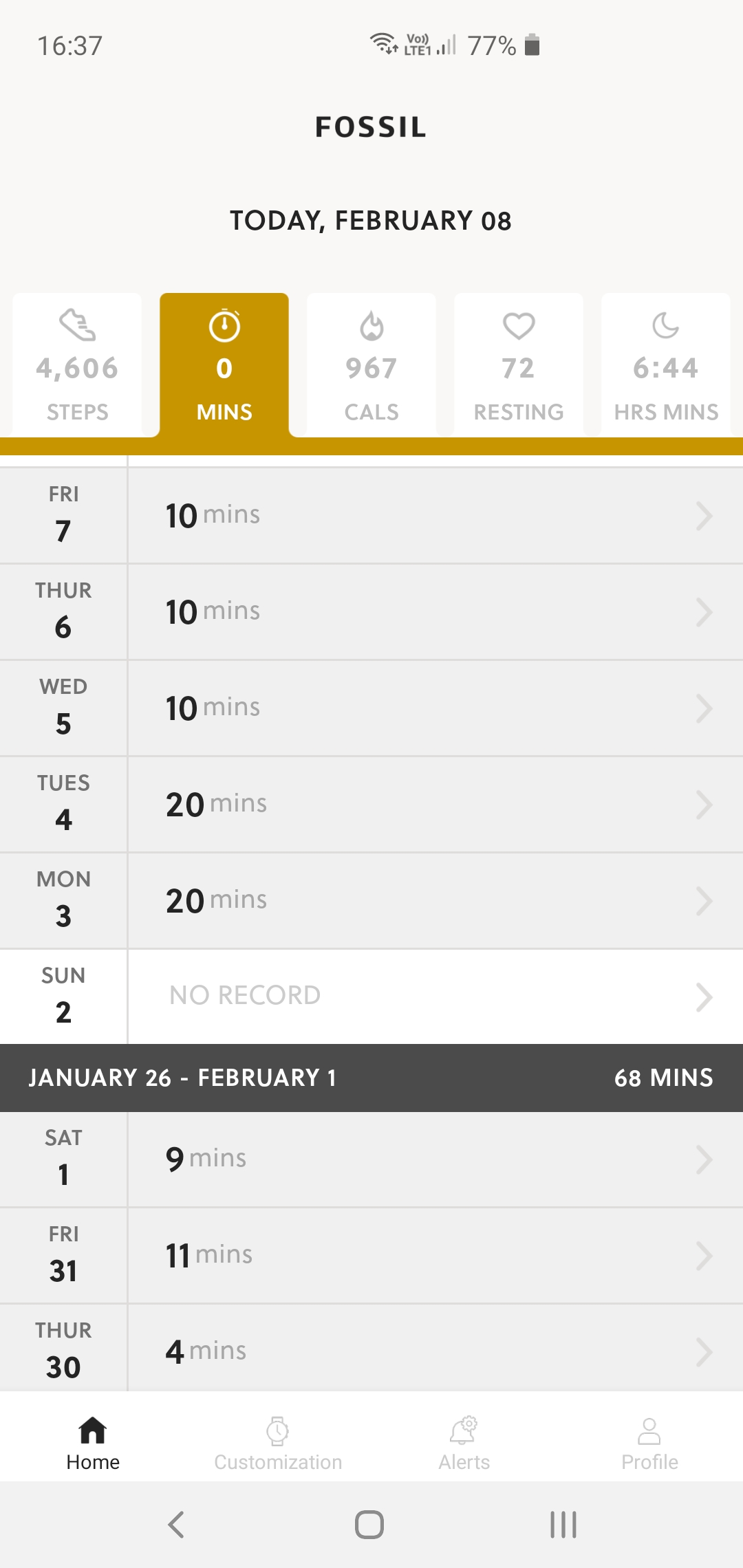
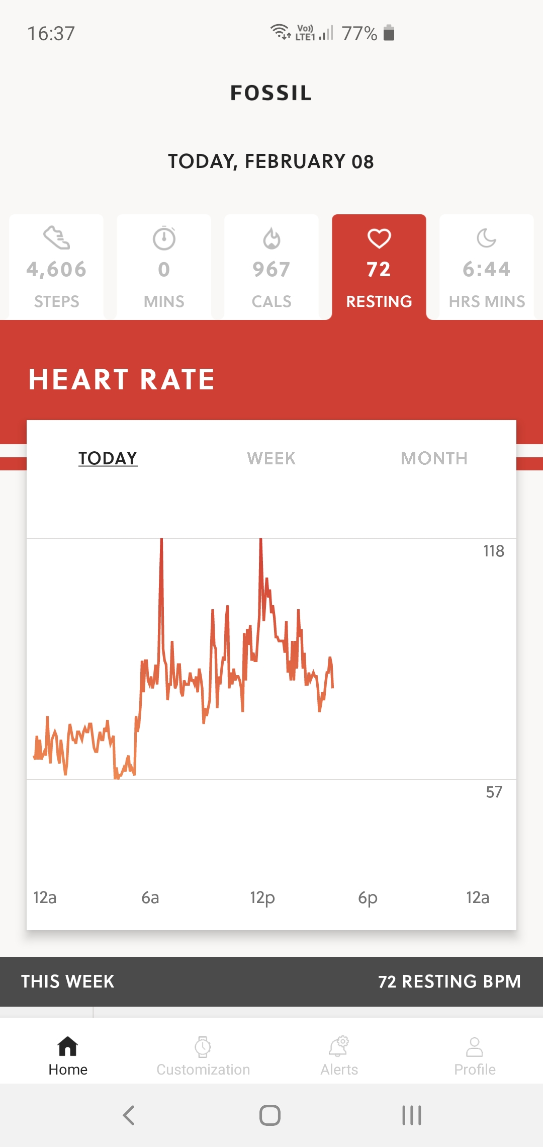
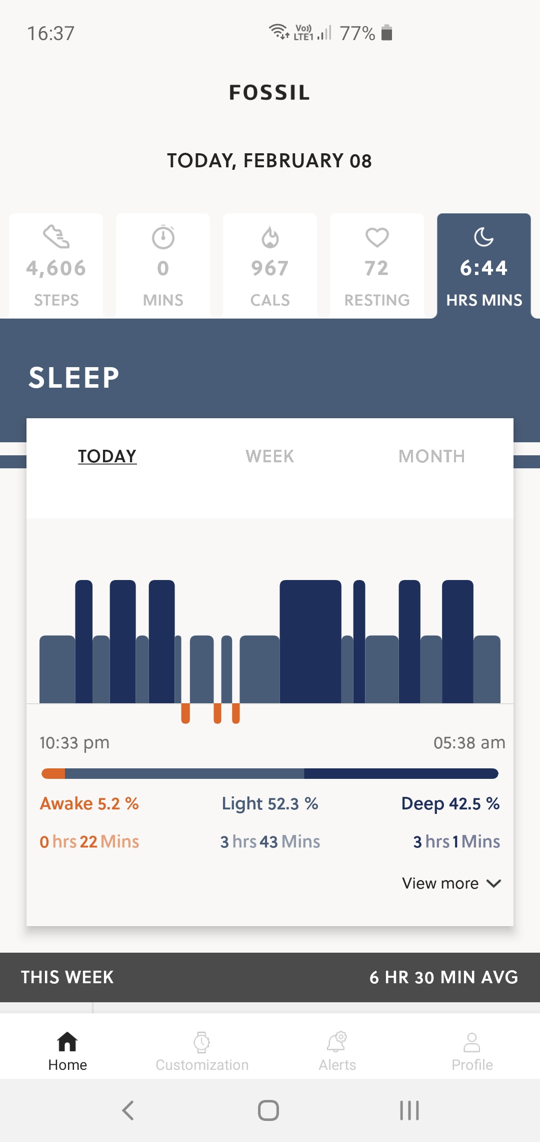
Being a smartwatch, its got a little more under the hood. Inside there’s an Accelerometer and Heart Rate Sensor. Using these two sensors you get step tracking, Fitness tracking, continuous heart rate tracking and sleep tracking.
Rounding out the watch bits, it has a standard 22mm interchangeable watch band with quick change pins. It features 3 atmospheres of water resistance according to their website though I never tried to get it wet.
WHAT’S IT GOOD AT?
Firstly it tells the time, 24 hours a day, 7 days a week. That may seem silly but I know many people who have their smart watch displays turned off to conserve battery life, this significantly retracts from the primary watch function of well, a watch. At night you simply have to double tap the display and a backlight flicks on so you can see the hands, and thus the time.
Battery Life
I know what you’re thinking, the battery must only last a day or two with all of that functionality? Nope, in fact the battery lasts so long I forget it even needs charging. I ran the watch with full normal use including the HR tracking and sleep tracking and after a week it still had more than 25% battery.
In my next test I charged it when I had a shower each day, and despite forgetting a few times it remained at 100% after the last day’s 10 minute or so charge. If you want multi day battery life, Hybrid is definitely the way.
I know this isn’t the first e-ink smartwatch around, but it’s one you can still buy today and it’s backed by a major force in consumer watches.
Delightful UI
I wasn’t expecting anything overly flashy from the device, but Fossil has solved one of my main grips with all watches, let alone smartwatches. And that’s when the hands are blocking something on the display.
The solution? A simple flick of the wrist. If you need to read the date and your minute hand is over that complication, simply flick your wrist back and forth, the hands will do a 360 degree syncronised sweep of the watch face, meaning you’ll get an interrupted view of the who display as the hands fly by.
When interacting with the device to read notifications for example the hands move to 9:15. This means they’re straight across the screen and fossil has designed the UI to have a gap right there. It’s simple and elegant and a good solution to the problem of having physical hands on top of a display.
Even digital only smart watches suffer from this issue, OEMs the worlds over, shamelessly copy this. Please.
Health Monitoring
With all previous smart watches I’ve had the included continuous HR monitoring I had to turn that feature off as it depleted the battery too quickly, and normally resulted in less that a days battery life.
I had previously been blaming the HR sensor figuring it was chewing the battery, but it turns out it was likely the overpowered SoC that was being used to crunch that data. I have loved being able to continuously monitor my HR and Sleep.
I haven’t slept with a watch for years, but now it doesn’t need daily charging, and I am getting valuable sleep data. I changed my habits because the functionality was helpful. Like all health data it’s only as useful as the changes you make with that data, but you can’t use it at all if you aren’t collecting it.
WHAT’S IT LESS GOOD AT?
Coming from a WearOS smartwatch the switch to a lower power SoC and slow refresh rate screen was discombobulating, to say the least. What can I say? I want it all. The speed and performance of the processor and screen are right on par for what they are, but make no mistakes this is a slow UI to navigate if you need to go any further than one screen away.
Not only was it slow to navigate and refresh, but more than one click away you often got lost in unintuitive menus. I found there was a large learning curve in figuring out when a long press was needed or when to press a different button. Being software however this could be compensated for.
What did that mean? For me the Collider became a dashboard and vibration alert system, and that is useful on its own. I found that while it was useful for seeing a message coming it, it was not good for reading, triaging and definitely not for responding.
As a result I found I used the watch less that I have been using a WearOS device, and just pulled my phone out a little more often. I don’t see that as an overall negative, it is doing what it is designed to do, and it is doing it well.
It doesn’t have a colour AMOLED touch screen and microphone for voice input, so honestly I would NEVER want to respond to anything from the watch anyway. What you need to know is that is its limitation. Sure you can open a message and read it and send a pre written response but trust me, don’t.
Payment
This is less something that didn’t work well and more something that just isn’t there. I used my WearOS device for payments every day. I miss that feature. It would have been great if the Collider HR featured an NFC chip for mobile payments, but I understand why it didn’t.
Which payment ecosystem would drive it? Fossil has no mobile payment app, and I assume has zero interest in developing one, that’s just not core business for them. Partner with Google you say? Yes, that was my preferred solution too.
However, that’s not completely clean either. Google would need to insert a secure element into the Hardware, that would then need to communicate with the Google Pay app. These things aren’t impossible but they would be very difficult. There is also the possibility that perhaps some people wouldn’t want a fossil hybrid watch with Google anything on it?
So the Collider HR can’t be criticised for not having something it never said it did, but boy do I wish it did.
THE FUTURE
There is definitely something here. A hybrid of this hybrid and WearOS may see us get closer to a great fully featured Smartwatch. I have seen colour e ink touch displays at trade fares so that technology is on the horizon.
We know that Qualcomm is working on more power effective SoCs for use in wearables, perhaps that is another piece of the puzzle. Battery tech continues to improve so maybe ultra low power will also be less of an issue.
We know that Google bought significant IP from Fossil last year in and around the Hybrid Smartwatch space. So clearly good is interested in some of the background tech that Fossil is using.
I think in time we may look back and see that a device live the Fossil HR family just may have been a fork in the road, perhaps the destination is down that track?
CONCLUSION
I started with the Fossil Collider HR with great excitement. I was intrigued exactly what a hybrid smartwatch in 2019 would bring to the table. I had a very set use case for my existing smartwatch usage and that largely informed how I thought about the device.
The enormity of the battery life just can not be overestimated. This one feature changed how I used smartwatches, the ability to constantly monitor HR and sleep daily and only need a 5 – 10 minute charge whilst in the shower and not run flat is world changing for smartwatches.
Now, this came with a trade off. The screen refresh rate means that the Collider HR is best used as a dashboard and for notification alerts. I got used to that and honestly I didn’t find it a huge compromise. I do want more, I’m just not sure where that line is.
Without payment there’s a major feature missing for me , but for some that may not be an issue, equally it could be a deal breaker.
So buy or no buy? Here’s the thing, despite the no payment and less functionality than I want, I just don’t want to take this thing off. It is a great watch, I find the heath data very useful and as a notification device it works great.
So if those things are what you are looking for in a smartwatch, then I have to recommend you check out the Fossil HR Hybrid family of devices. Watches start at $329 and go up to $369 depending on the finish.
The best place to find them is either Fossil.com or a Fossil store.



No nfc, no dice
So in terms of screen contrast my ancient Pebbles match this and their software blows it out of the water but I have high hopes for this range eventually. It was good to see the quick response when the watch launched with a very narrow range of supported apps for notifications and the Devs pushed an update that makes it handle all notifications natively (as I understand it) I hope the OS on the watch matures and then I’ll happily buy one where they drop the physical watch mechanism and accordingly slim it down. they can make it Svelte to… Read more »
I love it. My fossil smartwatch, with all the functions, i never wear. The button gets pressed every time I bend my wrist and it does stuff i dont need it to do its fat and dies quickly. I am 31 and have plenty of new technology around the house but on my wrist I only want a watch and to know who is texting or calling so I know if I need to ask the people in front of me if i may be excused for a moment to answer or respond and to set an alarm to vibrate… Read more »
thats brilliant. if this range is popular then we will have a parallel thread to the android wear stuff but emphasising battery life, screen readability, utility via physical controls. I didn’t think we would get that again after Pebble fizzled which I think was largely due to not being able to afford bespoke screens and parts to get the devices to look particularly stylish
Have owned the stainless steel Collider for just three days and love it. Don’t care about payment feature or slower screen refresh. It does everything I need. The Fossil app could use some minor additional features, but is solid and perfectly usable.