
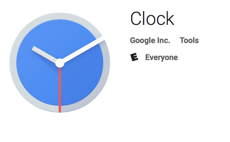
Google has updated their stock Clock app in the Play Store overnight, adding a dark theme, Android O support and a new icon.
There’s little more than the What’s New section to point at what’s actually changed, but if you simply look it’s pretty clear. The app itself has a dark black on grey theme which is a little easier on the eyes when looking at the clock at night than the previous bluish/purple hue.
Just as the app itself has gotten an update, the icon has gotten an update to support the new darker theme. Again, the purple has been replaced, but with a light blue instead of black although the grey is now present in the hands.
Exactly what Google means by Android O support is anyones guess at this stage, but with Android O moving inexorably towards an actual release we’ll find out sooner rather than later.




On Android O, the clock icon will be animated to match the current time. I suspect this is what the changelog references.