At today’s Google I/O Keynote at the Shoreline Amphitheatre, we got our next look at what’s coming in Android P and the official launch of the Android P Beta program. What’s new in Android P? According to David Bourke, Android P strives to move closer to having AI at the core of the operating system. The team has focused their efforts in three domains Intelligence, Simplicity and Digital Well-being, with AI influencing all areas.
Intelligence
Google is trying to move Android towards anticipating or predicting what the user wants to do next. Using on-device machine learning your Android P device will strive to learn how you use your phone and anticipate your needs.
Adaptive Battery
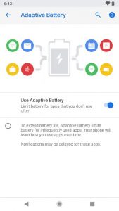
In combination with Google’s Deep Mind AI lab, the Android team has developed Adaptive Battery (AB) to give you a more consistent battery usage pattern day to day. Through analysing how you use your device, AB can result in a 30% reduction in CPU wake-ups by limiting access to the CPU to processes that aren’t essential to how you use your phone.
Google often promises better battery performance, and perhaps with the Deep Mind-trained on device Machine Learning model, Adaptive Battery may deliver those improvements?
Adaptive Brightness
If you’re thinking “I already have adaptive brightness on my phone” then you’re not crazy, however unless you’re running the new Android P you don’t have Adaptive Brightness powered by Machine Learning! The updated version of the original feature added in Android Lollipop will learn how YOU change your screen brightness in different lighting conditions and adjust the display based on your usage.
This sounds like a difference without a distinction, but I know from previous experience that the old adaptive brightness feature was a little hit and miss. Perhaps Google’s Machine Learning will deduce patterns in my screen brightness preferences even I didn’t know about.
App Actions
Building on Google’s predictive app draw experience in the Pixel Launcher where the system would predict and suggest 5 apps for you at the top of the app draw App Actions take things to the next level. With app actions not only will devices running Google’s flavour of Android, ie a pixel or and Android One device, predict the 5 apps you’re likely to want it will also surface actions from within apps.
For example if you log a run with Strava every afternoon when you open the app draw there between the app suggestions and the app list will be a shortcut straight into the Strava app to start a new work out. Another example would be connect a set of headphones and a resume playback button will appear on the list. App actions will also surface when you search on our phone either via the Google Omni box or via Google Assistant.

To support App Actions developers need to include a new XML file into this APK to drive the new functionality. For apps that are regularly updated this will likely roll out fairly quickly, for those less updated apps well you can’t expect new toys to work.
App Slices
With App Slices Google has introduced a new API to allow app developers ot let users interact with app content from with device searches or the Assistant. App Slices will launch as an early access beta next month.
ML Kit
To round out the intelligence section Google announced the launch of ML Kit – Machine Learning Kit – to assist developers with rapidly and easily integrating ML features into their apps without the need to actually learn how ML works. At launch ML Kit will include image labeling, text recognition, face detection, barcode scanning, and lots more.
Built on Google’s Tensor Flow Lite ML Kit will be cross platform with both Android and iOS developers being able to implement the new APIs.
Simplicity
Android is great, and honestly if nothing changed I’d be mostly happy with it, for a while. Luckily Google isn’t going to rest on it’s laurels and has put together a compelling package to simplify the UI model with Android.
Gestures
We heard rumours it was coming, saw screen shots indicating it was in development and today Google took the wraps of their new gesture based UI model. First things first in my 5 minutes with it the Back button is still there, but only when needed, now we’ve gotten that out of the way how do the new gestures work?
After enabling the new feature the familiar navigation buttons are replaced by a single oval home button (unless a back button is contextually needed). A small swipe up on the lower part of the screen, from any screen/ app will reveal the new “recent apps” function. In the new UI the recent cards are full screen allowing you to easily review the content of any recent app, not just the most recent.
This makes a massive difference to the usability of the recent apps and the interface becomes intuitive after only a few minutes. Further more the text on any recent app is available to interact with. Need to cut and past from Keep into an email, simply swipe up scoot over to keep copy the information out live from the preview and then drop back into the app you’re using and paste in the info,
Rotation Lock
As simple as it sounds the rotation lock on Android is another pain point. Lock you screen in portrait and it’s a pain to switch back, don’t lock the rotating and you’ll have your apps switching like crazy when you’re reclining. In Android P when you’ve activated the rotation lock you’ll now see an icon where the recent apps button used to be that lets you manually change the rotation of the device.
Again a small change but another little tweak that removes a little more of the frustration out of the UI. One issue is it also increase the knowledge burden for some users. I’m not sure for instance if my wife would ever engage in how this all works.
Digital Wellbeing
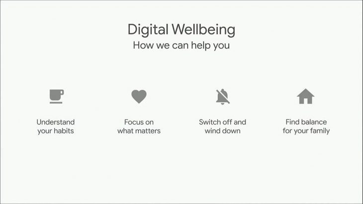
Lastly in Android P Google wants to help you disconnect and unwind from the digital world. According to Google 70% of smart phone users want to strike a better balance between the digital and the real world, I’d suggest the remaining 30% don’t even know they have a problem! To assist with this Google has built in some digital care take features to help you get control of your smart phone.
Dashboard
The Android P Dashboard will be a new interface to let you understand exactly when, how and for how long you’re using your devices. the new interface will show you usage metrics such as how many times you’ve unlocked the phone, how many notifications you’ve received and how long you spent in each app.

While the dashboard won’t change your behaviours it will certainty let you know what it is.
App timers
App timers however is designed to help you change your behaviour. Say you’ve got an app or two that consumes your whole life, oh lets pick Facebook at random. If you choose to find some real life balance you can set an app timer for Facebook limiting yourself to maybe 1 hour a day.
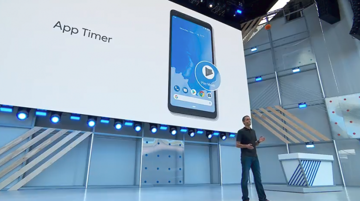
Using App Timers you’ll be able to set these usage goals and the system will send you notifications as you approach that maximum usage. After that he app icon will become greyed out as a reminder that you’ve already used that app for your goal time today. This is a light touch approach not forcing you out of the app but for those willing to change their habits this may just be the reminder they need.
Do Not Disturb
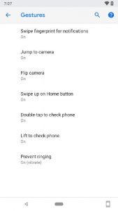
Do Not Disturb or DND has been on Android for a while now, in Android P it’s receiving a minor update to include a new “Shush” mode. When you flip you phone upside down on a table Your device will enter DND mode, perfect for that meeting or a family dinner. This is a great way to quickly silence your beast.
Additionally Google will be expanding DND to include blocking notifications while it’s active. It’s hoped that this will assist people with remaining present in a moment and not getting distracted by notifications from apps. Of course DND more does allow you to program some emergency break through contacts so don’t worry, the Pizza guy will always be ale to call you.
Wind Down Mode
Wind Down Mode is Google’s attempt to assist people who use their phone while they “fall asleep”, or as it normally is keeps them awake, seriously people stop going to be with your phone. For those of you that have this as pat of your nightly routine you can now program a Wind Down period.
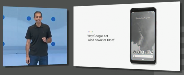
At the appointed time your phone will fade to grey scale, not only reminding you that it’s sleepy time but also reducing the negative impact that some colours of light are though to have on your sleep. In the morning your phone will have returned to all of it’s colourful magic.
Android Beta
As has become tradition, Google announced the official launch of the Android Beta program at the end of the android section of the Keynote. You can now get on to the Android P Beta program on a number of devices – click here for more details.
While we’re sure Google I/O has plenty more Android P surprises in store, for now that’s the state of play for new android features out of Google I/O. Stay tuned for more coverage as Dan brings you the latest updates live from the ground in Mountain View.





I like all the digital well being stuff. Not sure yet on the remix of the UI in general, but seeing I don’t even have Oreo yet (Moto Z Play direct from Moto AU hasn’t been updated) I’m sure the freshness at least will be appreciated if I consider a Pixel 3 later in the year.
Fantastic summary, and well written. Thank you, Duncan!