When Google introduced the new navigation gestures in the first Android Q Beta there was a lot of outcry over them. Many people didn’t like them, including myself. It is one of the biggest changes to the Android UI we have seen in recent times and Google seem set on it so they have taken to their Android Developers Blog today to explain why we need these gestures.
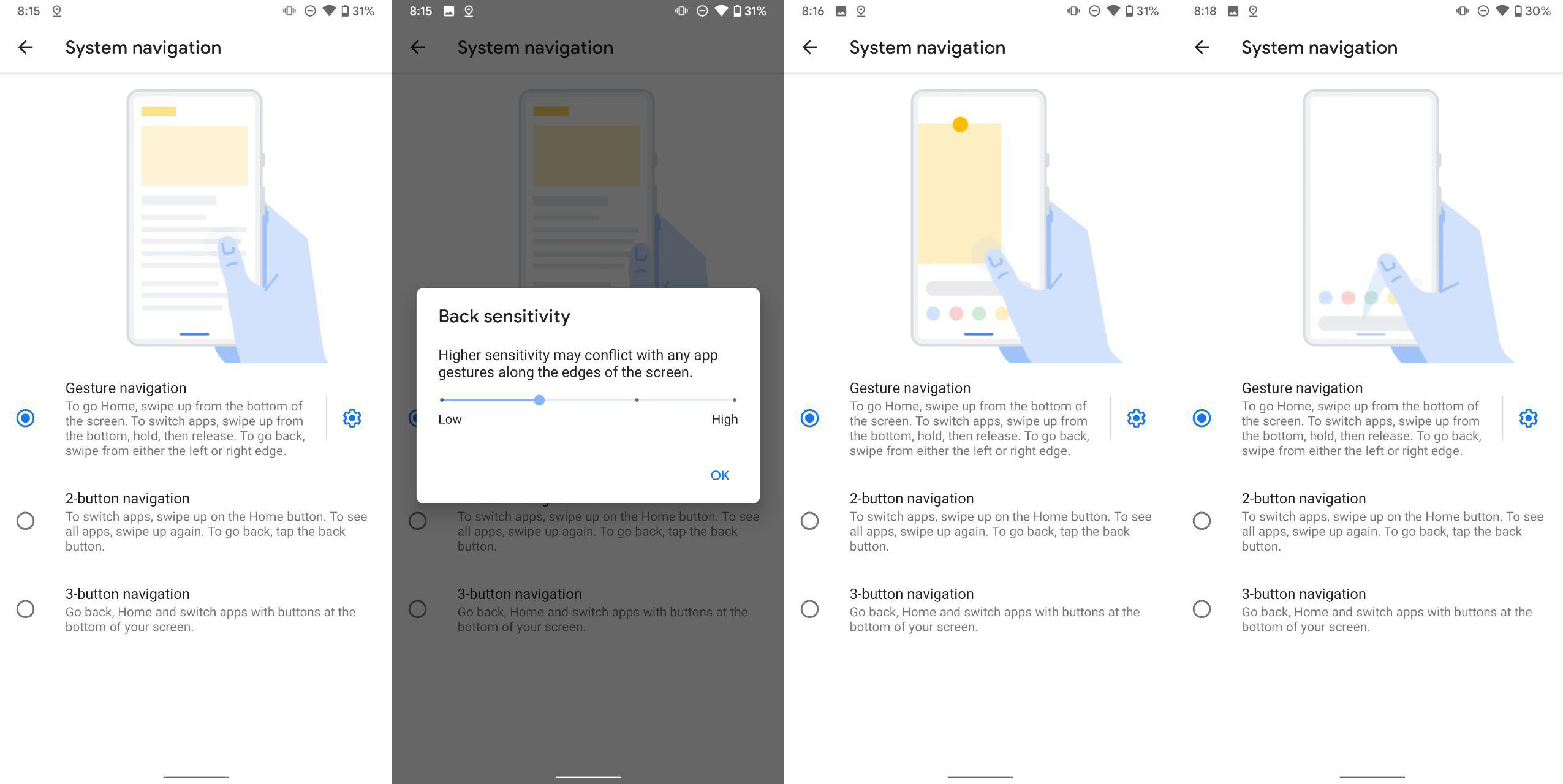
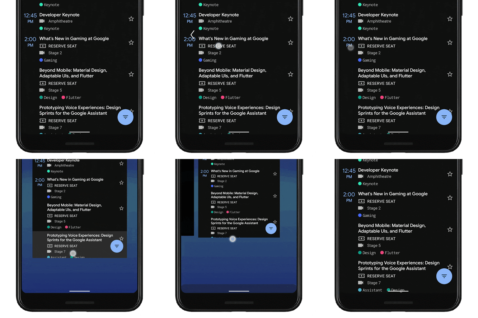
With the new system navigation mode users can navigate back using a left or right edge swipe , to the home screen using a swipe up from the bottom, or trigger the device assistant with a swipe in from the corners. The whole premise of the new system is to allow more of the display to be used by apps to create a “more immersive experience”.
Android UI product managers Allen Huang and Rohan Shah explain that they looked at the “very cool ideas” from not just Android Partners (OPPO, OnePlus etc) but also apps from independent developers (Fluid NG and XDA) and took inspiration from them in a bid to improve Android’s system navigation.
They settled on the current gesture system navigation because it is “faster, more natural and ergonomic”, less prone to accidental touches causing navigation, and provides a more immersive experience for apps. They did of course acknowledge some issues they would have to overcome with their new gesture system:
- Gestures don’t work for every user
- Gestures are harder to learn and can take some adjustment
- Gestures can interfere with an app’s navigation pattern
They did their research over how Android users use their phones to best determine how to provide the best experience for an overwhelming majority of Android users. They found that only 3-7 percent of people swipe to open drawers within apps with the rest (including myself) tapping on the hamburger button. They found that this back gesture was learnt quickly by users with most managing to use apps correctly without accidentally triggering the back gesture. For those who swipe to open the drawers within apps — too bad, so sad — they/you will have to adapt to using the hamburger button.
Adaptation took on average one to three days to adapt to the new gestures with users most struggling with “patterns like swiping right or left on a carousel and triggering back”. After this adaptation period users were able to consistently distinguish between the two gestures with a majority of users not wanting to switch back to using the 3-button navigation system.
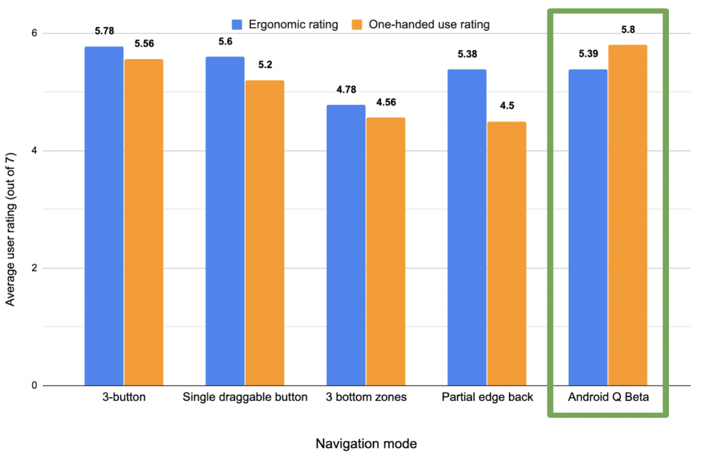
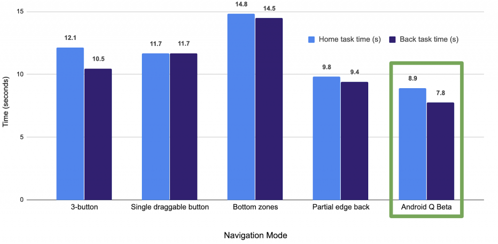
After testing out several different options they found that the one included in the Android Q Beta provided the best one-handed use rating and the best of the gesture systems for ergonomic rating. They also found that using the Android Q Beta gestures provided the lowest average time to complete Home/Back tasks.
The downside of the new system navigation gestures model was that the time taken to access the Overview/Recent apps was second worst out of all of the navigation options they tested.
The blog ends with some instructions for developers with how best to support the new gesture navigation within their apps:
- Go edge-to-edge to enable your app to draw across the entire screen
- Handle any visual overlaps with the system user interface (i.e. navigation bar)
- Resolve any gesture conflicts with the system gestures
In the end Android is still about choice and the 3-button navigation system will remain on-board but it will not be the default system navigation system. Whatever you prefer it is good to see how Google came to end up with this new system navigation system and it might just be time to give it another shot.
What about you? Have you tried the new gestures? Like, love or hate?


I’ve been using an app called Gesture Control and made up my own set of gestures, a mix of iPhone, OnePlus and Pixel. It works perfectly with my paid custom launcher Smart Launcher 5.
I tried making a set of gestures based on the new Q ones, not a big fan. I hope that Q doesn’t kill the ability to use my custom gestures.
Maybe I’m just an old fart , but the three button system works for me, and double tapping on the recent apps button ,
I can navigate back and forth between them so fast , I love it.
If it ain’t broke , why fix it.
As for going into apps , sometimes I use the up swipe , sometimes I use the burger button , it depends which launcher I’m using , I periodically change launchers every X amount of months depending on my mood(I love android ! ) .
I have been using them on the beta on my 2XL and find them quick and quite intuitive. Agree multi-tasking carousel the one that takes the longest to get used to. Definitely prefer to Pie’s pill system and gestures on EMUI 9 on Mate 20 Pro
Don’t use them because they don’t work with third party launchers.
The real reason is iOS did the same
If this means that I won’t have access to the current gesture of a quick swipe to the right on the Pill to switch between my current and previous app then I’ll be enabling the legacy (or existing Pie style) navigation system…or maybe I’ve just read the information incorrectly?