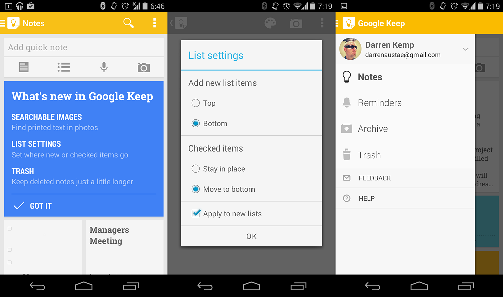
Today is Google’s regular day for updates and there are a few headed our way. One of those is for Google Keep which has a few nice little changes, nothing ground breaking, but nice all the same.
The change you will probably notice straight away is the new user interface. Although this is mostly just a few minor tweaks, with the exception of a new yellow Action Bar, I really like the direction Google is heading with the UI.
The other changes being made is the ability to search text within images, new list settings that control where new and checked items go and a new trash folder for those time that you need retrieve a deleted note.
Source: Droid Life.


Wish they went with transparent navigation/status bars with this update…
Google Keep is one of my favourite and most used apps. So simple – perfect for what it needs to do. Great update!