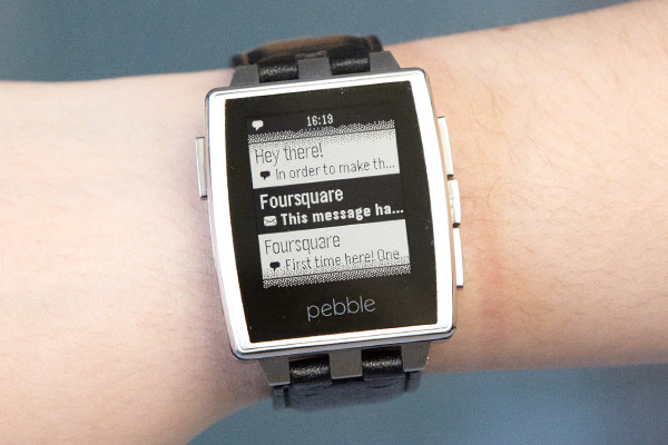
The Pebble Steel is the second generation Pebble smart watch, following on the success of the original Pebble, after its own success as a Kickstarter graduate. The Pebble presents a simple premise: a watch that doubles as a ‘second screen’ for your smartphone, allowing you to see emails, notifications, reminders and the like on your wrist without having to pull your phone from your pocket.
Both the Pebble Steel and the original Pebble did this, but there’s really one major difference between the two. The original Pebble made for a pretty ugly watch. As shipped, it had a fairly ordinary rubber band (which for me at least caused a bit of skin irritation), and a fairly boring black case (though there were other colours which looked equally wrong for a watch).
The Pebble Steel addresses this in a couple of ways — firstly, it’s made of steel, and so it looks more like a normal dress watch. Secondly, it comes in brushed steel (depicted above) and a matte black steel as well. Not only does it nail the wrist-top notifications, but it’s also passable as a day-to-day watch as well.
When we saw the news of the Pebble Steel back in January, we knew we had to order, and so we did. While we had a few hiccups with Pebble’s customer service, some delivery delays and a few other concerns, the Pebble Steel did eventually arrive, and we’ve been having a play with it since.
Pros:
|
Cons:
|
Hardware wise
Inside the Pebble Steel are largely the same innards as the previous model. It has a 144 x 168 pixel display in black and white with a modest backlight activated by a button press or just shaking your wrist. It connects to your phone using low-power Bluetooth 4.0 (where available), has just four buttons, a vibrating motor, and an accelerometer with gesture detection. It’s water resistant, to boot.
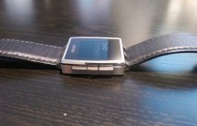
The buttons on the Steel are the same as the original. The single button to the left could be considered a ‘back’ button, whereas the three on the right (top to bottom) are up, select, and down. Using these buttons you can navigate the Pebble’s menus, change watch faces, open apps, interact with them, and change the Pebble’s settings. It’s rather intuitive and very easy to change whatever you want. After all, it should be.
The Steel loses the compatibility with standard 22mm watch bands, but there’s a good chance you won’t miss it. In the box are supplied a leather band (in our unit, this was the one fitted on delivery), and a spare steel band which you can fairly easily swap onto the Pebble with a small screwdriver and some patience (and dare we say, very good eyesight). Changing bands really isn’t too tricky, and adjusting the size of the steel band wasn’t hard either, once we Google’d how to actually do it. There’s no instructions included …
Size-wize, the Steel is slightly thinner than the original Pebble (by all of about 1mm) but due to the square-frame of the Steel, it actually feels bigger, or chunkier at least. Otherwise the dimensions are similar; one just looks a bit better than the other.
Despite all the hubbub about the Pebble Steel though, and its placement as perhaps a more upper market connected smartwatch, this view perhaps didn’t bear out in the final product. Yes, I’ll say it, the Pebble Steel still feels cheap. The supplied bands — both leather and steel — both feel really cheap. The steel band lacks the solid, quality feel of most metallic watch bands. It feels light, it’s not polished, and just isn’t premium. The leather band is slightly better, but it still isn’t the kind of quality leather I’d expect in a decent watch-band.
The quality didn’t stop .. or start .. there. The sharp bezel around the screen also didn’t quite make sense, and perhaps the enormity of the bezel around the display, including the Pebble logo, just made the Pebble look much more like a watch I wouldn’t choose to wear.
The soft side
The hardware aside, and perhaps it might have been a little harsh, it’s time to look at what’s inside your Pebble Steel, and I don’t mean circuit boards and other gunk, but the software that runs it.
Primarily, after being a watch, the Pebble is about notifications from your phone, and perhaps less-so about running apps on the watch itself. Notifications haven’t markedly changed. Depending on how you configure the Pebble app, and what third party apps you might try, emails, SMS, Hangouts messages, and basically whatever you like can be mirrored from your notification tray to your watch.
The ecosystem works fairly well, but with one hiccup.
The Android Pebble app is absolute rubbish.
The Pebble App
In the ten days that I’ve had the Pebble Steel, I’ve had to re-pair the watch with my phone at least four or five times, because the Pebble Android app just can’t see it anymore, even though the two devices are connected via Bluetooth (confirmed on both ends). Add to this that even when the app does work ‘properly’, loadable watch apps and faces have settings options which work roughly half the time, and the other half just cause the Pebble app to crash.
The most annoying part? You can’t readily tell that the Pebble app has fallen over until you realise that you’ve missed a heap of notifications and your watch hasn’t vibrated even once. It’s only once you come to this realisation, and potentially miss some calls, emails and other things, because you’re reliant on your new Pebble, that you have to go through the pain of trying to re-pair it, get the Pebble app working again, and get things working as it should.
The Pebble App Store
The Pebble App Store which came out not long after the Steel’s announcement, is a real mixed bag.
Prior to the App Store, the only way to get custom watchfaces onto the Pebble was to download them from a third-party site and install them onto your phone via the Pebble app. The process was pretty simple, and rarely (if ever) screwed up.
With the App Store, you browse for watchfaces and apps using Pebble’s app, and it’s not really intuitive. I mean, it works, but it just feels rushed. The design is a bit ugly, sometimes apps just refuse to install (without indicating why), and it has crashed on more than one occasion. Putting the App Store (perhaps a less stable, newer addition to the Pebble eco-system) in the same app as the control interface for the Pebble itself doesn’t seem like a brilliant idea. App Store crashes, and suddenly the watch becomes a whole lot less inclined to notify you.
The Pebble App Store is a perfect example of ‘just because you can, doesn’t mean you should’. Some apps and watchfaces work really well, and look pretty good. Some, however, are an exercise in packing as much ‘functionality’ (and I use that term loosely) into a tiny display, to the point where a watchface becomes indecipherable because it tries to do too much.
If I glance at my watch, I want to see the time, and in the case of a Pebble, maybe a quick idea of the weather / temperature. I don’t need to see two battery levels, atmospheric pressure, wind direction, and God-knows-what-else on one screen. The Pebble isn’t designed for this, yet people have designed this for Pebble.
Twitter clients are another curious addition. Interacting with a fast-moving social feed is tricky enough on a smartphone, much less a tiny smartwatch display. Just because you could, doesn’t mean you should.
This isn’t fairly a criticism of Pebble though; they built the platform and opened it up to developers. I suppose its more of a caution — there’s a lot of things out there in the Pebble App Store, and not all of them are worth installing. In fact, much of it isn’t. You’ll probably enjoy your Pebble a whole lot more if you find a watchface or two that you like, and stick with that. The added bloat available doesn’t justify its own existence.
Conclusion
When I ordered the Pebble Steel, I was excited. I liked the original Pebble, and I wanted it in a fancier case. I watched the announcement at CES, and I was hopeful.
That we ordered the Pebble in January, and it didn’t arrive until April, didn’t really help. Expectations lessened, apathy grew. By the time the Pebble Steel arrived, we’d seen a lot of things change in the smartwatch space. Samsung had announced (and just about delivered) its second generation of Galaxy Gear devices (three, no less), Android Wear had been announced together with a Moto 360 watch (which looks promising), and the Pebble hadn’t shown up.
When it arrived, after some discussions with Pebble, I was optimistic. However after a week or so with the Pebble Steel, I find myself not really concerned about whether it’s on my wrist or my night stand. I love the premise of notifications on my wrist, so I don’t have to pull out my phone. This is great when out and about, and means I don’t miss calls (a constant irritant to those trying to reach me) or messages, when often I would because I prefer to keep my phone on silent.
However, the Pebble Steel (and the Pebble) which should absolutely nail this use case, just don’t. Notifications that just didn’t come through, battery life that was very up and down (from one day, to four days, to two days, with no real difference in use), and something on my wrist that just didn’t look like the usual watch I’d wear (a nice Tissot or a Citizen) … I just wound up not liking the Pebble Steel very much.
The fact that the software — which in previous versions had been so stable and reliable — had turned in to such a steaming pile of $%^& was a real disappointment. It took a reliable notification system and pretty much destroyed it.
Maybe I came at the Pebble Steel from the wrong angle. Perhaps my experience has been spoiled by knowing what’s now around the corner.
Android Wear promises a hell of a lot more than Pebble delivers, and wrist-based access to Google Now, as well as notifications and a variety of watch formats (given it’s open to whoever wants to make one) … I feel that the Android Wear ecosystem will take off, and Pebble will need to innovate quite a lot, again, to catch or keep up. The Android Wear devices might not even need a partner app on the phone to work. That’d be great.
If you’re looking for a smartwatch today, though, there’s really not a lot of choice. Samsung’s Galaxy Gear (the first version) was widely considered a bit of a flop, and it remains to be seen whether the second generation are much better. They do, however, tie you to a Samsung device, which we don’t all use. Pebble will work with just about any Android or iOS device, and it’s available today (shipping issues aside).
For my money, though, I’m waiting to see what the Moto 360 delivers, and what comes with Android Wear. Until then, I’ll be just fine without a smartwatch.


Had mine since Xmas, no pairing or dropped connection issues, seems a little hit and miss about what notifications come through (auto sort folders, not inbox-GMail). Battery is about 7 or so days, I have turned the light off for work hours (lighting up while using keyboard was driving me mad). But happy all round
Sad really, I had high hopes for this too. Guess I’ll have to wait for a Nexus Watch instead which is fine by me.
I’ve had the same pairing issues and lack of notification issues too. I’m running 2.0 pebble store on Galaxy S 3
Great review. What Android device was it you had problems staying paired with the Pebble? My Note 2 has paired fantastically both before and after the 2.0/Pebble Store update.