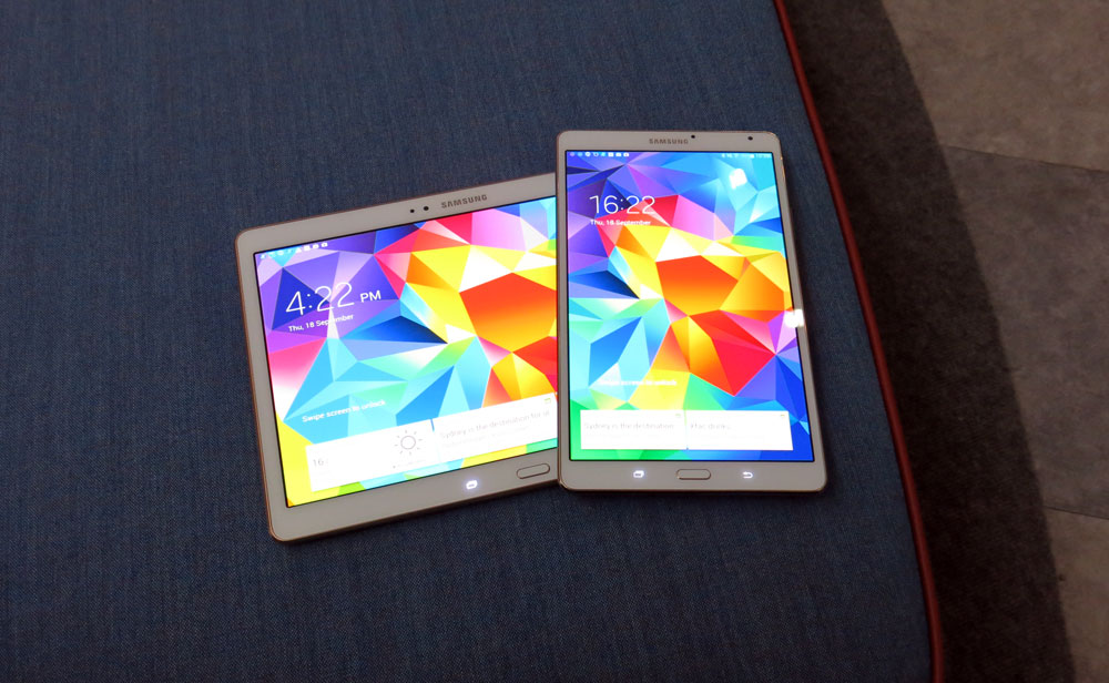
When a company like Samsung, who seems to bring out a new device every other week with a slightly new screen size, tells you “this is the one”, you tend to sit up and pay attention.
While Samsung’s been at the forefront of the Android tablet market for a while, it hasn’t really had a clear flagship. The original Galaxy Tab trailblazed Android into the tablet space – perhaps a little before it was ready to go there – but these days languishes in the market space known as “the midrange”. If you ask someone their opinion, they’ll probably pause and tell you they’re “okay”.
The Note series fares well in spec wars, but when you move away from Samsung’s obvious darling – the supersized 5.x-inch phone – into the tablet space you tend to buy the Note name because it stands for specs rather than because you have a specific use for the S Pen, which does tend to command an extra price and add some heft to the device.
It’s fair to say Samsung hasn’t quite had the top end of its tablet product line in order for a while. Now they’ve decided it’s time to crown a flagship in their product line, and that means adding their “S” to the name, just like their world-famous Galaxy S series of smartphones.
Enter the Galaxy Tab S, a double-pronged attack on the high end of the tablet market, available in 8.4- (portrait) and 10.5-inch (landscape) sizes to suit the way you want to use a tablet. The 8.4 is well suited to carrying with you and reading books (or comics as you’ll notice from many of the photos), while the 10.5 seems better suited to a more sedentary pace, watching movies and browsing the Internet comfortably on the couch. We’ve been checking out both units for a little while now, and liked what we’ve seen.
- Stunning high resolution Super AMOLED screen
- Amazingly thin and light
- One of the best cameras seen in a tablet thus far
- Still running Samsung’s Touchwiz Android UI
- Could do with knocking a little off the price
- Samsung needs to keep pace with the industry better
Hardware
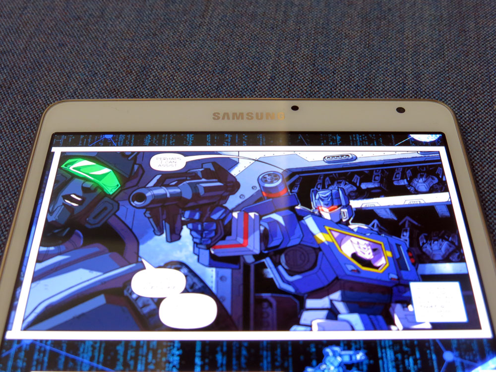
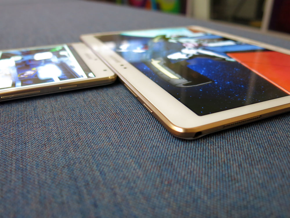
Samsung’s cut down the bezels to a reasonable degree, keeping their thicker top and bottom bezels to house the buttons and cameras, while thinning out the sides about as much as possible without accidentally detecting touches from the hands holding the device. This means the tablet is mostly screen at the front, and we’re a-ok with that.
Both tablets feature the same stunning Super AMOLED screen technology from the Galaxy S5, and both of them are running at a super high 2560 x 1600 resolution. This means the 8.4 is technically a little more impressive as it’s a more pixel-dense screen, but that’s splitting hairs.
On the 8.4 model, you’ll find a speaker on the top edge and the power button, volume rocker, IR port and MicroSD slot on the right. Another speaker graces the bottom of the device, along with the 3.5mm headphone jack and Micro USB port.
On the 10.5 model, the power button and volume rocker are on the top, along with the IR port. Micro USB, a speaker and the MicroSD slot are on the right. There’s another speaker on the left, with the 3.5mm headphone jack at the top of the left edge.
On the back you’ll find a similar stippled pattern to Samsung’s much-mocked Galaxy S5 back covers, although it seems to have been toned down a little here. The camera and flash are top center on the back. Both tablets have inset lugs that can be used to lock accessories (cases, covers etc) into place without requiring the tablet to sit within a shell that adds bulk.
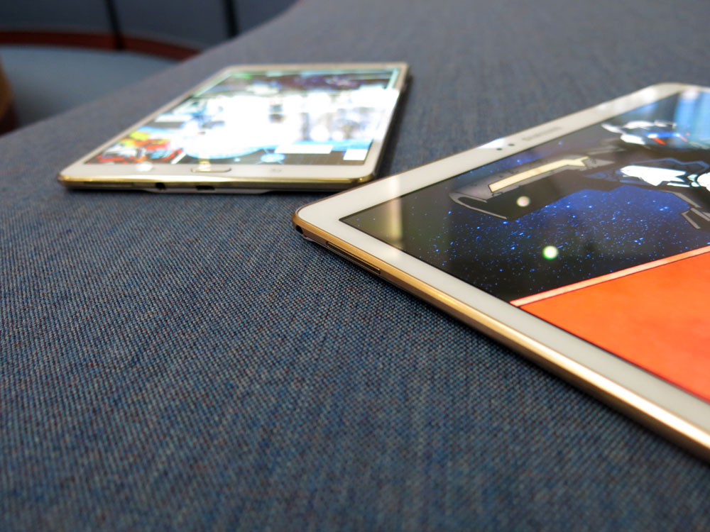
Both of our review units are “dazzling white” – the front and back of the units are white, while the chromed surround takes on a copper or gold finish which is quite nice to look at and aids the premium feel of the tablet.
It’s worth noting that each tablet presents a different screen orientation. The 8.4 is a portrait device and is perhaps better suited to reading (at least, in portrait) while the 10.5 is better suited to widescreen action. Of course, you can hold them any way you’d like, but Samsung’s physical/capacitive buttons get in the way when they’re not held “upright”.
Build Quality
When you pick up and hold either tablet in the hand you’ll be pleasantly surprised. They’re both amazingly thin and light, and the cut down bezels have allowed Samsung to pull off some black magic in terms of size and weight.
The 10.5 model in particular feels much smaller than its dimensions would have you believe, and is in fact noticeably smaller than Sony’s 10.1-inch Z2 Tablet, despite actually being a little heavier. The 8.4 feels pocketable, even though it’s not. You simply won’t believe how easy the tablets are to pick up and wave around.
That quality extends to the durability, too. Both units simply don’t flex when pressure is applied.
Screen
It’s not possible to say enough good things about the screens on these tablets. They’re amazing. Samsung’s pushed their latest iteration of their Super AMOLED technology further than before in blowing it up to the size of a tablet, and the results are stunning.
The screens are so bright, you can see your way with them in the dark (I’ve used them to find my way upstairs at night). In fact, sometimes you might even find them too bright and have to turn the brightness down a little manually. Viewing angles are similarly great – even at close to 180 degrees, there’s no discoloration and the brightness is only ever so slightly affected.
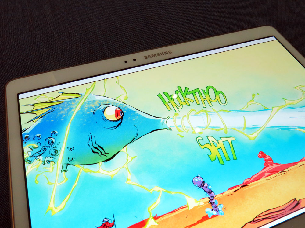
Screens this good demand media be consumed on them. Watching movies and reading (comics in my case) on them was a fantastic experience. Browsing the internet on either of these tablets is a pleasure – the screens are big enough that the slight squint or zoom you need on a Nexus 7 (come on, admit it) is a thing of the past.
What’s still missing though, is a better Android experience on a 10-inch landscape tablet. The 8.4 scoots in on the same exception the Nexus 7’s been riding for a couple of years – it’s like a big phone, so apps run like a big phone screen. On the 10.5 however, you’ve got apps having to adapt to expansive high resolution displays in landscape mode, and the result still isn’t great after all these years.
Battery life
In the pursuit of the thin-bodied tablet, there’s simply not enough space inside to put everything, and so something’s got to give. The battery in the 8.4 model is 4900 mAh while the 10.5 fares better with 7900 mAh.
The simple fact for battery life is that it’s not as good as I’d have liked on the tablets, but given the physical constraints on the space in the device and the power required to run the screen, the battery life is “pretty good”. You certainly won’t have a problem getting through a day of light to moderate use, but if you do a lot on your tablet over the course of the day, you might be reaching for a portable battery or AC charger a little more often than you’d like.
Connectivity
There’s few surprises in device connectivity these days, and Samsung’s had plenty of time to refine its portfolio of connections on all their Android devices.
Both Tab S tablets feature 802.11 a/b/g/n Wi-Fi, and had no problems connecting to my normal or 5 Ghz home networks. You can get both tablets in 4G LTE versions, or Wi-Fi only. Samsung’s WatchON app is present and tales control of the IR port on both tablets so you can control your TV, although it should be noted that WatchON only lets you control a TV and Set Top Box.
Bluetooth is fully spoken for, with Samsung’s familiar Bluetooth 4.0 BLE stack on board. Samsung’s Bluetooth stack is pretty solid and has a good reputation for maintaining a solid connection – something we didn’t expect to be an issue in 2014, until it was. This review was written with a Bluetooth keyboard, A2DP headphones and an Android Wear device connected to the 10.5 model. Last Bluetooth part – if it’s important to connect external fitness trackers to your tablet, they both have ANT+ compatibility.
There’s also GPS / GLONASS support. The tablets both quickly obtained and maintained a solid location lock while navigating (and of course, playing Ingress).
Perhaps the most surprising part in a discussion of connectivity options is the omission of NFC, made even more confusing when you note the presence of NFC for easy pairing in Samsung’s wireless audio product range.
Sound
We’re finally starting to see devices – both phones and tablets – where the manufacturer has decided to go the extra mile and have a go at providing quality audio for their customers. HTC’s been leading the way in this department with its front-facing BoomSound speakers on phones, but we haven’t seen a concerted effort to bring these kinds of components to tablets (mainly because HTC hasn’t made a tablet).
What we’ve got on the Tab S is a landscape stereo arrangement where the speakers are actually in the chromed edges on either side of the tablet – this makes them small, but not tiny. There’s a miniature speaker grille in both cases, and the speakers themselves do provide decent, loud and deep audio without getting too tinny. It’s not BoomSound, but it’s better than we’ve seen before. You probably won’t want to run them at full blast, but a couple of notches away will do just fine.
It’s great to see Samsung getting on board with this movement – can’t wait to see what they do in the Galaxy S6.
Performance
As you’d expect from a tablet that shares its name with Samsung’s premier smartphone range, the tablets don’t disappoint. Apps open in a snap, scrolling is smooth and the tablets just don’t miss a beat.
You wouldn’t know they’re pushing pixels around WQXGA resolution screens, and this is probably down to the 3GB of RAM found on the device, along with Samsung’s newest Exynos CPUs combined with the high end of the Mali GPU range.
I don’t think I’ve actually used an Exynos-powered Android device before, but if this is the kind of blazing fast performance you get from Exynos – at least on Android, let’s not talk about Samsung’s Chromebooks – then it’s no wonder people import the Galaxy S phones with them.
Camera
Samsung’s packed an 8MP camera into the back of both tablets, and a 2.1MP camera on the front. They’re both far and away some of the best cameras I’ve used in a tablet – as long as you use them right.
What does take some getting used to if you’ve been using a phone for photography for a while, is the sheer size of the viewfinder in front of you – especially the case with the 10.5-inch model. It’s the whole screen, and that makes the viewfinder present the image at a larger size than you’ll probably ever look at these photos again. It’s also presenting a slightly cropped version of the final image, so if you’re lining up photos with pixel-perfect precision you’ll probably need to edit them in post to get the crop you wanted.
When I first tried the rear camera out during the launch event, I was actually really put off by the experience – I was looking at an image in the viewfinder that looked grainy and pixellated and so I barely glanced at the results. However, that was on a night walk around Sydney – a bit of an unfair test. It didn’t produce wonderful results, but it wasn’t a complete washout.
Taken out in daylight, the Tab S produces some pretty stunning results, and features mostly the same camera software and controls seen in Samsung’s other products. Bells and whistles like the Galaxy S5’s realtime HDR preview is missing, but the tablet is not meant to be your main shooter, so its results are pretty much “good enough”.
Aimed at skylines, landscapes and generally well-lit scenes, the Tab S produces some wonderful-looking results. Be confident it’ll capture the image – and it’ll look better than what you see in the viewfinder. You do need to be a little careful not to move the tablet much during capture though, which is actually not trivial – especially for the 10.5 model.
The front camera is a revelation for video calls – my parents complained when I stopped using the Tab S to call them on Skype, because it was the clearest video they’d seen from me in a long time. It’s a step up from the front-facing cameras on both my Nexus 7 and my MacBook Air, and has a good field of view on it so your callers aren’t looking directly at your nose. Together with the speaker arrangements on both tablets, it makes them a pleasure to use for video conferencing.
Software
Software always seems to be the point where we turn on Samsung devices lately, and the Tab S isn’t likely to be any different, although perhaps for different reasons than you might imagine.
The simple fact of the Android tablet experience of the last few years is that the 10-inch UI is a bit of a dumpster fire. Apps usually don’t scale well to 10 inch screens, and this means that you’re left looking at a blown-up phone app. The 8.4-inch Tab S scoots by with this because the apps are in portrait orientation and the screen is physically only a little larger than a phone (especially in the age of the phablet). This isn’t news – the Nexus 7 has also enjoyed this exception for a couple of years now.
Hopefully this will change now that developers are thinking about new form factors like Android Wear watches and Android Auto for their app UIs, but until then I consider the 10-inch tablet landscape no-mans-land as far as UIs go. Why shouldn’t Samsung be able to make a go of it?
Android OS
The Tab S is currently running Android 4.4.2, with no update to 4.4.4 in sight. There have been a couple of software patches applied that have kept it at 4.4.2 – these are probably fixes for things like Heartbleed.
Samsung has a spotty track record of providing updates to their multitude of devices, whereby even a premium flagship device can go without an update for a year. Hopefully those days are behind us. Being a premium device with the “S” name and only a couple of months old, it seems likely that we’ll see an update to Android L for the Tab S range – just don’t expect it to come around very quickly. Samsung hasn’t said anything on the matter.
Regardless of the particular Android OS point release though, as with every Android device with Google’s apps installed, Google Play Services will of course keep you up to date with new features that developers will be looking to take advantage of.
Skins
No mention of a Samsung device will go by without earning the scorn of the Touchwiz haters. I’ll earn a little more scorn here – it’s not all that bad, within reason.
Launcher and Widgets
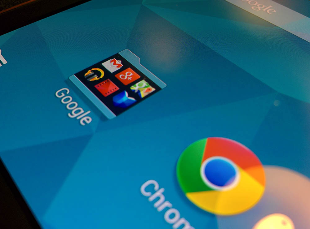
First of all, yes it’s the Touchwiz launcher. On the Tab S, its got a left-to-right screen arrangement, which I’ve come to find is a simpler way to handle home screen layouts instead of the 5 screen void we so often see on Android devices. New homescreens are added as needed. There’s no dock, so there’s nothing for us to complain about Samsung inexplicably locking. There are shortcuts to your files, edit controls for the launcher and the app list.
Touchwiz has always been fairly configurable (if you ignore the locked docks of yesteryear), and the tablet UI is no different. You can move shortcuts and widgets around, customise the display order in the app list, and of course set the wallpaper. There’s a large number of huge widgets in place by default, but they can be moved, removed and resized.
To the left – in a move that somewhat emulates HTC’s Blinkfeed and Google’s Google Now Launcher – you’ll find the remnants of Samsung’s Magazine UX, now seemingly just named “Widgets”. Samsung’s Widgets interface provides multiple, configurable split-panel screens, and is really an information home screen for your home screens.
Out of the box it has a Briefing area showing upcoming events, alarms and favourite bookmarks alongside panels for Arts and Culture, Sports and News areas (which you can personalise) and a WatchON panel showing you what’s currently on TV.
You can customise the panel arrangement (sort of, there’s a number of presets) and you can also add panels that match your interests – widgets are broken up into News, Social and Applications sections, and there’s multiple options under each of these sections.
UI Customisations
Get ready for the bad news – the Settings are still kind of a mess. The Tab S settings UI seems to follow on from the Galaxy S5’s controversial settings rearrangement, with tabs for Connections, Device, General and Applications. A Connections category, I can understand (Bluetooth, Wi-Fi, IR, etc), but Device as a concept is a little less straightforward – it includes configuration of physical aspects of the device (like screen brightness) but also software configuration like Wallpaper, Motion Controls and Lock Screen. When you get to General, forget it – all bets are off. That’s got Accounts, Cloud, Battery, Security and About. The Applications area is pretty much app management as well as app-specific settings.
You’re going to have to learn where Samsung thinks your settings should be found. Fortunately, there’s a search function for all of this, but if you have to rely on search then you’ve got some pretty big UX problems. But you know what? I don’t spend all my time in Settings. It’s just a pretty easy place to put the boot in. The fact is, the rest of the user interface is pretty good.
Samsung’s also reworked some aspects of Android’s tablet UI to take advantage of the hardware on offer. Multitasking is no longer a full-screen operation but rather an overlay over about a third of the screen. The notification panel has configurable quick settings icons at the top that again work better than Android’s original mess, and it also includes brightness and volume controls.
What’s also interesting is what Samsung isn’t doing. Competitors have a number of novel controls that allow you to do things like double-tapping the screen device to turn the screen on, using “edge gestures” to launch particular applications, or intelligently running the camera when waking the device in a particular orientation, but Samsung’s made absolutely no move in that direction. Perhaps the physical home button on the face of the device makes this a bit redundant, as you can always press it to turn the screen on, but it’s disappointing to see Samsung inexplicably behind its competition here.
While we’re talking about waking up the device, it’s also worth mentioning the lock screen. It’s not the standard Android lock screen, it doesn’t support lock screen widgets and doesn’t have the slide-to-camera shortcut. What you do get is Samsung’s custom card UI along the bottom of the screen, reminding you of things like Flight Mode being enabled, upcoming events, birthdays and more. It’s a bit disappointing, but at least you can configure the unlock method.
Finally, Samsung’s keyboard is still a bit of a mess. Visually, it’s got bevels on its keys in a flat design world, and the keys just don’t quite feel large enough to type confidently – even on the 10.5-inch model – and the symbol layout leaves a bit to be desired. It’s better replaced with something else.
Bundled Apps
As is fast becoming the norm for a company playing in both the phone and tablet ecosystems, Samsung’s got a companion app called SideSync that mirrors your phone on your tablet or PC allowing you to control your phone from your PC, drag and drop files and more. The intention is that you don’t need to have your phone near you while you’re using your tablet. Of course, it’s limited to running only on Samsung devices.
Otherwise, there’s a number of bundled apps, many of which betray the fact that Samsung really wants the business-minded customer: The Australian, Bloomberg Businessweek+, Dropbox, Flipboard, Hancom Office Viewer, PayPal, Remote PC, S Planner, S Voice, Samsung Music Hub (the Australian version of which is still running), SideSync, WatchON and WebEx.
Galaxy Gifts and Essentials
Samsung’s started to negotiate deals on apps with some developers – in exchange for prominent placement of their apps, they give special deals on content subscriptions and more to owners of Samsung devices. These are Galaxy Gifts, and there’s a decent number of them packed into the Tab S.
The headline offers are a free 2 month digital subscription to the Australian, 3 free movie rentals from EzyFlix, 3 months of free access to Marvel Unlimited, 3 months of free Evernote Premium, 6 months of Wall Street Journal. There’s also a few games on offer like Fruit Ninja, Asphalt 8, Cut The Rope 2, Family Guy and my favourite pick, Halfbrick’s Colossatron. Most of these special offers are carried over from the Galaxy S5 launch and actually don’t mention the Tab S at all in their descriptions.
There’s also a number of “special deals” accessed via PayPal, although your definition of “special” may differ from ours. Telstra waives surcharge fees when paying with PayPal (thanks?), while there’s also a few dollars off a particular order value or percent off from Sears, Allurez and ShoeBuy.com.
Outside of the freebies, Samsung also provides an “Essentials” list, which is pretty much a recommendation list for apps they think you should install. This is a pretty scattershot list mainly consisting of Samsung’s own apps like Gear Manager, Scrapbook, Smart Switch. Curiously, it also recommends an app for Samsung’s Level range of headphones which actually hasn’t come to market here yet. It’s questionable whether you could really call any of them “essential”. More likely, you’ll just want to get rid of the widget on your home screen that tricked you into clicking on it in the first place.
Setup Process
Screenshots
Samsung Galaxy Tab S
8.4, 10.5
- 8.4 / 10.5 inch Super AMOLED display (PPI: 258 8.4, 385 10.5)
- Samsung Exynos 5 Octa 5420
- 3GB RAM
- 16/32GB storage, with microSD up to 128GB
- 8 MP rear camera, autofocus, LED flash
- 2.1 MP front camera
- Wi-Fi 802.11 a/b/g/n/ac (dual-band), Bluetooth 4, GPS
- GPS, GLONASS, Beidou
- Cellular connectivity:
- GSM: 850 / 900 / 1800 / 1900 Mhz
- WCDMA: 850 / 900 /1900 / 2100 MHz
- 4G LTE: 700 / 850 / 900 / 1800 / 2100 / 2600 Mhz
- Micro SIM
- Android 4.4.2
- 4,900 (8.4), 7,900 mAh battery (10.5)
- 8.4: 125.6 x 212.8 x 6.6mm, 294g (Wi-Fi) 298g (LTE)
- 10.5: 247.3 x 177.3 x 6.6 mm, 465g (Wi-Fi) 467g( LTE)
- GSM: 850 / 900 / 1800 / 1900 Mhz
- WCDMA: 850 / 900 /1900 / 2100 MHz
- 4G LTE: 700 / 850 / 900 / 1800 / 2100 / 2600 Mhz
- Micro SIM
Given Samsung’s dominance in the phone market (and the interconnect options offered by SideSync), I can see a lot of people buying these tablets purely on the strength of name alone and they won’t be disappointed. Whether you like Samsung’s software or not, the hardware is almost compelling enough to drive the purchase of these tablets alone. The internals are some of the most powerful on the market, paired with amazing screens and a thin and light body that wows you as soon as you pick it up.
Samsung has delivered what are probably the best specced Android tablets at the moment, and it’s no surprise that they’re priced equivalent to the iPad Air and Mini. The hardware feels like it has the power to last a long while before it’ll start showing signs of age, and in a tablet that’s especially comforting.
The Tab S devices are both functionally the same, but my preference has to be for the 8.4 inch model. It’s much easier to handle and the portrait orientation means it doesn’t struggle with landscape app UIs (and thus it can also play Ingress). They also have legs, from a product standpoint – even comparing favourably to the newly-released Nexus 9.
Confession time: I’ve never owned a Samsung tablet; my Nexus 7 barely saw a recharge after I got my hands on the Tab S devices, and the Nexus 9 isn’t the tablet I reach for around the house (yet). That should say it all in terms of “Should I buy one?”



I’ve had the 8.4 Lte for a month now, yes i went full phablet >< , it's awesome, only gripe would be the settings, which seem to have been designed by someone who has never used settings.
That aside the Tab S is blazing fast, battery lasts till bedtime without heavy use ( normally have ~40% left ) display is stunning & responsive, very happy!
Optus are giving away the 8.4 LTE version with new broadband contracts.
Brilliant deal, especially with the ability to share on my post-paid data plan.
Thanks for the great review Jason. I went and purchased my wife one (no really) of the 10.5-inch versions to replace her ageing iPad 2 that was really struggling. Great Tablet, and love the fact you can have two profiles to log in with which saves everything you set up etc. Fantastic Display, very fast, she won’t mind touchwiz.
Holy late review batman! This thing came out in July! As for the price, I got the 10.5 for $479 when it came out from DSE. Half the price of an iPad, but better specs. I’d say that’s a pretty good deal.
I thought about getting one of the 8.4s. In the end I got a Sony Xperia Z3 Tablet Compact. My main reason was that battery life is supposed to be better on the Sony, plus good reviews re build quality etc. Main downside is that it is “only” 1920×1080. That’s not a downside for me.
Thanks for the great review Jason. As a WiFi data/3G data/4G data tablet, this looks to be damn good. That comic frame showing Soundwave was cool. 🙂 Who was he aming his gun at ? The problem you note about the poor, in general, experience with apps, when trying to use them on a tablet, is long overdue to be fixed. Google COULD fix this, if they were willing to start putting pressure on devs to make their apps properly landscape/tablet friendly, instead of how so many apps are only portrait/phone friendly. The point you make about power consumption and… Read more »
I’ve rooted my 10.5 so I could remove a lot of the bloatware apps Samsung have added that I don’t need, and of course I’ve been using ADW Launcher from day one. It’s good hardware, but their user interface is annoying when I’m used to standard Android.
Tip for anyone looking at purchasing one. If you are on a phone contract with optus ($60 plan+) you can purchase the 4g 16gb 8.4/10.5 tab s for a little more than cost of a wifi only one at most retail stores. Its subsidised and u pay only for a data share sim ($5)…and whether u buy it outright…12 month or 24 month contract, the price is the same. I did this for mine and usually have it set in airplane mode with wifi on. I hardly use 4g but its been good to have it there – and only… Read more »
To be specific…JB hifi have 16gb wifi only model for $478 and the 4g model with optus on data share plan is $485 all up
I moved to a Tab S 8.4 recently after waiting for this year’s Nexus 7 upgrade which didn’t come (and the Nexus 9 reviews were underwhelming).
I’m a happy customer – the screen is stunning, it’s light to hold and it’s very fast.
IMO those cons are not Really cons
1 – Still running Samsung’s Touchwiz Android UI…this is not a nexus, a it’s only skin that has better multi window feature
2 – Could do with knocking a little off the price…..it’s a premium device, what you pay is what you get.
3 – Samsung needs to keep pace with the industry better….. I didn’t get this.
But nice review, but bit late
TouchWiz OS is more than a mere skin on Android.
It comprehensively changes the settings system, and alters all of the general UI, and unlike a mere skin, you cannot easily peel it off a Samsung device.
As for me purchasing one, no. From the screenshots of the apps on the device, there looks to be no Phone icon.
Going by its raw specs, the 10.1 version of this would have been a great tablet.
Ehh…skin or bone, UI is UI please don’t keep calling them OS. TouchWiz don’t do what an OS does… and the reason it doesn’t have a phone icon is because its a tablet, not a phone or phablet.
oooohhh, now you’ve done it!
It’s a no sale mate.
Colin . although Julia `s st0rry is really cool… on friday I got a gorgeous Toyota sincee geting a check for $6595 this – 4 weeks past and even more than ten grand this past month . it’s realy the best-work I have ever done . I actually started five months/ago and almost straight away startad bringin home at least $77…..tiny.cc/wii5ox
There is a phone icon on the LTE editions…..even if it wasn’t touchwiz it would still be no sale for you Jeni
Thanks for that info, Judgemental.
🙂
Not a single mention of the price?
You can’t comment on the price and then not tell us how much it costs.
Check Amazon.com! $380.00 the 10.5
I wouldn’t purchase one myself, I’m not into tablets, but these look pretty good.