Ever since the introduction of the Quick Settings screen in Android Jelly Bean, we’ve been complaining about the feature.
Google’s original vision of Quick Settings was a confused mish-mash of toggles and shortcuts to settings screens, and offended the Android world for one main reason: the settings couldn’t be customised, you were stuck with them whether you liked them – and they served your preferences – or not.
In this respect, many OEMs have been besting Google with their Android customisations for a while. HTC chose to extend the base AOSP settings, while Samsung and other manufacturers have been doing their own Quick Settings as a sliding panel of toggles above the main notification area for some time.
In Android 5.0 Lollipop, Google has redesigned the Quick Settings panel again. You still can’t customise it, but hopefully that won’t matter any more. With the addition of Flashlight, Screen Rotation and Personal Hotspot to the toggle list, the reasons we’ve all had for installing extra apps to provide additional notification toggles might have gone away.
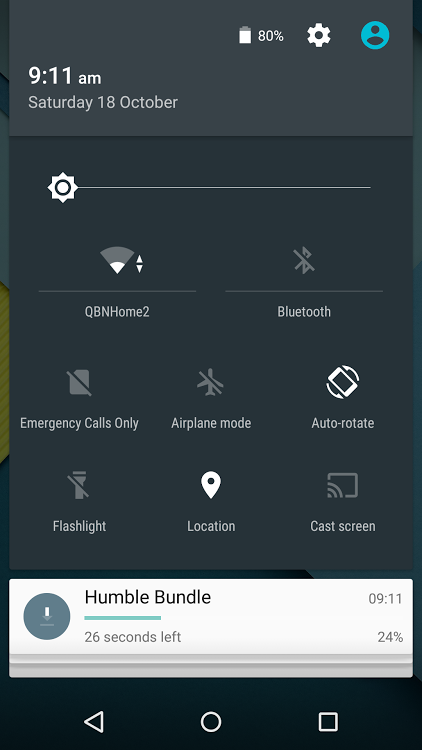
Quick Settings can still be accessed with a two-finger swipe down from the top of the screen, or two consecutive swipes down – the first opens the notification shade, and the second compresses all the notifications as the Quick Settings panel appears.
Note also that the Personal Hotspot toggle doesn’t appear until you’ve set up the Personal Hotspot for the first time. The layout changes a little to accomodate the new toggle, and Dan’s also been exploring accessibility options, so there’s also a toggle for inverting the display colours on offer now:
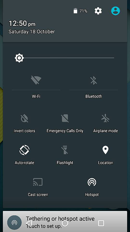
Google has also sorted out the toggle/shortcut behaviour as well. All the icons in the new Quick Settings panel are now toggles for switching things on and off, while text labels now act as shortcuts for the settings panels. Brilliant!
Less brilliant? Landscape mode. It scrolls:
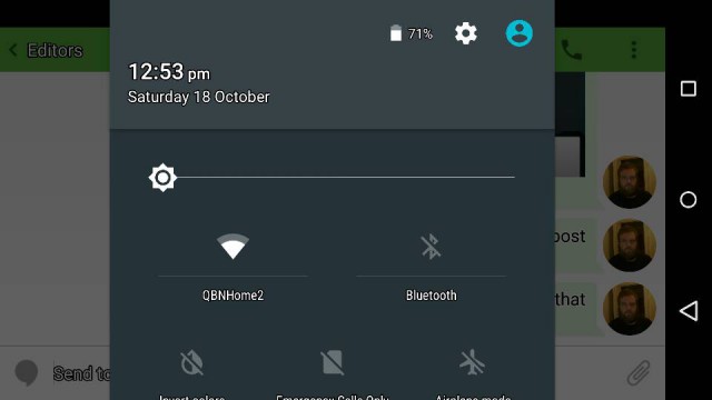
Can’t win ’em all. There’s still a chance Google will change this somehow in the final release.
It remains to be seen whether OEMs will adopt Google’s new Quick Settings display in their customised builds of Android 5.0. We’ll have to watch over the coming months.
Check out the Android 5.0 Archive


I do hope it is customisable in the release, I’m not even sure how to get the “do not disturb” notification toggle on their again
It customize itself a little, but it can’t be configured by the user.
Press the physical buttons for volume control to bring up the new widget for do-not-disturb settings. It’s really handy, you can tell it to not make any sound the next n hours for instance.
I know flashlight is an American term, but I wish it could be changed to Torch.
I have the opposite problem with Cyanogenmod. I know torch is an English term, but I wish it could be changed to flashlight.
Where are you seeing Torch on your Android device?
The quicksettings.
Why can’t Google just open up the notification and quick setting menus so that users can COMPLETELY customise them to include the options we want?!? I would love to have a 2G/3G/4G quick setting toggle available, as I sometimes don’t need 3G/4G access, and 2G battery life is so much better. And there are options here I won’t use, such as the “Cast Screen” toggle.
And before anyone says it, I have neither the expertise, nor the confidence, to root my phone and flash to alternative ROM (which includes these customisation options). I just don’t see why it seems to be so hard for Google to allow full customisation of the Quick Settings drop down?
I agree with you. Perhaps you should try my solution for the exact same problem and create a settings widget for that particular setting. It has eased my pain quite a bit actually.
Xposed framework for me.
“All the icons in the new Quick Settings panel are now toggles for switching things on and off.”
You could do already… Just touch and hold to toggle.
Well… You learn something new everyday! I never knew you could toggle the Quick Setting options in Kit Kat by holding down the relevant option… Cheers mate! 🙂
The point of that was that the /icons/ are the toggles now, and they toggle when tapped – no long press needed.
“Less brilliant? Landscape mode. It scrolls:”
Crass incompetence more like – there is simply no excuse for that. There is more than enough screen real estate to have EVERYTHING on a corner of the screen. I’ve got 5 icons across the dock even on a phone; therefore 5 icons down in landscape is perfectly possible – enough to hold a proper, workable, QUICK, settings panel.
Someone shoot the google UI designers.