
LG was there right at the beginning of Android Wear with the LG G Watch. It was a far from stylish watch, with LG instead focusing on its functionality. This was afterall, the company’s first attempt at a smartwatch. They followed that up with a slightly more stylish round watch, the G Watch R. The G Watch R was a good looking watch but still had somewhat rough edges to it. If you didn’t like the “diver style” watch and wanted something a little more upmarket, LG’s product range came up short.
Earlier this year LG announced another round smartwatch running Android Wear, the LG “Watch Urbane”. With identical internals to the G Watch R, it set itself apart with a more stylish metallic design, resembling a designer watch. Premium looks come with a premium price though, and the Urbane is now available from the Google Store for $460 with free delivery.
When Expansys offered a review unit of the LG Watch Urbane, I jumped at it. I wanted to know if the premium price over the G Watch R was really worth it, and whether the premium price brought with it a premium experience. Was it really any better than my G Watch R, and could I see myself upgrading to it?
- Android Wear 5.1.1
- Shiny
- Battery life
- Voice recognition
- Colour not to everyone’s taste
- No GPS
- Proprietary charger
Design
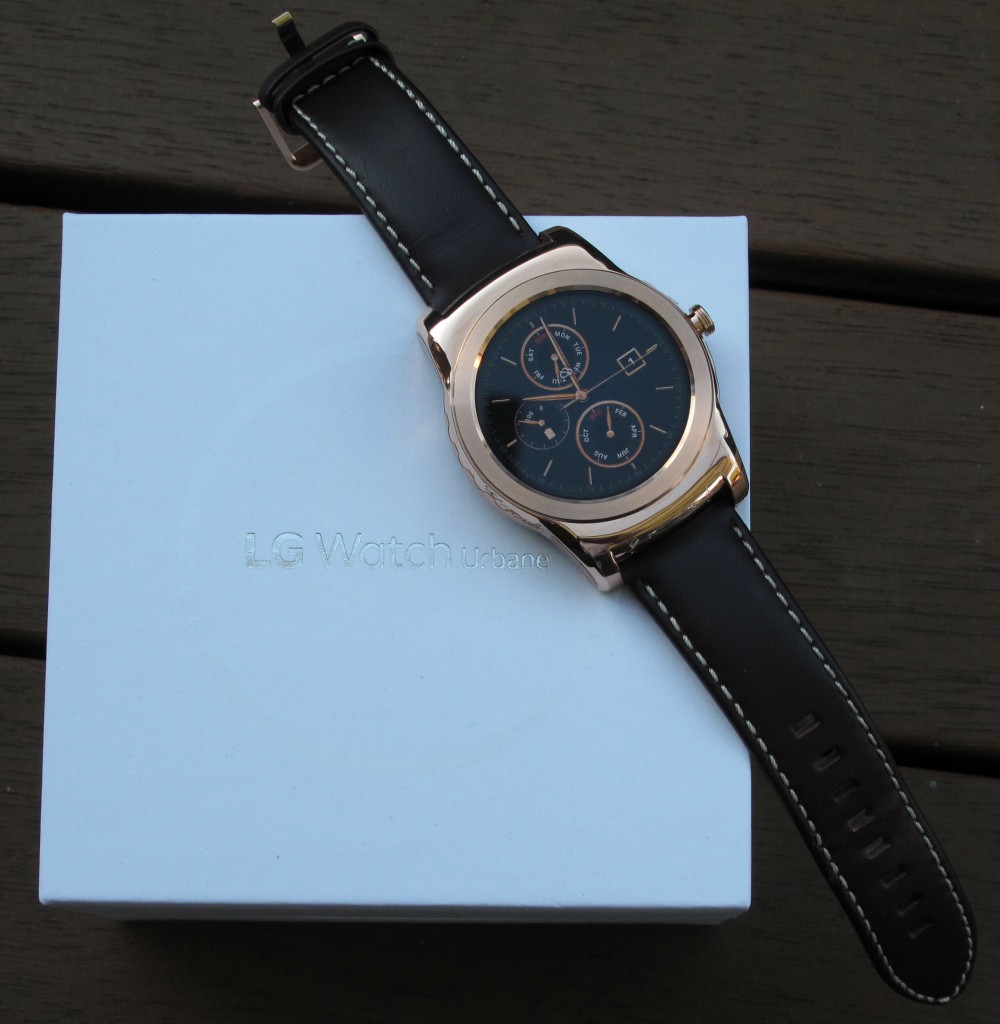
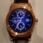
When I first looked at the LG Watch Urbane I was stunned at how shiny and stylish the watch is. The rose gold version of the watch we received was simply stunning. Gold may not be for everyone, and it normally isn’t for me but it grew on me. For those who are not partial to the rose gold there is a silver version which I am sure is equally stunning.
Given the similarity between the Watch Urbane and the G Watch R, it seems appropriate to spend some time detailing the differences.
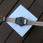
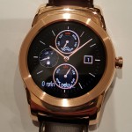
The bezel surrounding the face of the watch doesn’t have any markings on it – the G Watch R’s seconds markers are long gone from the Urbane. The lines are clean and smooth, without the sharp edges that are present on the G Watch R. The edges are rounded and while it is hard to find enough adjectives to describe the look of it I just have to say that I have so many more people comment on the watch and say they like it more than the G Watch R, and I’ve had the G Watch R since it was released, and the Urbane for only 10 days.
LG has learnt a lot in the 12 months since they introduced the G Watch to the world. The LG Watch Urbane looks like a watch, in a more classical and upmarket sense than the G Watch R. This not only looks like a watch but looks like a well built, beautifully designed, expensive, brand name watch.
I sound like I am gushing over it and I suppose I am but it is just not me. I caught up with fellow Ausdroider Jason last Sunday and within 5 minutes of seeing the Urbane he sent out the following tweet:
Checking out @Montalbert's review LG Watch Urbane. I think I want one. pic.twitter.com/VqdyTk5Fu6
— Jason Murray (@JM77) May 17, 2015
Hardware
The Urbane has exactly the same hardware as the G Watch R. It houses a Qualcomm Snapdragon 400, clocked at 1.2GHz. It has 4GB storage and 512MB RAM. I am a bit disappointed LG dsidn’t provide a small bump in specs in the Urbane. There is a pause when tapping the screen before the required menu or app opens and I think they could have improved this with a better processor. Many times I thought the tap on the Settings did not work and would tap it again only for it to open the brightness settings (the first options in the settings menu). A very minor gripe but a gripe nonetheless.
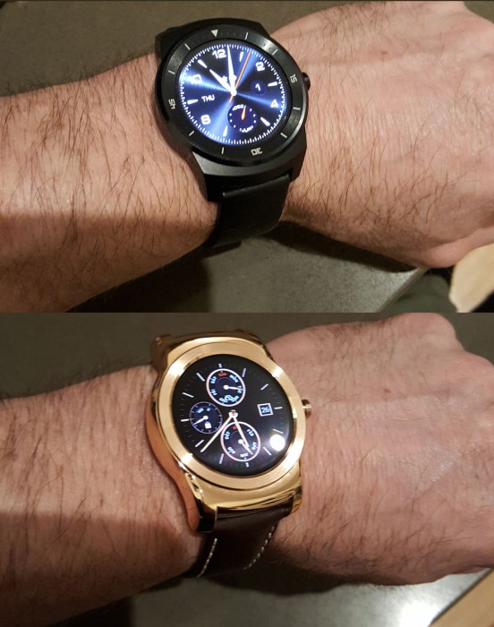
The Watch Urbane is slightly smaller in size than the G Watch R, although it’s thickness is larger. The Watch Urbane measures 45.5 x 52.2 x 10.9 mm while the G Watch R is 46.4 x 53.6 x 9.7 mm. The differences in size are extremely minor and honestly I did not notice it.
The difference in size should not be forgotten because once again LG have decided to go with a proprietary charger and the chargers for the 2 LG round Android Wear watches are not interchangeable. The Urbane has a smaller and more refined base and thus its charger is smaller than that for the G Watch R. The G Watch R thus cannot be charged with the Urbane charger. Conversely though, the Urbane can be charged with either charger but must be carefully positioned over the pins on the G Watch R charger for it to work.
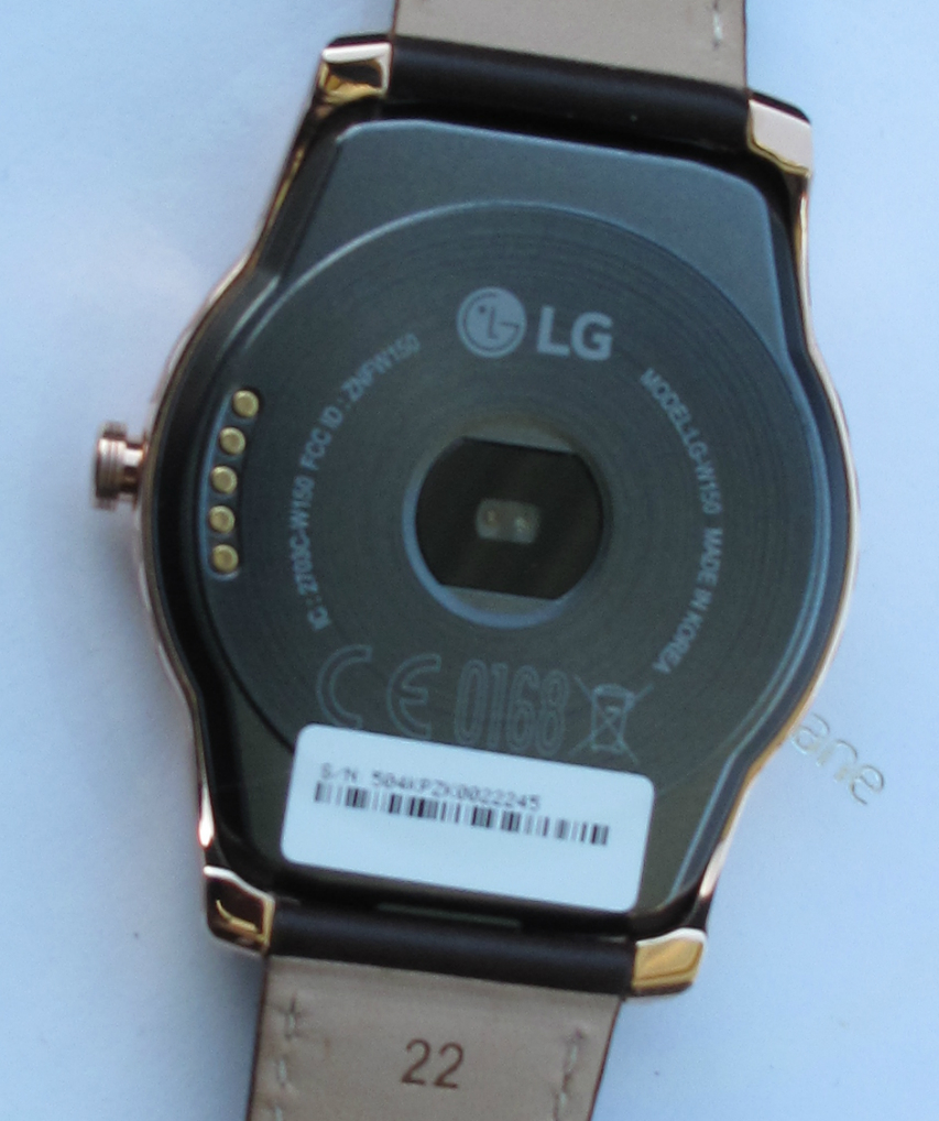
The Urbane sports all the usual sensors with the presence of a 9 axis gyro, accelerometer, and compass, a heart rate monitor, and a barometer. The barometer on the G Watch R in on the underside of the watch (small hole) but on the Urbane this hole is not present leading me to the conclusion that the second hole next to the microphone is in fact the barometer. I could be wrong, but LG have not stated otherwise and there are no other barometer holes anywhere.
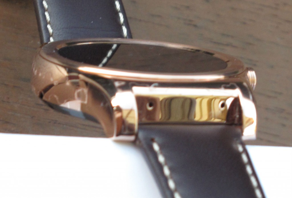
The Urbane comes with IP67 rating which means “the product will maintain its operability even if it is gently submerged in a tank of still tap water at room temperature for about 30 minutes, up to a depth of 1 metre”. Even with that I’m careful not to get it wet … “just in case”. This whole “waterproof electronics” thing still doesn’t sit right with me.
Display
The Urbane body may be slightly smaller than the G Watch R, but it has the exact same display, a 1.3in P-OLED display with a resolution of 320 x 320 pixels. Even in bright sunlight it was still visible, which is a good thing for a watch, when you want to have a quick glance at it for the time or a notification.
As with the G Watch R there’s no ambient light sensor, so you’ll have to adjust the brightness manually as you move from light to dark environments — or, just find a happy medium you can leave the brightness at.
Battery Life
The Urbane has a 410mAh battery, just like the G Watch R. It has slightly better battery life than the G Watch R, though. At the time of writing, it ran Android version 5.1.1 which seems likely to include some efficiencies around battery use. It also has compatibility with Bluetooth version 4.1 (compared with version 4.0 for the G Watch R). It could also be due to Bluetooth 4.1 compatibility (it also brings some enhancements that may improve battery life).
Whatever the case, I was able to get 3 days of use out of the Urbane, using it around 12 hours a day and I normally only get 2 and a half out of my G Watch R.
Software
The Watch Urbane and the G Watch R may have the same hardware but, at the time of release the software is different. The Watch Urbane comes with Android 5.1.1 out of the box and thus has the most up to date software available (the updated version of Android Wear is now rolling out to other watches, though).
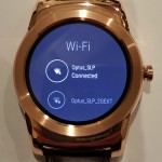
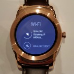
Android 5.1.1 brings a host of changes to the Android Wear experience. One major change that won’t arrive for the G Watch R for a while is the ability to connect to Wi-Fi directly from the watch (after connecting it on the phone when prompted). Bluetooth can then be turned off on the phone if required and the watch will continue to receive notifications, although you won’t be able to initiate or answer calls from the watch. A maintenance release is coming for the G Watch R by the end of Q3, at which time the capabilities and hardware of these 2 LG smartwatches will be identical.
We’ve previously written about Android Wear 5.1.1’s new features, so I’ll quickly mention my favourites.
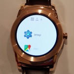
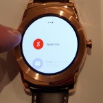
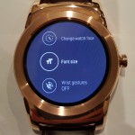
The most obvious change is the new launcher. To say that the previous incarnation of the launcher on Android Wear was a mess is an understatement of monumental proportions. For this reason many of us installed Wear Mini Launcher, a tool that allowed easy access to apps without having to speak to the watch or tap through multiple menus to find the app you wanted to launch. The need for that is almost completely gone now, as the new launcher puts the app list front-and-centre when you tap the screen. You can now scroll quickly through all the available apps, and the most recently-used at the top of the list. I found this extremely useful, even though I don’t use many apps on my smart watch.
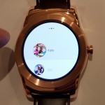
The launcher also allows easy access to contacts. After tapping the screen and the app launcher loading, a lateral swipe across takes you first to your contacts, then another swipe takes you to the “OK Google” commands page. Having the contacts there allows you to initiate a call, text message or email to someone in your contact list easily.
What’s missing there though is the ability to customise the list of contacts that the launcher displays. Further, tapping on a contact yields only the ability to call or send a text. If you want to contact someone via Hangouts, Telegram, WhatsApp, Skype, Line, WeChat, etc, you’re out of luck – something we’ve long complained about – you still can’t initiate a Hangout with someone from your watch. Hopefully this gets some attention in further updates. At the moment, seeing every name in my phonebook without any most-recently-used sorting makes the contact list a little useless.
The ability to connect the phone to the internet via Wi-Fi rather than being tethered to your phone via Bluetooth allows for a lot of new functionality. No need to take your phone everywhere with you, as long as you have Wi-Fi access (and only need to perform the actions you can perform via Wi-Fi). Saves battery life on your phone quite a bit, and it seems the battery in the Urbane is happy with a Wi-Fi connection too.
In the end, software from one Android Wear smartwatch to another will vary very little. The only difference will be the few watch faces that the manufacturer will include with the device. LG has included a couple of distinctive watch faces designed with the Urbane in mind. The gold colour of the watch match perfectly with the watch and make it even more stunning. These watch faces also come in a silver version for those who have the silver Urbane.
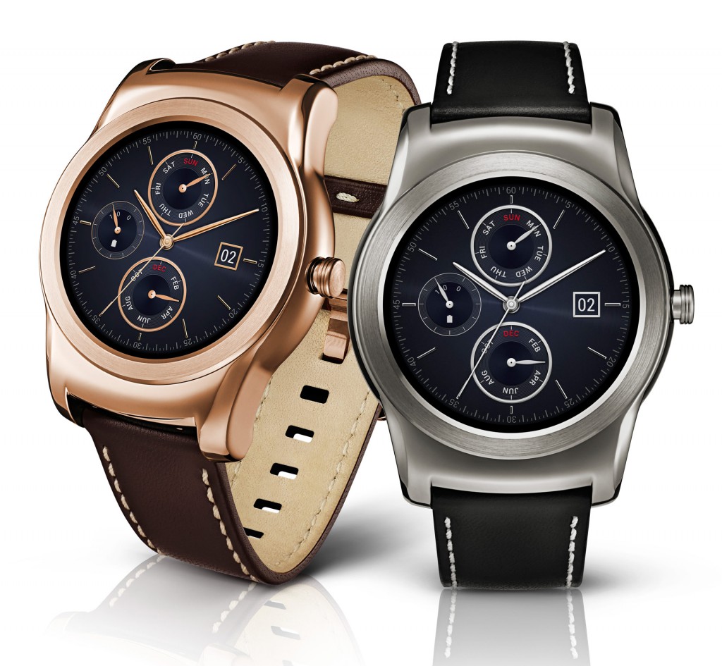
These are great, but there are a plethora of even better watch faces available on the Play Store, especially if you choose to use Facer or Watchmaker.
Specs
- Android Wear
- 1.3” Full Circle P-OLED
- 46.4 x 53.6 x 9.7 mm
- 62 g
- 410 mAh
- CPU Qualcomm® Snapdragon™ 400, 1.2GHz
- Bluetooth 4.1 LE, Wifi
- 4GB eMMC* (user available memory up to 3 GB), 512MB RAM
- 9-Axis (Gyro, Accelerometer, Compass), PPG (Heart rate monitor), Barometer
- IP67
- Changeable 22mm stitched leather watch band
With six Android Wear watches on the market now, style and design seem to have taken a back seat with a couple of notable exceptions. LG has attempted to turn this around with the LG Watch Urbane, and I believe they’ve succeeded. The watch is a shiny, well-crafted device that is an eye-catcher, while not a glaringly obvious smartwatch.
The issue I see with the Urbane is that the style comes at a premium price over the G Watch R, even though the two watches have identical internals. The Urbane looks so much better than the G Watch R (if you’re looking for a dress watch), but it’s a lot more expensive at an extra AU$110. That’s a big difference (a third of the G Watch R’s price again), and if I was in the market for a new watch going for the Urbane would be a tough decision.
In the end, it’s up to you – the buyer – to determine if the added style of the Urbane is worth it. For me, it depends on what you are wearing it for. If it is with a business suit in a well-dressed environment then the Urbane will fit in a lot better.
If you’re after the gold version of the Watch Urbane it can be purchased from Expansys for $495 plus shipping. A premium price, but many people do prefer the gold colour on their watches. It is unknown if or when the gold version will ever arrive on the Australian Google Store.
Would I buy the Watch Urbane? Probably not, as I am happy with my G Watch R. At the moment though, the Urbane is the best-looking Android Wear smartwatch available. If I was in the market for a new smartwatch I would be waiting to see what is about to be released with many manufacturers expected to release updates to their models (Motorola and Samsung) and some about to release their first (Huawei). It’s an exciting time for Android Wear though, and only time will tell whether the Watch Urbane will hold up against all the new watches about to be released.


I think the watch has a tendency to look a bit bulky and garish when on the wrist – which isn’t good given that the watch is supposed to be design-focused – but if you have thicker wrists it seems to look OK.
all smart watches look big atm. And if you look at many watches around these days they are big and thick as well. I don’t see it as an issue. The gold is very gold though. The silver would give a more understated look.
Good points. But I think (at least to me) that the look of the Urbane suffers because it’s trying too much to look like a dress watch when it doesn’t really have the right size or proportions for it… something like the Moto G looks a bit better despite being equally big because it’s a more original design.
Did LG make the crown on the Urbane behave like the crown on an analogue watch?
nope. its solid. not moveable