This year’s Google I/O was different than previous years – no new version of Android was announced and no new devices were launched – but the lack of new products certainly didn’t mean that I/O 2013 was disappointing. Google instead took the opportunity to focus on application design, opening up new APIs for location services and cloud data storage; as well as placing a focus on gaming with the new Play Game services.
So this month’s Beautiful Android column focusses on applications launched at, or inspired by, this year’s I/O conference, starting with the newest application in Google’s GApps package – Hangouts.
Hangouts

There are a myriad different ways to send messages on an Android phone – Google Talk, Google+ Messenger, Google Voice, Gmail, SMS – and these are just Google’s services. It was widely expected that Google would make some attempt to unify these services at this year’s I/O, but instead what we got was Hangouts. Hangouts rolls Google+ Messenger and Google Talk into one package, and even though it’s missing SMS integration, it sure is pretty. It has a beautiful holo style; inline photo sharing; support for web, Android and iOS so you can seamlessly switch between whichever platform you choose; and it also supports video calling. Another really neat little touch is that it shows exactly where various hangout participants have read to in your message stream by placing their avatar at their last read location.
Google updated Hangouts soon after its release to support tablets, with large high-resolution photos of your contacts, and a sidebar for quick access to all of your hangouts.
[app]com.google.android.talk[/app]
Sliding Messaging
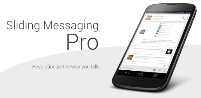
Google’s Hangouts is pretty nice, but the rumours of an integrated IM/SMS client turned out to be wrong, at least for now. If you are so disappointed with the lack of support for SMS in Hangouts that you can’t bear to use your phone’s stock messaging application anymore, or you just want to text in style, check out Sliding Messaging. It’s a pretty cool application that draws heavily from the Google Now cards-like style that everyone loves so much these days.
Sliding Messaging, as its name suggests, allows you to switch between different message threads by lateral swipes, and by pulling out the sliding menu, you can easily see all your conversations at once. The application has theme support, has rich notifications to let you reply from the notification bar (or you can enable pop up notifications if you’re into that kind of thing), supports Samsung’s multi-window, and has a couple of different themes. If you cough up 99 cents for the pro version, you get a lot of additional customisation options, such as 6 more themes, background support, and a widget.
[app]com.klinker.android.messaging[/app]
Helium – App Sync & Backup
One of the neatest things Google announced at this year’s I/O was the ability for third-party applications to sync their data with Google’s servers, so you can set up your Google account on a new device, and data such as settings, and save games will automatically migrate across to your new device. It’s still too early to tell whether this will be picked up by a majority of developers – I definitely hope that it does – but until the rise of app data syncing, Koush’s Helium (formerly Carbon) backup application has you covered. You may remember Koush from such applications as ROM Manager and the ClockworkMod recovery, but unlike those applications, Helium doesn’t require root (although your life will be a lot easier with it). With the free version, you can only backup to your SD card, but if you cough over a few dollars, you can store your backups in the cloud.
[app]com.koushikdutta.backup[/app]
Google Play Music
Google’s music application was pretty cool when it was first introduced, but Android’s style has changed a fair bit since then, and Play Music had been stranded in the Honeycomb design era for a long time. Thankfully, the version Google announced at I/O fits much more neatly into Google’s new design aesthetic, with bold colours, and large tiles with album art displayed prominently. It also uses Android’s new UI element – the slide-out Navigation Bar, complete with the hamburger button.
Unfortunately, Google’s Play Music All Access service isn’t available in Australia yet (at least, not officially), but hopefully it will come to Australia before too long. Even without the streaming service, Play Music is a gorgeous music player for the music you have stored locally on your phone.
[app]com.google.android.music[/app]
Shuttle
If you don’t like Google Music, Shuttle might be right up your alley. It’s a pretty straightforward application whose UI is inspired by Google Now, and I really like it. The free version uses the dark Holo theme that so many people like, but if you’re more into the Holo theme’s lighter variants, the paid version comes with theme support. Shuttle also features playlists, lockscreen and notification controls, gapless playback, album art downloading, gesture support and tag editing. On top of that, the developer is Australian!
[app]com.simplecity.amp_pro[/app]
Found a great Holo themed app you’d like to share? Are you an Australian developer with a Holo themed app you would like reviewed? You can tweet us or email us.




Wasn’t the biggest gripe about no new version or products that attendees didn’t get all the freebies they were expecting ?
It doesn’t really matter, it was for developers after all.
i thought they got a free pixel chrome book 😮
They don’t call them rumours for no reason.
They sure did!
http://www.networkworld.com/community/blog/google-i0-attendees-each-given-pricey-chromebook-pixel