Material Design was big news at Google I/O, it represents the new design language for Google across all their platforms – Android, ChromeOS and even web. It’s still in the early stages, but we’ve begun seeing the underpinnings of it in some Android Apps (Google+, Sheets, Docs and Slides), and even in Google Docs on the web, now it’s emerging that a Google Play update is coming which incorporates the new design language.
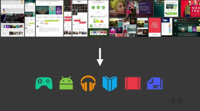
Android Police have done the deep dive into the Material Design update for Google Play, with many examples of how the simple and elegant new look will affect entries in Google Play. At Google I/O, the team at Google took the opportunity to show off Material Design in this talk which is available from the Google Developers YouTube channel (about 11:30 the good stuff shows up):
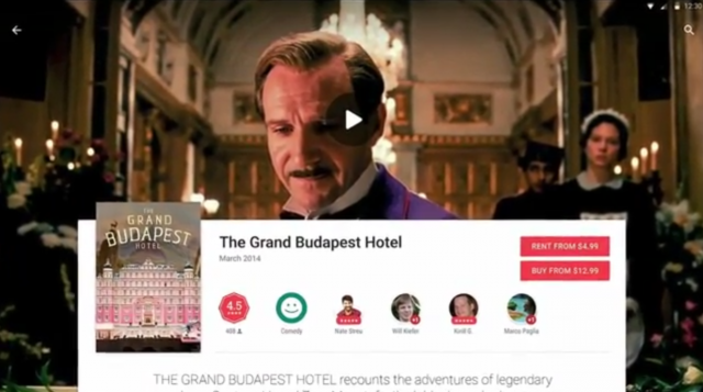
The new Play Store look is, like material design, focused on Typography, Colours and Imagery. There’s larger images in play in the backgrounds as evidenced by the title pictures in the screenshot for Grand Budapest Hotel:

There’s many more examples including screenshots on Android phones of how the updated Google Play will look, over at Android Police. It’s an interesting look and now the wait is on for when it will roll out. It is highly possible though that it could be destined for the Android L release – Only Google Knows.


