Material Design makeovers are really coming thick and fast these days, after being announced at Google I/O in June last year, the new design standard is really starting to filter through to apps. The latest app to get a Material makeover is run tracking and training app Runkeeper.
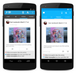
The new look Runkeeper retains all the features you know and love, just wrapped in a beautiful new makeover. Runkeeper has advised that a number of Material Design touches have been implemented such as transitions across tabs, as well as fully updated new-look screens. The New Activity list in particular has seen an update to include the Google Now card like styled, with activities all presented on individual cards displaying stats and your activity map.
Other places within the app like the Start, Me, and Friends tabs also got a Material touch, with a clean up that also includes the new transitions and animations.
As you can see from some of the screenshots, there are differences between what you’ll see in Android Lollipop, versus earlier versions of Android.
If that’s not enough for you, Runkeeper has also killed a heap of bugs in the latest update. To grab the new Material Runkeeper head on over to Google Play and download the app now.

