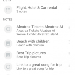
Personal productivity tool Centrallo has been updated, with the app receiving a fresh new makeover to bring it inline with Google’s Material Design guidelines. The update has gone live over night and has received good feedback from their core beta group testers.
The Material Design update, includes a more colourful, minimalist interface that’s described as more airy and has plenty of room for text. The update means there’s an awful lot of white space, though this is in line with other Material overhauls we’ve seen previously.that’s more colorful, minimalistic and airy, with lots of space for text.
The new update includes functional improvements as well as the visual design, with the full changelog including :
- Full update to support Google Material Design standards
- Significant synchronization improvements
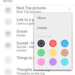
- Colors added to categorize lists and notes
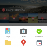
- Simplified add attachment redesign
- View for most recent activity screen
- Enhanced sort views
- Improved sharing flow
- Cleaner navigation throughout
If you’re wanting to try out Centrallo, you can head to Google Play and grab the latest update now.




Absence of a widget was the dealbreaker for me. Looks like a terrific app, but not being able to have a visible list right there on my home screen – as I can with Keep, Evernote, Wunderlist, etc – has really spoiled it for me.